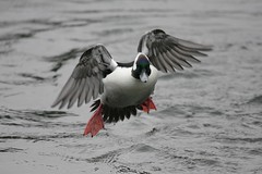
Monday, February 25, 2008
Canon 100-400L in the field
After testing my new Canon 100-400 f/4.5-5.6 L I realized that it had potential for being a very sharp lens. Testing the 100-400L against my 70-200L near the close focus limits of both lenses showed the results to be equal (see prior post). Now, I wanted to see how the 100-400L behaved with subjects at distances greater than six feet.
As for the lens being sharp? Oh yes, it most certainly is sharp. Much sharper than I anticipated, in fact. After reading all the mis-leading comments over on DPReview I had to steady myself and come back to reality. The 100-400 f/4.5-5.6 L Canon lens is simply superb.
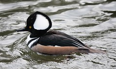
One has to be careful when using long lenses. Vibration and shake are greatly magnified.
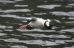
In my case, I haul out the Bogen 3033/3057 setup and strap the long super zoom to the head. For stationary subjects I can clamp the controls down tight and either trigger the shutter using the 40D's 2 second delay, or use my new 2.5foot tethered trigger.
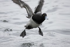
For birds in flight (BIF) I found that loosening the tripod head controls (horizontal and vertical) just enough to be able to move the camera setup is very usable. I realize it might be counter-intuitive, but using the tripod in this manner allows me to keep the focus point fairly steady on the subject. I have now shot thousands of images using this method and have better results than with trying to follow a BIF handheld (camera/lens off-tripod).
As for the lens being sharp? Oh yes, it most certainly is sharp. Much sharper than I anticipated, in fact. After reading all the mis-leading comments over on DPReview I had to steady myself and come back to reality. The 100-400 f/4.5-5.6 L Canon lens is simply superb.
Thursday, January 10, 2008
DSLR lens testing - Canon EF 100-400mm f/4.5-5.6 L
All the bird photographers I know and those I've seen on line (DPReview, Fred Miranda, etc) seem to use Canon's 100-400mm f/4.5-5.6 L series lens. And there has been quite a bit of discussion about possible variability in build quality between samples. For this reason it became very important to me to test a new sample before I put it to use in the field. I wanted to use such a test to "spot check" the example I purchased to see if it needed to be returned for another.
As in previous tests, the numbers that follow the aperture are resolution in line pairs per millimeter (aka lines per millimeter). For this lens I tested both center (at some focal lengths) as well as the edge of the frame (in selected focal lengths). As in the 70-200mm f/4 L testing, as I got to the longer lengths I started to use the Canon 40D's Live View mode with 10x magnification to carefully focus on the USAF Resolution Test Chart.
One thing to note before we get to the numbers; I strapped this lens on the heaviest tripod I own, a Bogen 3033 set of legs on a Bogen #3057 head. This rig has firmly held a Folmer and Schwing 12x20 inch view camera in the field. It easily holds an 8x10 Deardorff quite solidly. Yet when I was attempting to focus in Live View mode it was very easy to tell that the 100-400L gets "shaky" when I barely touched the lens.
This illustrated very very clearly to me the need for careful technique when using the 100-400L in the field. IS may play an important role. High shutter speeds will also play an important role. And, finally, I may need to strap this lens down to the 3033/3057 Bogen and trigger the shutter with a remote release. All this in an attempt to get the highest possible resolution out of the Canon 40D/100-400L setup.
100-400L
(100mm) AF focused - center measurement only
f/4.5 58
f/5.6 65
f/8.0 65
(200mm) AF - center measurement only
f/5.0 58
f/5.6 58
f/8.0 58
(200mm) Live View, careful 10x focusing, center + edge measurement
f/5.0 65 82
f/5.6 65 82
f/8.0 65 82
(400mm) AF - center measurement only
f/5.6 58
f/8.0 52
f/11 46
(400mm) Live View, careful 10X focusing, center measurement only
f/5.6 58
f/8.0 56
f/11 46
At 100mm, the lens appears to test "OK". It's certainly not what the 70-200 f/4L measured at the same 114 inches from the target. I wasn't entirely thrilled. But I kept going, just to see what else this lens might have in store for me.
At 200mm I tested in both AF and Live View modes. I was also able to capture edge resolution performance readings. Here again, the lens tested "OK" against the 2D test chart. But then something caught my attention. When I read the edge performance of the Live View tests I realized that 82l/mm is outstanding! performance. I had to wonder what I'd done wrong. Perhaps the Live View focusing wasn't as accurate as I'd hoped. And, of course, there's the fact that at these higher magnifications, AF and manual focusing with the wee-Canon 40D is nothing like focusing a 120 format film camera. The brightness of the display as well as the distance to the subject must come into play.
- Click on the following image to view it full size -

As in previous tests, the numbers that follow the aperture are resolution in line pairs per millimeter (aka lines per millimeter). For this lens I tested both center (at some focal lengths) as well as the edge of the frame (in selected focal lengths). As in the 70-200mm f/4 L testing, as I got to the longer lengths I started to use the Canon 40D's Live View mode with 10x magnification to carefully focus on the USAF Resolution Test Chart.
One thing to note before we get to the numbers; I strapped this lens on the heaviest tripod I own, a Bogen 3033 set of legs on a Bogen #3057 head. This rig has firmly held a Folmer and Schwing 12x20 inch view camera in the field. It easily holds an 8x10 Deardorff quite solidly. Yet when I was attempting to focus in Live View mode it was very easy to tell that the 100-400L gets "shaky" when I barely touched the lens.
This illustrated very very clearly to me the need for careful technique when using the 100-400L in the field. IS may play an important role. High shutter speeds will also play an important role. And, finally, I may need to strap this lens down to the 3033/3057 Bogen and trigger the shutter with a remote release. All this in an attempt to get the highest possible resolution out of the Canon 40D/100-400L setup.
100-400L
(100mm) AF focused - center measurement only
f/4.5 58
f/5.6 65
f/8.0 65
(200mm) AF - center measurement only
f/5.0 58
f/5.6 58
f/8.0 58
(200mm) Live View, careful 10x focusing, center + edge measurement
f/5.0 65 82
f/5.6 65 82
f/8.0 65 82
(400mm) AF - center measurement only
f/5.6 58
f/8.0 52
f/11 46
(400mm) Live View, careful 10X focusing, center measurement only
f/5.6 58
f/8.0 56
f/11 46
At 100mm, the lens appears to test "OK". It's certainly not what the 70-200 f/4L measured at the same 114 inches from the target. I wasn't entirely thrilled. But I kept going, just to see what else this lens might have in store for me.
At 200mm I tested in both AF and Live View modes. I was also able to capture edge resolution performance readings. Here again, the lens tested "OK" against the 2D test chart. But then something caught my attention. When I read the edge performance of the Live View tests I realized that 82l/mm is outstanding! performance. I had to wonder what I'd done wrong. Perhaps the Live View focusing wasn't as accurate as I'd hoped. And, of course, there's the fact that at these higher magnifications, AF and manual focusing with the wee-Canon 40D is nothing like focusing a 120 format film camera. The brightness of the display as well as the distance to the subject must come into play.
It seems that the resolution drops off on my 100-400L at 400mm. But it's not far behind the 200mm center measurements on that lens when using either AF or Live View to focus this 100-400L. I wasn't sure what this meant, even after looking at DPReview's performance tests of this lens at 400mm and comparing it against the 400mm EF f/5.6 L. There was one last test I wanted to undertake before I headed into the field.
I took the nice and sharp 70-200L, set it at 200mm, and moved the tripod to 54 inches from the target. This made the subject size the same as the 100-400L at 400mm. I then Live View focused images. Testing f/5.6 on both lenses I put the results into an image viewer (Gimp or Canon's own software worked nicely in my tests) and observed the differences in apparent resolution at 200x.
The results are really quite interesting. The 100-400L was tested at 400mm and 114 inches from the target. The 70-200L was tested at 200mm and 54 inches from the target. In the following image, take a close look at the results. Resolution is really nice on the 100-400. Looks at the test bars for both the 70-200L and 100-400L at f/5.6. They look very nearly the same, don't they? Then look at how the performance degrades from f/5.6 thru f/11 on the 100-400L. This appears consistent with a few user observations I read on DPReview.
- Click on the following image to view it full size -

What's interesting to me is that when operating near the closest focus of either lens (6 feet for the 100-400, and slight farther but still near the close focusing limits of the 70-200L at roughly 4 feet) that performance between the supposedly less sharp 100-400L and the know to be brilliant 70-200 f/4L is identical! What this leads me to believe is that close focus performance of Canon's zooms might not be as good as their ability to resolve scenes at something greater than their close focus limits.
With this in mind, could it be that the 100-400L's performance is actually quite good at greater distances from the subject? To find out, I'm headed out into the field...
Wednesday, January 09, 2008
DSLR lens testing - Canon EF 70-200mm f/4 L
Shooting a Canon 40D, mounted on a heavy tripod, looking at the smallest resolvable block of information from a USAF Resolution Test Chart, at 114 inches from the target, I took a look at a 70-200mm f/4 L (non-IS) resolution. In general, I like this lens for it's size and weight. So I was looking forward to seeing just how sharp it could be.
The numbers from left to right after the test aperture are the resolution figures noted in Lines Per Millimeter (aka line pairs per mm - they're the same thing). My comments follow.
70-200mm f/4 L (non-IS)
(70mm) AF enabled
f/4.0 65 65 58
f/5.6 74 74 65
f/8.0 93 83 74
f/5.6 73 73 73
f/8.0 73 73 73
(200mm) AF enabled, center measurement only
f/4.0 40
f/5.6 58
f/8.0 58
(200mm) Live View - careful focusing at 10x, center measurement only
f/4.0 82
f/5.6 72
f/8.0 72
For the first pass I let the camera autofocus on the USAF Resolution Test Chart. The resolution numbers you see here reflect this.
Looking at resolution at 70mm the lens performs very nicely. As some people feel, the resolution improves from f/4 through to f/8 as the lens is stopped down. At f/4 the numbers look good compared with the two previous tests of fixed focus lenses. By f/8 the 70mm resolution is the best I've seen so far. Simply brilliant.
Looking at resolution at 100mm the lens performs very consistently at all apertures all across the field. Very nice and even, but no improvement in resolution by stopping down. I measured this length specifically to compare with a soon to be acquired 100-400mm f/4.5-5.6 Canon EF-L.
Looking at the top end of the zoom range I performed two test passes. The first pass let the autofocus select the focus point. The resolution of the 2D subject (the USAF chart is flat, after all) is down from 100mm resolution. For a second pass I used the 40D's Live View and 10x magnification to hand focus the lens. I did this to see if there was any improvement to be had in the lens measured resolution performance, and there is. As you can see, the lens is just as sharp at 200mm as it is at 70mm, depending upon the aperture.
The second test pass taught me that the 40D's autofocus, while good, might not be the absolute best in all cases when shooting a 2D subject. I'm sure there are many factors which come into play with regards to the 40D's AF performance. I just happened to stumble upon on sample/observation. This is a good learning and will be applied to the 100-400L tests when I get there.
Please Note: Resolution tests should not be confused with Modulation Transfer Function testing. MTF looks at a lens' ability to preserve contrast from the original scene. Resolution tests look for the finest possible sharpness, independent of contrast. The two tests are somewhat related in that the human eye perceives resolution as contrast. But the nuance is important as many folks feel that MTF is the only valid optical test. It's not. There are many ways of looking at lens performance. These happen to be just two, and I have chosen the simpler to implement resolution test process.
The numbers from left to right after the test aperture are the resolution figures noted in Lines Per Millimeter (aka line pairs per mm - they're the same thing). My comments follow.
70-200mm f/4 L (non-IS)
(70mm) AF enabled
f/4.0 65 65 58
f/5.6 74 74 65
f/8.0 93 83 74
(100mm) AF enabled
f/4.0 73 73 65f/5.6 73 73 73
f/8.0 73 73 73
(200mm) AF enabled, center measurement only
f/4.0 40
f/5.6 58
f/8.0 58
(200mm) Live View - careful focusing at 10x, center measurement only
f/4.0 82
f/5.6 72
f/8.0 72
For the first pass I let the camera autofocus on the USAF Resolution Test Chart. The resolution numbers you see here reflect this.
Looking at resolution at 70mm the lens performs very nicely. As some people feel, the resolution improves from f/4 through to f/8 as the lens is stopped down. At f/4 the numbers look good compared with the two previous tests of fixed focus lenses. By f/8 the 70mm resolution is the best I've seen so far. Simply brilliant.
Looking at resolution at 100mm the lens performs very consistently at all apertures all across the field. Very nice and even, but no improvement in resolution by stopping down. I measured this length specifically to compare with a soon to be acquired 100-400mm f/4.5-5.6 Canon EF-L.
Looking at the top end of the zoom range I performed two test passes. The first pass let the autofocus select the focus point. The resolution of the 2D subject (the USAF chart is flat, after all) is down from 100mm resolution. For a second pass I used the 40D's Live View and 10x magnification to hand focus the lens. I did this to see if there was any improvement to be had in the lens measured resolution performance, and there is. As you can see, the lens is just as sharp at 200mm as it is at 70mm, depending upon the aperture.
The second test pass taught me that the 40D's autofocus, while good, might not be the absolute best in all cases when shooting a 2D subject. I'm sure there are many factors which come into play with regards to the 40D's AF performance. I just happened to stumble upon on sample/observation. This is a good learning and will be applied to the 100-400L tests when I get there.
Please Note: Resolution tests should not be confused with Modulation Transfer Function testing. MTF looks at a lens' ability to preserve contrast from the original scene. Resolution tests look for the finest possible sharpness, independent of contrast. The two tests are somewhat related in that the human eye perceives resolution as contrast. But the nuance is important as many folks feel that MTF is the only valid optical test. It's not. There are many ways of looking at lens performance. These happen to be just two, and I have chosen the simpler to implement resolution test process.
Tuesday, January 08, 2008
DSLR lens testing - Canon EF 50mm f/1.8
A second lens that I tested during a big weather event. It was raining like crazy around here and the wind was of Hellenic proportions. I didn't feel bad about testing instead of going outside and shooting live subjects.
To get an idea of what my optics and camera would do in my situation, and ignoring the fact that MTF measures contrast reproduction and USAF resolution test charts measure resolution - leading to vast differences in how results are to be interpreted, understood, applied... on a Canon 40D mounted to a sturdy tripod and letting the AF do it's thing, measuring line pairs per mm (same as saying lines per mm), at a target 114inches from the CMOS sensor plane...
...three numbers: Center ~ Middle ~ Edge of the frame...
EF 50mm f/1.8 II
f/1.8 46 52 52
f/2.8 52 52 58
f/4.0 73 73 65
f/5.6 73 73 65
I see that the resolution is fairly flat across the field. By f/4.0 this seems like a sharp little lens. The performance at wider apertures might actually be better than whats recorded here, but for that kind of test I would use Live View and 10X magnification to carefully focus.
For $70USD new, this is really a nice lens!
Monday, January 07, 2008
DSLR lens testing - Canon EF 28mm f/2.8
Just got out of the basement from running tests of my various optics against a USAF resolution test chart. It's raining like crazy here and the wind is of Wizard of Oz proportions, so I didn't feel bad about testing instead of going outside and shooting live subjects.
If I have time in the future, I may write up something more complete. Until then, my words and calculations will have to do.
To get an idea of what my optics and camera would do in my situation, and ignoring the fact that MTF measures contrast reproduction and USAF resolution test charts measure resolution - leading to vast differences in how results are to be interpreted, understood, applied... on a Canon 40D mounted to a sturdy tripod and letting the AF do it's thing, measuring line pairs per mm (same as saying lines per mm), at a target 114inches from the CMOS sensor plane...
...three numbers: Center ~ Middle ~ Edge of the frame...
Canon EF 28mm f/2.8f/2.8 82 65 52
f/4.0 82 65 58
f/5.6 82 65 65
Compared with other DSLR lenses I tested, this is a really nice result . The edges come up cleaner and sharper as the aperture is stopped down. This is a seemingly sharp little optic.
Monday, November 05, 2007
Onward...
Life is very strange and wonderful.
Ever since I started taking photographs (40 years ago, in fact) I wanted to emulate the "great" photographers of the 1920's thru the 1960's. If I could do that, then I too must be "great". Or so the theory went.
Recently, I have shortened the cycle-time between image capture and final "product" by moving to digital. What's happened for me is an extremely rapid development of my own view(s) of the world. Image quality has improved. The chemical darkroom and even the hand coated palladium processes sit idle. Instead, electrons whiz around, sharing images, gathering feedback, stacking up more views then I ever got from gallery shows.
I don't so much care what the "greats" have done, nor do I wish to any longer emulate them. What I want is to continue to uncover that which is uniquely "me". Hopefully there will be enough time between now and when I become food for the worms that I will have created something of value to someone. Someone like "me".
Tuesday, October 30, 2007
Reaching back 80 years...
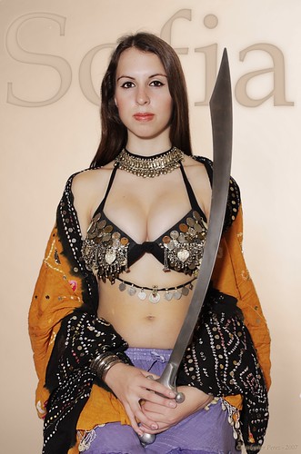
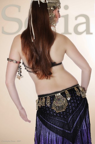
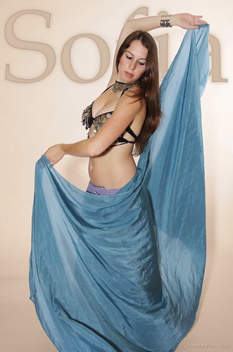
Working with Sofia was a joy. She's a very fine dancer and knew, instinctively, how to begin a pose. My wife and I would refine it to the point everyone was happy.
The Canon 40D with it's 3inch LCD helped greatly in the review process. Instant feedback is something I never had with film, even with Polaroid.
The lighting is William Mortensen's Basic Light. This comes from his text "Pictorial Lighting" c.1937. It worked well then and the same lighting works well now. William Mortensen's Basic Lighting using two off-camera strobe or constant lights is "timeless". In his opinion, Basic Lighting was good for creating images where a formal Notan light is expressed. You see this kind of light used by Botechelli as well as nearly all pre-Renaissance artists. This image utilizes what Mr. Mortensen would could a modified Notan light. The predominant light is the use of "limb-effect" to give depth and curvature to an image. This is the first time I have consciously used this approach and I think I'm hooked.
William Mortensen first described a two off-camera light setup in his c.1937 book on "Pictorial Lighting". In there he describes six unique lighting setups.
Each lighting setup is very easy to understand and deploy, and he decried the use of too many lights positioned in too many ways. In fact, he called the effect of deploying too many lights as "butchery by light", and provided a few examples.
After reading through several of William Mortensen's books, I came to realize that my use of light boxes and umbrellas was inappropriate to the ideas I was attempting to express.
Further, I learned that Mr. Mortensen's Basic Light (of which image deployed) is best used for presenting an iconic, formal idea. Since my intention was to create something "timeless" and in keeping with the Notan sense of line and texture, the use of Basic Light seemed best.
Had I wanted to express a "familiar" image, I would have deployed Mr. Mortensen's Dynamic Light. That is still a two light setup. However, the image gives a heavily modified Notan expression of light.
In all events, I have learned to avoid the harsh, though dramatic, Chiaroscuro light that so many artists used during the Renaissance. In fact, in America these days, I see that Chiaroscuro is the predominant light form used in photography. It has that sense of drama that's overly popular, but seldom lasting after an initial emotional "hit".
William Mortensen wrote many books that were published by Camera Craft of San Fransisco during the 1930's and 1940's. In my own work, I'm finding that his "Pictorial Lighting", "Modeling", and "Outdoor Modeling" books to be the most useful. There are many great suggestions, guides on what to do and what to avoid, and in-depth presentations on lighting and what to do with it. Mr. Mortensen's works and writings pre-date St. Ansels by several decades and are still useful today.
The studio space we rented for this is down at Euphoria Studios. Jane Archer is the kind lady who runs the operation. It's a dance studio and attracts some wonderful teachers and artists. I look forward to continuing to work with Sofia, Jane, and Jane's dance troupe Mandala.
Post-processing included heavy Gimp with layers, Gaussian blur, tints, and contrast controls. These have palladium tints for the background, lettering, and vignetting. Sofia is slightly (and I mean slightly) softened, where certain areas are pulled out as perfectly sharp. The palladium tints appear to work very nicely with Sofia's skin tones.
Wednesday, August 22, 2007
No thought
I was resting comfortably in the living room the day after I hung my Camerawork Gallery show. I was pretty much hammered. Knackered, I think the British call it. It was a very emotional thing to hang 25 Palladium prints and to step back and view it all. It's difficult to take it all in at one look.
As I was sitting there feeling worn out from the 6 months of preparation, image selection, printing, matting, and working with the gallery curator, I let the mind drift and cut it loose from any moorings where it usually docks. The living room is long-ish and slightly narrow. The mind can make weird associations. This mind thought about how it felt when visiting the Sri Gopalaswami Temple just outside Bandipur in southern India last March.
An engineering manager colleague and I paid a visit to the God Krishna just as a family came in to pray and receive His Darshan. Three pujaris (I think they call them archicas, or something similar in Karnataka State) were chanting and waving ghee filled lamps in front of the God.

It was stiflingly hot inside the small low ceilinged temple. My colleague and I were stuffed in tight with the family into the Sanctum Santorum. At one point as the chanting, praying, singing and worship was reaching a peak, one of the pujaris motioned us to make a clear path from the eyes of the God to the doors of the temple. Everyone stepped against the wall so Krishna, now awakened, could view the world. It was incredibly moving to see the tears in the women's eyes as they sang their songs. It was fascinating to watch as the men bowed their heads and prayed their prayers.
What struck me as I sat in the living room half a world away from that beautiful moment of devotion in India was the silence of the God. Unable to do much other than just sit there, I watched as the mind made it's various associations and stilled into contentment. In silence was something intangibly profound and just out of reach in it's incredible depth.
I sat quietly for awhile to feel the silence as I remembered the God, the family, the small temple sitting high on a hill. I looked out on the world, through the front window, out over the street, and up the hill to a beautifully clouded sky.
I wondered if this is what my India colleagues meant when they said that the Gods and Devotees silently watch the world. This, even when carved from stone. This, particularly when they have been imbued with the devotional energies that we sometimes call Mantra. This, regardless of whether we humans are there to witness silence or not.
Thursday, July 26, 2007
Getting to the outter edges of the craft
After working with a black and white background as a way of making the foreground more visible I thought I'd better try my hand at all color images to see how that might work.
Here's a first attempt. I like the process and level of control I have over the final image. So... it's coming down to being a matter of mere "vision" on my part as to what gets created.

Here's a first attempt. I like the process and level of control I have over the final image. So... it's coming down to being a matter of mere "vision" on my part as to what gets created.

Monday, July 23, 2007
And now... for something completely different...
I find that I'm really enjoying exploring all kinds of photo creation and photo manipulation. In the following image, it started out with what I felt was a very distracting background of multiple jewel tone colors. Using the Gimp and Layers, I made a Palladium toned B&W layer and erased anything that represented color that would show through from a lower layer in the image stack.
I like this technique and will be experimenting with various images and styles and tone combinations to see where this might lead.

I like this technique and will be experimenting with various images and styles and tone combinations to see where this might lead.

Monday, July 16, 2007
Notan - Real Master Artist Light
Here is a concise definition of Notan. This is the light that William Mortensen felt was long lasting, classic, serene, and the very best for use with "art" pictorial images.
Chiaroscuro - Light by the Masters
Here's a concise definition of Chiaroscuro. It is this light that William Mortensen felt was overdone by artists in the West.
Friday, June 15, 2007
William Mortensen
For some reason, St. Ansel couldn't stand the man. Early in my life I "believed" St. Ansel and attempted to follow in his footsteps. Over time I have come to know that the Grand Landscape is not for me. And I have come to appreciate William Mortensen.
I'm left to wonder if there might be a way I can emulate Mortensen's "look" from the digital workflow?
I'm left to wonder if there might be a way I can emulate Mortensen's "look" from the digital workflow?
Thursday, June 14, 2007
Back in the day...
Back when my adopted daughter was in college, she would periodically come back for a visit. Each time the kids would come home I would see if there was a "theme" we could use for making a few photos. Something to capture a "memory" of what was.
In similar time, I was quickly working my way through various camera setups and had just acquired a new studio light setup. The lighting was Alien Bees, which I very much enjoy using. The camera gear was something I had picked up at a photoswap after selling a beautiful but very unreliable Hasselblad system. The replacement was a larger than the 'blad Mamiya RZ kit.
People I spoke with said that Zeiss was the best. Period. I reluctantly started using the Mamiya RZ. I was thinking about how it's optics couldn't stand up to the 'blad and their Zeiss glass. This photo-session taught me to not be concerned about Mamiya optics. This is a Good Thing(tm). You see, the Mamiya RZ has proven to be utterly reliable and the final images are every bit the match for anything I ever squeezed out of a Hasselblad.
On this occasion, my daughter started goofing around with a raccoon tail that someone had given me. One thing led to another and suddenly I'd run through a whole roll of 120 film. Those were nice times. Things got ugly between us later. I miss the good times.


Monday, June 11, 2007
... after all these years, finally, using a soft focus optic...
I can't tell you how many soft focus lenses have passed through my hands. It started with my participation in the early days of eBay. Some of the optics I have owned, put on the shelf, and then sold unused by me were brilliant. A Pinkham Smith. A Verito. Something very rare that got shipped to Japan. It nearly breaks my heart thinking of it all.
I convinced myself each and every time that I prefer very sharp contrasty images to the classic soft focus Mortenson kind of image. I say "convinced" since I never ever actually tried my hand at any of it.
Recently, I have come close to dumping all my LF gear and going straight MF and digital. Scanning MF negs yields 50mbyte sized files with enough detail to make a LF guy weep.
As the wheel of life turned, a very inexpensive 150mm Mamiya RB f/4 Soft Focus lens came my way. It arrived last week. I swore an oath that I would not let this lens go until I had a chance to try it.
So... this past weekend I hauled the Mamiya RZ up out of the basement, mounted it on a tripod, grabbed my wife's very beautiful bouquet of roses that she grew and cut just before the rain hit, and put them somewhere I could focus on them. The light coming into the living room where we were working on these images is north light. It is the most fabulous light to work with.
The film was Kodak TMax100 rated at ISO 50, souped in Rodinal 150:1 for 20 mins at 72F with agitation 5seconds every minute. The negs were then scanned using a Nikon 8000ED film scanner. The processing was through the Gimp (no Photoshop here!) with minimal curve manipulation (I pulled the bottom end of the curve snug against the lowest value on the image). I then took a gum over palladium tint and sample colorized it over the base image.

150mm Mamiya RB f/4 Soft Focus lens at f/4 - This image used no diffusion disks and is shot wide open. It is understandably very soft. There is a nice glow about the highlights that bleed into the shadows.

150mm Mamiya RB f/4 Soft Focus lens at f/5 - This image used f/5 diffusion disk. It is understandably still very soft. The glow around the highlights that bleeds into the shadows is less than the an image shot without a disk.

150mm Mamiya RB f/4 Soft Focus lens at f/5.6 - This image used the f/5.6 diffusion disk. The image softness is better controlled than when shot with either the f/5 disk or no disk wide open at f/4. The image appears to glow and gives what appears to me to be a very pleasing effect.

150mm Mamiya RB f/4 Soft Focus lens at f/6 - This image used the f/6 diffusion disk. This disk has a smaller center hole, as one would expect from a smaller aperture, and the tiny holes that surround the center hole that allow the spherical aberrations through to reach the images from the edges of the optic are quite numerous. I am amazed at how much softer this f/6 image appears than the f/5.6 (with it's wider center hole and fewer tiny surrounding spherical aberration passing holes. Still, the effect is quite pleasing.

150mm Mamiya RB f/4 Soft Focus lens at f/8 - This image used no diffusion disks and on the in-lens aperture set at f/8. There is some glow in the highlights that come from the design of the optics. But at this point, the effect is minimized. It appears that by f/11, the Mamiya 150mm behaves just like any "properly corrected" photographic lens.
Wednesday, May 30, 2007
Street Art - a folio of images
I have been working to create a folio of images. The new HP B9180 printer is beyond belief. I just LOVE that thing. All I do is take an image (scanned or native digital), work it in the Gimp (a free Open Source image manipulator that rivals full blown PhotoShop), and send the finished image along to the printer. Out comes something like this.
I'm thrilled!
Now... it's off to make a folio of Street Art from India (movie poster art, actually), three folios of images from World Heritage Site temples from the Hoysala Dynasty (found in Southern India), and a folio of color images from around Karnataka state. I think I'll add a quotation from Indian poetry to each image too.
See what happens when a person "gets started?"

Wednesday, May 02, 2007
India - working on a sadhu part two
I realized after yesterday's post that comparisons between the various tints might be difficult. Each image was handled individually. So any consistancy between the images for contrast, resolution, and tint handling might be invalid.
Here's my second try. The first image uses Ken Lee's "Bronze Quadtone".

The next image uses my sampled chocolate. This is the one I think is a little too magenta. But I'm willing to reconsider this position.

The last image uses my sampled second chocolate tone, with yellow added to the mid-range and very slight yellow added to the highlights.

I'm not yet sure, but it feels as if Ken's quadtone tint has more depth than the two chocolates I sampled.
Tuesday, May 01, 2007
India - working on a sadhu
I was recently visiting the Sri Gopalswami Temple in Southern India. Periodically I visit the state of Karnataka on business. This trip I hauled the wee-digi-snapper instead of my usual 4x5 inch Ikeda Anba view camera. The goal was to get "sufficient" image quality while being mobile and unteathered to a tripod.
In general the experiment worked well. I was able to take images, look at them briefly and then reposition myself for another go at a subject if I felt it needed it.
The sadhu was sitting near the entrance of the temple and was begging for money. My colleague gave him a few rupees while I attempted to capture something of the spirit of this man and his way of being in the world.
After I returned home I "sampled" a chocolate color from one of the chocolate, well, colors. I dropped this into the Gimp to see what might happen. I LOVE this color, but I think I need to work a little on a few of the tones. I have images were I needed to bring the shadow detail "up" and the coloration in the highlights suffers to become nearly duo-tone.
In the mean time, here are three comparison color "samples". The first is Ken Lee's "Bronze Quadtone" palette.

This image was toned using a straight chocolate "sample" over the standard grayscale. No alterations were made beyond what Gimp gave me. I'm not sure I like the tones yet as it appears to be too magenta on my LCD displays.

The last image shared here is with a second chocolate color that I sampled. This time the color came from one of the commercial chocolate supplier backgrounds. After I "sampled" the color over a standard grayscale, I noticed that it too contained too much red or magenta for my taste. So I bumped the mid-tone yellow up a bit and tweaked the shadow with just a smidge of yellow too. It's not half bad and is getting closer to the chocolate tones I'm looking for. I may have to play with this palette a bit to get it "perfect", but at least this is a start.

Friday, April 13, 2007
Tones - Bronze Quadtone, Afga BS111 (in two forms)
I have a print that has the tones I really love. It's something that's not been made for decades and comes from an original silver-based print. The paper came from Agfa and was labled BS 111 Double Weight.
There were several formulations of this paper. The one I like contains warm tones throughout. I have one surviving print of my grandfather and the image is just about perfect.
Using GIMP Sampling I was able to take a scanned copy of the print (in color, of course), and apply the tone sample to a standardized black and white gradient. I don't know if the scanner was able to faithfully capture the original colors, so I modified the gradient colors slightly to get the gradient to match my monitor's coloration.
First, here is a copy of the image that uses Ken Lee's Bronze Quadtones.
Here is a copy of the image that uses the raw scanned gradient from the Agfa BS 111 warmtone print.

Here is the copy of the image that uses the slight manipulation of the original Agfa BS 111 warmtone gradient.
I want to look at this for awhile and consider if any progress has been made in "improving" Ken's original Bronze Quadtone sample.
Looking at a LCD, the "agfa" samples look too green. Ken's Bronze Quadtone sample looks just slightly magenta compared with the original print tones. So, at first pass it appears that the print scan does not match the print tones of the original image. Bummer.
There were several formulations of this paper. The one I like contains warm tones throughout. I have one surviving print of my grandfather and the image is just about perfect.
Using GIMP Sampling I was able to take a scanned copy of the print (in color, of course), and apply the tone sample to a standardized black and white gradient. I don't know if the scanner was able to faithfully capture the original colors, so I modified the gradient colors slightly to get the gradient to match my monitor's coloration.
First, here is a copy of the image that uses Ken Lee's Bronze Quadtones.

Here is a copy of the image that uses the raw scanned gradient from the Agfa BS 111 warmtone print.
Here is the copy of the image that uses the slight manipulation of the original Agfa BS 111 warmtone gradient.
I want to look at this for awhile and consider if any progress has been made in "improving" Ken's original Bronze Quadtone sample.
Looking at a LCD, the "agfa" samples look too green. Ken's Bronze Quadtone sample looks just slightly magenta compared with the original print tones. So, at first pass it appears that the print scan does not match the print tones of the original image. Bummer.
Subscribe to:
Comments (Atom)