Setup -
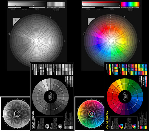
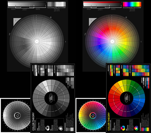
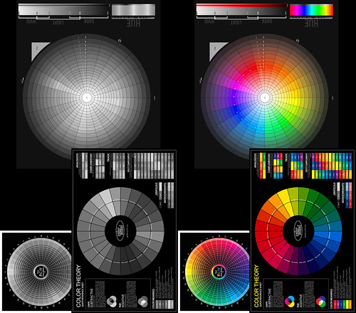
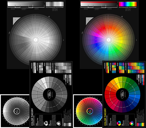
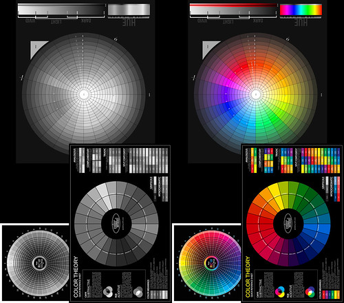
- Three color wheels illustrating different color principals organized into a single image
- Rawtherapee used to process images through the "Black and White" tool
- Gimp used to reorganize the converted images so the original color image is show side by side - so viewers can gauge the relative color "intensities"
Black and White Conversions -
Color image simply de-saturated -
As a first pass this isn't too bad. If you like the results you can stop here and "call it good."
But as you can likely see, the dark blue areas, the reds, and greens in the upper-most wheel don't "feel" like the tones are correctly expressed in grays. They are either too "light" to our eyes or too "dark."
So if the goal is to closely match how a color "feels" in gray relative to other colors then simply de-saturating an image might not "feel" right.
Conversion using luminosity values -
The subtle blue values seem to convert rather better in this technique than with simple de-saturation. However, the greens, yellows, and reds still don't "feel" right.
Conversion using the Channel Mixer (no filter) -
To my eyes this is an improvement over the luminosity and de-saturation processes. There is more subtle tonal variations between the colors. Yet, the conversion still feels like it's missing a bit of "pop", which is to say it "feels" as if there might not be enough separation between the subtle shades of color as they are expressed in gray.
Conversion using a Channel Mixer Yellow Filter -
The classic approach in silver halide films was to take a panchromatic black and white emulsion and to shoot with a yellow filter. The idea was to find a way to make an image "pop." There are even lenses known to have properties that helped make an image behave this way. The Takumar 50mm f/1.4 screw-mount lens comes to mind. The lens coatings had a yellow cast.
In digital we can perhaps begin to understand why this approach usually worked for us old film photographers. Take a look at the image above. It's starting to "pop." The colors converted to grays are beginning to "feel" more or less correct. The only problem I see is that the reds don't yet "feel" right and the yellows are a little too "hot."
Conversion using a Channel Mixer Yellow-Green Filter -
Goal! Suddenly it feels as if we've found a very good solution.
Applying a Yellow-Green filter in Rawtherapee we see the various color intensities expressed as clearly delineated grays. The only comment I would make is that perhaps the blues and teals could be just a touch darker. But this is easily fixed by gently darkening in these two colors prior to conversion to black and white.
Other Filters -
Early photographic emulsions captured only the blue end of the visible spectrum of light. This is why all early photographs show skies as white or very light. It wasn't until the advent of panchromatic emulsions that skies in photographs became what they are today.
If you want to emulate early emulsions you can start by using a blue filter. Here is how Rawtherapee expresses this filter.
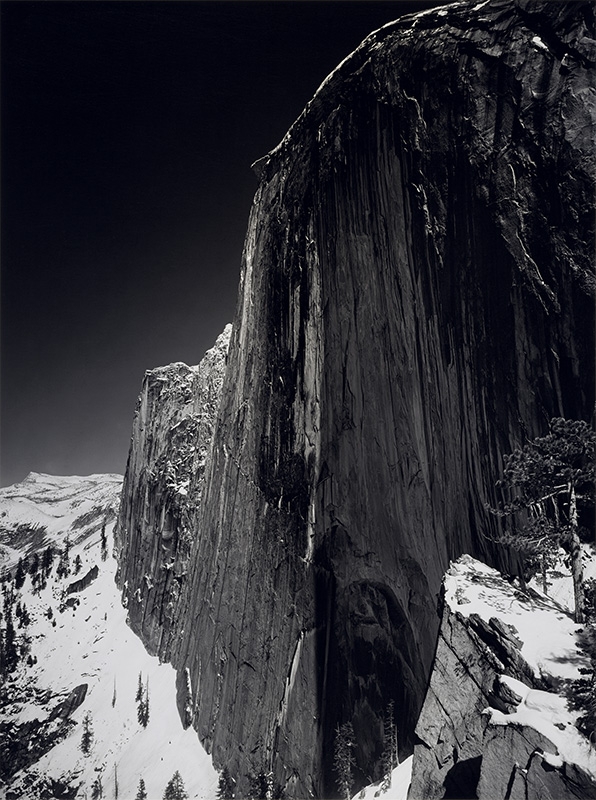
In the early part of the 20th century, Saint Ansel made a fine image of Half Dome in Yosemite Valley. He wrote about the making of this image and how he felt he'd hit upon a good solution to make the image "pop." He used panchromatic film to capture the full spectrum of light and a red filter to darken the sky.
So in this spirit, sometimes a red filter is the right tool. Here is how Rawtherapee expresses this filter.
In closing I can't stress strongly enough that people should do their own image conversion comparisons using the tools they normally use to process their images. I have found that different tools implement black and white filters differently.
------------------
For further reading as additional background on the topic of how we "see" things in Black and White, please refer to this.
No comments:
Post a Comment