Monday, June 28, 2010

Sometimes...

Every now and then I drop the heavy textured Noir Victorian Gothic image look and return to straight old fashioned image making.

My wife's roses (Jude the Obscure) are incredible this year. After sitting in a vase in our dining room, I saw them begin to droop. Before we recycled them I wanted to see if there was an interesting composition or two that could be made with them.

What I ended up with are incredibly large image files. They retain the kind of resolution only large format film photographers seem to be able to achieve. Printing these to extremely large print sizes shows bugs and pollen and other minutiae.

What camera was the rose image made with? Was it film? Was it digital? Or did I use a camera at all? Are these "real"? Or are these "Memorex" (as the commercial used to go)?


Roses

Sunday, June 27, 2010

Published...

David Burns Smith has published me. Again. It's quite a fine honor. David does a great job keeping up with artists around the US.

Wednesday, June 23, 2010

Oh what fun!

I used to think that I needed to be creative entirely on my own for anything I did to be "valid". Once I started looking at the word "valid" and began asking what that could possibly mean, I saw that it is nothing more than a cultural perception perpetrated by folks who stand to make something off it.


Irish - Noir Victorian Gothic


Once I realized the word "valid" held little to no sway over me, I began to experience life, art, and image making differently.

What I presently see is that a collaboration can help bring together and create a sum much greater than it's individual parts.

My wife acts as my assistant and a valuable extra set of "eyes" and ideas. My subjects bring not only themselves and wardrobe, but a lifestyle and way of looking at the world that I dont' always have for myself.


Irish - sample image


When taken in total, my ideas blended through the aid and help of my wife, and amended and expanded through my subjects leads places I could never have otherwise envisioned.

One such case was when Irish Heather Collins asked if we could do a Pin-Up photo-shoot for a calendar she will be in next year, 2011.

I think the results speak for themselves.


Irish - image candidate

Tuesday, June 01, 2010

Evolving...

In 1984 I picked up a Guide Blue 1929 while visiting Paris for my first time. In 2006 my wife's Uncle's steam engine maintenance and mathematical calculations guide came into my hands.

As I worked some of my recent images on the various themes of steam, Noir Victorian Gothic, and tribal punk, the thought occurred to me that I could use text as a texture. Relevant to the period I was trying to depict. Subtle enough to not overpower the primary subject. Mixed with other textures to give the image a well "worked" surface.


Age of Steam - At Ready


Since I have plenty of material to work with already, I was able to avoid organizing another model shoot. While working with other artists is fun, I knew I needed to try my hand at the processing stage of image creation.

These images edge closer to expressing ideas of Steampunk, Oilpunk. There is still more to be gained. But for that, I think I need to head back into the studio and re-work my lighting. In fact, I have studied the light of Eugenio Recuenco, and am developing a few ideas. I hope they work out as I intend.


Age of Steam - Contemplating the Struggle

Friday, May 14, 2010

Interviewed

David Burns Smith, from The Studio Chronicle, interviewed me this week. Here is the result.


Seraphic Society - Viola Rose (Butoh)

Monday, May 03, 2010

Inspiration...

If you've never seen a Roman Catholic Mass card, you might not know what I'm about to refer to.

Every now and then I stumble across my up-bringing.

Take, for instance, the photo in this post. As I worked it the images that appeared to me became more and more iconic in nature. Finally, it hit me. My sub-conscious was driving toward a prayer card look.

Brilliant! At least I knew where the inspiration was coming from. Then I could, with a little more awareness, create what it was I felt.

How fitting it was to create Saint Mermaid. Classic. Simple. Religious.

Mermaid - Saint

Tuesday, April 27, 2010

Opportunities abound...

Riches pour in from all sides.

Collaborating with local artists is, for me, very energizing. Recently I have had the wonderful opportunity to work with Stephanie Lopes, Gemma Adams, Keph, Shelley Frederick, and Viola Rose. Some of the work we have done together is quite pleasing. The results are better than I could have imagined. Each collaboration brought new ideas as well as increasing visual challenges.

How to convey the sense of beauty and grace when working with aerialists and handstand artists? How to participate in the act of Butoh when called upon to do so? How to extend the visual themes and ideas that I find so compelling?

Out of the blue, a kind email was received from Irish Heather Collins. She asked if I would be interested in working a theme of Mermaid? Never one to turn down a request of this magnitude, I replied "yes".

We set a time and place. My trusty assistant, my wife, joined me in the studio. Irish painted and groomed herself in the manner of a Mermaid from the very great deep.

As we worked through the shoot, various ideas were raised and worked. We reached a point where the sea chest needed to be opened and it's contents revealed. All the while, tulle was attempting to make it's way out of the chest and into the open world.

It felt like a key point in the shoot when my wife suggested that the tulle needed to be set free. She asked "... why not have our Mermaid marry the Sea?" All at once something struck and held firm. An idea was born.

This is one of the most satisfying images I have made this year. Actually, since this was a collaboration, this is one of the most satisfying images I have had the opportunity to help create with help from other fine artists and assistants.


Mermaid - Marrying the Sea

Wednesday, April 21, 2010

... or maybe not...

I have to smile.

Again, I have changed direction.


Night Flight - Stephanie Lopes


This time it seems I need to explore simplicity against a white background. As with my other recent work, I try to let the subject and composition inspire the Muse. There just seemed no way around keeping these images clean and simple. The Muse allowed for nothing less and nothing more.

Working with Night Flight's Stephanie Lopes in her dance studio, my wife and I arrived one fine Saturday afternoon to set up the backdrop and lights. Stephanie worked to apply her makeup and adjusted her attire. After she'd warmed up, it was up onto the cloud swing and away we went.


Night Flight - Stephanie Lopes


I really enjoy working with creative people. They inspire me. They give me hope. They help make life engaging and interesting. Invariably, they have political and cultural views similar to mine.


Night Flight - Stephanie Lopes

Friday, April 09, 2010

... running into the unknown... [3]

One of my creative modes seems to be drawing me into areas that may be difficult for viewers of my work to "connect" with, get, understand, and even enjoy. Yet I can't stop myself.


Seraphic Society - Viola Rose (Butoh in fractured dimensions)


The idea that there are as many views of reality as there are viewers drove a concept of varying areas of an image. Each modified area represents a different aspect of reality.

My first implementations of this concept are rather graphic. Straight lines. Modified tones and textures. Varying colors.


Seraphic Society - Shelley Frederick (Butoh)


Yet I can see the first images based on this concept are likely to be considered immature. That is, they don't quite say what I want them to say. Not yet, at least. Hence immaturity.

I used to be bothered by immature work. Not any more. Or not as much any longer. The roughness of immaturity has worn off enough that I can now post to view and consider works in transition. I find I can use this time to evaluate and ponder where to take a concept, which direction feels right.


Seraphic Society - Viola Rose (Butoh)

Friday, March 26, 2010

... running into the unknown... [2]

As my wife and I watched "Oregon Art Beat" last night something caught my eye. The things that seem to be attracting me these days have a strong graphic quality to them. It feels like a more complete blurring of the line between photography and graphic arts, in more traditional terms.

Coming into work this morning I completed processing an image of Shelley Frederick and thought I'd try to implement the kind of image that caught my eye last night. It feels like yet another direction to launch off into.

Very exciting times. Particularly after a friend reminded me yesterday that just a few months back I was complaining that my muse had wandered off.


Seraphic Society - Shelley Frederick (Butoh - fractured by dimensions)

Friday, March 19, 2010

... running into the unknown...

I notice that as I work on photographic images how my awareness changes. It's almost as if my mind has taken leave and I'm left to respond to the work as it evolves. There seems to be no clear indication that a work is "completed" either. If I didn't force myself to pause and look back at a body of work or to see how an image has evolved, I might continue without end.


Alternative History - Hunter


This is how my recent work has come into being. I start with a broad idea and then let each of the images take me where they will.

A couple groups contacted me about working with them to collaborate on small image collections. They got what they needed for various promotionals and such. I received the opportunity to expand my portfolio of ideas, expressions, and finished works.

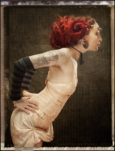
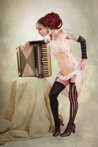
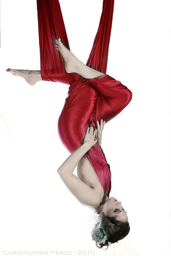
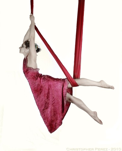
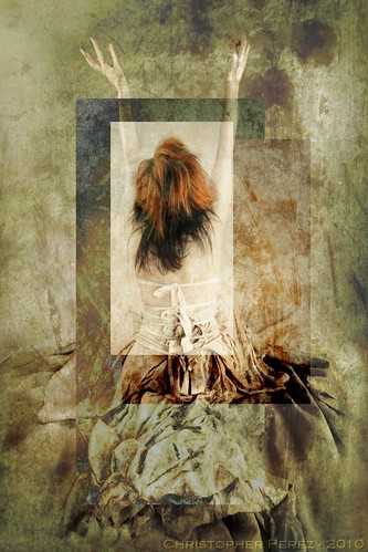
When I started processing the image from the "Night Flight" shoot with Gemma Adams and Stephanie Lopes, I felt that the results would be heavily textured. I could almost "see" how the finished images would be. That is, they would continue a theme I first developed with the Tribal Fusion, Steampunk works.

However, the image refused to follow my formula for processing. Something didn't feel right. The images looked pressed to fit into an expression that was inappropriate for the subject. So I took a step back and cleared out my mind (allowed it to take it's leave?). Then I started anew and tried to listen to what the subject had to say.

It didn't take long to realize that my subject was sleek and athletic. It demanded a cleaner, crisper line than my heavily textured work did. I couldn't hide the beauty, rather I needed to reveal it.


Night Flight - Gemma Adams, Stephanie Lopes


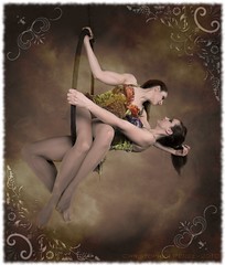
Stephanie Lopes shared that she felt the images evolved into a fairy tale-like expression. I can see what she's saying. I'm thrilled with the results and hope they are too.

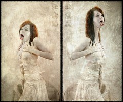
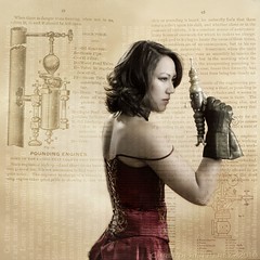
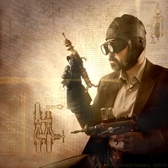
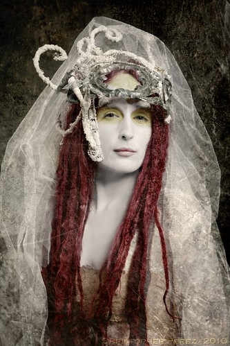
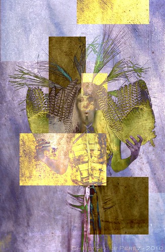
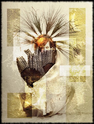
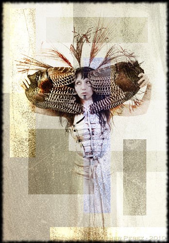
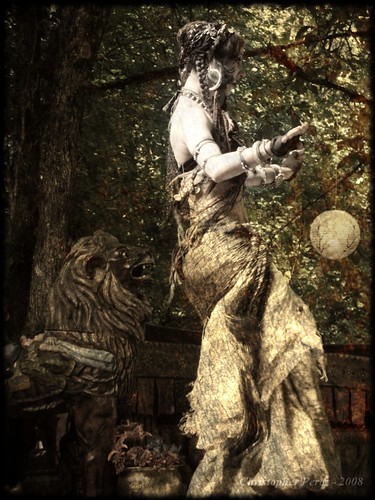
A month later I had the opportunity to work with a Butoh group called the Seraphic Society. They presented an entirely different set of challenges.

Here was a group that reveled in the extreme. Here was a group who could move in a very different manner from the beautiful Night Flight troupe. Here was a group who wanted to experiment.

To add to expectations, they had also seen my work and liked what I had done in the past.

Yet, when it came time to process their images, I found I was stuck. Every time I tried to use the heavy textures from the Alternative History sets, my images didn't work. So taking a recent lesson and applying it to the Seraphic Society, I took a step back and cleared my mind yet again.


Seraphic Society - Viola Rose (Butoh)


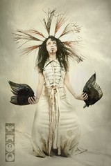
What revealed itself at first was a very elegant, subtle, gorgeous light. The subject could still express something not commonly seen in culture and society. Yet it demanded an image expression that was very classic and pure.

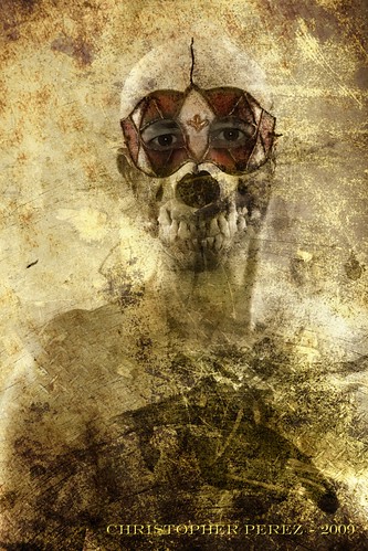
After talking with Shelley Frederick and realizing they wouldn't mind my trying to go dark and scary, I tried a more subtle set of textures. Et voila! Another expression of the subject was quickly revealed.


Seraphic Society - Shelley Frederick (Butoh) diptych


Folks over on Facebook have been very responsive to both sets of images from the Seraphic Society shoot. For that matter, they were also very responsive to the fairy-tale like results from the Night Flight shoot too.

Thursday, February 18, 2010

Fluidr

Someone commented on one of my photos on Flickr from Fluidr. I am happy to see alternative interfaces like this being developed to access Flickr. These are turning into great tools for exploring the very best Flickr has to offer. I'm continually impressed with the level of talent found on Flickr. Very inspiring.

Friday, February 05, 2010

Published

My work made the front cover of the Oregon Coutry Fair's Fair Family News. Fun stuff! THANK YOU OCF!!!

Tuesday, January 05, 2010

Published

The photos of Rachel Brice are mine. Kind thanks to Marthyna for contacting me and selecting these two images from my collection. If you are in the Quebec area in March, consider attending their Tribal and Fusion bellydance event.


Tuesday, December 22, 2009

Now for the really difficult test...

I have to laugh to myself every time I read somewhere on the 'net (like over on DPReview, or MF Forums, or Fred Mirdanda's forums) that anyone can tell the difference between images made using Zeiss lenses and those made with something else. To some folks it appears that the magic is obvious. The Leica crowd sometimes behaves the same way. "This is the best lens there is and you can see the quality in your final print" they seem to be saying.

I have been testing lenses and cameras systems for over 15 years and have learned a thing or two about how commercially available optical systems behave. People who tell you they can see the difference between lenses, between manufacturers, or between focal lengths are just blowing smoke.

Seriously.

Want to try something that should be easy for kinds of folk who "know" their Zeiss or Leica lenses are visibly superior to all other makes? Click here and take a very close look at these results.

I used a Canon 7D camera. It was the highest density sensor of any DSLR currently made at the time I performed this test. The sensor can resolve 116 line pair per mm. You can calculate this from the number of image nodes in your file divided by the size of the sensor in mm's. To get line pairs per mm, divide the result by two. You will confirm that the Canon 7D is capable of resolving 116 lppmm. To me this says that if there are differences between lens resolution and/or recorded image contrast you should be able to see them quicker with the 7D than with other cameras, regardless of the number of pixels those cameras have. It's about the size of each sensor site, not the total number.

There are 9 lenses. The focal lengths go from 50mm's through to over 100mm's. There is a mix of Zeiss (oh ya, bring it on!, say's I), Nikon, Pentax, and Canon glass. Some of the lenses are very old indeed. Some are brand new. I guess I should say that there are three Nikkors, two Pentax, two Zeiss, and maybe a Leica lens or two, balanced out by Canon.

It will be impossible for folks to know, but did I start at f/1.2? f/1.4? or f/2? Did I end up at f/5.6 or f/8? Did I include zoom lenses or are these all primes? I did my best to achieve correct focus in all cases.

Each 300x300 pixel image is a 100 percent crop. I shot raw and used DPP to convert the result to jpg. To see differences between lenses I set the sharpness at 3 on the RAW tab of the Tools window in DPP. If I didn't do this, you would have an even harder time telling the differences between these lenses.

So... which lenses are which? Where are those Zeiss lenses? Did I throw in a Leica optic or two just to mix things up a bit? Did I really include a couple "ringers", including two or three or four lenses that cost less than $20 each?

You decide. And if you get it right, I'll buy you a beer.

I doubt anyone will come close, so let me take this opportunity to stress, once again, that it's better to have a lens than not, and that the sharpest lens in my kit is a tripod.

Said another way, I really do not believe that it matters what lens you use. If you are creative, then you are capable of making wonderful images, regardless of what equipment you own.

Sunday, December 20, 2009

Testing the Sigmonster

This Fall while visiting my favorite Ducking Hole to see if my favored Buffleheads were back from their Summer breeding ground, I spied a gent with a rather nice lens. He had a Canon 40D mounted on a Canon 500mm f/4L IS. He may have had a 1.4x teleconverter on it too, though I can't recall with certainty. He seemed to be having a very good time.

I looked down at my Canon 7D mounted on a lovely Canon 100-400 f/4.5-5.6L and was instantly overcome with lens envy. The gent with the 500mm lens was able to reach out a lot farther than I was able. And, there were birds out there that I really wanted to photograph. Of course. This is how addition works, right?

After selling off a stack of unused glass, I was able to find a nice Sigma 300-800mm EX HSM f/5.6 lens. It arrived in good shape and I wanted to test it.

So here is a wee test. I used images taken with a Canon 24-105L and Nikon 55mm f/3.5 Micro as control lenses. These are as sharp as sharp can be. I also shot the Canon 100-400L to see how good the Sigmonster stood up against my favorite bird lens.

By clicking here, you can see the full sized results. These are 100% crops from a Canon 7D. Since the 18mpixel sensor has such a strong anti-aliasing filter, I added 3 sharpen in the RAW tab in to DPP Tool menu. 3 seemed to be a nice balance between the very soft straight out of the camera thru DPP converted JPGs and obvious over-sharpening.

The Sigmonster is a very fine lens. However, focusing the Sigmonster at 800mm's was a real bear! I'm not convinced I have the test target in focus. Look at how the Nikon 55mm f/3.5 performed at f/5.6 with the same two dollar bill details. The Nikkor was MUCH easier to focus than the Sigmonster. Still, one lesson may be to stop the Sigma down at least one stop when shooting at 800mm. It might be unacceptably soft wide open at that focal length.

The Sigmonster appears to out-perform the Canon 100-400L at 300mm and 400mm, but just barely. The 100-400 is a nice lens and holds it's own against the Canon 24-105L and Nikon Micro Nikkor. Though the shorter Canon zoom and the Nikon prime appear ever so slightly sharper to me, it's nothing that a little sharping with DPP can't clean up.

Bottom line, for me the combination of the Canon 100-400L and Sigma 300-800mm EX HSM will be wonderful to chase birds with. Both are sharp. Both focus nice and quick. Both respond well to the 7D's speed of handling and the DPP conversions to jpg.

Tuesday, December 08, 2009

From the Age of Steam

I would very much like to connect with folks in the Portland, Oregon, Seattle, Washington, or San Fransisco, California cities who are this deep into the scene. I want to make more images based on the theme of Noir Victorian Gothic, Steampunk, and Tribal Fusion and am looking for folks willing to model in their regalia of their genre.


Monday, December 07, 2009

Published

I received a very nice email from Marthyna. She publishes a belly-dance magazine called Papyrus. Marthyna asked if she could publish one of two images in an upcoming issue. I had to say "yes", "please", and "merci beaucoup!"

It is an honor and a pleasure to have my images show up in print like this. One of the following images should be published shortly.


Oregon Country Fair 2008 - Rachel Brice

Oregon Country Fair 2008 - Rachel Brice

Tuesday, November 03, 2009

Tuesday, October 27, 2009

All Hallows Eve


Alternative History - Age of Dystopia


I love Fall. It's my favorite time of the year. The colors of the leaves can be intense. The weather is crisp with just a biting hint at the Winter to come. There is time to work on images made the previous Summer.

I have had it in mind to migrate into the boarder regions of the art with a new for me style. I wanted to create my own images, using people's work like Miss Aniela and Brooke Shaden as my inspiration. The base images would be a continuation of variations on a theme of Steampunk.

Using the Open Source Photoshop equivalent called the Gimp, I needed to learn how to hide and reveal, clip, crop, size, and skew small bits of images. I wanted to take this new knowledge and blend it with the approaches I'd taken in using texture layers to see where the art would lead me.


Alternative History - Hunter


It didn't take long for me to get way in over my head and to begin to see the possibilities for a whole new approach to image making. In this new context, I really mean image making. With the stress on the word making.

Now that I see what is possible, I feel the pull to try and create a new body of work based on noir Victorian gothic, Tribal Fusion, and Steampunk themes. So stay tuned. The image found here may be just a stop-off point along my Muse's Path.


Alternative History - Age of Hunter