Wednesday, June 29, 2011

The more things change...

I spent some time studying the images of Joel Grimes. I also spent some time studying the Canadian photographer, Renaud Bergeron, and the European photographer, Eugenio Recuenco.


Tungsten Bob a mange' la Poule


What attracts me to their work is the quality of light they have each achieved. There seems to be a sense of balance between the strong off camera lighting and their somewhat subdued shadow details. Eugenio Recuenco's work reminds me of film set lighting. Perhaps something from a colorized film noir feature. Renaud Bergeron's work is stunning for his mastery of his subject matter. I found Joel Grimes through his Flickr images.

My own work seemed flat and boring by comparison. Perhaps it's that competitive streak in me. Or perhaps it's my continual striving for "perfection". I don't know, but something needed to be done about my boring lighting.


Estella Zephyrine ~ Bogville ~ Gypsy Dust


After WWII certain fashion photographers working in Paris, France made wonderful use of north light. That's where a large bank of north facing windows spilled light onto a subject. It is gorgeous, this kind of light. But the three photographers who's work I admire did not seem to employ that kind of light.

William Mortensen (St Ansel's arch nemesis, for reasons I have never understood) wrote a series of wonderful books back in the 1930's. They helped photographers understand their craft as a means of improving their work. William encouraged the use of two kinds of lighting. One gave an iconic, Byzantine tile mosaic kind of light. The other gives a more "familiar" kind of lighting effect. I have followed William's ideas for the past four years. Perhaps it was my flat lighting approach which led to boring images?


Courtesan in Teal


In any event, I reviewed my lighting equipment along with my approach and came to feel additional controlled light sources were required. Alien Bees had a PLM parabolic umbrella light system that was back-ordered for many months. One day I saw that their new materials were arriving and I ordered a PLM64.

What I came to realize was that my shoot-thru umbrellas were spilling too much light onto the backdrop, and that my main light could not be controlled in the manner I wanted. I also realized I needed to begin varying the intensity of my various lights to enhance the textures of a subject's clothing as well as to gently spread the shadow areas in certain ways.


Pensive Child ~ Bogville ~ Gypsy Dust


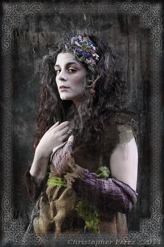
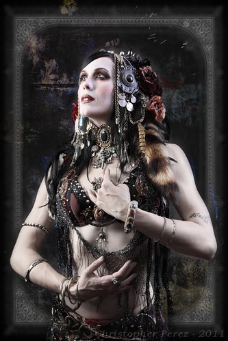
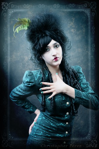
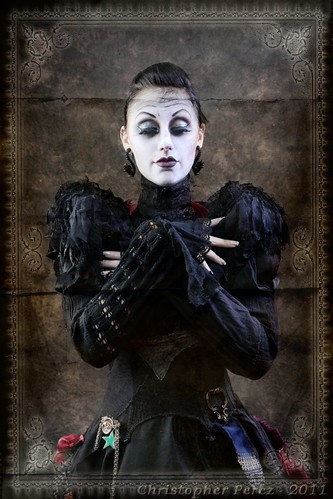
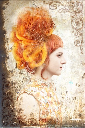
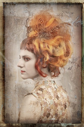
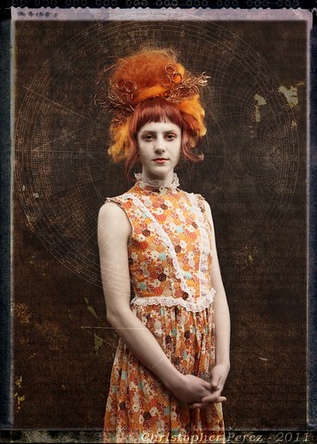
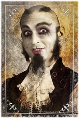
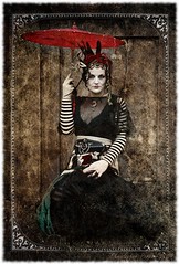
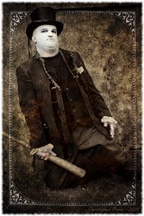
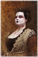
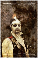
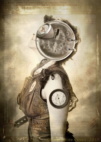
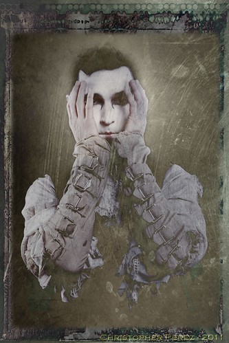
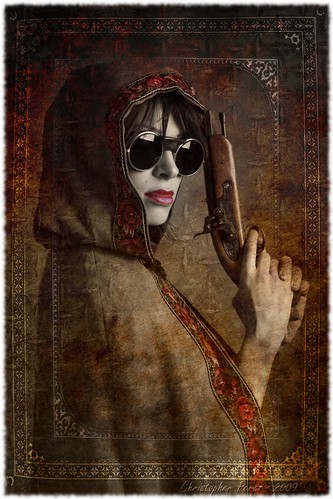
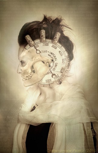
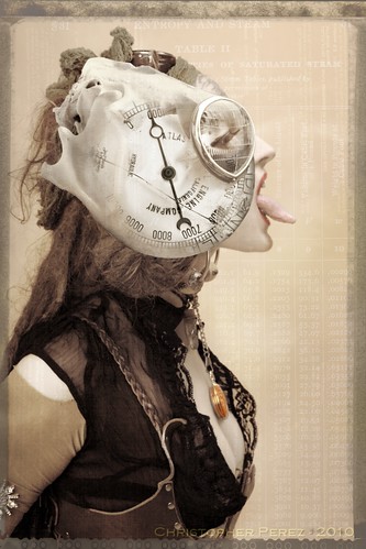
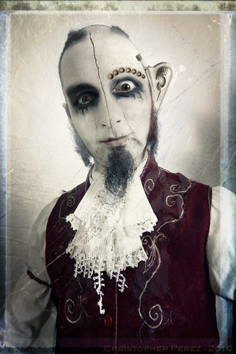
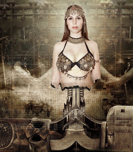
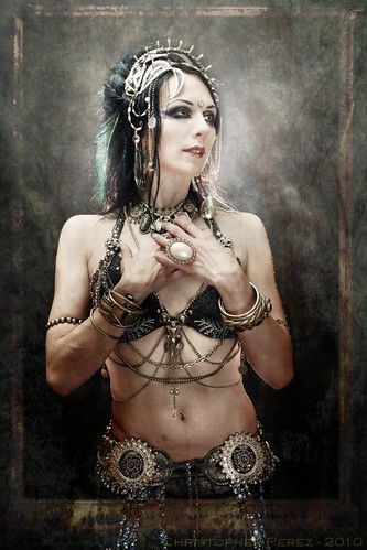
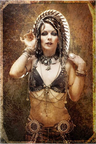
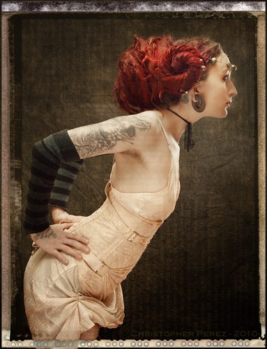
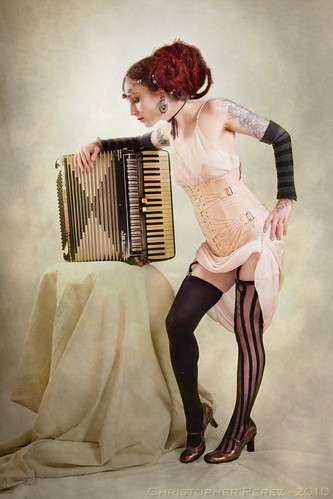
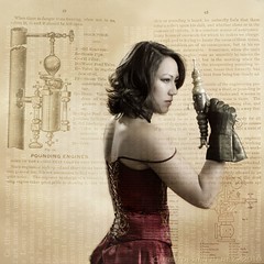
It took awhile and several shoots for me to gain confidence in the new approach. Yet the goal was attractive enough that I felt it was worth pursuing. By the time Ivy Slime of Wigslitters asked me to help photograph her wigs a second time, I felt I was ready. Quickly on the heals of that shoot, Tiare Tashnick asked if I could make a few images of her Bogville ~ Gypsy Dust cast.

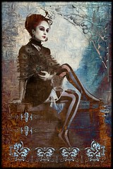
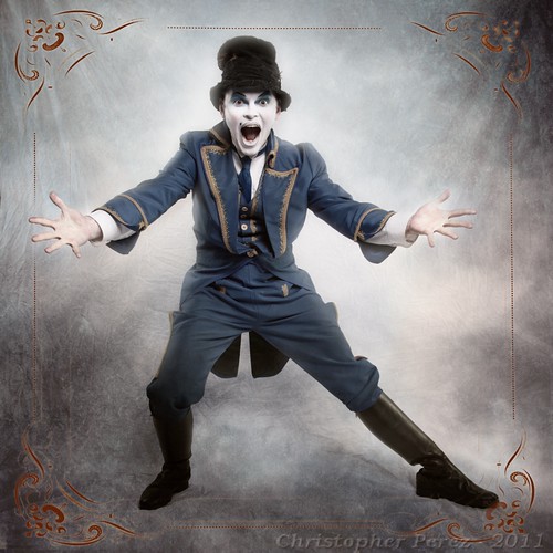
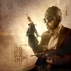
The results are, hopefully, conveying the change in direction in a way that makes my work subtly more dramatic and approachable. It's only been two years since I submitted work for publication in "1000 Steampunk Creations." The book was very recently released and I am fortunate enough to have two pages of work printed as part of the large, beautiful compilation of Steampunk-themed work. While this is quite thrilling, I realize that I'd love to have another shot at it. I'm much more pleased with my latest images.


Ms. Alvida Wicketstitch ~ La Reve


Perhaps this is what drives me, then. Not competition. Not "perfection". Rather, perhaps what I'm really involved in is a continual exploration of the craft and art of image making.

It's a real joy, photography.

Monday, March 07, 2011

Wigs!


Duchess of the French Court


The longer I live in Portland the more I absolutely love it here. The creative energy is vibrant, accessible, and, well, it certainly helps me feel part of the whole "scene" when I can contribute to the image making fun.

Recently a nice young lady, whom we shall call Ivy Slime, contacted me to see if I would help her out. She runs an Etsy store-front under the name "WigSplitters". Ivy sells wigs and other Victorian style regalia.


Duchesse en Profile


I keep my eyes open for new photo-making opportunities, particularly when they involve image styles I'm attracted to. Noir Victorian Gothia, Tribal Fusion, Steampunk, Oilpunk, and Cyberpunk are themes that currently "turn my crank".

My model was stuck in another city. So I called Ivy to ask if we could/should still continue with the photoshoot. Miracle of miracles! She had someone already lined up and they were on their way to the studio.

Katarina was a complete novice in front of the camera. She was a little nervous I think. Yet she held it together very nicely for the duration of the shoot. In fact, I would never have known she was nervous unless Ivy had made the interpretation for me.

Have I ever said how much I enjoy this kind of work? Oh, maybe only a million or more times!


Energy Waveform Ingenue

Friday, February 11, 2011

SilverShotz - model credits

Fourteen images have been published in SilverShotz magazine. Since there wasn't room in the publication to credit the models, I want to do that here.

First, on the inside front cover is Eyerish Heather Collins.


Bogville - Eyelet V. Wayward


Jay Lieber


Bogville - Mordalial Abrams


Uxepi Ipexu


Bogville- Maestro Crunk Vaultz


Ladyshade


Bogville - LadyShade


This is bad form. I don't remember who this is.


Bogville


Grayson White


Bogville - just before the show


Kris White

Bogville


Rowan


Bogville - they Mayor's Son


Noah Mickens


Bogville - Mayor in repose


Kate Badenoch

Bogville - Malachi

Thursday, February 10, 2011

SilverShotz Magazine hits the stands...

I can't wait to get home to see how the issue turned out and which images were chosen. The anticipation... the anticipation...


Rising Motion - Age of Mutations


The Muses Steam and Hiss, Crackle and Fizz. The Muses scream of Irreversible Past and ponder Unknowable Future. The Muses close their ears to the Unfathomable and open their eyes to the Dreams of Squids and Red Herrings Daring. Laviathans of deep dark dank wriggle and slither between Coral Towers.


Reve et Savoir


Cheating Death tears the spirit to render both matter and reality substantially modified. The costs of changing forever ones fate is impossibly high.


Command to Enter


Into the vastness of time, come all ye whom dare dash the madness of life. Come all ye to whom life means little. Come all ye whom desire to taste and test the three ring circus of the fates.

Friday, January 14, 2011

... after Paris...


Portland - Streetart


I decided to take another look at the level of accomplishment in Portland's streetart. Paris, I have to admit, was pretty hard to top. But, I thought perhaps things were improving around here too.


Portland - Streetart


The site for somewhat decent graff has been torn down. I'm sure other sites are developing, but I personally only know of one active site, and it is just down the street from where I live.


Portland - Streetart


Working with saturation and tonal range, I hoped to capture some of the intensity of the original work.


Portland - Streetart

Monday, December 20, 2010

Paris - City of Public Art


Paris - rue Denoyez


My wife and I visited Paris, France for over two weeks in the Fall, 2010. We wanted to see what it was like to visit this famous "city of lights" and do several things. First, we vowed to see none of the Paris icon tourist spots. What could we see in them that we haven't already seen in prior trips? Second, we wanted to live in an apartment and not out of a hotel. The idea was to begin to experience living in Paris as Parisians do. Third, we wanted to see if the city and it's citizens were as vibrant and alive as during those well documented times of the early 1920's.

Crossing the high tourist sites off our list of things to do freed us up to become flâneurs. We could walk or metro to places where normal life and living takes place. We could stop and talk with people when the urge hit. We were free to discover some incredible places not usually highlighted in guide books.


Paris - rue Denoyez


In this way we found Saint Germain l'Auxerrois, Saint Julian le Pavre, the Hotel Sully, several fine bistros (including Fois de l'isle), Gallery Verto-Dodat, and an ancient church around the corner from Sacre Cour. We wedged through the crowds around the pet shops that line the river Seine. I got to walk through the grève of September 23rd and see how the French unions are alive and active in trying to protect the working class from excessive corporate greed.

Living in an apartment was a wonderful way to participate in life and living in Paris. We prepared many of our meals in the apartment. Buying food in Paris was really no more expensive than buying food in the States, and it tasted much better too (the European food system isn't broken like it is in the USA). Being centrally located on l'isle St. Louis allowed us easy access to anything our hearts desired.


Paris - rue Denoyez


When it came time to see if the Parisian culture was still alive, vibrant, and informed, I could think of no better measure than to find and appreciate Paris streetart. While this may seem odd to some, streetart can be a barometer used to measure the level and volume of art a culture has under development. Streetart, by its nature, is transitory and ephemeral. None of it will ever hang in an "official" gallery. None of it will ever be appreciated by the monied conservative class.

Yet, the form, style, and content of streetart can inform even the casual observer about the level of artistic activity. For me, when art spills out into the streets and onto the buildings and vehicles, it tells me that people are demanding to be heard because they feel they have something important to say. Without access to more formal, traditional art outlets, streetart becomes one of the few public sharings of ones work available.


Paris - rue Denoyez


We visited rue Denoyez. The entire street has been given (or taken?) over to street artists. New works are constantly under development. New ideas are continually being expressed. New visions appear to be explored.

What impressed me most about Paris streetart is its level of sophistication. Artists seem well informed and aware of cultural pressures. They seem to be using these pressures to drive their work. While it may be difficult for me to see outright, I felt a vibrancy, an aliveness about some of the work.


Paris - rue Denoyez


Next time we visit Paris, I want to again seek out a bit of street art. There are more places than just Belleville to visit, too.

Monday, November 22, 2010

The Proof...

A couple posting ago I went on a rant about how people in the photo-forums have nothing better to do than squawk about something they know little to nothing about. Mainly, that lenses have properties that influence image quality that are obvious (to them). I'm thinking of the flame wars about Nikon vs Canon sharpness. I'm thinking about the Leica crowd who fervently believe their images are better than anyone else's because Leica lenses are (somehow) better. I'm thinking of the heavy Sigma lens bashing that goes on. I'm thinking of the folks who pick over potentially unobservable details between one Canon zoom over another. I'm thinking of the folks who "test" lenses and then pontificate over their findings.

OK. So I too am pontificating. Here's my proof. So maybe I'm not exactly pontificating, rather just sharing potentially useful information.

I have once again proven to myself (if no one else) that lenses, by and large, are not the limiting factor in image resolution. From my observations, the sensor is the limiting factor.

Look at the test of four lenses and look for the smallest group of lines that can be resolved. Compare results within specific focal lengths. Look at the influence (or, really, non-influence) of aperture on resolution. Then think about what these observations mean.

If you're being truthful with yourself, you'll realize, as I have, that lens resolution is really sensor resolution in the case of modern AF optical systems. There is no way of getting more resolution into a file than this.

So why do folks go on and on about which lens is better than another? They say "resolution" in many cases, but what people may really be referring to are other dimensions. Perhaps build quality? Perhaps how a lens "feels" in the hand? Or, what I really suspect is true in a large number of cases, is how people can impress complete strangers with their ability to spend large sums of money.

If you want to make wonderful images, buy a lens. Just about any lens. If you want to impress folks, I'm sure you can find a way to spend a lot of money to achieve you goals.

The following are 100% center crops from a 5D MkII Canon full frame DSLR. +1 EV CR2 originals were then converted using #3 Sharpness in DPP. The image style was set to "Standard". No other manipulations were made to the output.

Click on this image, mouse over the image, click again and you can observe the file at full resolution.

Tuesday, November 16, 2010

Autumn

I love this time of year.

Everything seems to quiet down from the mad rush of Spring and the constant humming of Summer. Peace settles on nearly everything.

Maple leaves are one of my favorite expressions of Autumn. Their vibrant colors attract my eye.

The sensation of light emitting from fallen leaves is powerful. Walking through piles of them, kicking up a whiff or two.


Autumn Leaves

Published!

It is with very great pleasure that I am able to announce that my work will be published by Silvershotz Magazine, an international publication devoted to photography. A few of my Noir Victorian Gothic images will be published in an 8 page spread in the January 2011 issue.

Need I say? I'm very excited. It's thrilling. It's wonderful. It's way too much goodness. Like a dream realized. Like a life lived fully.

My many thanks extended to the Silvershotz editor, Clive, for selecting my work.

If you are not familiar with Silvershotz, you really should check it out. They are everything in quality and content that I wish the now moribund Aperture Magazine had become.


Age of Tribes

Thursday, November 04, 2010

Going cheap... but who would know?

The online discussion boards and forums sometimes make me laugh.

The first fit of laughter was started from a comment by the editor of canonrumors.com. He was talking about a future 5D MkIII at 28+ mpixel requiring new sharper lenses to take full advantage of the sensor resolution. If I weren't laughing so hard...

The problem with the editor's utterances is in the math. Or lack of understanding thereof.

Let's look at the physical dimension of the Canon 7D/60D/T2i 18 mpixel sensor. Divide the number of information nodes in an image file from these cameras by the size of the sensor in mm's for whichever file dimension you choose. Now look at the answer. It should be 236. Divide this number by two to calculate the number of line pairs per mm and read/note/remember the answer. It will 116 line pairs per mm.

Run a similar calculation on the current 5D MkII using it's sensor size in mm's divided into the file output node number in the same dimension as the sensor size you just used. Divide by two. The answer? It should be 79 line pairs per mm.

After extensive testing against a USAF Resolution Test Chart, I have confirmed that every single lens I own (including Sigma, Canon L, Canon non-L, Nikon, Pentax, and Zeiss) out-resolves my 7D's sensor from wide open. You read that correctly. Read 'um and weep if you need to.

Now think about this a moment. OK. Times up. If lenses were the limiting factor to image resolution, wouldn't it make sense that the Canon 18mpixel crop sensor cameras would require a sharper lens than the full frame 5D MkII? Seriously. Think about it until you see this is true.

So how on earth will new lenses be required due to some mysteriously wonderful resolution of a 28mpixel 5D MkIII? If my lenses are good enough for the 7D/60D/T2i, they will remain overkill for any new full frame sensor'd camera anyone on earth makes until the sensor size (use your math skills to confirm this again, please) cross beyond 60mpixels.

Not unrelatedly, Sigma lenses are derided in the online forums. If it's not image quality its AF noise. If it's not AF noise, it's about AF accuracy... well... OK... there may be something to this last item.

I recently picked up a Sigma 28-70mm f/2.8 lens for a whopping $200. Canon's own 28-70 f/2.8 L still fetch north of $700. So I thought I'd try something cheap. I could use the optical speed in darkly lit video situations like bellydance gigs for Nagasita, but I don't want to break the bank over a lens that I would seldom use.

Mounting the Sigma to a 5D MkII, I noticed the focus was consistently on the nearest item, regardless of where the AF nodes lit up in the viewfinder. I was irked. This seemed to confirm the blabbering masses nattering nuttiness of whackdom.

I thought about the problem and wondered how Sigma could make such a mess of the AF system. Couldn't they reverse engineer the Canon AF system any better than this?

Then I had an idea to see if selecting one AF point in the 5D MkII made any difference in how the Sigma focused. I had read somewhere that someone had tried this with limited success. I tried it anyway.

Guess what? the AF is spot on every single time I hit the shutter release. Independent of which AF point I select, as long as that AF point is placed over the desired focus location the image is sharp exactly there every single time.

This little discovery leads me to think that Sigma's engineering problem may be related to their electronics. Perhaps Sigma really did not correctly reverse engineer Canon's AF system. Maybe they got stuck confirming a single AF node? I can't believe that, but...

OK. Believe it or not, I can live with this defect. For many stills photo situations I select the AF point myself anyway.

Now I have a very cheap, and even though I haven't covered it here, the lens is VERY sharp from wide open!!! (something again about out-resolving the sensor), usable optic. Did I mention the Sigma was cheap? Need I mention the optic is sharp? It's cheap too.

Need I mention that viewers of my images cannot tell the difference between images made with this cheap usable merely competent optic and my $1200 L-glass?

Friday, October 15, 2010

Stars shining brighter than ever...

I don't usually follow celebrity or well known photographers. For me it feels like their work is so well known that it would be difficult for them to say anything new or significant. I'm looking for new themes, new ideas, new mem-types.

Really now. I do know better than that. Still, it rests in the back of my mind this way.

Fred Miranda's website had this video. I found it charming, inspiring, and it asked me to reconsider how I view other's work.

It was good for me to see that not all famous photographers come across as laser eye'd type-A personality over-achievers.

Friday, September 10, 2010

More Obscure Ideas...


Madonna Engine


Once I started down this path, I could see the ideas and realizations unfolding in front of me. There's no slowing me down at times like this.

The original idea came from looking at other people's work on Flickr. Over the past couple years I could see where the ideas and presentations were becoming ever more sophisticated.


Aeronaught Etherius


In similar time, I read a few books by Neil Gaiman and Neil Stephenson. Some of the visuals scenes and descriptions of people in certain settings started me to thinking. Once the thoughts took hold I knew I needed to try my hand at photo-manipulation.

The visual genres that have appealed to me for some time now has been around Steampunk and Noir Victorian Gothic. All I need to do as I read various authors is to close my eyes and "see". After that, it's a simple matter of composing a series of images and working them to completion.

Can you tell how much I'm enjoying this new expression of my art?


Rising Motion - Age of Mutations

Friday, August 20, 2010

Obsure ideas...


Age of Mutations and Adaptations


Much of my work is guided by the books I read. Recently I stumbled upon Neil Stephenson's "Diamond Age". It's a pretty quirky book, and it has a few ideas that I find compelling. It's like reading Terry Pratchett or Neil Gaiman, but with a very nerdy twist.

The idea of a Matter Compiler gives me a lot of ideas. A MC is a device that takes atoms and builds them into things people need, use, or want. When you're done, you just put the things into a decompiler and the item is returned to it's constituent atomic bits.

The "Diamond Age" is a fairly dark text. Since I'm exploring ideas along the lines of dark Victorian and Gothic, I thought I'd try my hand at this concept to see what came up.

The images posted here are just a start. With a photoshoot coming this weekend, I hope to add substantially to my base materials that will allow me to explore these ideas more fully.


Matter Compiler - fabricating Madonna

Tuesday, July 27, 2010

Working with textures...

Back in the day, William Mortensen sold texture layers to photographic artists. They came (at least) in 8x10 inch sizes. A person selected the texture they wanted to print with and would head into the darkroom. Setting the enlargement size to 8x10 inches, focusing the negative, placing a red filter between the negative and the paper (so as to not expose the paper while setting the rest of this up and help control the exposure), putting the photographic paper into the easel, then laying the selected texture over the top of the paper would, many times, lead to magic.

Using similar principals, artists in the age of digital "lightrooms" can create some rather interesting images.


Nagasita - Art Nouveau Goddess


As many of my readers know, I use a Photoshop-like tool called the Gimp. It is the Open Source communities answer to Adobe's for sale products. The power of the tool allows me to create layers and masks, tints and crops, and all the color management/manipulation capabilities that I could ever desire. In fact, the tool is so powerful that I seldom use more than a fraction of it's overall capability. Much of the time I'm anxious when I launch the Gimp, particularly when I'm just doodling and have no strong idea of where I'd like to go. Stumbling around reaching for an idea while using this tool has many times lead me to disaster.

While some of the textures and tint layer are not obvious, I tend to use them to help create dimension in my work. Somewhere in my processed images will be metal, concrete, clouds, tiles, ceramics, or aged polishes. To support this work, I have created a library of tints and colors that I use in many different layers to achieve the kinds of blended effects that I'm after.

It's not hard to see what influences me. Old photos. Old photographic processes. Movie set lighting. Traditional poses. Jules Verne-like ideas. Increasingly, the more fantastic the idea, the more excited I am to try and express that idea. In fact, I'm thinking of a theme of Death in a Jar, a steam-era Mad Scientist of Biologist's Laboratory. Hmmmm... I wonder if I can pull it off...?


Nagasita - Art Nouveau postcard

Monday, July 19, 2010

Flickr Explore...

One of the more interesting features of Flickr is it's Explore function. This presents a collection of images rated by some mysterious algorithm that selects for something called "interestingness".

Having one's images "Explored" has become something of a contest between Flickr image contributors. There are even web pages devoted to describing how to make the "Explore" pages.

I have had many of my own photos "Explored". But it had been awhile since something of mine was picked up by the wee-minions of Flickr. So it was a bit of a surprise to see that one of my images made it up to #199 on July 19, 2010.


Nagasita - Art Nouveau

Wednesday, July 07, 2010

Monday, June 28, 2010

Sometimes...

Every now and then I drop the heavy textured Noir Victorian Gothic image look and return to straight old fashioned image making.

My wife's roses (Jude the Obscure) are incredible this year. After sitting in a vase in our dining room, I saw them begin to droop. Before we recycled them I wanted to see if there was an interesting composition or two that could be made with them.

What I ended up with are incredibly large image files. They retain the kind of resolution only large format film photographers seem to be able to achieve. Printing these to extremely large print sizes shows bugs and pollen and other minutiae.

What camera was the rose image made with? Was it film? Was it digital? Or did I use a camera at all? Are these "real"? Or are these "Memorex" (as the commercial used to go)?


Roses

Sunday, June 27, 2010

Published...

David Burns Smith has published me. Again. It's quite a fine honor. David does a great job keeping up with artists around the US.

Wednesday, June 23, 2010

Oh what fun!

I used to think that I needed to be creative entirely on my own for anything I did to be "valid". Once I started looking at the word "valid" and began asking what that could possibly mean, I saw that it is nothing more than a cultural perception perpetrated by folks who stand to make something off it.


Irish - Noir Victorian Gothic


Once I realized the word "valid" held little to no sway over me, I began to experience life, art, and image making differently.

What I presently see is that a collaboration can help bring together and create a sum much greater than it's individual parts.

My wife acts as my assistant and a valuable extra set of "eyes" and ideas. My subjects bring not only themselves and wardrobe, but a lifestyle and way of looking at the world that I dont' always have for myself.


Irish - sample image


When taken in total, my ideas blended through the aid and help of my wife, and amended and expanded through my subjects leads places I could never have otherwise envisioned.

One such case was when Irish Heather Collins asked if we could do a Pin-Up photo-shoot for a calendar she will be in next year, 2011.

I think the results speak for themselves.


Irish - image candidate

Tuesday, June 01, 2010

Evolving...

In 1984 I picked up a Guide Blue 1929 while visiting Paris for my first time. In 2006 my wife's Uncle's steam engine maintenance and mathematical calculations guide came into my hands.

As I worked some of my recent images on the various themes of steam, Noir Victorian Gothic, and tribal punk, the thought occurred to me that I could use text as a texture. Relevant to the period I was trying to depict. Subtle enough to not overpower the primary subject. Mixed with other textures to give the image a well "worked" surface.


Age of Steam - At Ready


Since I have plenty of material to work with already, I was able to avoid organizing another model shoot. While working with other artists is fun, I knew I needed to try my hand at the processing stage of image creation.

These images edge closer to expressing ideas of Steampunk, Oilpunk. There is still more to be gained. But for that, I think I need to head back into the studio and re-work my lighting. In fact, I have studied the light of Eugenio Recuenco, and am developing a few ideas. I hope they work out as I intend.


Age of Steam - Contemplating the Struggle