Tuesday, March 19, 2019

Something other than resolution and sharpness...

As you are no doubt aware, there are many ways an interested party can consider photographic optical performance.

For going on thirty years I've been looking at camera system resolution.  Now I would like to begin to consider how lenses transition from sharp to out of focus regions behind the point of focus.

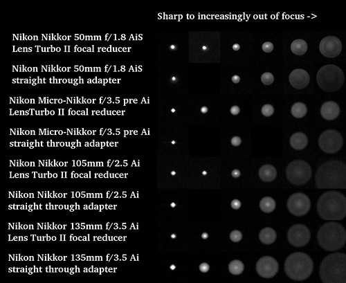
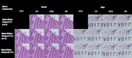
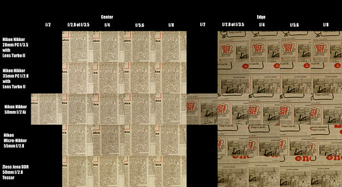
There is a useful approach outlined by Mariane Oelund in a discussion thread on DPReview.  For my look at the question I displayed a 2 pixel wide "dot" on a computer screen and photographed it with lens apertures set to wide open from sharp to increasingly out of focus.

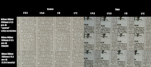
Here are the results for a few lenses shot wide open, with and without a Lens Turbo II focal reducer.

Out of Focus transition ~ Comparison


 Comments and Observations -

The immediate question is how to interpret what we see?  Zeiss provides an good starting point.  On a practical level, Jakub Travnik provides a useful illustration

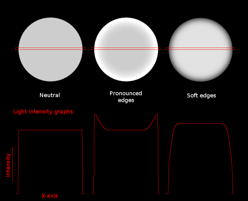
If an out of focus circle is bright around the outside edges, it is said to be over-corrected for spherical aberration.  Some people refer to this as "soap bubble bokeh."

If the out of focus circle is evenly lit across the disk, it is said to be neutrally corrected.  Zeiss currently champions this approach to lens design.

If the out of focus circle is bright in the center and less bright toward the edges then the lens is said to be under-corrected for spherical aberration.

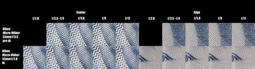
With these things in mind, we can see that my Nikon Nikkor 50mm and 55mm lenses used with a Lens Turbo II focal reducer increases under-corrected spherical aberration.  The Nikon Nikkor 105mm and 135mm lenses seem to be under-corrected for spherical aberration to very similar degrees when used with or without the Lens Turbo II focal reducer.

An important question is how does this work in the real world?

We already have a hint from the way the over-corrected spherical aberrations are interpreted photographically.  That is, such lenses create "soap bubble bokeh" in the out of focus regions.

For neutrally corrected lenses we have two very good examples.  One is Zeiss' own 135mm f/2 and, perhaps surprisingly, the Rokinon/Samyang 135mm f/2.  These lenses are said to provide neutrally corrected out of focus renditions.

Lastly, the thing that started me on this quest (which I am only now beginning and am by no means understanding as fully as I would like) were comments made about the history of Nikon lens designs.  Read carefully I found out that Nikkor designers from the outset deliberately under-corrected for spherical aberrations in certain designs (1950's Sonnar formula RF lenses - 5cm, 8.5cm, and 105cm as well as many standard and longer than stardard focal length lenses for the F-series SLRs).  Nikon appears to have continued this approach up until rather recently.

Nikon designers felt that under-corrected spherical aberrations in the out of focus areas behind the point of focus lead to a "delicate rendition" of a scene.  This property of a lens would change as the aperture was stopped down.  One or two stops down from wide open would change a lenses character to being sharp across the field and quickly reduced/eliminated spherical aberration in out of focus areas.

At the same time I read the Nikkor lens history site I stumbled upon information provided by the Metabones adapter manufacturer.  They suggest that their focal reducer adds a little under-corrected spherical aberration.  While the Zhongyi Lens Turbo II I use was likely not designed by Metabones, I'm wondering if it too doesn't add a bit of spherical aberration to some lenses?  Nearly all of my 50mm-ish lenses seem to "improve" their out of focus renditions when mounted on the Lens Turbo II.

I really appreciate Nikon's lens designer comments and feel they have given us an idea of why their lenses behave the way they do.  If anyone knows of similar sources of lens design choices for Zeiss, Leica, Canon, and other photographic application lens manufacturers, please let me know.

Tuesday, March 12, 2019

Now Available ~ le Mans Classic ~ dans les Paddocks ~ 2018

I have published a second book.  This is also from le Mans Classic.  This time its from year 2018.

As with the first book, the 2018 book is rendered in black and white.  The print edition is high quality and uses heavy paper that gives the book a certain "heft."

The print copy is rather expensive, as far as books go.  So if you'd like to see what the book is about, consider the PDF edition that is also available through Blurb.

Thanks for looking.

le Mans Classic ~ 2018

Wednesday, February 06, 2019

Capturing the "glow" of old Black and White photographs - Vastly Simplified Procedure

In May 2018 I wrote about black and white conversions in digital.  It was a very early effort and I see I rather missed the mark.

It is going on a year, now, and I am very much enjoying the process.  I find I have a renewed enthusiasm for black and white photography.  And I find that converting digital files is, in general, nowhere near as complicated as I first wrote.

So here is a vastly simplified process, complete with examples of the image and the curves function that I use to make digital black and white images "glow" like old silver halide prints.

Step One

Start with a color image where the highlights and shadows are not clipped.

Color Curves Base

Step Two -

Convert the color image to black and white.  In this example I simply desaturated the image.

BW Base Conversion

Step Three

Open the curves function, grab the middle of the curve, and raise it.

BW Curves Raised - Step One

If the image you are working on looks like it might benefit from being lighter or brighter, simply raise the center of the curves more.  I deliberately "overcooked" the effect to illustrate the effect.

BW Curves Raised - Step Two

Example Image -

Here is an example of something that I feel fully expresses the gray tones and looks a lot like something I would have printed back in the day of film.

Example BW conversion image

Comments

Desaturating a color image to make a black and white photograph in digital photography creates a dead, lifeless image.  Just look at the results of Step Two.  Ghastly, I say.

Now take a look at the results of Step Three (first image).  The image is starting to "sing."  The effect is now beginning to mirror film photography.

Important Observation: Scanning a black and white film negative will give the same results as in Step Two above with the very same ghastly results.  The "magic" is how the tones are raised when a print is made.  Silver halide papers effectively raised the mid-tones.

Borrowing further from film photography, keep in mind that the viewer's eye will seek lighter portions of an image.  This is why the classic technique is to vignette the edges of the frame.  I find that around a 1/2 stop works well for the kinds of subjects I photograph.

Once you have these basic steps sorted out you can now move the brightness slider to lighten or darken the overall image.  You can also move the contrast slider to increase or decrease contrast.  Using the two sliders a person can quickly find the balance between tones and contrast that appeals to them.

The topic of filtering an image can quickly become complex, so I make the following over-simplification to start from.  If a starting image was made out of doors under bright sunlight I find that using a yellow, orange, or red digital filter to convert the file can have some benefit in darkening the sky, just like in film photography.   

For myself I feel I have made a lot of progress using the simple three step technique illustrated above and tend not to mess around with contrast while in some cases gently moving the brightness slider.

Tuesday, January 15, 2019

Macro vs Non-Macro ~ a small comparison

Something I've wondered about for far too long is what, if any, meaningful difference is there between a dedicated macro and "normal" lenses when shooting close-up subjects?  So, one dull morning I grabbed a few "supplies" and set about looking at what kind of answer I might come up with.

Setup -

  • Sony NEX-5T, 100ISO
  • Big Beefy Manfrotto tripod 
  • Nikon lenses -
    • Micro-Nikkor 55mm f/3.5 pre-Ai
    • Nikkor 105mm f/2.5 P pre-Ai (early Sonnar design) with Nikkor F E2 extension tube
    • Nikkor 105mm f/2.5 Ai (later modified Sonnar design) with Nikkor F E2 extension tube
  • 0Euro Napoleon "currency" - for it's sharp image, text and paper fibers
  • Sony RAW converter software used at it's default settings (no sharpening, no contrast, no exposure changes) to convert 100 quality jpg

Scene setup ~ macro

Comparison Results -

[If you click on the image it'll take you to the Flickr hosting site. Once there, look at the file at full resolution. In many cases the differences between lenses is small and likely can't be seen until you take a squint at the comparison at 100 percent.]

55mm Micro-Nikkor vs 105mm Nikkors with extension tubes ~ Comparison


Comments -

The Micro-Nikkor 55mm f/3.5 pre-Ai is a very fine optic.  I've tested this on subjects at "normal" working distances and it's brilliant.  I see for macro work that two things stand out.  First, the lens is, indeed, very sharp from wide open.  Second, the field is flat from wide open (just as advertised). 

I'm enjoying this lens so much that I've brought it with me to the cote d'Azur where my wife and I are spending the winter.  This lens is shouldering the bulk of the photographic duties while we're here.

I wasn't entirely sure what to expect from the 105mm Nikkors.  These are of two slightly different optical designs and I wasn't sure if that would play a role in their macro performance.  Hence this comparison, right?

For the 105mm Nikkors with an E2 extension tube I see the optical performance wide open suffers visibly.  The centers are slightly soft and the edges are visibly soft (when viewed at 100 percent file resolution).  But stop either lens down to f/4, and things clean up quite nicely.  The centers become as sharp as the Micro-Nikkor and the edges are getting better.  By f/5.6 and certainly at f/8, the center and edge resolutions look to be as good as the Micro-Nikkor.

Based on prior comparisons and what I learned about field curvature in many lenses I wondered how much that might come into play with the 105mm lenses used here.  So I went back to the camera, set the focus magnifier in a corner of the field of view and changed the focus slightly.  Both lenses were still soft in the corners wide open, but it wasn't quite as bad as the comparison images.  At f/4 I could clearly see that if an absolutely flat optical field isn't required that the edges would be in clear good focus somewhere near the center focus point, but not exactly.

One of the things I learned in this comparison is that I might not "need" a 105mm Micro-Nikkor (either f/4 or f/2.8) when shooting close ups.  If I made my living shooting 2D subject matter with the lens set wide open, well, yes, then I might see a good benefit by acquiring additional lenses. 

But since I'm retired and am making these kinds of comparisons out of intellectual curiosity, I think my current Toy Collection remains sufficient to just about any task.  Unless, that is, I happen to stumble upon a nice Micro-Nikkor 105mm lens at a rather attractive price.  Then all bets would be off.  Isn't there always room for "more" if it comes along for cheap?

Thursday, December 20, 2018

Now Available - dans les Paddocks ~ le Mans Classic ~ 2016

dans les Paddocks ~ le Mans Classic ~ 2016

I am happy to announce that a book project of over 100 images is now available.  The work is printed in classic black and white.  I chose monochrome to pay honor to the time and style of reportage many of the automobiles have come from.

Aston Martin ~ le Mans Classic ~ 2016

Saturday, December 08, 2018

A little something called "SuperResolution"...

A friend recently picked up a Nikon D850 and more recently a new Fuji GFX 50R.  Both are very high resolution cameras.  In my case, the highest resolution camera in the closet is a 24mpixel Sony A6000.  Beginning to feel a little "behind the curve" in the Mpixel Race (whatever that is) I wondered how close I could come to 50mpixel sensor output given my current tool set.

Several years ago I saved a link to an article that described a process for creating very high resolution photographs.   I found that recipe after having written about how to generate high resolution images from a single base image.  This blog entry combines the two techniques, and adds a few things that I've learned along the way (which I will Note: in the text below).

Base setup -
  • Sony NEX-5T set to jpg output (to streamline the stack blend processing)
  • Lenses
    • Sigma 19mm EX DN E
    • Nikon Nikkor 50mm f/1.8 AiS
    • Nikon Nikkor 85mm f/1.8 K pre-Ai
  • Camera handheld
  • Multiple exposures shot using the "S" fastest continuous shutter release function
    • Shot 20 to 30 images of each subject that would next be used to create an image stack
  • Follow the "SuperResolution" recipe (with two important Notes and one Observation) using
    • Hugin to align the image stack
    • Gimp (v2.8) to perform a linear 2x "cubic" uprez from approx 4900 pixels (native Sony NEX-5T file size) to 9500pixels
    • Gimp (v2.8) to blend the layered image stack
    • Gimp (v2.8) to apply a 2 pixel unsharp mask
In the following side by side comparisons, along the left hand side I have labeled from "File Viewed at 100%" to "File Viewed at 400%".  This applies in all three comparison cases to the left hand column only and represents the base image at its native resolution viewed at the indicated enlargements.  The right hand indications of "File Viewed at 50%" thru "File Viewed at 200%" apply in all three cases to right three image columns.  These three columns represent the output of various processing techniques I used to explore the idea of "superresolution".

Setup One - Nikon Nikkor 50mm f/1.8 Ai set at f/8

Super Resolution Investigation ~ Base Image
Scene Setup

Super Resolution Investigation ~ Comparisons

Setup Two - Nikon Nikkor 85mm f/1.8 K pre-Ai set at f/1.8

Super Resolution Investigation ~ Base Image
Scene Setup

Super Resolution Investigation ~ Comparisons

Setup Three - Sigma 19mm f/2.8 EX DN E set at f/4

Super Resolution Investigation ~ Base Image
Scene Setup

Super Resolution Investigation ~ Comparisons


Comments -

Regarding the optics, all three lenses performed very well, indeed.  They are sharp and contrasty in the base image.  Printing at 300dpi using the native 16mpixel sensor resolution of the Sony NEX-5T will easily generate a 17inch on the long dimension high resolution image.

As for the "superresolution" techniques, here is what I have thus far experienced.

My early understanding of how "cubic" up-rez works was insufficient.  Up-rez'ing an image at 150dpi or 300dpi will yield jagged edge transitions and will amplify "noise" across an image field. 

Note: What I've learned is that by increasing the sample rate of the "cubic" filter that the output up-rez'd image will contain fewer artifacts.  In clear terms - to perform a 2x up-rez requires, minimally, a 600dpi filter sample rate.  This is fundamental to understanding how to retain the most image quality when performing an up-rez. 

For this comparison I set the "cubic" filter sample rate to 1200dpi.

Using the Gimp's "cubic" Image Scale function quickly generates a 9500pixel file from the base 4900+pixel image.  No new information is added, of course.  Image problems (shake, mis-focus, etc) and sensor "noise" are amplified.  Following my early attempts at understanding "superresolution", this approach still has some promise.  Compared with the following two "superresolution" examples that follow, the simple "cubic" up-rez technique is somewhat lacking.

Looking at the blended image stack examples I see the results can be pretty interesting.  The very first thing I see is a dramatic drop in sensor "noise".  The images are much smoother than even the original base image.  In fact, blending just two images produces a very useful reduction in noise, even in a non-up-rez'd image, that this technique is worth utilizing.

The second thing I see is that stacked images do indeed appear to add information to the resultant image.  This is much like what we expect out of the "superresolution" functions in some Olympus and Sony mirrorless cameras where, in those cases, they "wiggle" the sensor electronically.  For the handheld technique, this is a very nice finding.

The technique of image stacking wasn't as straightforward as described in the recipe.  My first attempts were actually rather soft.  On close inspection I found that the Hugin "aligned" image output was not really "aligned."  The images were all too often many pixels mis-aligned, but only in the "y" dimension.  The "x" dimension seemed to be correctly positioned.  There is something I don't yet understand about the Hugin image stack output and how to import them correctly aligned into the Gimp.

Note: To achieve correct image stack alignment I chose a scene segment with clear dark to light transitions (like a raindrop or door keyhole or a piece of paper with writing) and set the "view" to 400% so that I could see every pixel magnified.  Using the base image (the image at the bottom of the stack) as the reference I worked with each layer, one at a time (turning off the visibility to all the other layers and by setting the "opacity" to 50% so I could see both the layered image and the base image). Then I used the keyboard arrows to move the layered image to set the exact alignment.  It was time consuming but yielded, obviously, the best results.

Observation: The recipe calls for a minimum of 20 images stacked and blended to get the most information.  In my case, I found that as few as 5 layers above a base image can yield outstanding results.  Perhaps my process technique isn't as accurate as it could be, but I can't see any "improvement" in the amount of information an image stack gives by going beyond those first 5 layers.

The last item in the recipe was the strong suggestion that a 2 pixel unsharp mask sharpen function be applied to the up-rez'd blended "superresolution" image stack.  To my eyes the results are quite impressive.  It appears, at first glance, as if a 300dpi 30inch print can be made while retaining all the native blended layer file resolution of the up-rez'd image stacked file.

It appears that my output is similar to the recipe examples.  Before declaring victory and moving on to another area of investigation I needed to compare my results, not only with the original "superresolution" recipe, but with the output of the latest generation of high resolution cameras.  Looking thru Flickr for Fuji GFX full resolution images I have come to realize that the handheld "superresolution" technique produces a different "look."  The native GFX file resolution is clearly superior to the approach being explored here.  Have I missed something in my own process?  Or is this just the way things are?

While clearly superior to native resolution base image output, using the handheld "superresolution" technique produces an image that reminds me of the soft, gentle tonal transitions I see in old contact print large format film. That is, the "feeling" of the image is that of light gently scattering through the gelatin surface coatings of traditional 20th century print papers. 

Saturday, December 01, 2018

Process ~ when it seems to work

Looking back over the past two years I see that a lot has changed in my understanding of the craft of photography.  I've looked as deeply as I could (without access to a full optical lab) at the subject of lenses, resolution, and what really happens when we talk about resolution and "sharpness".

I was prodded into action by a couple of articles on The Online Photographer's blog about how to make "good" black and white images from digital files.  The outcome of that was I rediscovered how much I enjoy making monochrome images.  As a bonus it seems to me that my current output has become "sharper" and "smoother" than my earlier 4x5inch and 8x10inch enlargements and contact prints.

Which leads me to a short story about the path I've taken in transitioning from large format film to APS-C digital.

Uffizi Gallery ~ Florence, Italy 2018

The thing that kicked me into digital was it's ease of access and immediacy.  I could see something, snap a photo of it, and review the results before I continued on my way.   The change certainly was not because digital was as sharp as large format film.  It wasn't.

When I started into digital I acquired a Canon 40D (later a 50D, a 7D, and a 5D MkII) and two lenses, a 24-105L and a 10-22mm EF-S.  I paid a lot for all this equipment so I was "all in" as they say.

Looking back I'm shocked at my early digital work.  In a small size the images are merely OK.  But comparing the original files against my current output I can't believe I hadn't chucked the whole plot into the ocean and returned to film.  The Canon sensors and lenses, while famed and widely lauded, are "soft".  The original files are nearly unusable.  I can't stand to "pixel peep" them.

Thinking I might shoot a bit of video I started picking up old Nikon Nikkor manual focus lenses.  They are widely available and can be had for little money.  I went with Nikon because Canon's old R/FL/FD mount lenses would not fit on Canon EOS without serious modification.

Uffizi Gallery ~ Florence, Italy 2018

With the Nikkor lenses all I needed was a simple adapter.  But manually focusing, even with AF confirmation chips in the adapters, was a hit and miss operation.  For this one reason I never could see how much sharper than Canon zooms a good fixed focal length lens really is.

One of the first things I did after buying a Sony A6000 was to mount one of my Nikkors on the camera and see how sharp the system was.  I was shocked by what I saw.  The APS-C sensored images were demonstrably sharper than anything I ever saw out of the Canon system.

Knowing what resolution was possible and wanting a bit of auto focus, I purchased a trio of Sigma Art DN lenses, tested them, found them to be as sharp as my Nikkors.  Back when I owned Canon cameras Sigma was still known as a low cost, low quality aftermarket supplier.  Over the years Sigma's reputation changed and some of that is due to the quality of the Art DN series.

Now I have a choice between using the old manual focus Nikkors and newer AF capable small lenses.  I find that around town and when I can relax and take my time I like using the Nikkors.  When my wife and I are traveling the Sigma lenses are just about perfect.

Accedemia ~ Florence, Italy 2018

On this end of the long road of experience I find that coupling high quality imaging with a better understanding of how to make a "luminous" black and white image that something startling to me is possible.  When I compare my old 8x10inch film contact prints with a digital print, the digital image in many ways "looks" better.  When I compare a 20x24inch enlarge 4x5 image to a similarly sized digital image I see the very same thing.   The digital image in many ways "looks" better.

While there is so much more I could say about all this (I have obviously skimmed over many important details), the bottom line is: The tiny, very lightweight Sony APS-C mirrorless cameras produce images at least the equal in terms of quality as any high quality large format film camera I ever hauled through the world.

Wednesday, October 24, 2018

On William Mortensen...

This just popped up today and I thought I ought to share it.

While certain details of Mortensen's life might not be accurately recounted here, the overall subject is interesting. 

I'm happy to see people talking about him.  His Camera Craft published books were a source of information and inspiration to me for years.  In fact, I still have a book or two of his on the bookshelf.

Saturday, October 20, 2018

On the Art of Photography...

I very much enjoy this interview with Keith Carter.  It's a very human, non-equipment centered conversation.


Anne Brigman ~ Pictorialist

There is an interesting article on Messy Nessy concerning Anne Brigman.  If you know about early pictorialism in photography, you likely already know about her.

Thursday, September 13, 2018

Nikon Nikkor 24mm f/2.8 Ai ~ a closer look

[UPDATE 29 January 2022 -  I was definitely out of my depth here with this post.  I have since learned that the field curvature I observed is not the fault of the Nikon Nikkor 24mm f/2.8 Ai lens.  The curvature is introduced with the use of the Lens Turbo II focal reducer.  It does not change the fields of all lenses to this degree.  The Nikon lens in question is beautiful and I'm glad I kept it.  You can read my mea culpa in a post I made four years after this one.]
 
I've wanted to like the Nikon 24mm f/2.8 manual focus lens.  Really, I have.  But every time I compare it against the cheap, small, light, modern Sigma 19mm f/2.8 EX DN E, it loses out.  The corners are soft every single time I try to conduct a comparison.  I had a f/2 version of the 24mm Nikkor that behaved just as poorly.

Having owned these lenses for years I sold the f/2 version out of frustration.  The entire experience has been nearly maddening.  I couldn't imagine how Nikon could've screwed up two versions of the same focal length.

Early one morning I was cogitating on the edges of a dream-like state and something occurred to me.  I suddenly felt I should check for field curvature.  Figure 1 illustrates the effect I'm talking about.

What I thought about was how Nikon might have designed these lenses to have a plane of focus that was equidistant from the lens (IOW, a curved field).  So I quickly set up a test.  The scene is simple.  To place the two bottles near the edge of the frame, I scribed an arc from the lens where all three bottles sat on that arc.

Then I compared three lenses.
  • Nikon Nikkor 24mm f/2.8 Ai at f/4
  • Nikon Nikkor 28mm f/3.5 Ai at f/4
  • Sigma 19mm f/2.8 EX DN E at f/2.8
I thought the 24mm Nikkor would show an arc that described the point of focus for that lens.  After having used the 28mm f/3.5 I thought it would show a point of focus as a straight line.  I knew the Sigma would be a flat field lens.  I've used this one for years and it is my reference lens for resolution and field flatness in this focal length range.

Here is the scene setup.  As you can see, the bottles near the edge of the frame are well forward of the railing.  The railing represents the straight line.  The three bottles were placed on an arc equidistant from the lens, where the center bottle is resting against the railing/straight line.

Scene Setup ~ Nikon 24mm f/2.8 Ai

Here are the results (click on the image and select the full resolution image to look at the details).

Field Curvature Comparison
 
Indeed, the 24mm f/2.8 Ai Nikkor appears to be designed with a point of focus that is equidistant from the lens across the field.  This, to me, means it is deliberately not a "flat field" lens.
 
With this lens, however, the portion of the image that is in focus does not "pull" or exhibit sagittal distortions.  The subject is rendered "naturally".  And this may be the very reason why the lens was designed this way in the first place.
 
Considered in this new understanding, the Nikon Nikkor 24mm f/2.8 is actually a very fine optic.  I just have to keep in mind it's characteristics when using it.
As for the 28mm f/3.5 lens, the edge performance at f/4 is not sufficiently good for me to draw any conclusions about it's design nor field curvature.  I could've stopped the lens down further, but the depth of field might have been too great for me to detect it's point of focus at the edges of the frame.
 
The control lens, however, is quite outstanding and, though the effect is subtle, the railing is more in focus than the bottles.  This re-confirms for me that it's design is more "flat field" than the Nikkor 24mm.  Not "better" than the Nikkor 24mm, just "different" and more in line with what I expected (before conducting this little test).

Illustration ~ Fig 1
Figure 1

Friday, September 07, 2018

Hyperfocal Distances ~ Nikon Nikkor 24mm f/2.8 Ai

Recently a friend explained to me that he was having trouble focusing a Zeiss 25mm manual focus lens on his Nikon DSLRs.  Since very wide angle lenses give deep depths of field I suggested to him that he set the lens at it's hyperfocal distance, stop the lens down to f/11 and "call it good to go."

He wasn't familiar with the term "hyperfocal."  So I whipped out my favorite depth of field calculator and suggested he put the focus at 6 feet 6 inches, set the aperture to f/11 and that everything from 2 feet to infinity would be in focus.  I asked him to let me know what he thought after he tried it out.

Well, needless to say, he was thrilled and he sent me a couple sample images.

Which gave rise to the question of how this might look in practice.  So I took out a Nikon Nikkor 24mm f/2.8 Ai, setup up a tripod, and photographed a scene with different subjects at different distances to show how it works.

Here is the base scene -

Scene Setup Hyper Focal


And here is a look at the results for the lens focused at the hyperfocal distance, where it is focused at infinity, where it is focused on the foreground, and a look at what happens when a smart sharpen is applied to the hyperfocal image.

Comparison ~ Hyper Focal


What I see is that setting a lens to it's hyperfocal distance does indeed work.  Everything from the orange clothespin in the foreground to the windows at infinity are "acceptably" in focus.  It's a matter of how much of an "airy disk" we can accept before saying something is "out of focus."  Frankly, the detail at infinity isn't all that bad.

Of course, if I took the time to focus on infinity, subjects at that distance were slightly more in focus and the foreground dropped resolution.  When I focused on the foreground the clothespins were slightly better focused and the background dropped resolution.  From the above image you can see for yourselves by how much resolution changes in the various scenarios.

Taking the hyperfocal image and applying a light smart sharpen was rather interesting.  Of course sharpening an image does not add resolution.  It adds contrast to the dark/light transition zones of an image.  That is to say, it adds "apparent" resolution because the human eye sees increased contrast as increased resolution (up to a point).

Walking out into the "real world", here are a couple examples how how setting the Nikkor 24mm at f/11 and the focus at the hyperfocal distance looks in practice.


Passages ~ Paris, France

Monday, August 20, 2018

Learning to trust Focus Peaking

One of the many subjects I enjoy photographing are automobiles and motorcycles.

Twice a year here in Paris there is a large gathering of cars and bikes.  In trying to capture the overall atmosphere of the event I like to photograph the vehicles at rest and in motion.

la traversee de Paris estivale 2018


Over the years I've become somewhat dependant on autofocus when working with cars moving on the road.  I thought I'd lost the ability to accurately track a vehicle and come away with a very sharp image.

However, I've noticed that sometimes an AF lens will lock on to something that I don't want.  For instance the AF system can lock onto the foreground or background, particularly if the subject's contrast is lower than the surrounding area.  This has happened to me even when I set an AF point (such as center) to try and limit the AF to "seeing" the subject.

This mis-focus state happens surprisingly often and after some car events I have found many images that were less than sharp where I intended it to be.  It didn't matter if I used a DSLR or a mirrorless camera.

la traversee de Paris estivale 2018


Which got me to thinking about trying old manual focus lenses and learning to work with my Sony mirrorless cameras "focus peaking" function.  It would take practice and these car events happen only twice a year.  Practicing on cars driving on the street outside of these events is problematic as people here don't like their picture taken and will call the police.  I'd have to just jump in and see what I could do during la traversee de Paris itself.

Fortunately I had a glimpse of what might be possible when I photographed vintage automobiles in front of les Invalides.  As some of the cars were in motion I snapped a few images while trying to keep the "focus peaking" properly over the subject.  It was a little complicated because those old 35mm film days muscle memories of focusing on race cars had atrophied.  But I came away with enough very sharp images that I was rather happy.

la traversee de Paris estivale 2018


A month later I found myself snapping photos of quickly moving cars on la place de la Concorde.  My setup was a Sony A6000 camera, a Lens Turbo II focal reducer, and a lovely Nikon Nikkor 85mm f/1.8 K pre-Ai lens.  The focal length of the lens seemed to be about "right" for reaching out and capturing images of event participants.  Interesting cars were coming from all directions and I worked the manual focus ring like a madman trying get the right "focus peaking".

Once I got home and was able to review the outcome I realized I lost perhaps 5 of the hundreds I took due to the lack of critical sharpness!  And two slightly out of focus images I was really interested in keeping were easily sharpened up using a "smart sharpen" function during image processing.  That "hit rate" far exceeds anything I've ever experienced with AF lenses.  It didn't matter if I shot the 85mm at f/5.6 (where there is a bit of depth of field) or wide open (where I really need to "nail" the focus to keep things sharp).

la traversee de Paris estivale 2018


I'm pleasantly surprised and the outcome pleases me.  I can feel those old muscle memories about how to work manual focus lenses in quickly changing situations coming back.  It's a good feeling.

But it brings a question: Why am I _still_ wrangling over what to take to Nice during the winter?  You see, there will be a Carnival there and it will be yet another quickly changing environment.  For whatever reason I'm still a bit worried about taking my old Nikkors in place of the AF optics.  What to do?  Fortunately I have a few months to sort it all out.

la traversee de Paris estivale 2018

Friday, August 10, 2018

Historic Racecars in Black and White

In a previous post I illustrated the use of old Nikon Nikkor manual focus lenses to photograph a classic automobile show.  These older lenses tend to "round" off the top end of the curve, making highlights easier to control in processing.  It is a simple process to keep the highlights creamy and luscious.

le Mans Classic ~ 2018


Modern lenses tend to be a bit more "contrasty" in the highlights.  As such when using modern autofocus optics I've found I need to gently modify the highlight areas by using a "rounded" curve toward the top end.

After the teuf-teuf show I visited le Mans for the 24 heures Classic event.  This was the second time that I've been (the first visit being in 2016).  Not wanting to miss a shot by rushing to manually focus (I wasn't yet fully comfortable in trusting my manual focus abilities) I took three cameras mounted with three different autofocus lenses.

The first camera was a Sony NEX-5T with a Sigma 30mm f/2.8 EX DN.  The second was a Sony A5000 with a Sigma 19mm f/2.8 EX DN.  It was this camera that I put on the end of a monopod and remote triggered using a cell phone.  This was a wonderful solution for getting into those "hard to reach" places.  The third camera was a Sony A6000 and a Sony 55-210mm f/4.5-6.3 SEL OSS.  This is the setup I would use to "reach" out and "compress" the distance between me and a subject.

le Mans Classic ~ 2018


Le Mans has been hot and dry in the two years I've been there.  A hat (the one I used to wear to combat the sun in India), a sack lunch, and bottled water are basic requirements.  I selected Friday as the best day to be there.  The crowds on Saturday and Sunday can be massive.  To avoid as many people as I could I took a 07h30 TGV out of Montparnasse.  Le Mans is only an hour away and I was able to get to one of the entry gates just as they opened at 09h00.

Hot footing it over to the paddock meant I had to avoid strong temptation to take photographs of private cars as they arrived.  There are areas set up all around the infield for car clubs.  These clubs come from all over Europe and some very interesting automobiles are on display.  They would have to wait until I was done working the paddock and racetrack.

le Mans Classic ~ 2018


I can get pretty excited seeing old racecars.  Ferraris, Jaguars, Alfa Romeos, early Bentleys and the oh-so-French Bugattis.  These and many many more marques and makes of racecar are on display as they prepare for a weekend of racing.  The atmosphere is even better than anything I read as a young boy in Road and Track magazine.

There is simply too much happening all at the same time to take it all in.  I did my best to concentrate on cars I was most interested in.  From time to time I would stop and talk to car owners and drivers to learn more about them and their vehicles.  The histories are so deep and rich.

It's difficult to do the subject justice in just one seven hour day, but I did the best I could.  Of course I am looking forward to the next 24 heures Classic in two years.

le Mans Classic ~ 2018

[Note: Here is an album of images from the 2018 Le Mans Classic - including both black and white as well as color works]

Sunday, August 05, 2018

Vintage Automobiles in Black and White

The French are seemingly just as Car Crazy as the English and Americans.  We have so many motor related events that it's hard to keep up with them all and impossible to visit each and every event.  I try to select the events I'm most interested in.

Paris-Rambouillet ~ 2018

This year a couple local clubs hosted a Paris to Rambouillet event.  It was for very early automobiles and they would set out from les Invalides.  The cars massed on a Saturday afternoon and set out around sunrise Sunday morning.

I was curious to see what might show up.  There are so many early marques that I know nothing about, and I thought it would be fun to explore and discover a bit.  Of course I wanted to make a few images.

For obvious reasons the image style that appealed to me most was black and white.  To answer questions about image quality and focus-peaking focus accuracy I wanted to take two lenses.  The first was a Nikon Nikkor 24mm f/2.8 Ai that tested a little poorly way out in the corners.  The second lens was a Nikon Nikkor 85mm f/1.8 K that tested ever so slightly "soft" wide open.

Paris-Rambouillet ~ 2018

My wife and I headed over the see the cars as they arrived and the public display the clubs put on in front of les Invalides.

As you no doubt know, I really enjoy using Sony APS-C mirrorless cameras.  But one of the things I've been too "chicken" to test in a "live photoshoot" was focus peaking accuracy on moving subjects.  With plenty of time I can magnify the scene and carefully focus on the part of the subject I want in maximum focus.  But with moving objects I wondered how far my "hit rate" might fall when using non-AF lenses.

Taking a deep breath and risking being disappointed by the lack of sharp images I dove in to see how things might come out.

Paris-Rambouillet ~ 2018

Looking at the images from the Nikon Nikkor 24mm f/2.8 Ai the first thing I considered wasn't the edge performance.  It was the composition and lighting of the subject.  Only when I forced myself to look across the image did I think about the edges.  They seem just fine.

To test the focus-peaking accuracy in situations with no time to magnify a section of the scene I shot the Nikon Nikkor 85mm f/1.8 K wide open.  Over the past few months in working with test subjects I observed where the sharpest images are achieved relative to the focus-peaking line widths.  So I had a little confidence that things might come out OK, but until everything was in motion and in play I couldn't be certain I had the best/correct technique.

It turns out that using a Sony A6000 with focus-peaking through the EVF I was able to get a very high focusing accuracy "hit rate."  Frankly, I was more than a little surprised.  And the images were sharp, too, even wide open.  This was important to me because AF lenses on the same camera would sometimes choose an AF point behind the intended subject.  Now, it appears, I can control the focus point with surprising accuracy and better consistency.

Paris-Rambouillet ~ 2018

While I might not declare a Year of Manual Focus Lenses Only (there are still situations where I feel I have to trust AF), unofficially more and more of my work is and will be made using old Nikon lenses.

Saturday, June 30, 2018

Comparison ~ Nikon Micro-Nikkor 55mm f/3.5 pre-Ai and f/2.8 Ai

The insanity continues.

A friend recently sent me his old Nikon Micro-Nikkor 55mm f/2.8 Ai.  I already had a copy of the earlier lens, a 55mm f/3.5 pre-Ai.

Playing around, I took a look at how well these worked with a 52mm threaded reverse adapter that flips the lens around on a camera.  I learned that the adapter worked best when the subject to lens distance was shorter than the focal length (otherwise the edges went soft very quickly).  But for everything else macro a normally oriented lens worked best.

In general use, I couldn't help but notice the f/3.5 "felt" sharper wide open than the f/2.8 at f/2.8.  But stopped down, everything was brilliantly sharp out of both lenses.

Macro is not what I do, but, still playing around and wondering about "things" I thought it might be fun to see how the two Micro-Nikkor lenses behaved at 1:2 magnification (as marked on each lens).

Setup -
  • Sony NEX-5T, 100ISO, AWR converted in Sony's software 
  • Big Beefy Manfrotto tripod 
  • Nikon Micro-Nikkor 55mm f/2.8 Ai
  • Nikon Micro-Nikkor 55mm f/3.5 pre-Ai 

Comparison Results -

[If you click on the image it'll take you to the Flickr hosting site. Once there, look at the file at full resolution. In many cases the differences between lenses is small and likely can't be seen until you take a squint at the comparison at 100 percent.]

Nikon 55mm f/2.8 and f/3.5 Micro-Nikkor Comparisonf28f35


Comments -

Indeed, the Micro-Nikkor 55mm f/2.8 shot at f/2.8 is softer than it's brother lens shot at f/3.5.  The difference isn't that great, but it is noticeable (otherwise why comment on it, right?). 

However, the f/2.8 lens at f/4 is sharper than the f/3.5 at f/3.5.

From f/5.6 on down both lenses look nearly identical.

One of the things I like about shooting with a Micro-Nikkor is that the image field is flat and without distortion.  Images can be sharp all the way to the edge and I don't have to apply pincushion/barrel distortion corrections.  As a bonus, the out of focus rendition of both lenses shot wide open is very smooth and creamy.  I like this since many 50-58mm lenses suffer from over corrected out of focus regions which leads to "soap bubble bokeh".

I suppose I should, for completeness, take a look at how both lenses compare at more normal photography working distances.

Friday, June 29, 2018

Fungus ~ Nikon Nikkor 300mm f/4.5 pre-Ai before/after CLA

It so happened that I picked up a cheap 300mm Nikon Nikkor f/4.5.  After receiving the package I realized why it was so cheap.  Here was a second opportunity to see how fungus could affect image rendition.  This time the lens was pretty clouded with champignons.  The inside forward elements were covered with nastiness.  And it looked like the inside and outside of the rear element set hadn't ever been cleaned.

Setup -
  • Sony A6000, 100ISO, AWR converted in Sony's software 
  • Big Beefy Manfrotto tripod 
  • Nikon Nikkor 300mm f/4.5 pre-Ai with very very light scratches on the front element (as the control optic)
  • Nikon Nikkor 300mm f/4.5 pre-Ai filled with fungus (before CLA) and cleaned (somewhat)
  • Lens Turbo II adapter

Comparison Results -
[If you click on the image it'll take you to the Flickr hosting site. Once there, look at the file at full resolution. In many cases the differences between lenses is small and likely can't be seen until you take a squint at the comparison at 100 percent.]

Nikon Nikkor 300mm f/4.5 pre-Ai


Comments -

The control optic is a fine lens.  Sharp from wide open, this lens, even with the light scratches, is contrasty and just plain downright good.

The fungus infected 300mm did indeed show performance degradation.  This really is no surprise.  There was so much gunk and crud that just about any amount of cleaning would've done the lens good.  And it did.

However, the CLA'd lens still suffers for a very slight lack of contrast.  A re-inspection of the lens revealed that the inside of the rear element set is a little cloudy.  The way Nikon manufactured these lenses makes it difficult to disassemble.  The various threaded retainers tend to be nearly impossible to remove.  So... I'm not sure what to do with the lens... perhaps I'll sell it as is?

Wednesday, June 27, 2018

Fungus ~ Nikon Nikkor 35-105mm f/3.5-f/4.5 zoom before/after

I wanted to see what effects fungus infected lens elements might have on resolution and contrast.  On hand was a Nikon Nikkor 35-105mm f/3.5-f/4.5 zoom that was somewhat infected.  It wasn't too bad, but still, I thought even a little should affect the outcome.

Setup -
  • Sony A6000, 100ISO, AWR converted in Sony's software 
  • Big Beefy Manfrotto tripod 
  • Nikon Nikkor 35-105mm f/3.5-f/4.5 zoom
    • Straight-thru adapter
    • Lens Turbo II adapter
Fungus -

Here's a look at what fungus there was in the lens before a proper CLA.

Nikon Nikkor 35mm to 105mm f/3.5-4.5


Comparison Results -

[If you click on the image it'll take you to the Flickr hosting site. Once there, look at the file at full resolution. In many cases the differences between lenses is small and likely can't be seen until you take a squint at the comparison at 100 percent.]

Nikon Nikkor 35mm to 105mm f/3.5-4.5


Comments -

There's not much to say.  I can't tell any difference between the pre and post-CLA'd lens output.  This is a case where fungus had little to no effect on image creation.

Friday, June 08, 2018

David Douglas Duncan

Gods!

David Douglas Duncan has died.

I grew up with DDDuncan's images.  I well remember his work in the '60's from Vietnam.  I well remember his other images, too.  He was one of the Greats against whom so much was measured.

It is because of him that I chase, buy, and use old wonderful Nikon Nikkor optics.


Friday, June 01, 2018

Comparing a strange mix of optics

... once more again into the abyss, shall we?

Today I would like to take a look at a rather odd mix of lenses.

Two lenses offer fields of view that are much greater than the usual 35mm Full Frame format.  They are Nikon's original perspective control lenses.  These are traditionally used for keeping vertical lines and perspective when photographing building interiors and exteriors "correct" by shifting the lens.

Two of the other lenses are new to the Toy Box. It is an old Nikon Nikkor 105mm f/2.5 P pre-ai (the one with the small rear elements.   The other new Toy Box lens is a Nikon Micro-Nikkor 55mm f/2.8.  A good friend sent me these lenses as well as the 35mm PC.

One of the Nikkor lenses was part of the Super Deal that I scored off eBay point fr that set me back all of 7 Euro.  For an old somewhat thrashed 50mm lens, this one seems to tickle one of many funny bones I seem to have.

Lastly, I wanted to take another look at the Zeiss Jena DDR 50mm Tessar.  I couldn't believe that it performed as poorly as it did in the first test.  So I wanted another go at it to see if in reassembly I might have aligned things a little better this time.

Setup 
  • Sony A6000, 100ISO, AWR converted in Sony's software 
  • Big Beefy Manfrotto tripod 
  • Lenses - 
    • Nikon Nikkor 28mm f/3.5 PC  - shot straight on, no shift
    • Nikon Nikkor 35mm f/2.8 PC - shot straight on, no shift
    • Nikon Nikkor 50mm f/2 Ai  
    • Nikon Micro-Nikkor 55mm f/2.8 Ai 
    • Zeiss Jena DDR 50mm f/2.8 Tessar "pancake" in m42 mount 
The perspective control lenses were shot on a Lens Turbo II focal reducer adapter.  I wanted to see what the performance would be across the field.

The other lenses were shot using "straight through" adapters. So what we will observe there is full frame lens performance on APS-C sized/cropped sensors. This means the very outer limits of the field of view will not be compared at all. If something already performs poorly at the outer edges of the APS-C frame, it will very likely be pretty horrible at the far edges of the full frame 35mm format.

Comparison

[If you click on the image it'll take you to the Flickr hosting site. Once there, look at the file at full resolution. In many cases the differences between lenses is small and likely can't be seen until you take a squint at the comparison at 100 percent.]

Nikon 28mm, 35mm PC, 50mm Zeiss Comparison

Comments

To begin with, the Nikon Nikkor 28mm f/3.5 PC is absolutely brilliant.  It's sharp across the field and all the way out to the edge of the focal reduced frame.  If I didn't know any better I'd say I was shooting the equally wonderfully sharp 28mm f/3.5 Ai Nikkor that I have. 

After seeing these results I'm happy haven't sold this PC lens.  It's been up for sale for the past several years, but no one has ever enquired about it.  Sale prices have dropped pretty dramatically, too, from the days when these were moving for north of 500USD.  No, this is being taken off the market and it now stays in the kit.

The second perspective control lens I own, the 35mm PC, is ever so slightly soft wide open.  The edges, too, seem to be slightly softer than it's 28mm PC sister.  Stopped down things improve across the field.  When shooting architecture and using the shift capability I see I should shoot the lens at f/8 or f/11 to make sure the outer edges are kept as sharp as possible.

Coming to one of the lenses that really tickles my many funny bones is the 7Euro Nikkor 50mm f/2 Ai.  It's acceptably sharp wide open and becomes wickedly sharp one click down at f/2.8.  This lens has seen a rough life and there is a mark on the rear element.  But none of this seems to matter.  It's just plain sharp sharp sharp.  Period.

If you've been following along with some of my other comparisons you'll know I have a Micro-Nikkor 55mm f/3.5 non-Ai.  That lens is wickedly sharp from wide open.  By comparison, the f/2.8 example seen here is ever so slightly softer wide open than the older f/3.5.  It's nothing that can't easily be resolved using a bit of smart sharpen in processing. 

Still, it surprised me a little as I'd read and heard that the f/2.8 version was "better"than the f/3.5.  Now I'm wondering by what measure the f/2.8 is supposed to be "better."  Stopped down, of course, the f/2.8 and f/3.5 are indistinguishable from each other.  Both are wonderful lenses... and... now that I've gone looking for comparison results from the 55mm f/3.5... I can't seem to find them... which means I have yet another opportunity to compare lenses.  Oh boy!

Lastly, the dreaded Zeiss Jena DDR 50mm f/2.8 Tessar performance hasn't changed.  For this comparison I stopped all the test samples down to f/8.  It's there (at f/8) that the center of the Tessar finally equals the resolution of the other lenses.  This is very strange to me as Zeiss has a strong reputation for performance. 

Perhaps Zeiss failed to wave their Magic Resolution Performance Wand over this design?  Every single copy of the Zeiss Tessar I've had has tested the very same way, and I've owned early and late examples of the little lens.  On the other hand, I've heard some people say they don't care about any of that, but instead enjoy the Tessar's ability to produce strong "bubble bokeh" in the out of focus regions when shot wide open.