Thursday, May 21, 2020

Selective toning in the Gimp

A friend asked how we might be able to selectively tone an image using the Gimp.  His goal was to make the whites white and the blacks black, but have the mid-tones hold some interesting color.

As with everything digital, there are a gazillion ways of doing things.  For mid-range toning, here is just one way.


Step One - load a color image into the Gimp.  This will be the base layer.

Mid-tone tint steps ~ Gimp


Step Two - convert to Luminosity (human eye tonal intensity matching) black and white.  You can do this by adding a BLACK layer over the base color image and setting the blend mode to "Lch Color" (shown below prior to flatten image) and then flatten the image in preparation for the next step. 

As an aside: I see that by using Luminosity curves in a black and white conversion that I get the kind of tonal separation that I prefer in my black and white images.  In fact this approach, to me, is so good that old silver halide film can not match this.

A simple digital de-saturation (which is what old film used to try and achieve with its "panchromatic" product offerings) makes things muddy.  A filter over RGB curves doesn't give exactly what I wish.  Your mileage will vary, of course.

So once you have a black and white image, however you get there, you can move on to step three.

Mid-tone tint steps ~ Gimp

Step Three - Set the foreground color to something "interesting".  There are a number of colors that emulate things like cold silver, warm tone palladium, sepia toning, etc, etc, etc.  Choose something you like.


Mid-tone tint steps ~ Gimp


Step Four - Add a layer over the base black and white image using the foreground color you just selected

Mid-tone tint steps ~ Gimp

Step Five - Put the new color layer over the base black and white image.  Then select Layer -> Mask -> Add Layer Mask and add a white mask to the color layer.

Mid-tone tint steps ~ Gimp


Step Six -
Select the base image (in this example the color wheel image in the base layer) and select Edit -> Copy Image

Click on the White color layer mask to make it active.  Then select Edit -> Paste.  This will add a copy of the base image as a Mask to the Color Layer.

Now set blend mode of the color layer to either "Lch Color" or "HSL Color" - your choice

Mid-tone tint steps ~ Gimp


Step Seven - Open "Curves" on the Mask image and set the curve as seen below

NOTE: by raising the center of the curve, you _add_ more color to the mid-tones, but only if that's the effect you want.  Play with this to see how your base image toning changes.

NOTE 2: By lowering the ends of the curve you make the whites whiter down the tonal range and the blacks blacker up the tonal range.  For myself, I  don't mind a bit of color in the blacks, so I raise that black end of the curve - to taste, of course

Mid-tone tint steps ~ Gimp

Step Eight - Verify your results.  Flatten your image and save.

Mid-tone tint steps ~ Gimp


Wednesday, May 20, 2020

A photo from Nice...

I received the following email.  I'm thrilled.  A big thank you to "Don't Take Pictures" magazine -

Congratulations on being accepted to The View From Here online gallery through Don’t Take Pictures magazine! Thank you for sharing your art with us. 50 outstanding images by photographers from around the globe were selected for display on our website through August 18. Please visit the gallery page to view your work and click on the thumbnail image to enlarge the photograph (hover over the enlarged image to display image information). 

Sunday, May 17, 2020

How much does that weigh???

As we were leaving Nice at the end of April to catch a "dawn patrol" flight to Paris my wife offered to help me with the baggage and picked up my carry-on bag.  It was stuffed with one large laptop and two tablets, power supplies, documentation and three of my small Sony NEX cameras with manual focus Nikon Nikkor lenses.  She asked how on earth I could carry such a heavy thing as I watched her leave the bag right where it was.

She had a point.

We went to Nice by TGV and I knew I could overload the baggage a little as we would be taking taxis between the rail stations and our apartments.  I never figured we would be trying to get a flight anywhere.  I would never have packed my camera gear the way I did.

So when we got home and after we settled back into our apartment I brought out the little food scale my wife uses for measuring food stuffs.  Here is what I found.

940grams - Sony A6000 with Lens Turbo II focal reducer and a Nikon Nikkor-P 105mm f/2.5 pre-Ai - This was one of the camera/lens combinations in the bag in Nice.  That is 2 pounds of equipment right there and I had two more image makers in the side pocket next to this one.

662grams - Sony NEX-7 with Lens Turbo II focal reducer and a "pancake" Nikon Nikkor 50mm f/1.8 AiS - This was another of the cameras in my carry-on bag the morning that my wife tried to lift it.

586grams - Sony NEX-5T with Lens Turbo II focal reducer and a Nikon Nikkor 28mm f/2.8 Ai - this is very similar to one of the other cameras in my bag where I had a pretty little Nikon Nikkor 24mm f/2.8 Ai.

347grams - Sony NEX-5T with Sony 16mm f/2.8 SEL

409grams - Sony NEX-5T with Sigma 30mm f/2.8 EX DN E

422grams - Sony A5000 with Sigma 19mm f/2.8 EX DN E

542grams - Sony NEX-7 with Sony 18-55mm /f/3.5-f/5.6 SEL OSS kit lens

587grams - Sony A6000 with Sony 50mm f/1.8 SEL OSS

The Nikkor lenses are built like tanks.  They are rugged and the housings and barrels were machined from brass and aluminum.  The optics tend to be large compared with super-light weight plastic barreled modern APS-C format auto-focus lenses.  Image quality is pretty consistent across the range of Nikon lenses, too.  The way they treat the out of focus transition behind the point of focus is nothing short of gorgeous.  I really enjoy using these old lenses.

Yet, all image quality things being equal (which I will revisit in another blog post or two), in the future I can carry two cameras with modern AF optics for the weight cost of just one of my Nikon Nikkor manual focus setups.

While on the road, this kind of weight savings could be good to experience.


Nice ~ in black and white ~ 2020

Tuesday, April 21, 2020

Digital Black and White Conversion ~ Correct Human Tonal/Value Perception

Mike Johnson's The Online Photographer blog is a continued source of inspiration, education, and insight.

I read a post about how humans correctly perceive colors as they are converted to black and white.  In the article Mike references a Twitter post by French photographer Tim Soret.

Following the recipe M.Soret lays out, I tried two things.  Using a color wheel collection that I use to understand digital black and white conversion:

First, in the Gimp, I added a black layer over the color wheels and set the blend mode to LCh (Luminosity Channel - which in RGB terms translates to 71%Green 21%Red and 8%Blue).  Here is the result.


To my admittedly aging eyes this looks perfect.

Second, in RawTherapee, using the "Black and White" module I set the "Method" to "Luminosity."  Taking the above image and letting Rawtherapee convert the color side, we can note any differences between this software package and the Gimp.


Between the two images it looks like a perfect match.  The conversions are visually the same.

Revisiting my earlier comparisons and taking another look at the "Luminosity" conversion my mind's eye begins to appreciate the subtle differences in perception. 

In this earlier study I concluded that the "Green-Yellow" filter more closely matched what I had in mind than any other conversion process.  Now, after reading M.Soret's Twitter thread I'm not so sure.

As a reminder, here is the "GreenYellow" filter conversion.


Considering the color blue in particular, the "Luminosity" conversion approach seems to be more accurate for how the human eye perceives relative color values expressed in Black and White after-all.  The math doesn't lie. 

I think I'll have to sit with this a bit, make more digital color to B&W conversions and see how things proceed.

Tuesday, April 07, 2020

... and after all the testing and analyzing and looking and poking at this stuff...

Here is yet another in a rather long list of interesting questions.

Can a person honestly tell a difference between lenses when photographing in the real world (ie: outside controlled situations where one might be looking at optical and camera system performance and the minutiae there of)?

It so happens that I have two photoshoots that I did two years apart that might help me answer this very question.

The photoshoots are of the same subject (zombies) photographed under very similar lighting (large, open, low on the horizon sunlit sky).  The 2017 Paris Zombie Walk event was photographed using a Sony 50mm f/1.8 SEL OSS auto-focus optic and the 2019 event was worked using a Lens Turbo II focal reducer and a Nikon Nikkor 85mm f/1.8 K pre-Ai. I photographed the two events with both lenses shot wide open (to give some separation from a background that I find distracting).

Optically the two lenses render the out of focus regions somewhat similarly.  There are, however, subtle differences. The Nikkor shows stronger under-corrected spherical aberration behind the point of focus than the Sony.  And the Nikkor, when used with the focal reducer, shows less depth of field.

For this comparison I used RawTherapee to process images from the two events.  I used the same curves, lightness, contrast settings and LUTs (Kodak Portra NC).

Here are a few examples -


Zombie Walk ~ Paris 2017

Sony A6000 
+ Sony 50mm f/1.8 SEL OSS 


Zombie Walk ~ Paris 2019

Sony A6000 
+ Lens Turbo II 
+ Nikon Nikkor 85mm f/1.8 K pre-Ai 


Zombie Walk ~ Paris 2017

Sony A6000 
+ Sony 50mm f/1.8 SEL OSS 


Paris Zombie Walk ~ 2019

Sony A6000 
+ Lens Turbo II 
+ Nikon Nikkor 85mm f/1.8 K pre-Ai 


Paris Zombie Walk ~ 2019

Sony A6000 
+ Lens Turbo II 
+ Nikon Nikkor 85mm f/1.8 K pre-Ai
straight off the sensor
un-sharpened


Paris Zombie Walk ~ 2019

Sony A6000 
+ Lens Turbo II 
+ Nikon Nikkor 85mm f/1.8 K pre-Ai 
+ RawTherapee "Capture Sharpen"


Thoughts -

As you can no doubt see, while there are differences, it is very difficult to "put your finger" on what exactly those differences are.

Because I have stared at these at full rez I feek I know how they are different.  The Nikon lens' strongly under-corrected spherical aberration behind the point of focus becomes more obvious under close inspection.

The Sony lens is very crisp and clear from wide open.  Without going over the top with superlatives, in my opinion Sony designed an outstanding optic when they created this particular 50mm lens.  I've used this lens in various situations and every time I come away with faultless images.

However, because the out of focus rendition behind the point of focus contains less spherical aberration than the 85mm Nikkor, the Sony 50mm rendition is not quite as creamy smooth as the Nikon.  Mind you, it's not 1/2 bad and had I never understood what was going on with the Nikkor I would be completely satisfied with the Sony.

Again, I feel the Sony 50mm f/1.8 SEL OSS (for APS-C Sony mirrorless) is a very very fine optic. And for the price... wow!  I feel it is pro-level gear, this.

If "resolution" is important when using the old slightly software wide open Nikkor, I found/confirmed that standard "capture sharpen" functions during image processing can make the Nikon images as crisp wide open as the Sony is without "capture sharpen."  For an illustration of this, see the last two sample images above and pay close attention to the nylon clip just below the zombie's right shoulder.

Having illustrated this "resolution" effect, can you image how "sharp" a Sony image would be after "capture sharpen?"  Depending on the subject a Sony photo improved in this way might be too sharp.

However... going to the absolute camera-nutter extreme of extremes, going to the outer edges of the craft that no one but I may ever know, knowing that manual focusing old lenses can be challenging when working with moving subjects (these zombies changed pose and position every few seconds, of so it seems), knowing that my "hit rate" might not be 95 percent (like it is with the Sony SEL mated to the A6000's fast AF, face recognition, and eye detect ), knowing that a Sony A6000 + Lens Turbo II + Nikkor 85mm is a rather hefty setup to haul around for hours on end, and knowing I do not have OSS (image stabilization), I feel, to repeat myself, I feel I prefer the Nikkor 85mm images.

After much time spent studying these photographs the Nikkor images have an ever so subtly more pronounced "roundness", "creaminess", and "three dimensional" quality to them.

There you have it.  My little look at comparing real world image output between a 40+ year old manual focus Nikon and a current autofocus, image stabilizing, all signing, all dancing Sony.

All this, of course, begs the question:
Is it worth the effort of working with and optimizing my controls and technique around the Nikkor lens for something many people will never see, nor care about?


An entire folder of comparison images can be found here.

Wednesday, March 18, 2020

"Texture" ~ examples of emulated LithPrint localized overdevelopment

It may be instructional to look again at the idea of "grain" in digital photography, as borrowed from traditional film work, and take that idea to an extreme.  In this way the psycho-emotional effects of "grain" can be experienced perhaps more clearly.

LithPrint ~ digital emulation

In an earlier post I talked about "grain" and how it influences how we see and feel about an object/subject.

The straight forward simplified idea is that "grain" in a photographic image separates the viewer from the subject/object being photographed.  It's helps make an image more "art" like.  This effect was often seen in miniature camera work (ie: 35mm, sometimes 120, and more often in Minox).  The inherent grain became part of the image "aesthetic."

Villefranche su Mer ~ LithPrint ~ digital emulation

Conversely, in "grainless" photography, the subject/object being photographed is viewed as if through a window.  There is no (or very little) barrier between the subject/object and the viewer.  In traditional film photographic style this effect was achieved through the use of 8x10inch (or larger) film.  The effect is quite easily achieved today when shooting digital.  This is best experienced in "noiseless" images (which the vast majority of digital images tend to be).

Over the years I have enjoyed the works of Susan de Witt.  Some of her work took the "grainy" image idea to an extreme that I find fascinating.  She achieves this effect through the Lith Print chemical processing technique.  Once I understood what Susan was doing it was pretty easy to find some very nice work created by other artists, too.

The Lith Print effect goes well beyond "grainy" 35mm images. The process celebrates "grain" (though in this case it is actually localized over development that is causing the effect during printing).

I find that the more "grain" there is, the more an image encroaches on the traditional domain of "art."

Villefranche su Mer ~ LithPrint ~ digital emulation

As I no longer have access to a chemical darkroom (my last darkroom is many years long gone), I set out to try and emulate the Lith Print effect digitally.  The images shared here are a brief example of what I've come up with.

While not exact duplicates of the Lith Print aesthetic, I feel the digital emulation might be, as we used to say, "close enough for government work."

Some of my digitally emulated Lith Print images are collected into an ever expanding album on Flickr.

Monday, February 17, 2020

Steering wheels ~ examples of film-like grain in digital photography

I realize that sometimes it helps to see real world examples of some of the concepts and ideas I share here.

To illustrate how film-like grain can change the emotional response to how we view images I selected a series of classic car steering wheels.

As a first pass I had processed a few of them in color and liked the results.  But when I processed them in black and white, there was always "something" missing.  Now that I better understand film-like grain and it's "purpose" or "role" in how we see things I can see my earlier mistakes.

So I reprocessed my earlier images using first Rawtherapee to get the monochrome scale correct (green-yellow digital filter and curves modifications) and then through the Gimp (G'Mic-Degradations-Add Grain - Tri-X 1600 - Overlay blend mode).

So, without further ado, here is a series of classic car steering wheels from the 2016 traversee de Paris estivale.

 [Suggestion - click on an image to get to the Flickr page, then enlarge to 100percent to see the grain.  Back out the resolution and see how it "feels."  The effect will be subtle.]


la Traversee de Paris ~ 2018 (BW redo)

la Traversee de Paris ~ 2018 (BW redo)

la Traversee de Paris ~ 2018 (BW redo)

la Traversee de Paris ~ 2018 (BW redo)

Saturday, February 08, 2020

The role of film (or film-like) grain in photography... [part two]

Properly adding film-like grain to a digital image takes into account how silver halide prints actually behave. 

If you carefully study silver halide prints you may notice two things.

First, the grain structure is not even across the field.  There is less visible grain in the highlights and shadows.  It is primarily the mid-tones that show grain structure.  This is an effect of film.

Second, the highlights tend to "bloom" or "glow" ever so slightly.  This is the effect of light passing through print paper gelatin top layers and very gently scattering as it passes these layers.  The effect is indeed gentle and might not be noticeable at first glance.

With this as background, here is a process for adding film-like grain to a digital image using the open source software image processing package called the Gimp.  You can adapt this approach using Photoshop or other software that allows the addition and manipulation of layers.

Highlight "bloom" or "glow" -
  • Copy base image to a new layer
  • 1 pixel Gaussian blur upper layer (if you don't like the way this looks, try different blur radius' to find the effect you like best)
  • Add a "Grayscale layer mask"
  • Adjust curve of mask to allow just the highlights to show the 1 pixel blur
  • Flatten the image

Grain (two approaches) -

I use one of two ways to add grain to an image.  The first is using the G'Mic "Add Grain" function.
  • Open G'Mic - Degradations - "Add Grain" 
  • Select the film type that appeals to you
  • Note the blend mode selection (we will come to this shortly)
The second is building a grain layer from digital noise.  This is useful when applying grain to smooth images with large contiguous tone areas.  The G'Mic Add Grain function sometimes gives an obvious non-random repeating pattern in this specific case which we want to avoid.

Using the base image processing software (not G'Mic) -
  • Add a new layer with medium tone gray
  • Add digital noise to the gray layer
  • Gaussian blur the gray layer 2 to 3 pixels (observe the effect at 100% enlargement to find the effect that most closely matches film grain)

Set blend mode -

The selection of the blend mode is critical to how your digital image will correctly mimic film grain structure in a print.
  • Select "Overlay"
Flatten your image if the tools haven't already done so for you and you're finished.

Here is a look at the output of the highlight "bloom" steps and illustrates why setting the blend mode is so important.

Comparison ~ Digital Film Grain Simulation


Coming back to the real world, here is a failed attempt that I made by not correctly setting the blend mode.  The "grain" looks too harsh in both the highlights and shadows.  Old silver halide prints never look like this.

Emulating Tri-X film "look"


Here is another real world example, this time of how correctly setting the grain layer blend mode can look.  As in the above image, the Tri-X 1600 G'Mic "Add Grain" function was used.  But as you no doubt easily can see, the difference between the two images is quite noticeable. 

Look carefully at how the "grain" behaves in the highlights and shadow areas.

la Traversee de Paris ~ 2018 (BW redo)

Friday, January 31, 2020

... and speaking of black and white photography...

My father sent me this link about photographers who continue to shoot in black and white.  I find this encouraging.

The role of film (or film-like) grain in photography... [part one]

Living in Europe as afforded me the opportunity to study styles of paintings by visiting art exhibitions at some of the worlds finest museums and galleries.

Yet only recently have I begun to appreciate differences in brush-strokes and brush and palette knife techniques.  How an artist applies paint has a subtle but significant impact in how I respond.

For example, for hundreds of years many artists used brush techniques that beautifully blended colors in a way that when a finished work is varnished the individual brush strokes seem to disappear.  I'm thinking of (just to choose a very few artists) Titian, Leonardo, Vigee le Brun, Messonier, and David.

Looking at paintings in this style I feel as if I am looking thru a window and into a scene.  The art can be rather literal, in this sense.  For me, this is a key point.  This art mimics the real world as we see it.

In the mid-1800's a group of artists seemed to revel in showing their brush-work.  This approach was, in part, in response to Japanese woodcut art that had just reached Europe.  The art of Manet, Monet, Bazille, Morissot, and most certainly van Gogh are prime examples of this contrasting brush work style.

In this instance I feel as if I am looking at "art" with all its (sometimes amplified) imperfections and nuances that shares, or perhaps illustrates the real world from a potentially more emotional perspective.  This kind of work mimics the real world as the artists feels it.

How does any of this relate to photography?

Let's consider large format film and modern digital images as compared to small format film work.

Contact prints and digital "noiseless" images, to me, are like looking through a window into the real world.  This kind of photography mimics the "real" as there is no "barrier" between me and "there" (the subject).

Small format 35mm and 120 film photography, on the other hand, is like looking at the world from an emotional perspective.  The enlarged grain structure plays the role of clearly visible brush-work in a painting.  The grain acts as a "barrier" or "filter" between me and "there."

As an aside, platinum/palladium hand coated prints can celebrate a papers texture as a way of helping an image appear more "art like."  So, strictly speaking, large format film photography can still be bent to the task of "art."  This aside, I feel awareness of how we respond to images can be helpful.

Looking at the craft of photography in this manner helps me make decisions.  Do I want to share something crisp and clear in the classic art and large format film photography manner?  Or do I want texture to provide a separation or veil over the subject?

I find it interesting that working in digital photography we can make these kinds of choices well after clicking the shutter.  Everything doesn't have to be "pre-visualized" beforehand.

Chateau Lascaris ~ Nice 2020 
Windows ~ Musee Lascaris, Nice, France 
Tri-X film-like grain overlay

Thursday, January 23, 2020

Working in Black and White ~ further refinements

While visiting the Charles Negre photography museum here in Nice, France, I was able to closely inspect various black and white images.  I was paying particular attention to the grain structure as it varies with print tones (a topic for a future post, perhaps?) and how the whites are rendered under various circumstances.

In an earlier post I suggested a conversion process from digital color into black and white that involved rising the mid-tones to match silver halide black and white printing.

Recently I suggested a Rawtherapee filter that helps separate subtle colors in a way that could be pleasing to the eye.  It's worth noting that black and white filters vary from software package to software package.  I feel it's worth testing whichever software package is used (ie: Lightroom, Photoshop, Darktable, the Gimp, etc) for oneself to find the filter that gives the most pleasing effect.

In this post I would like to illustrate the overall effects of these two steps as they relate to the gray scale.  I would also like to suggest a way to "manage" the creaminess of the highlights so that they very closely match those of film printed to black and white paper.

The base for this post is a simple gray scale step wedge (top image). 

By rising the center of the "curve" it is easy to see how the mid-tones rise and how the steps between the shades of gray on the white end of the scale "flatten out" (center image).


After returning home from the Charles Negre museum I considered how a digital file can be converted to black and white and nearly perfectly match how silver halide film/print combinations behave, specifically in the highlights.  I think I have a suitable answer.

After applying a yellow-green filter and after rising the mid-tones by rising the center of the image "curve" the effect of "creaminess" in the highlights can be enhanced by lowering the "brightness."  This "narrows" the gaps between the various shades of white and lowers the absolute/pure white so that it begins to take on a pale gray tone.

The following might illustrate what I mean.


Monday, December 30, 2019

Converting digital color images into Black and White ~ back to basics with filters

After covering the color to black and white conversion process in a simplified manner I think it might be helpful to take a look at the very foundation of image conversions.  That is to say, how we as humans "see" or "experience" the relative color intensity as it relates to gradations of gray.

Setup -
  • Three color wheels illustrating different color principals organized into a single image
  • Rawtherapee used to process images through the "Black and White" tool
  • Gimp used to reorganize the converted images so the original color image is show side by side - so viewers can gauge the relative color "intensities"

Black and White Conversions -

Color image simply de-saturated -

Rawtherapee BW Conversion ~ Desaturation Only

As a first pass this isn't too bad.  If you like the results you can stop here and "call it good."

But as you can likely see, the dark blue areas, the reds, and greens in the upper-most wheel don't "feel" like the tones are correctly expressed in grays.  They are either too "light" to our eyes or too "dark."

So if the goal is to closely match how a color "feels" in gray relative to other colors then simply de-saturating an image might not "feel" right.

Conversion using luminosity values -

Rawtherapee BW Conversion ~Luminence Equalizer

The subtle blue values seem to convert rather better in this technique than with simple de-saturation.  However, the greens, yellows, and reds still don't "feel" right.


Conversion using the Channel Mixer (no filter) -

Rawtherapee BW Conversion ~Channel Mixer Normal Contrast 5400 Kelvin

To my eyes this is an improvement over the luminosity and de-saturation processes.  There is more subtle tonal variations between the colors.  Yet, the conversion still feels like it's missing a bit of "pop", which is to say it "feels" as if there might not be enough separation between the subtle shades of color as they are expressed in gray.


Conversion using a Channel Mixer Yellow Filter -

Rawtherapee BW Conversion ~ Channel Mixer Normal Contrast Yellow Filter

The classic approach in silver halide films was to take a panchromatic black and white emulsion and to shoot with a yellow filter.  The idea was to find a way to make an image "pop."  There are even lenses known to have properties that helped make an image behave this way.  The Takumar 50mm f/1.4 screw-mount lens comes to mind.  The lens coatings had a yellow cast.

In digital we can perhaps begin to understand why this approach usually worked for us old film photographers.  Take a look at the image above.  It's starting to "pop."  The colors converted to grays are beginning to "feel" more or less correct.  The only problem I see is that the reds don't yet "feel" right and the yellows are a little too "hot."


Conversion using a Channel Mixer Yellow-Green Filter -

Rawtherapee BW Conversion ~ Channel Mixer Normal Contrast GreenYellow Filter 5400Kelvin

Goal! Suddenly it feels as if we've found a very good solution. 

Applying a Yellow-Green filter in Rawtherapee we see the various color intensities expressed as clearly delineated grays.  The only comment I would make is that perhaps the blues and teals could be just a touch darker.  But this is easily fixed by gently darkening in these two colors prior to conversion to black and white.


Other Filters -

Early photographic emulsions captured only the blue end of the visible spectrum of light.  This is why all early photographs show skies as white or very light.  It wasn't until the advent of panchromatic emulsions that skies in photographs became what they are today.

If you want to emulate early emulsions you can start by using a blue filter.  Here is how Rawtherapee expresses this filter.

In the early part of the 20th century,  Saint Ansel made a fine image of Half Dome in Yosemite Valley.  He wrote about the making of this image and how he felt he'd hit upon a good solution to make the image "pop."  He used panchromatic film to capture the full spectrum of light and a red filter to darken the sky.

So in this spirit, sometimes a red filter is the right tool.  Here is how Rawtherapee expresses this filter.


In closing I can't stress strongly enough that people should do their own image conversion comparisons using the tools they normally use to process their images.  I have found that different tools implement black and white filters differently.

------------------
For further reading as additional background on the topic of how we "see" things in Black and White, please refer to this.

Thursday, December 26, 2019

Thirty Years of Looking at Photographic Gear and Lenses ~ Summary of Findings

Musee d'Orsay ~ Paris, France


If you've read my scribblings and blather from the early days you know that I've been poking at this subject for over 30 years.

I tend to put a lot of, dare I say too much, energy into photography, camera equipment, and image processing.  In my defense, however, every day seems to bring some new understanding or some spark of insight.

It recently dawned on me that there might be a simple short summary of my "findings."  I'm not sure how this would help, but, I think it might be worth the effort to articulate a few things.  Years and years of cogitation boiled down to practically nothing.  Just a few sentences.

As someone famously said, make things as simple as you can, and no simpler.  This is my attempt to be simple and no simpler.  In this light (ahem), I feel confident enough to articulate three basic, foundation insights into the tools of photographic image creation.

Here they are -
1) The limiting factor for sharpness and resolution in an image is not the lens.  The limiting factor is, instead, the light sensitive material used to capture that image (film or digital sensor).   

NOTE: Most lenses, regardless of focal length, aperture, and coverage that I have owned, held, looked at and used, from small through ultra-large format, easily out-resolve whatever is capturing those photons of light.


2) The "interesting" thing about lenses is not how sharp they are (see #1 above), but how they transition into and out of focus.  

NOTE: This is where some of the real "magic" in a lens can be found.  It will show in the final results, whether we understand and recognize this or not.


3a) When shooting film - expose for the shadows and process for the highlights

3b) When shooting digital - expose for the highlights and process for the shadows

There it is.  My "findings" in a 30 year nutshell. 

I hope this helps.

Sunday, December 22, 2019

Flickr ~ the long slow goodbye?

Lens Stories ~ Sony A6000 + Nikon Nikkor 20mm f/3.5 UD pre-Ai


Something kept me awake last night.  I thought a lot about the current pace of change in the online world.
 
Earlier this month I received an email from Smugmug, the current owners of Flickr.  They were offering a discount to open a Smugmug account.  I thought that was curious since I thought I was already part of the Smugmug Group.

Then came an email from one of the Big Wigs at Smugmug.  It sounds like Flickr is failing to meet financial expectations.  As a last gasp, the new owners of Flickr are pleading with users to buy more subscriptions.

I've been a Flickr member for 15 years and am a rather heavy user.  I have over 28 thousand images posted and 13 million views.

My use pattern quickly developed in the early days.  Flickr hosted everything I wanted to share.  It has never been a backup site (a massive image cloud, if you will).  Rather, it was a site for publishing finished works and the make connections with like-minded image-making crafts/arts-people.

My blogs, Facebook, Tumblr, Instagram, and PX500 pages all pointed to or originated from my Flickr account.  I have links to Flickr sprinkled nearly everywhere I've had an online presence.

Over time, however, my online participation changed.

I closed and deleted my Facebook account after I realized Zuckerberg and his management team were more interested in selling out than they were to expressing, enabling, or extending truth telling, truth sharing of democratic impulses in the country they are incorporated in.

By extension, because Facebook owns Instagram and has an even more onerous business style, I cancelled them, too.  It wasn't just the personal information selling that concerned me, it was their loose interpretation of copyright protections.

Similarly, I deleted my Tumblr pages after Yahoo sold to Verizon and became "Oath."  Tumblr had been a free-wheeling environment where I could find just about anything image-related.  There were sometimes interesting image ideas that I could borrow from.  But with the Verizon acquisition came a Puritanical lock-down on certain image forms thus casting out any art expression management didn't like.  My image never tended toward anything controversial, but it was the principal of the matter.

At one time it seemed like PX500 was doing good things.  They had their image sharing platform and they offered guidance on creating good images as well as conducting interviews with prominent photographers.  Two things happened in similar time to cause me to close my accounts there, too.  First was the huge security breach that they failed to tell users about for quite a long time.  Second was sale of PX500 to the Chinese.  That did it.  I was done.  Out of there.

Now comes word that Flickr is not meeting financial goals.  The implication is that the platform may not be around much longer for paid subscribers.

This leads to a number of questions -
  • What will become of the images I've posted to Flickr?
  • Will the site simply go "dark?"
  • Will Smugmug provide a migration path to their other platform?
  • What do I do about all my Flickr links that are embedded in things I've written
  • How do I manage links and information on sites I have contributed to but have no control over where my contact information is published?

Most of this I can manage, I hope.  Yet this doesn't really address my concern for where to share my images.

Should I move to Smugmug and bet against history that they continue to live?  Or is there another platform I haven't already considered?  Or should I just pull the plug and "go dark?"

Happy Holidays!  It's been an interesting year.

UPDATE: The CEO updated his comments. 

UPDATE2: The CEO added yet another comment.

Thursday, December 12, 2019

Out of Focus Rendition ~ a summary of thoughts and findings

What a year it's been.  The end result being that I have moved decisively to considering more than just lens resolution when thinking about commercially available optics for photography.

With the help of some comments made over on DPReview (which, unfortunately, I can no longer find) and Nikon's "Thousand and One Nights" series I have had the opportunity to explore something that truly distinguishes one lens from another.

I continue to poke at the topic in spite of the mobile phone having become the primary image maker for the vast majority of people.  Thus far I feel that phone camera images have a "synthetic" feel to them.  They still feel much like the early point and shoot camera images did.  They tend to have a "water-color-y" look and feel, but this is quickly changing.

I don't have the budget to rush out and buy the latest gadget, which encourages me to continue to explore interesting properties of "old 
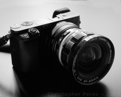
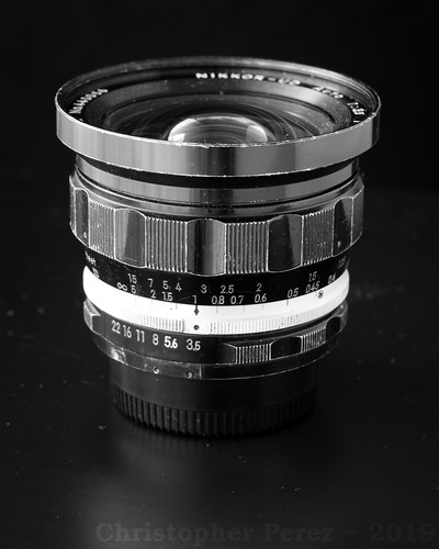
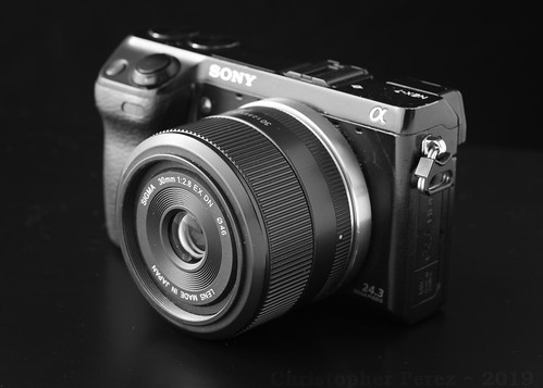
school", "traditional" photographic equipment and, of course, lenses.  For the moment I am sticking with stand alone cameras with APS-C sized sensors (Sony NEX and Axxx) and old manual focus lenses (Nikon, Takumar) and, much of the time, focal reducers (Lens Turbo II). 

This year I learned the most interesting thing about commercially designed and manufactured lenses is not how sharp they are.  Sharpness in the purest sense of the word is rather trivial to achieve.  Lenses more than one hundred years old are quite often sharp.

Other optical properties are at last as important as resolution.  Field flatness, chromatic aberration control, and distortions are lens faults commonly found, even in modern optics.  While processing can do nothing to correct field flatness issues, distortions and chromatic aberration controls are usually just a short step away from being corrected in software (either in-camera, or during processing on a computer).

As for field flatness, I recently learned a lot more then I ever knew.  Fixed focal length lenses are often touted as having flatter fields than zoom lenses.  I have found it depends on the lens and distance to the subject, but to be, in the broad sense, true.  I have several wide angle fixed focal length lenses that suffer from as much field curvature as a few zoom lenses I have.

Conversely, zoom lenses are frequently criticized for being "soft" in the corners.  But this depends on where you focus the lens.  Most of us focus a lens near the center of the field.  As an experiment try focusing a zoom lens in the corner and you will likely find that it actually is quite sharp there.  The effect is a clear demonstration of field curvature and not of a zoom lens being "soft".

In all my years of looking at this only one family of lenses ever tested soft when I expected it to be sharp.  I have owned far too many of these thinking I'd somehow picked up "bad" copies.  The lens is the famous but utterly uselessly soft down to f/8 Zeiss Tessar 50mm f/3.5 or f/2.8.  I paid 7USD for the last copy I had and now know what I know and, well, I will never buy another, no matter how cheap.

Tessars don't need to be soft, and in fact most aren't. I had a 200mm Nikkor-M f/9 large format lens that was razor sharp from wide open.  Similarly, every single Kodak Commercial Ektar f/6.3 (all tessar formula lenses) I ever owned and used was incredibly sharp, again, from wide open.  So the Zeiss 50mm Tessar problem wasn't with the optical configuration.  It was something else.

Related to famous marque identification is the phenomenon where someone "in the know" claims some lens or other to be an un-discovered gem.  It's crazy watching how the market responds like sheep in a herd.

Nearly anything labeled Zeiss or Leica appear to "hold their value" on the open market.  It doesn't seem to matter if the lens is actually "good" or not.  No matter.  The brand etched onto the lens barrel seems one factor that drives pricing.

Then there are lenses which have special "optical effects."  Petzval lenses went from relatively cheap and unknown to highly valued and expensive when someone talked up the "swirly" out of focus rendition.  I watched as an American whipped out a rather impressive stack of Euros at a French photo swap to pay a German for a small collection of brass-era lenses, some of which were Petzvals.

Similarly, the Helios 40 85mm f/1.5 "Sonnar" design Russian lens has the power to drive crazy prices.  True Petzval lenses are rare and might be worth what one pays, but the Helios?  Really?  There are a ton of them out on the market today but no one is asking the less than 100USD they might have gone for before they were "discovered."

Then there is the "soap bubble bokeh" craze that, even now, appears to be raging out of control.  Certain lenses are so expensive that it takes my breath away.

The herd is "all in," as they say.  And for what?  A three element lens that was deliberately designed to give over-corrected spherical aberrations behind the point of focus so that one or two aperture clicks down from wide open the thing would be acceptably sharp?  Yikes!  If what you really want is "soap bubble bokeh" I can point you to three lenses that might set you back all of 25USD that still do that trick.  But find one of those "special" lenses and you might pay a bunch of money for it.

No.  I try to avoid herd-thinking and wallet-denting pricing for an imaging fad.  None of those things are all that interesting to me.  Besides, my fixed income life has put a halt to chasing highly touted optical "pixies."

However, the thing I find most interesting about lenses is how they transition from in-focus to out-of-focus.  That is where the optical "magic" lay.  That is where lenses can distinguish themselves, one from another.  And like field flatness, there are no "corrections" for this in software.  The effect is inherent in the lens, whatever it is.

Optical formula has little or no effect on out of focus rendition.  This includes Plasmat, Planar, Xenar, Xenotar, Tessar, Ektar, Artar, Sonnar, Gauss Wide Field and many many other basic, and now classic optical formulas.  Lens element layout is not a real, nor very useful predictor of out of focus rendition.

I smile when I read marketing literature claim such and such a lens is "classic Sonnar," for example, and such and such lens will give the "classic Sonnar" out of focus rendition.  Such claims are wildly misleading.

Returning to my large format lens example, the Nikon Nikkor-M 200mm f/9 tessar formula lens was not only sharp from wide open, but the out of focus rendition was creamy beautiful.  Not so on either account the poor old Zeiss Tessar 50mm previously mentioned, which is famously "soap bubble bokeh" over-corrected for spherical aberrations behind the point of focus.

How spherical aberrations are treated in the out of focus areas of an image are determined by the lens designer and the calculations they make, in the lens curvatures they specify, and not by the number of elements nor the configuration they are arranged in.


Coming back to the practical, experiential world, to my eyes, I find I prefer -
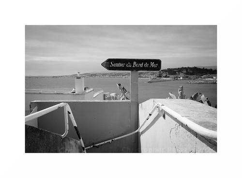
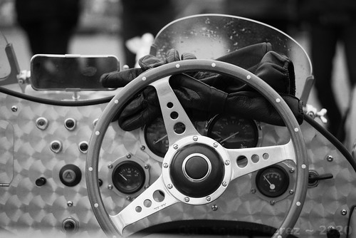
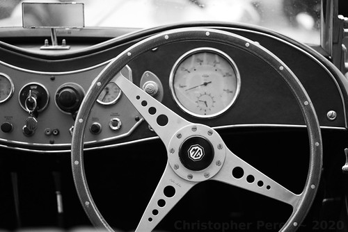
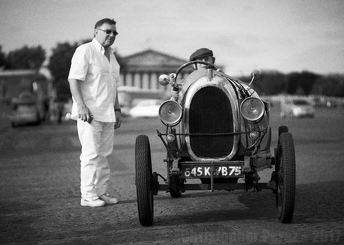
  • Neutrally corrected spherical aberration lenses for most subjects including street scenes and transportation (cars, trains, motorcycles)
  • Under-corrected spherical aberration lenses for portraiture, still-life, and gardens (trees, shrubs)

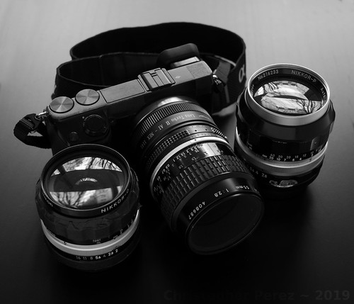
My current favorite neutral spherical aberration corrected lenses include -
  • Nikon Micro-Nikkor 55mm f/2.8 and f/3.5 
  • Three Nikon zoom lenses
    • Nikon 75-150mm f/3.5 E-series 
    • Nikkor 80-200mm f/4.5N Ai 
    • Nikkor 100-300mm f/5.6 AiS

My current favorite under-corrected for spherical aberration lenses behind the point of focus include -
  • Nikon Nikkor 50mm f/1.8 AiS
  • Nikkor-P 105mm f/2.5
  • Nikkor 85mm f/1.8 H, HC, or K

If I had unlimited resources and access to other lenses from other manufacturers it would be interesting to see how they compare to my current collection of Nikkors.  Alas, such things must be left to others interested in the topic or for me in another lifetime.


Parcs Châtenay-Malabry

Tuesday, December 10, 2019

What to pack and other First World problems...

... so... we're packing our things in preparation for leaving Paris for the winter.  I never thought I'd see the day when I, too, could be considered a Snow Bird by flying (as it were) south for the winter.  But there's the truth of things.

A couple friends asked which cameras I would be taking.  My answer was this -

I ran a test of my lenses to see how much I "gained" in terms of IQ by going with the old Nikkors. 

Alas, It's really difficult to tell much difference. I know where to look so I know the old lenses out-perform the new stuff. But it's not really significant.

Particularly this beautiful 50mm f/1.8 SEL (APS-C only) Sony that I have. It turns out, she's a 'beaut. 

Just one 20mm Nikkor UD f/3.5 out-weighs an A5000 + two AF plastic lenses. Weight. 

And I'm getting old. So... the AF lenses are what I'm taking. The Nikkors I'll continue to use, as you say, around town and close to home.

Sony NEX-7 "walking around" kit

I wrote too soon and promised things that will never ever come to pass.

A little thought came when I looked more closely at the Out Of Focus Rendition of the Sigma 30mm f/2.8 EX DN E I was considering taking.  Frankly, the OOFR is scary bad when compared against a Micro-Nikkor 55mm f/2.8 Ai.  Looking at some of my recent work with the lens convinces me of the Micro-Nikkor's brilliance in separating a subject beautifully from the background.

At which point I felt the Sony A5000 with the Sony 16mm f/2.8 SEL, the Sony A6000 with the gorgeous Sony 50mm f/1.8 SEL OSS, and the Sony NEX-7 with a Lens Turbo II focal reducer and the Micro-Nikkor 55mm would do the trick.

Slippery Slope Alert: 
Since the Lens Turbo II is now part of the "kit", why not, I asked myself, carry not only the NEX-7 with the aforementioned Micro-Nikkor and for just a bit more weight carry the lovely Nikkor-O 35mm f/2 that I recently picked up for a song along with it?  That way I could carry one workhorse camera along with a slightly wide and slightly long lens.  Maybe I could leave the Sony A6000 at home?

Er.  Right.

The NEX-7 is new to me and I'm not sure I'd put full faith and trust in it.  Particularly since we'll be gone for three months.  Anything could happen, right?  Ah, heck!  The A6000 is small and light, so just put a body cap on it and take is as a backup camera.  Just in case, and all that.

You see where this is headed, right?  Yes.  I was sure you would.  But.  It gets worse.

Quickly reviewing the list of places we want to visit I see several art communities, small villages, a couple car and motorcycle events, and, of course, Monaco.  Indeed, the NEX-7 could do well in these situations.  The Micro-Nikkor could practically live on the camera.  Or maybe the Nikkor-O could do most of the imaging duties.  No worries.  I'd have both with me.  All is good... um... hold on...

We want to visit Menton during the Orange Festival (which is at the very same time as the Carnival in Nice).  Part of the Menton partying includes an orchid show.  Hmmm... I've been wanting to shoot some flowers using... oh gawds... here we go... some more...

Now I'm at the point of taking the A5000 with the ultra-wide angle pancake lens.  It's super light and will be nice when I photograph cars from above.  I'll have the NEX-7 with the focal reducer and the two lenses, 35mm and 55mm.  The A6000 will be sitting there as a backup, so why not mount up a wonderful Nikkor-P pre-Ai 105mm f/2.5 and take the little Nikon 12mm extension tube, too?

There.   Everything is covered.  All imaginable situations (based on prior history of being on the Riviera during the winter) have been considered.  Alas, there are a few more days before we leave and maybe a new thought will come to mind?  I sure hope not.

That we all should have such problems, right?

Sony NEX-7 "walking around" kit

Wednesday, December 04, 2019

Tones and Tints ~ Creating Look-Up Tables (LUTs) for use in RawTherapee

Background ~

About a year ago I started to have trouble with a hard-drive that was failing on my super-fast laptop.  My father's HP (different model than mine) did the same thing a year earlier.  Maybe HP laptops overheat the hard-drive?  Or perhaps they had a long run of "bad" drives?

Fed up and disgusted with how Microsoft Windows rots from the inside out and how HP buries it's hard-drives deep into their laptops, I jettisoned the whole thing and returned to my roots.  One of the things I did in my work life was bring Linux to software developer's attention.  In this case it was easy for me to grab a slow, under-powered, and unused Dell laptop and load it with Linux and have it perform decently.

I have used the Gimp for over fourteen years and am used to Open Source Software.  The biggest restrictions for me with the Gimp is it's inability to open RAW files and to work in anything but at an 8-bit color depth.

The Gimp offers at least two useful approaches to change a base image's colors, "Sample Colorize" and a wide range of options implemented in G'Mic (Color Presets, Color Grading, Film Emulation). 

Around the time my Win10 HP box was causing trouble I downloaded RawTherapee.  It opens a vast variety of RAW formats and provides a default color depth of 16bits.  While at first it seemed difficult to understand and use, I quickly caught on.  Naturally one of the first goals I was to emulate film tones in the RawTherappe 16bit space.

Fortunately G'Mic has a set of emulations for RawTherapee.  I installed them, but instantly wished for more.  There are some really interesting LUTs in G'Mic Color Presets on the Gimp and over the years I have created some nice color samples from beautifully tinted black and white photographs.  These are what I wanted over in RawTherapee.


LUT creation and transfer ~ 

Using the (privacy) Force I did a bit of research and quickly understood how I could transfer some of the Color Presets and film emulations I like as well as my black and white tints from the Gimp into RawTherapee.   

I used the following materials -
  • Linux Mint OS (any Linux distribution should do - and something similar should be achievable with Windoze and Apple)
  • A copy of the base 12 or 16 bit HaldCLUT image to work from (the LUT base)
  • the Gimp (in my case v2.10)
    • G'Mic installed (the latest version)
    • black and white Sample Colorized step wedges
  • RawTherapee
    • G'Mic film emulations (used for its directory structure if you don't want to create your own - besides the G'Mic film emulations are a pretty nice place to start)

To transfer LUTs or Film Emulations from the Gimp -
  • Open an unaltered base LUT in the Gimp
  • Open G'Mic -> Color -> Color Presets
  • Apply the desired Color Preset to the open LUT image
    • NOTE: I like to keep the default layer active and have G'Mic write the changed color pattern as a new (inactive) layer.  That way I don't have to destroy and re-open the base image.  
  •  Keeping G'Mic open, move to the Gimp after the new LUT layer is available and save the Color Preset modified layer named as something meaningful to you and in .png format (this is essential)
  • Repeat these last two steps for as many Color Presets as you would like to transfer into RawTherapee

To create black and white tint LUTs in the Gimp -
  • Open an unaltered base LUT in the Gimp
  • Open Color -> Map -> Sample Colorize
  • Sample Colorize the open LUT image using a BW tint step wedge
    • NOTE: I like to make a copy of the base as a new layer and Sample Colorize the new layer.  That way I don't have to destroy and re-open the base image.  
  • Save the Sample Colorized LUT layer named as something meaningful to you and in .png format (this is essential)
  • Repeat these last two steps for as many Color Presets as you would like to transfer into RawTherapee

Making these updated LUTs available in RawTherapee -
  • Verify the location of the LUT directory you have pointed RawTherapee to
    • If you're not sure where the film emulations are found, open RawTherapee -> open Settings and note the LUT directory location
  • Using a terminal or, better, Folder view, Change Directory to the LUT directory and note there are (at least) two sub-directories inside the HaldCLUT directory
    • Color
    • Black and White
  • Inside each of these directories are further sub-sub-directories.   At this point you can choose an existing sub-sub-directory, or, as in my case, create new sub-sub-directories using a meaningful naming convention (such as GimpLUTs or anything that differentiates your new LUTs from the existing collection)
  • Copy your newly created .png LUTs from their current locations into the new RawTherapee directory structure locations.
  • Restart RawTherapee if it's still for some reason open
  • Go to Film Emulations and verify your new LUTs are where you expected them to be
  • Open an image file and apply your new LUTs to verify they look like they did in the Gimp
If you are fluent in Linux system and application management you will quickly recognize there are several ways of achieving similar results.  What I've tried to provide here is a recipe based on an existing directory structure, that being provided by G'Mic.  Of course you can create your own directory structure and forego the use of G'Mic altogether.  Just point RawTherapee at your top directory and the system should be able to understand your intent.

Sunday, December 01, 2019

A little something called Super-resolution [part deux]

After looking at handheld super-resolution image making a friend suggested that image stitching, rather than image stacking, could lead to useful improvements in image file size.  So, naturally, I had to take a closer look.

Before we look at the results, let's compare the two approaches.

Image Stacking for Super-Resolution -
  • Shooting handheld
  • Fire-off a half dozen images of the scene using a high-speed multiple exposure mode
  • In processing -
    • Align the images
    • Stack the images as layers in PS or Gimp
    • 2X bi-cubic 600DPI (minimum) up-rez every image
    • Set the opacity of each layer
    • Flatten the image
    • Apply an Unsharp Mask of 2 pixels
Pros -
  • Image noise is reduced significantly
  • Light/Dark transition zones are smooth and "creamy"
  • 2x up-rez gives a somewhat useful, if not exactly brilliant, increase in viewable detail
  • If all else fails, at least there is an image to begin with, up-rez'd or not.  

Cons -

Image Stitching for Super-Resolution -
  • Set exposure to something at accurately expresses highlight and shadow detail - use this combination of aperture, shutterspeed, and ISO for taking all the "section"
  • Shoot small-ish "sections" of the scene where images sequentially overlap eachother, making sure you've covered the entire scene (see: Breznier Method)
  • In processing -
Pros -

Cons - 
  • Images need to be planned with final images visible only after processing - which means it really helps to "pre-visualize" a scene
  • Depending on the software and accuracy of shooting image "sections" there may be distortions (example of failing to accurately rotate the lens around the nodal point)
  • Limited to static subjects
  • Slow setup time - suggest manual exposure metering to help the "sections" stitch correctly and to keep the overall final scene exposure even and correct
 

Comparison of Resultant Images -

[If you click on the image it'll take you to the Flickr hosting site. Once there, look at the file at full resolution. In many cases the differences between lenses is small and likely can't be seen until you take a squint at the comparison at 100 percent.]

Super-Resolution ~ comparing stitched and "cubic uprez"


The obvious conclusion is this - even though the stitched image is 1400 pixels shorter in the long dimension than the stacked up-rez'd image, the stitched image clearly resolves small details better than the stacked image.


My friend is, of course, correct.  Check out the section titled "4-Way Focusing Rail..."  The image stitch approach can be very nice indeed, but only if you plan ahead.

Wednesday, November 27, 2019

Lens Stories ~ Nikon Nikkor 20mm f/3.5 UD pre-Ai

The gifts keep coming.

Lens Stories ~ Nikon Nikkor 20mm f/3.5 UD pre-Ai

In the box along with the Sony NEX-7 my friend sent a Nikon Nikkor 20mm f/3.5 UD.  I was surprised, pleased, and, of course, very interested to see how it performed.

Historically, Nikon had earlier designs for a 2,1cm lens.  Those were symmetrical and the rear element set recessed deeply into, first, Nikon rangefinder camera bodies and later the Nikon F SLR.  In the case of the SLR the mirror had to be mounted up and out of the way so the rear element set could be properly positioned, thus nullifying the benefits of being able to look through the lens.

Thinking about it for a moment, the 20mm f/3.5 UD I was now holding represents Nikon's first strongly asymmetrical ultra-wide angle lens designed specifically for the Nikon F SLR.  For its time the lens would've been rather unique.

Lens Stories ~ Nikon Nikkor 20mm f/3.5 UD pre-Ai

Off to beers with a friend one day I took one of my trusty Sony NEX-5T cameras (I have far too many of these because, well, they're cheap now) with a Lens Turbo II focal reducer and mounted the old Nikkor.  The first thing I noticed was just how large the 20mm Nikkor is when used on a very slim, very small APS-C Sony mirrorless camera.  The next interesting thing I would notice had to wait until I returned from the pub.

One of the images that I'd taken had deliberately included sections of strong daylight highlights and deep pub-interior shadows.  The (now) small 16mpixel sensor is well known for it's long 13EV dynamic range.  The newer 24mpixel APS-C Sony sensors only slightly extend the range to 13.4EV (NEX-7).  So this, to me, means the old sensor will continue to perform very nicely for much of the kinds of photography I tend to do.

Liking fields of subtle grays I am pleasantly surprised by the detail and "creaminess" of the image I took of my friend.  As you can see, there is detail deep into the shadows and the highlights roll off nicely, just like when using old silver halide film.

The lens appears to produce little to no flare, which is quite remarkable considering the age of the optic and the fact it is only single coated.  It is sharp from wide open. 

I think this lens is a "keeper."

Lens Stories ~ Nikon Nikkor 20mm f/3.5 UD first light

Thursday, November 21, 2019

Camera Story ~ Sony NEX-7

A friend sent me his "old" Sony NEX-7.  Such a gift this is.  Such a gift.

Lens Stories ~ Sony NEX-7

My friend's first NEX-7 had died a mysterious and sudden death.  So he went down to the local camera store and picked up a nice used example as a replacement.  This second NEX-7 is the one he sent me.

I really like how Sony implemented the "rangefinder" EVF in the upper left-hand corner of these cameras.  In bright sunlight I can see what I'm focusing on and my "hit rate" is much better than with the non-EVF NEX-5T or A5000 camera bodies that I also use.

The first thing I did after receiving the camera was to check that the sensor was clean, and it was.  Then I took some photos and then applied black tape to "blacked out" the make and model information.  I like my cameras appearance better when I do this.  Lastly, I opened an instruction manual and read through how to set the functions and dials and wheels.

It is easy to see how similar it is to the more recent Sony A6000.  The controls layout, the overall size and weight of the cameras are nearly the same.  There is a strong family resemblance between these two. There are a couple minor differences (such as an AF mode control switch) between the NEX-7 and A6000.

Another difference is the Sony NEX-7 dual wheel control.  I think they called this "tri-navi", or something like that.  This is different from any Sony camera I've used.  There are two programmable wheels along the top back edge.  The default setting has the right wheel modifying the exposure value for setting under/over-exposure.  The left wheel is dedicated to aperture, shutter speed controls.  Then there is the role of the (unmarked) "function" key and how it is programmed.

Lens Stories ~ Sony NEX-7

After fiddling around with this for awhile it all seems rather complicated to me.  I can barely keep straight the menuing systems change that took place between the NEX-series cameras and the newer A-series.  When in a photo-shoot I find myself checking the setting, concentrating on not bumping something, rechecking and so-forth.

I seldom encounter a need to change a camera's setting once I enter a photo-shoot.  Sometimes I will change the over/under exposure settings, but that's easily done on the wheel control on the back of the camera.

In any event, I try to anticipate the conditions I will find myself in, set a camera's controls and functions, and then try to avoid, as I said, bumping any of the dials and controls during a shoot.

Reading the manual I came across the method Sony provides for disabling the dual wheel system.  It involves holding down the (unmarked) "function" key that sits just next to the shutter release button.  Now that this has been sorted I feel the camera won't "fight" me when I accidentally bump something or other.

According to DxOMark the Sony NEX-7 has 13.4EVs of dynamic range.  Which is to say, it has over 13 "f-stops" of dynamic range.  By comparison, the Sony A6000 I have is reported to have 13.7EVs of dynamic range.  The difference between these two cameras would be, I imagine, rather difficult to see in practice.

In summary, think the camera will be every bit as good an image making machine as the A6000 which I will continue to very much enjoy using.

Camera Story ~ Sony NEX-7

For the illustration images seen here I mounted-up a nice, light, sharp little Sigma 30mm f/2.8 EX DN.  Shortly after taking the images I blacked out the bright spots and replaced the Sigma lens with a Lens Turbo II, Nikon Nikkor-O 35mm f/2 pre-Ai setup.  It's in this configuration that I will see how things work out for me and my friend's "old" camera.