Sunday, May 31, 2020

Super Selective Toning in the Gimp - Part Two

Continuing the search for subtle toning based on selective tone ranges, here is a second method a person can use in the Gimp.

In Part One I laid out a process for selecting unique colors for selected Luminosity Mask regions.

In this, Part Two, I would like to share a process for using a unique feature found in the Gimp.

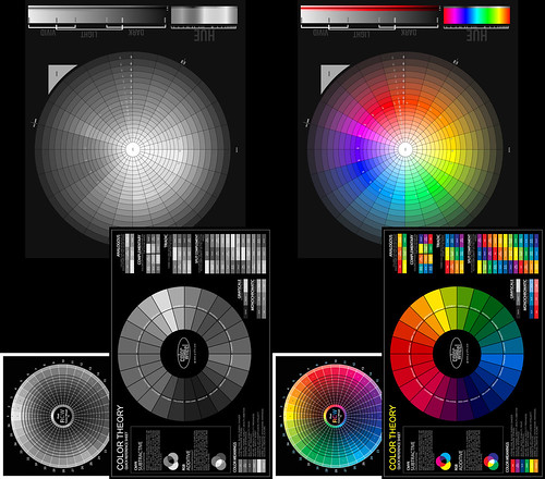
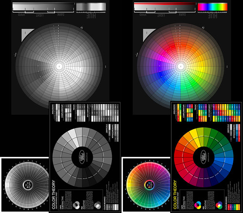
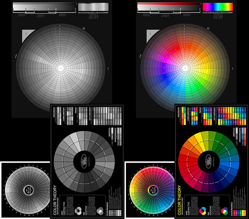
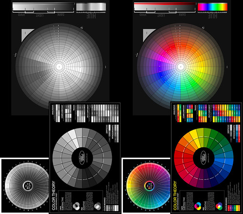
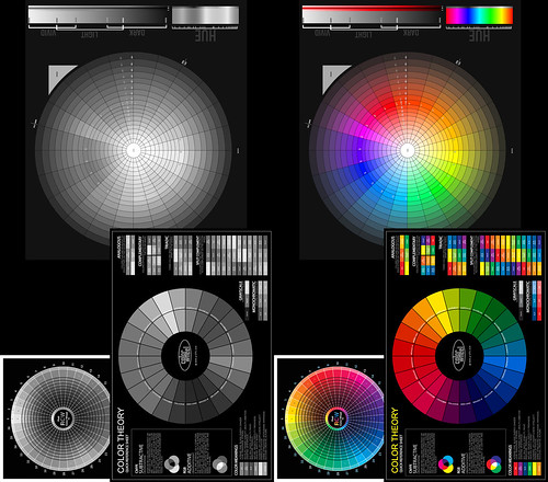
Under Colors -> Map at the end of the drop-down list is something called "Sample Colorize".  When used with a step wedge you can specify a range of colors that spread from pure black to pure white that apply tints to an image.  In analog photography terms you can think of this as a sophisticated toning mechanism.

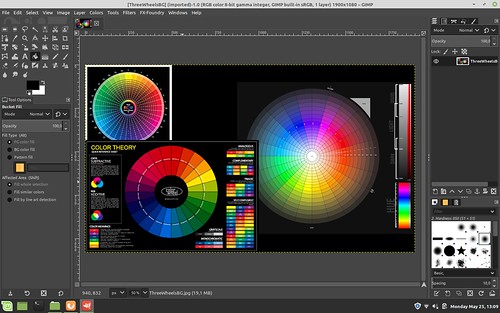
There used to be a collection of step wedges you could download to work from, but I can't seem to find them anymore (it's been a number of years).  So I create my own step wedges from tinted images with color ranges that I like.  I tend to work from scanned carbon tissue, or platinum-palladium, or chocolate toned images.  I also have step wedges I created from scanned cool tone silver gelatin prints (I used to be a black and white photo print tech back when dinosaurs roamed the earth and still have some of my earlier works).

Looking at these step wedges you may quickly realize the subtleties in colors that are possible.  Here-in lay the promise for even finer tonal gradations when combined with the Luminosity Mask technique previously described.

I can't stress enough that there are any number of valid ways of achieving these kinds of results.  I am simply following a process path that seems obvious to me.  You mileage will vary (as they say).
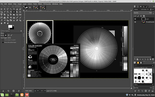

Step Three - Get your step wedges ready

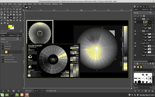
Continuing in the Gimp, open three step wedges.  I would suggest a cool tone wedge, a chocolate tone wedge, and a yellow-ish tone wedge.  These will open as separate files next to your base image tab.

Step Four - Cool down the shadow/dark tones

Return to the image to be toned and make the "DD", "MMM", and "LLL" layers the only _active_ (visible) Luminosity Mask layers.  We won't need the other masked layers so we need to make sure they are de-activated.

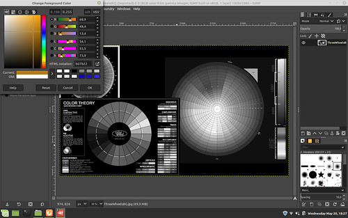
Working with your base image, select (for this example) the "DD" layer image (not the mask as you can not Sample Colorize masks).
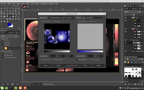
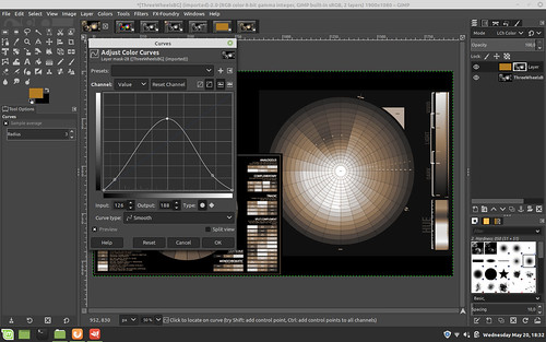
Open Colors -> Map -> Sample Colorize

In the upper right corner of the dialog box, find and select the cool tone step wedge. 

"X" use subcolors ("smooth colors" should already be selected just to the right)

Select "Get Sample Colors"

Select "Apply"

Select "Close"

You should now see the image you are working on has taken on the cool tones of the step wedge in the dark regions.

Step Five - Warm up the middle tones

Select (for this example) the "MMM" layer image (not the mask as you can not Sample Colorize masks).

Repeating the Colors -> Map -> Sample Colorize steps outlined in Step Four, apply the chocolate toned step wedge colors to the mid-range tones of your image.

Step Six - Make the highlights "sing"

Select (for this example) the "LLL" layer image (not the mask as you can not Sample Colorize masks).

Repeating the Colors -> Map -> Sample Colorize steps outlined in Step Four, apply the yellow-ish toned step wedge colors to the mid-range tones of your image.

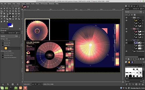
Your image should now be toned using portions of three colorized step wedges and three Luminosity layer masks.

If upon close inspection you find one region or another is too strongly tinted, you can lower the opacity of that layer/mask to something you find more pleasing.  I tend to do this in the shadows/dark tones as my colorized step wedge tends too be too blue to my eye.  So I tend to set the "DDD" layer/mask opacity to 50 percent.

Super Selective tone mapping in the Gimp


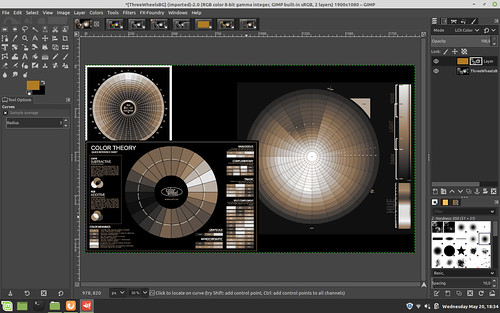
In the example screenshot image you can see how I have modified the process just slightly from what is written above.  Note the layer/mask arrangements and visibility settings (the "eye" found just to the left of each layer/mask).

In this example I have set the "LLL" layer/mask above everything else.  This will keep the whites white as I did not tint the "LLL" image.

I moved the "M" layer/mask above the "MMM" layer/mask and tinted both layers.  As you can see, the "M" layer/mask has a grayer mask than "MMM."  This means the "M" layer/mask is more subtle and for it's effects to be seen it has to be placed above the stronger "MMM" layer/mask.

Lastly, the "DD" layer image is cool toned and the opacity of that layer/mask is set to around 50 percent.

This is a lot to take in, but it helps understand why we will do what we do in the next Part Three example where we greatly simplify the entire process.

Tuesday, May 26, 2020

Super Selective Toning in the Gimp - Part One

In a prior blog entry I described a simple means of toning the mid-range of a black and white photograph while keeping the blacks black and the whites white.

Some years ago I remember reading where one of the attractions to using carbon tissue layers in registration to create a black and white photographic print was that a person could vary the colors of each layer.  That is, each carbon tissue layer represents some narrow range of overall image intensity and by carefully selecting the colors of each layer a printer could, for example, use cool tones in the shadows and warm tones in the highlights.

We can achieve the same effect with perhaps even finer tonal controls than carbon prints by using digital black and white images. 

Here is another of perhaps many valid methods for achieving the carbon tissue colorizing controls in digital image processing.

Setup -

Processing -
I will give a very specific set of instructions.  However, keep in mind there are many combinations and variations that might help you express your intentions better.

Before we begin, I want to note that in this example I'm using three strong primary colors so that you can see the blending transition effects from light to dark.  For a proper black and white image we would like never do something like this.

Step One - Create the Base Black and White Image

Open an image in the Gimp.

Mid-Tone color generation and blending using Luminosity Masks


Add a black layer over the base image and set the blend mode of the black layer to "Lch Color".  Flatten the image in preparation for the next steps.

Mid-Tone color generation and blending using Luminosity Masks


Step Two - Create 9 Luminosity Layers and Masks with One Click

Open Filters -> Generic - Luminosity mask setup and watch as new masked layers are generated.  Note how they are arranged with the "Darks" layer set of three grouped layers labled "DDD", "DD", and "D".  Similarly, note how the "Mids" and "Lights" are organized.  We are about to rearrange them.

But before we do, take a close look at how each set of three sub-layer masks are slightly different from one another.  They define how much of a region will be affected when we make changes to the layer image.  Said another way, each mask uniquely describes what portion of the image will be affected by any changes we make to each layer image that each mask is attached to.


Mid-Tone color generation and blending using Luminosity Masks


Step Three - Re-Order Luminosity Mask Layers

When we add color to these Luminosity layers, their arrangement and order will be important.  How the colors will blend and transition between the layers will be determined by the order you choose.  We will now rearrange them to prepare for sample colorizing.

Click on the "Mids" top of group layer (where the "MMM", "MM", "M" sub-layers are organized just below it) and select the up arrow carrot.  When you click on the up arrow carrot after selecting "Mids", the entire "Mids" layer structure will move.  The up arrow carrot is found on a tool bar just below the base image.  Verify that "Mids" collection of three layers and masks are now positioned above the "Darks" collection of three layers.

Mid-Tone color generation and blending using Luminosity Masks

Now click on the "Lights" collection of three layers and masks and again using the up arrow carrot click twice to move "Lights" first above "Darks" and then above "Mids".  "Darks" will now be the first Luminosity layer collection above the base image.  We have simply reversed the order of the layers and their masks.

Mid-Tone color generation and blending using Luminosity Masks


Step Four - Add Highlight Color

Select a foreground color.

Mid-Tone color generation and blending using Luminosity Masks

Deselect visibility (the "eye" found just to the left of the layer image) of the "LL" and "L" layers.

Select the "LLL" layer image (and not the "LLL" mask since we cannot add color to a mask).  In this example we are selecting the layer who's mask most narrowly describes the highlight region of the image.  Selecting "LL" or "L" would broaden the colored highlights further down the tonal range.  This is something to keep in mind as you work with this technique as you can use this to introduce subtle gradations of colors within the tonal region defined by these Luminosity masks.

Select Filters -> Map -> Sample Colorize 

Select Sample: From Reverse Gradient

Select  Get Colors (perhaps not strictly required)

Select Apply

Select Close

Mid-Tone color generation and blending using Luminosity Masks


Here is how the image looks after adding color to the "LLL" highlights layer.  You can begin to see where we are going with all this by looking carefully at the various color wheels in the image we are working on to observe what just changed.

Mid-Tone color generation and blending using Luminosity Masks


Step Five - Add Mid-Tone Color

Select a new foreground color.

Mid-Tone color generation and blending using Luminosity Masks


Deselect visibility (the "eye" found just to the left of the layer image) of the "MM" and "M" layers.

Select the "MMM" layer image (and not the "MMM" mask since we cannot add color to a mask) under the "Mids" layer grouping. 

Select Filters -> Map -> Sample Colorize

Select Sample: From Reverse Gradient

Select  Get Colors (perhaps not strictly required)

Select Apply

Select Close

Here you have a choice and you will need to try both to see which mid-toning works best for you.  In this example I have continued to select Sample: From Reverse Gradient though you could use Sample: From Gradient.

Mid-Tone color generation and blending using Luminosity Masks


This is how the mid-tones are colorized and blended with the "Lights" "LLL" layer that we added in the prior toning step.

Mid-Tone color generation and blending using Luminosity Masks


Step Six - Add Low-Tone Color

Select yet another new foreground color.

Mid-Tone color generation and blending using Luminosity Masks

Deselect visibility (the "eye" found just to the left of the layer image) of the "DD" and "D" layers.

Select the "DDD" layer image (and not the "DDD" mask since we cannot add color to a mask) under the "Darks" layer grouping.

Select Filters -> Map -> Sample Colorize 

Select Sample: From Gradient  (note the change of this field value from the prior two steps)

Select  Get Colors (perhaps not strictly required)

Select Apply

Select Close

Mid-Tone color generation and blending using Luminosity Masks


Here is how the "Darks" look after following this, the final step, in this example.  Carfully observe how the colors transition between colorized regions.  This may have important consequences for the colors you choose in your own work.  There is potentially a lot to consider here.


Mid-Tone color generation and blending using Luminosity Masks


Summary -

As you can see, we have successfully added different colors to the highlight "LLL", mid-region "MMM", and shadows "DDD".  We did this by sample colorizing copies of the base image that are included in each of the 9 layers that were generated by the "Luminosity mask setup".  Each Luminosity layer has a unique mask that defines the region and extent to which the sample colorization will be applied.  In this way we can control the exact colors of, in this example, three different regions - highlights, mid-tones, and shadow.

Remember, we have 9 masked layers to work with.  So we have the possibility to further "finesse" the colors and their transitions.  If/when you choose to take advantage of the 6 masked layers that we did not use in this example, I suggest that you will want to invert the order of "Mids" under the top layer grouping.  That is to say, instead of ordering the "Mids" sub-layers as "MMM", "MM", and "M", reverse this too "M" first, you can leave the "MM" where it is, and move "MMM" to the top. 

The "Lights" and "Darks" sub-layer ordering can be left alone.  As a potentially mind-bending exercise I will leave the reasoning for this to the reader.  On second though, maybe I should cover it here.

If you look at the masks for the "Lights" and "Darks" sub-layers you will see that the most restricted mask is on top, with the following two layers expanding the regions affected by color changes.  So you will want the most restricted color mask on top in the "Mids" so that its color effects will be seen and not hidden _below_ upper more expanded layer mask.

In any event, as you add colorized layers, re-select the visibility "eye" found just to the left of each layer image to make that layer "active" and its effects visible in the overall image.

There you have it.  A potentially mind-bending, mind-exhausting way of subtly controlling colors of different tones across an image.  All this in the pursuit of old carbon tissue photographic image style.

Now, honestly, wasn't that fun?  Well, maybe not.  But at least you have real control over your image, right?


Thursday, May 21, 2020

Selective toning in the Gimp

A friend asked how we might be able to selectively tone an image using the Gimp.  His goal was to make the whites white and the blacks black, but have the mid-tones hold some interesting color.

As with everything digital, there are a gazillion ways of doing things.  For mid-range toning, here is just one way.


Step One - load a color image into the Gimp.  This will be the base layer.

Mid-tone tint steps ~ Gimp


Step Two - convert to Luminosity (human eye tonal intensity matching) black and white.  You can do this by adding a BLACK layer over the base color image and setting the blend mode to "Lch Color" (shown below prior to flatten image) and then flatten the image in preparation for the next step. 

As an aside: I see that by using Luminosity curves in a black and white conversion that I get the kind of tonal separation that I prefer in my black and white images.  In fact this approach, to me, is so good that old silver halide film can not match this.

A simple digital de-saturation (which is what old film used to try and achieve with its "panchromatic" product offerings) makes things muddy.  A filter over RGB curves doesn't give exactly what I wish.  Your mileage will vary, of course.

So once you have a black and white image, however you get there, you can move on to step three.

Mid-tone tint steps ~ Gimp

Step Three - Set the foreground color to something "interesting".  There are a number of colors that emulate things like cold silver, warm tone palladium, sepia toning, etc, etc, etc.  Choose something you like.


Mid-tone tint steps ~ Gimp


Step Four - Add a layer over the base black and white image using the foreground color you just selected

Mid-tone tint steps ~ Gimp

Step Five - Put the new color layer over the base black and white image.  Then select Layer -> Mask -> Add Layer Mask and add a white mask to the color layer.

Mid-tone tint steps ~ Gimp


Step Six -
Select the base image (in this example the color wheel image in the base layer) and select Edit -> Copy Image

Click on the White color layer mask to make it active.  Then select Edit -> Paste.  This will add a copy of the base image as a Mask to the Color Layer.

Now set blend mode of the color layer to either "Lch Color" or "HSL Color" - your choice

Mid-tone tint steps ~ Gimp


Step Seven - Open "Curves" on the Mask image and set the curve as seen below

NOTE: by raising the center of the curve, you _add_ more color to the mid-tones, but only if that's the effect you want.  Play with this to see how your base image toning changes.

NOTE 2: By lowering the ends of the curve you make the whites whiter down the tonal range and the blacks blacker up the tonal range.  For myself, I  don't mind a bit of color in the blacks, so I raise that black end of the curve - to taste, of course

Mid-tone tint steps ~ Gimp

Step Eight - Verify your results.  Flatten your image and save.

Mid-tone tint steps ~ Gimp


Wednesday, May 20, 2020

A photo from Nice...

I received the following email.  I'm thrilled.  A big thank you to "Don't Take Pictures" magazine -

Congratulations on being accepted to The View From Here online gallery through Don’t Take Pictures magazine! Thank you for sharing your art with us. 50 outstanding images by photographers from around the globe were selected for display on our website through August 18. Please visit the gallery page to view your work and click on the thumbnail image to enlarge the photograph (hover over the enlarged image to display image information). 

Sunday, May 17, 2020

How much does that weigh???

As we were leaving Nice at the end of April to catch a "dawn patrol" flight to Paris my wife offered to help me with the baggage and picked up my carry-on bag.  It was stuffed with one large laptop and two tablets, power supplies, documentation and three of my small Sony NEX cameras with manual focus Nikon Nikkor lenses.  She asked how on earth I could carry such a heavy thing as I watched her leave the bag right where it was.

She had a point.

We went to Nice by TGV and I knew I could overload the baggage a little as we would be taking taxis between the rail stations and our apartments.  I never figured we would be trying to get a flight anywhere.  I would never have packed my camera gear the way I did.

So when we got home and after we settled back into our apartment I brought out the little food scale my wife uses for measuring food stuffs.  Here is what I found.

940grams - Sony A6000 with Lens Turbo II focal reducer and a Nikon Nikkor-P 105mm f/2.5 pre-Ai - This was one of the camera/lens combinations in the bag in Nice.  That is 2 pounds of equipment right there and I had two more image makers in the side pocket next to this one.

662grams - Sony NEX-7 with Lens Turbo II focal reducer and a "pancake" Nikon Nikkor 50mm f/1.8 AiS - This was another of the cameras in my carry-on bag the morning that my wife tried to lift it.

586grams - Sony NEX-5T with Lens Turbo II focal reducer and a Nikon Nikkor 28mm f/2.8 Ai - this is very similar to one of the other cameras in my bag where I had a pretty little Nikon Nikkor 24mm f/2.8 Ai.

347grams - Sony NEX-5T with Sony 16mm f/2.8 SEL

409grams - Sony NEX-5T with Sigma 30mm f/2.8 EX DN E

422grams - Sony A5000 with Sigma 19mm f/2.8 EX DN E

542grams - Sony NEX-7 with Sony 18-55mm /f/3.5-f/5.6 SEL OSS kit lens

587grams - Sony A6000 with Sony 50mm f/1.8 SEL OSS

The Nikkor lenses are built like tanks.  They are rugged and the housings and barrels were machined from brass and aluminum.  The optics tend to be large compared with super-light weight plastic barreled modern APS-C format auto-focus lenses.  Image quality is pretty consistent across the range of Nikon lenses, too.  The way they treat the out of focus transition behind the point of focus is nothing short of gorgeous.  I really enjoy using these old lenses.

Yet, all image quality things being equal (which I will revisit in another blog post or two), in the future I can carry two cameras with modern AF optics for the weight cost of just one of my Nikon Nikkor manual focus setups.

While on the road, this kind of weight savings could be good to experience.


Nice ~ in black and white ~ 2020

Tuesday, April 21, 2020

Digital Black and White Conversion ~ Correct Human Tonal/Value Perception

Mike Johnson's The Online Photographer blog is a continued source of inspiration, education, and insight.

I read a post about how humans correctly perceive colors as they are converted to black and white.  In the article Mike references a Twitter post by French photographer Tim Soret.

Following the recipe M.Soret lays out, I tried two things.  Using a color wheel collection that I use to understand digital black and white conversion:

First, in the Gimp, I added a black layer over the color wheels and set the blend mode to LCh (Luminosity Channel - which in RGB terms translates to 71%Green 21%Red and 8%Blue).  Here is the result.


To my admittedly aging eyes this looks perfect.

Second, in RawTherapee, using the "Black and White" module I set the "Method" to "Luminosity."  Taking the above image and letting Rawtherapee convert the color side, we can note any differences between this software package and the Gimp.


Between the two images it looks like a perfect match.  The conversions are visually the same.

Revisiting my earlier comparisons and taking another look at the "Luminosity" conversion my mind's eye begins to appreciate the subtle differences in perception. 

In this earlier study I concluded that the "Green-Yellow" filter more closely matched what I had in mind than any other conversion process.  Now, after reading M.Soret's Twitter thread I'm not so sure.

As a reminder, here is the "GreenYellow" filter conversion.


Considering the color blue in particular, the "Luminosity" conversion approach seems to be more accurate for how the human eye perceives relative color values expressed in Black and White after-all.  The math doesn't lie. 

I think I'll have to sit with this a bit, make more digital color to B&W conversions and see how things proceed.

Tuesday, April 07, 2020

... and after all the testing and analyzing and looking and poking at this stuff...

Here is yet another in a rather long list of interesting questions.

Can a person honestly tell a difference between lenses when photographing in the real world (ie: outside controlled situations where one might be looking at optical and camera system performance and the minutiae there of)?

It so happens that I have two photoshoots that I did two years apart that might help me answer this very question.

The photoshoots are of the same subject (zombies) photographed under very similar lighting (large, open, low on the horizon sunlit sky).  The 2017 Paris Zombie Walk event was photographed using a Sony 50mm f/1.8 SEL OSS auto-focus optic and the 2019 event was worked using a Lens Turbo II focal reducer and a Nikon Nikkor 85mm f/1.8 K pre-Ai. I photographed the two events with both lenses shot wide open (to give some separation from a background that I find distracting).

Optically the two lenses render the out of focus regions somewhat similarly.  There are, however, subtle differences. The Nikkor shows stronger under-corrected spherical aberration behind the point of focus than the Sony.  And the Nikkor, when used with the focal reducer, shows less depth of field.

For this comparison I used RawTherapee to process images from the two events.  I used the same curves, lightness, contrast settings and LUTs (Kodak Portra NC).

Here are a few examples -


Zombie Walk ~ Paris 2017

Sony A6000 
+ Sony 50mm f/1.8 SEL OSS 


Zombie Walk ~ Paris 2019

Sony A6000 
+ Lens Turbo II 
+ Nikon Nikkor 85mm f/1.8 K pre-Ai 


Zombie Walk ~ Paris 2017

Sony A6000 
+ Sony 50mm f/1.8 SEL OSS 


Paris Zombie Walk ~ 2019

Sony A6000 
+ Lens Turbo II 
+ Nikon Nikkor 85mm f/1.8 K pre-Ai 


Paris Zombie Walk ~ 2019

Sony A6000 
+ Lens Turbo II 
+ Nikon Nikkor 85mm f/1.8 K pre-Ai
straight off the sensor
un-sharpened


Paris Zombie Walk ~ 2019

Sony A6000 
+ Lens Turbo II 
+ Nikon Nikkor 85mm f/1.8 K pre-Ai 
+ RawTherapee "Capture Sharpen"


Thoughts -

As you can no doubt see, while there are differences, it is very difficult to "put your finger" on what exactly those differences are.

Because I have stared at these at full rez I feek I know how they are different.  The Nikon lens' strongly under-corrected spherical aberration behind the point of focus becomes more obvious under close inspection.

The Sony lens is very crisp and clear from wide open.  Without going over the top with superlatives, in my opinion Sony designed an outstanding optic when they created this particular 50mm lens.  I've used this lens in various situations and every time I come away with faultless images.

However, because the out of focus rendition behind the point of focus contains less spherical aberration than the 85mm Nikkor, the Sony 50mm rendition is not quite as creamy smooth as the Nikon.  Mind you, it's not 1/2 bad and had I never understood what was going on with the Nikkor I would be completely satisfied with the Sony.

Again, I feel the Sony 50mm f/1.8 SEL OSS (for APS-C Sony mirrorless) is a very very fine optic. And for the price... wow!  I feel it is pro-level gear, this.

If "resolution" is important when using the old slightly software wide open Nikkor, I found/confirmed that standard "capture sharpen" functions during image processing can make the Nikon images as crisp wide open as the Sony is without "capture sharpen."  For an illustration of this, see the last two sample images above and pay close attention to the nylon clip just below the zombie's right shoulder.

Having illustrated this "resolution" effect, can you image how "sharp" a Sony image would be after "capture sharpen?"  Depending on the subject a Sony photo improved in this way might be too sharp.

However... going to the absolute camera-nutter extreme of extremes, going to the outer edges of the craft that no one but I may ever know, knowing that manual focusing old lenses can be challenging when working with moving subjects (these zombies changed pose and position every few seconds, of so it seems), knowing that my "hit rate" might not be 95 percent (like it is with the Sony SEL mated to the A6000's fast AF, face recognition, and eye detect ), knowing that a Sony A6000 + Lens Turbo II + Nikkor 85mm is a rather hefty setup to haul around for hours on end, and knowing I do not have OSS (image stabilization), I feel, to repeat myself, I feel I prefer the Nikkor 85mm images.

After much time spent studying these photographs the Nikkor images have an ever so subtly more pronounced "roundness", "creaminess", and "three dimensional" quality to them.

There you have it.  My little look at comparing real world image output between a 40+ year old manual focus Nikon and a current autofocus, image stabilizing, all signing, all dancing Sony.

All this, of course, begs the question:
Is it worth the effort of working with and optimizing my controls and technique around the Nikkor lens for something many people will never see, nor care about?


An entire folder of comparison images can be found here.

Wednesday, March 18, 2020

"Texture" ~ examples of emulated LithPrint localized overdevelopment

It may be instructional to look again at the idea of "grain" in digital photography, as borrowed from traditional film work, and take that idea to an extreme.  In this way the psycho-emotional effects of "grain" can be experienced perhaps more clearly.

LithPrint ~ digital emulation

In an earlier post I talked about "grain" and how it influences how we see and feel about an object/subject.

The straight forward simplified idea is that "grain" in a photographic image separates the viewer from the subject/object being photographed.  It's helps make an image more "art" like.  This effect was often seen in miniature camera work (ie: 35mm, sometimes 120, and more often in Minox).  The inherent grain became part of the image "aesthetic."

Villefranche su Mer ~ LithPrint ~ digital emulation

Conversely, in "grainless" photography, the subject/object being photographed is viewed as if through a window.  There is no (or very little) barrier between the subject/object and the viewer.  In traditional film photographic style this effect was achieved through the use of 8x10inch (or larger) film.  The effect is quite easily achieved today when shooting digital.  This is best experienced in "noiseless" images (which the vast majority of digital images tend to be).

Over the years I have enjoyed the works of Susan de Witt.  Some of her work took the "grainy" image idea to an extreme that I find fascinating.  She achieves this effect through the Lith Print chemical processing technique.  Once I understood what Susan was doing it was pretty easy to find some very nice work created by other artists, too.

The Lith Print effect goes well beyond "grainy" 35mm images. The process celebrates "grain" (though in this case it is actually localized over development that is causing the effect during printing).

I find that the more "grain" there is, the more an image encroaches on the traditional domain of "art."

Villefranche su Mer ~ LithPrint ~ digital emulation

As I no longer have access to a chemical darkroom (my last darkroom is many years long gone), I set out to try and emulate the Lith Print effect digitally.  The images shared here are a brief example of what I've come up with.

While not exact duplicates of the Lith Print aesthetic, I feel the digital emulation might be, as we used to say, "close enough for government work."

Some of my digitally emulated Lith Print images are collected into an ever expanding album on Flickr.

Monday, February 17, 2020

Steering wheels ~ examples of film-like grain in digital photography

I realize that sometimes it helps to see real world examples of some of the concepts and ideas I share here.

To illustrate how film-like grain can change the emotional response to how we view images I selected a series of classic car steering wheels.

As a first pass I had processed a few of them in color and liked the results.  But when I processed them in black and white, there was always "something" missing.  Now that I better understand film-like grain and it's "purpose" or "role" in how we see things I can see my earlier mistakes.

So I reprocessed my earlier images using first Rawtherapee to get the monochrome scale correct (green-yellow digital filter and curves modifications) and then through the Gimp (G'Mic-Degradations-Add Grain - Tri-X 1600 - Overlay blend mode).

So, without further ado, here is a series of classic car steering wheels from the 2016 traversee de Paris estivale.

 [Suggestion - click on an image to get to the Flickr page, then enlarge to 100percent to see the grain.  Back out the resolution and see how it "feels."  The effect will be subtle.]


la Traversee de Paris ~ 2018 (BW redo)

la Traversee de Paris ~ 2018 (BW redo)

la Traversee de Paris ~ 2018 (BW redo)

la Traversee de Paris ~ 2018 (BW redo)

Saturday, February 08, 2020

The role of film (or film-like) grain in photography... [part two]

Properly adding film-like grain to a digital image takes into account how silver halide prints actually behave. 

If you carefully study silver halide prints you may notice two things.

First, the grain structure is not even across the field.  There is less visible grain in the highlights and shadows.  It is primarily the mid-tones that show grain structure.  This is an effect of film.

Second, the highlights tend to "bloom" or "glow" ever so slightly.  This is the effect of light passing through print paper gelatin top layers and very gently scattering as it passes these layers.  The effect is indeed gentle and might not be noticeable at first glance.

With this as background, here is a process for adding film-like grain to a digital image using the open source software image processing package called the Gimp.  You can adapt this approach using Photoshop or other software that allows the addition and manipulation of layers.

Highlight "bloom" or "glow" -
  • Copy base image to a new layer
  • 1 pixel Gaussian blur upper layer (if you don't like the way this looks, try different blur radius' to find the effect you like best)
  • Add a "Grayscale layer mask"
  • Adjust curve of mask to allow just the highlights to show the 1 pixel blur
  • Flatten the image

Grain (two approaches) -

I use one of two ways to add grain to an image.  The first is using the G'Mic "Add Grain" function.
  • Open G'Mic - Degradations - "Add Grain" 
  • Select the film type that appeals to you
  • Note the blend mode selection (we will come to this shortly)
The second is building a grain layer from digital noise.  This is useful when applying grain to smooth images with large contiguous tone areas.  The G'Mic Add Grain function sometimes gives an obvious non-random repeating pattern in this specific case which we want to avoid.

Using the base image processing software (not G'Mic) -
  • Add a new layer with medium tone gray
  • Add digital noise to the gray layer
  • Gaussian blur the gray layer 2 to 3 pixels (observe the effect at 100% enlargement to find the effect that most closely matches film grain)

Set blend mode -

The selection of the blend mode is critical to how your digital image will correctly mimic film grain structure in a print.
  • Select "Overlay"
Flatten your image if the tools haven't already done so for you and you're finished.

Here is a look at the output of the highlight "bloom" steps and illustrates why setting the blend mode is so important.

Comparison ~ Digital Film Grain Simulation


Coming back to the real world, here is a failed attempt that I made by not correctly setting the blend mode.  The "grain" looks too harsh in both the highlights and shadows.  Old silver halide prints never look like this.

Emulating Tri-X film "look"


Here is another real world example, this time of how correctly setting the grain layer blend mode can look.  As in the above image, the Tri-X 1600 G'Mic "Add Grain" function was used.  But as you no doubt easily can see, the difference between the two images is quite noticeable. 

Look carefully at how the "grain" behaves in the highlights and shadow areas.

la Traversee de Paris ~ 2018 (BW redo)

Friday, January 31, 2020

... and speaking of black and white photography...

My father sent me this link about photographers who continue to shoot in black and white.  I find this encouraging.

The role of film (or film-like) grain in photography... [part one]

Living in Europe as afforded me the opportunity to study styles of paintings by visiting art exhibitions at some of the worlds finest museums and galleries.

Yet only recently have I begun to appreciate differences in brush-strokes and brush and palette knife techniques.  How an artist applies paint has a subtle but significant impact in how I respond.

For example, for hundreds of years many artists used brush techniques that beautifully blended colors in a way that when a finished work is varnished the individual brush strokes seem to disappear.  I'm thinking of (just to choose a very few artists) Titian, Leonardo, Vigee le Brun, Messonier, and David.

Looking at paintings in this style I feel as if I am looking thru a window and into a scene.  The art can be rather literal, in this sense.  For me, this is a key point.  This art mimics the real world as we see it.

In the mid-1800's a group of artists seemed to revel in showing their brush-work.  This approach was, in part, in response to Japanese woodcut art that had just reached Europe.  The art of Manet, Monet, Bazille, Morissot, and most certainly van Gogh are prime examples of this contrasting brush work style.

In this instance I feel as if I am looking at "art" with all its (sometimes amplified) imperfections and nuances that shares, or perhaps illustrates the real world from a potentially more emotional perspective.  This kind of work mimics the real world as the artists feels it.

How does any of this relate to photography?

Let's consider large format film and modern digital images as compared to small format film work.

Contact prints and digital "noiseless" images, to me, are like looking through a window into the real world.  This kind of photography mimics the "real" as there is no "barrier" between me and "there" (the subject).

Small format 35mm and 120 film photography, on the other hand, is like looking at the world from an emotional perspective.  The enlarged grain structure plays the role of clearly visible brush-work in a painting.  The grain acts as a "barrier" or "filter" between me and "there."

As an aside, platinum/palladium hand coated prints can celebrate a papers texture as a way of helping an image appear more "art like."  So, strictly speaking, large format film photography can still be bent to the task of "art."  This aside, I feel awareness of how we respond to images can be helpful.

Looking at the craft of photography in this manner helps me make decisions.  Do I want to share something crisp and clear in the classic art and large format film photography manner?  Or do I want texture to provide a separation or veil over the subject?

I find it interesting that working in digital photography we can make these kinds of choices well after clicking the shutter.  Everything doesn't have to be "pre-visualized" beforehand.

Chateau Lascaris ~ Nice 2020 
Windows ~ Musee Lascaris, Nice, France 
Tri-X film-like grain overlay

Thursday, January 23, 2020

Working in Black and White ~ further refinements

While visiting the Charles Negre photography museum here in Nice, France, I was able to closely inspect various black and white images.  I was paying particular attention to the grain structure as it varies with print tones (a topic for a future post, perhaps?) and how the whites are rendered under various circumstances.

In an earlier post I suggested a conversion process from digital color into black and white that involved rising the mid-tones to match silver halide black and white printing.

Recently I suggested a Rawtherapee filter that helps separate subtle colors in a way that could be pleasing to the eye.  It's worth noting that black and white filters vary from software package to software package.  I feel it's worth testing whichever software package is used (ie: Lightroom, Photoshop, Darktable, the Gimp, etc) for oneself to find the filter that gives the most pleasing effect.

In this post I would like to illustrate the overall effects of these two steps as they relate to the gray scale.  I would also like to suggest a way to "manage" the creaminess of the highlights so that they very closely match those of film printed to black and white paper.

The base for this post is a simple gray scale step wedge (top image). 

By rising the center of the "curve" it is easy to see how the mid-tones rise and how the steps between the shades of gray on the white end of the scale "flatten out" (center image).


After returning home from the Charles Negre museum I considered how a digital file can be converted to black and white and nearly perfectly match how silver halide film/print combinations behave, specifically in the highlights.  I think I have a suitable answer.

After applying a yellow-green filter and after rising the mid-tones by rising the center of the image "curve" the effect of "creaminess" in the highlights can be enhanced by lowering the "brightness."  This "narrows" the gaps between the various shades of white and lowers the absolute/pure white so that it begins to take on a pale gray tone.

The following might illustrate what I mean.


Monday, December 30, 2019

Converting digital color images into Black and White ~ back to basics with filters

After covering the color to black and white conversion process in a simplified manner I think it might be helpful to take a look at the very foundation of image conversions.  That is to say, how we as humans "see" or "experience" the relative color intensity as it relates to gradations of gray.

Setup -
  • Three color wheels illustrating different color principals organized into a single image
  • Rawtherapee used to process images through the "Black and White" tool
  • Gimp used to reorganize the converted images so the original color image is show side by side - so viewers can gauge the relative color "intensities"

Black and White Conversions -

Color image simply de-saturated -

Rawtherapee BW Conversion ~ Desaturation Only

As a first pass this isn't too bad.  If you like the results you can stop here and "call it good."

But as you can likely see, the dark blue areas, the reds, and greens in the upper-most wheel don't "feel" like the tones are correctly expressed in grays.  They are either too "light" to our eyes or too "dark."

So if the goal is to closely match how a color "feels" in gray relative to other colors then simply de-saturating an image might not "feel" right.

Conversion using luminosity values -

Rawtherapee BW Conversion ~Luminence Equalizer

The subtle blue values seem to convert rather better in this technique than with simple de-saturation.  However, the greens, yellows, and reds still don't "feel" right.


Conversion using the Channel Mixer (no filter) -

Rawtherapee BW Conversion ~Channel Mixer Normal Contrast 5400 Kelvin

To my eyes this is an improvement over the luminosity and de-saturation processes.  There is more subtle tonal variations between the colors.  Yet, the conversion still feels like it's missing a bit of "pop", which is to say it "feels" as if there might not be enough separation between the subtle shades of color as they are expressed in gray.


Conversion using a Channel Mixer Yellow Filter -

Rawtherapee BW Conversion ~ Channel Mixer Normal Contrast Yellow Filter

The classic approach in silver halide films was to take a panchromatic black and white emulsion and to shoot with a yellow filter.  The idea was to find a way to make an image "pop."  There are even lenses known to have properties that helped make an image behave this way.  The Takumar 50mm f/1.4 screw-mount lens comes to mind.  The lens coatings had a yellow cast.

In digital we can perhaps begin to understand why this approach usually worked for us old film photographers.  Take a look at the image above.  It's starting to "pop."  The colors converted to grays are beginning to "feel" more or less correct.  The only problem I see is that the reds don't yet "feel" right and the yellows are a little too "hot."


Conversion using a Channel Mixer Yellow-Green Filter -

Rawtherapee BW Conversion ~ Channel Mixer Normal Contrast GreenYellow Filter 5400Kelvin

Goal! Suddenly it feels as if we've found a very good solution. 

Applying a Yellow-Green filter in Rawtherapee we see the various color intensities expressed as clearly delineated grays.  The only comment I would make is that perhaps the blues and teals could be just a touch darker.  But this is easily fixed by gently darkening in these two colors prior to conversion to black and white.


Other Filters -

Early photographic emulsions captured only the blue end of the visible spectrum of light.  This is why all early photographs show skies as white or very light.  It wasn't until the advent of panchromatic emulsions that skies in photographs became what they are today.

If you want to emulate early emulsions you can start by using a blue filter.  Here is how Rawtherapee expresses this filter.

In the early part of the 20th century,  Saint Ansel made a fine image of Half Dome in Yosemite Valley.  He wrote about the making of this image and how he felt he'd hit upon a good solution to make the image "pop."  He used panchromatic film to capture the full spectrum of light and a red filter to darken the sky.

So in this spirit, sometimes a red filter is the right tool.  Here is how Rawtherapee expresses this filter.


In closing I can't stress strongly enough that people should do their own image conversion comparisons using the tools they normally use to process their images.  I have found that different tools implement black and white filters differently.

------------------
For further reading as additional background on the topic of how we "see" things in Black and White, please refer to this.