Tuesday, May 11, 2021

Soft Focus ~ a little meniscus lens

I would like to recount a short tale of stumbling on a potentially interesting soft focus lens solution.  Before I tell the story, however, it might good to show a list of old lenses in this style, to set the foundation for all this Soft Focus Madness, as it were.

In the 19th and into the 20th centuries lenses made for Pictorialists were on offer.  Many of these were designed with soft image qualities when shot wide open and to sharpen things up as the aperture was stopped down.  

Browsing the Clarence White edited journal "Pictorial Photography in America" from 1920 thru 1922 reveals an interesting list of options (take a look toward the back of the journals in the advertising section) -

  • Aldis f/3 and f/4.5
  • Goerz Portrait Hypar
  • Pinkham and Smith -
    • "Synthetic" for landscape
    • "Visual Quality" for portraiture
    • "Wolf Artistic" slip-on diffusion lens
  • Spencer Portland Pictorial
  • Struss Pictorial
  • Turner Reich Hyperion Diffusion Portrait f/4
  • Wollensak Verito f/4

Even after the fall from grace of the Pictorialist style, lens manufactures continued to design and sell soft focus lenses.  I suspect they were made primarily for the Japanese market, but I have no definitive evidence of this.  

Here is a list of some of the post-Pictorialist soft focus lenses that were available for large format film systems.  Many came mounted in modern shutters such as Copal and Compur rendering them thoroughly usable for modern film photography.

  • Cooke PS945 9inch/229mm f/4.5
  • Fuji Fujinon 180mm f/5.6 SF with strainers
  • Fuji Fujinon 250mm f/5.6 SF with strainers
  • Rodenstock Imagon series with strainers
    • 120mm
    • 150mm
    • 170mm
    • 200mm
    • 250mm
    • 300mm
    • 360mm
    • 480mm
  • Yamasaki Congo 150mm f/5.6 SF
  • Yamasaki Congo 200mm f/5.6 SF

In medium format film post-Pictorialist era soft focus lenses minimally we have -

  • Fuji GX EBC Fujinon GX/GXM SF 190mm f/8 
  • Mamiya 645 Mamiya-Sekor SF C 145mm f/4 
  • Mamiya RB67 150mm f/4 C Variable Soft Focus 
  • Mamiya RZ67 180mm f/4 D/L Variable Soft Focus 
  • Pentax 67 SMC 120mm f/3.5

Interesting Note: I know I wrote this in a prior article, but it bears repeating verbatim.  In their guidance literature Kodak suggests pulling the focus on the subject to objects closest to the camera.  Kodak said there was no useful information produced by their Portrait lenses on things in front of the point of focus.  They suggest, too, letting the under-corrected spherical aberration and deep depth of field that comes with it keep things apparently in focus behind the nearest point focused on.  This is something to keep in mind when shooting any under-corrected spherical aberration behind the point of focus lens.

Since I no longer shoot film and have moved completely to digital with small sensors I've been interested in exploring what might be available for smaller formats.  In a prior article I wrote about the Pentax 85mm f/2.2 Soft.  It was designed and built to give an enormous amount of under-corrected spherical aberration behind the point of focus.

For me, working with the Pentax lens a little difficult.  I haven't found many subjects nor lighting situations that react well to the Pentax' over the top level of softness.  I looked for a less dramatic solution.

Before I could spend more money on exploring some of the old manual focus 35mm SLR soft focus option, a thought occurred to me that I could attempt to follow Jim Galli's example and disassemble a few lenses and try different lens element combinations.

Jim is well known in America's large format film community for his work with soft focus lenses.  Until very recently he had a website filled with images that illustrated soft focus optical effects from Pictorialist Era lenses.  And he didn't stop there.  One of the last posts I read of his talked about how he disassembled an old Schneider Symmar and used one of the lens elements to make photos.  The results were compelling.  Unfortunately his website appears to be off-line.  I can't reach it any longer from Europe.

Digging through my own box full of cast-off, cast-away lenses I choose a classic Plasmat design 6 element 4 group 50mm lens.  These are as common as dirt.  Everyone who was anyone manufactured their own versions of the original "Nifty-Fifty" (as Current Cool Cats like to refer to them as) for perhaps every 35mm SLR ever made.

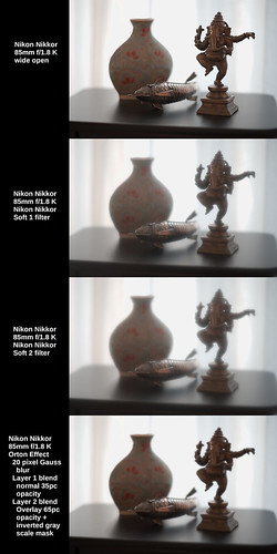
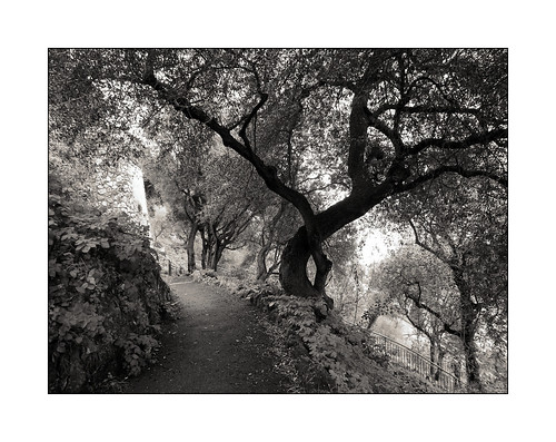
Just to see what might happen, I firmly grasped the poor old lens and unscrewed the front element set, fettled a correct distance to the sensor plane by adding a few short extension tubes, adapted it to a Sony A7, et voila! a behind the aperture three element two group "meniscus lens."  And it works!!  Have a look.


Nikon Nikkor 85mm f/1.8, Meniscus approx 60mm Soft Comparison


Classic Pictorialist lens image properties are clearly on display.  Images are soft around subject/object edges wide open.  There is increasing sharpness across the scene as the aperture is stopped down.  Using the aperture in this way I can control the amount of overall softness of an image.  

To me, this lens begins to strike a decent balance between the level of softness the lens adds and underlying image sharpness.  I find it crazy that I was able to hit upon this solution straight away at my first attempt.  It was almost too easy.  

Instantly, there is another viable optic for being able to re-create the early Pictorialist image qualities using more current small format tools.

Sunday, May 09, 2021

Soft Focus ~ Pentax 85mm f/2.2 in Nikon F-mount

Previously I had a quick look at how soft focus filters effect an image, and now it's time I had a comparative look at optical softening effects.

In the 19th and into the 20th centuries lenses made for Pictorialists were on offer.  Many of these had distinctly soft image qualities when shot wide open.  Browsing the Clarence White edited journal "Pictorial Photography in America" from 1920 thru 1922 reveals an interesting list of options, including -

  • Aldis f/3 and f/4.5
  • Goerz Portrait Hypar
  • Pinkham and Smith -
    • "Synthetic" for landscape
    • "Visual Quality" for portraiture
    • "Wolf Artistic" slip-on diffusion lens
  • Spencer Portland Pictorial
  • Struss Pictorial
  • Turner Reich Hyperion Diffusion Portrait f/4
  • Wollensak Verito f/4

There were, of course, other "Pictorialist" lenses manufactured over the years, including the color corrected Kodak Portrait lens series. 

Interesting Note: In their guidance literature Kodak suggests pulling the focus on the subject to objects closest to the camera.  Kodak said there was no useful information produced by their Portrait lenses on things in front of the point of focus.  They suggest, too, letting the under-corrected spherical aberration and deep depth of field that comes with it keep things apparently in focus behind the nearest point focused on.  This is something to keep in mind when shooting any under-corrected spherical aberration behind the point of focus lens.

More recently, small camera manufacturers have sold various "soft focus" lenses.  I have a Pentax 85mm f/2.2 Soft in a Nikon F-mount.  It's the only one I've ever seen configured this way.  All the other f/2.2 Soft lenses I've seen come in Pentax' K-mount.  In any event, this is the lens I would like to consider here.

The Pentax 85mm f/2.2 is a two element in front of the aperture meniscus lens.  From prior use I know how strong the under-corrected spherical aberration is behind the point of focus from f/2.2 through to f/4.  The effect is so strong that it is easily seen even on a rather small LC display.

Until I talked with a friend, I thought the super-strong softness of the Pentax was "just the way things were."  He pointed out that at f/5.6 Pentax Soft images just started to "look good."  His own work is much more subtle than mine has been up to now.  He doesn't shoot for softness, he shoots to get the highlights to "glow", which is a rather different thing.  The more of his images I see, the more I'm convinced his approach may be one of the best uses of soft focus lenses of any vintage and of any format, from large film to small APS-C digital sensors.

This led me to consider how the Pentax 85mm f/2.2 behaved down its aperture range.  The following comparison shows the Nikon Nikkor 85mm f/1.8 K shot into the light wide open at f/1.8.  Then I show the Pentax 85mm f/2.2 at each of its marked apertures.


Nikon Nikkor 85mm f/1.8, Pentax 85mm f/2.2 Soft Comparison


As we can see, at f/2.2 the intense softness of the Pentax lens just about knocks you over.  F/2.8 isn't much different.  The level of softness is still very high.  I'm not aware of a Pictorialist era optic that produced this much under-corrected spherical aberration behind the point of focus, though I've seen images taken with Wollensak Verito lenses shot wide open where the softness is somewhat intense.

By f/5.6 the Pentax 35mm SLR lens is, indeed, "just starting" to look like my friends preferred rendition.  The highlights start to "glow" while the underlying image begins to sharpen up.  In fact, it has something of the Nikkor #2 Soft filter image effect in the highlights, except that the Pentax optics are still doing things to the edges of objects that filters would never do.

One of the other curious things about the lens is that it only stops down to f/5.6.  It goes no further.  So I am tempted to make a couple Waterhouse-like aperture disks to lay against the Pentax' aperture blades to see how the lens performs at f/8 and f/11.  It could be an interesting experiment to see if I can get the corners to clean up a bit more while retaining the highlight "glow" that seems on promise.

Saturday, May 08, 2021

Soft Focus ~ filters and software

I'm used to being able to evaluate optical performance based on the number of lines per mm something resolves in a 6:1 contrast ratio scene (ie: how "sharp" a lens is).  I'm also used to being able to think about optical contrast performance based on reading Modulation Transfer Functions (ie: how much contrast a lens can pass through to the light sensitive material).  I think we're all pretty good at understanding chromatic aberration, field curvature, and such things.  

Out of focus rendition is a topic that gets, for me, a little subjective.  Though many people talk about "bokeh" and seem to understand each other pretty well.  But by the time we get to talking about Soft Focus lenses and filter, I think we find ourselves firmly into subjective terminology territory.

How do we talk about Soft Focus photography? As several friends have pointed out over the years, we really don't have a language for talking about nor evaluating image "softness." 

Part of the problem, I feel, has to do with history and the influence of certain West Coast photographers and American critics on the global conversation of what is and is not acceptable photography.  For whatever reasons, after passing through a period of Pictorialism it was collectively agreed that "sharp" is correct and everything else (soft focus lenses, filters, and image manipulations) is not.

Technically, part of the problem is image viewing size changes what we as viewers might find "pleasing."  It seems that too large a viewing size can soften a scene up to and beyond the limits of "pleasing."  Yet, a smaller viewing size of the same image can be found to be "pleasing."  Whatever the squishy, subjective, and imprecise word "pleasing" means.

I've thought about these things off and on for years.  In our current late-pandemic time I've taken up once again a quest to learn a bit more about soft focus images and how they are made.  Yes, Good Sir Knight, it may be a Worthy Quest.  Or not.  I'll see how things turn out after a few more articles on the subject.

I will start by considering something I felt would be obvious.  Filters, both analog and digital.  Filters are an inexpensive and easy way of modifying a scene when using just about any lens.

If you like and study his images, there are three things that come into play that contribute to Hamilton's signature style "softness."  Shooting against the light is one such thing.  We can see this from his earliest publications.  Along with at least one image manipulation (which we will consider in a future article) Max Stolzenberg  nearly exclusively shooting against the light.  If we look back to the earlier Pictorialists, they too used to sometimes shoot against the light.

Following their example I chose a scene that deliberately shoots against the light.  No reflected fill is added and the foreground objects are "wrapped" in delicate light.  The exposure is +1ev in an attempt to capture shadow detail against a very bright background scrim.

Technically, the following image comparison used a Sony A7 and a Nikon Nikkor 85mm f/1.8 K.  I photographed the scene without and with filtration.  The filters were a Nikkor #1 and a Nikkor #2 Soft.  Then I illustrate the use of a digital filter and it's effect on the unfiltered starting image.  The digital technique is called the "Orton Effect."


Nikon Nikkor 85mm f/1.8 K Soft Comparison

Thoughts -

 Wide open, the Nikon Nikkor 85mm f/1.8 H, HC, and K lenses (seemingly all versions have the very same optical implementation) are brilliant for the way they sharp from wide open and give a subtly beautiful under-correct for spherical aberration behind the point of focus.  I really enjoy working with this lens.

The Nikon Nikkor Soft #1 and #2 filters give a distinctive 1970's "look" to the scene.  Images are generally soft all over and highlights can glow.  With few exceptions, I don't yet see a compelling correspondence between filtration and early Pictorialist works.  This makes sense to me as Pictorialists used specially designed optics to achieve their unique style of "softness" and I haven't read where they used filtration to achieve the effects they did.  

Compared with what we see from David Hamilton's work neither can I see where there is a good correspondence between his image "look" and filtration.  Compared with Max Stolzenberg's work, the #2 Nikkor Soft comes closest to achieving Max's "style", but to my eyes it is not an exact match.

Considering the "Orton Effect" digital softening approach I don't see a strong correlation between the digital filter and the images of David Hamilton nor Max Stolzenberg.  However, I see where a careful crafts-person could begin to emulate some of the Pictorialist era "styles."  Of course this approach wasn't available to Pictorialists, but the potential to digitally recreate the "feeling" of the earlier era could be there. 

In the next article I will begin to consider Pictorialist style optical "softness" in image making.


Wednesday, May 05, 2021

Soft Focus ~ down yet another rabbit hole

The past year of confinements, restricted movement, and closures of nearly everything I enjoy (museums, motor events, restaurants, cafes, gardens, visits with friends, travel outside the country, etc) has given me far too much time to ponder various photography topics.  I would much rather be out making images, but for obvious pandemic reasons this clearly is not possible.

For seemingly ever I've been interested in camera system resolution.  From large format optics to current small format optics.  I've looked at hundreds and hundreds of systems.  I've spent years and years poking and prodding at this to finally understand that, in general, light sensitive materials (analog film, digital sensors) limit resolution.  With very few exceptions I've not met a "bad" lens that couldn't out-resolve the light sensitive materials.

Then, just a couple years ago I had a look at the transition from in focus to out of focus.  This was really quite interesting.  I learned that the best lens designers work hard to implement lenses that are "pleasing" in just this one narrow area of lens design.  Which led to my learning about how under-corrected spherical aberrations behind the point of focus helps create a softness and delicateness in an image that is highly regarded, particulary in Japan.

From there it was a very short jump to briefly looking at soft focus lenses.  The Pentax 85mm f/2.2 Soft was a somewhat strange lens to me.  Along with the obvious optical properies of "softness", the Pentax Soft has curiously deep depth of field, even shot wide open.  It turns out that this is one of the side effects of lenses designed with a large amount of under-corrected spherical aberrations behind the point of focus.

The Pentax Soft seems to fly in the face of current lens design.  Today it seems that photography is nothing if not needle sharp in rendition.  Yet, there used to be a significant movement in photography that accepted and included images made with soft focus lenses.  Pictorialist photographers turned out some very fine work from the late 19th to well into the 20th centuries.  I enjoy looking at images that span time from Clarence White to William Mortensen.

Thinking of this kind of photography I recalled the soft works of David Hamilton.  His images had an important presence in southern California where I lived during the 1970's and 1980's.  He seemed to use several different techniques for creating his images.  While trying to work out his various techniques I was led to a current day photographer by the name of Max Stolzenberg.

Max makes the claim that "... We can assure you that no filters, neither analog nor digital, have been used to shoot this picture! ..."  Even at a glance the image he refers to appears to be modified from what one would expect out of a camera system, regardless of date of manufacture.

If I take Max at his word, I am immediately presented a mystery.  How does he get his soft effect if he doesn't use a filter?  And, by extension, how did David Hamilton get the soft effects he did?

This series of "Soft Focus ~ ..." articles will explore some of the possibilities for how soft focus image can be created.  With luck I may come closer to technically understanding how to recreate the styles of David Hamilton, Clarence White, and perhaps even Max Stolzenberg.

Paris ~ Fall 2020

Monday, May 03, 2021

Knowledge Test ~ Good Luck!

I thought it'd be fun to see if anyone can figure this out.  It's a game of sorts.  Which lens took which photo?

Have a look at this and tell me what you see and what you think.  The images on the right are of the entire scene downsized to 1500 pixels.  The images on the left are 100 percent crops of the fish in the images on the right.  

It won't matter in this test, but I used a very low mileage Sony A7 (first generation) camera with the ISO set to 64, and strapped it to a very sturdy tripod.


Brain Twister ~ Mystery Lens Comparison


I deliberately chose two lenses of the same focal length and which showed differences in image rendition under test.

To help things along, I'll give a few hints. 

The setup was chosen pointing toward bright, soft light so as to express a full range of tones with plenty of detail in the shadows and specular highlights bouncing off unpolished metal.

One lens was designed in the very early 1960's and the other lens is quite current.  Both derive from the same base optical layout.   

One lens is single coated and the other is multi-coated.

One has a tiny bit of fungus around the very outer edges of the forward element and the other is clean and clear.  

Both RAW images were exposed and processed with exactly the same parameters on a Linux system using RawTherapee.  

Lastly, one lens was designed with over-corrected spherical aberration behind the point of focus and the other was designed with under-corrected spherical aberration behind the point of focus.

NOTE: I think this illustrates that the optical layout (ie: Tessar, Planar, etc) has little to do with rendition.  It's the math used on each and every surface in any design that determines the curve/shape of the lens that matters. 

Still, this is difficult, isn't it?

I've looked at the two images for quite awhile and know where the obvious differences are.  Of course knowing the answers helps me know where to look.

Yet this raises, for me, one simple question: Are the differences important enough to choose one lens over the other?

Last thing: If you correctly tell me just one lens, I'll buy you a couple beers at my favorite pub after the 19th of May, 2021 when things start to re-open here in Paris.

Saturday, April 24, 2021

Orthographic film emulation ~ a real world scene

As I said at the start of the prior post, someone who's work I'm following and who's PhD thesis on pictorialist lenses I've closely read posted something that captured my attention.  I find this and other images of his very charming. As you can see from the EXIF it is an image made using an old single coated lens Zeiss Ikonta B film camera using Orthographic film.

As background information, Ortho film is very sensitive to blue light, minimal sensitivity to green, and zero sensitivity to red.  This was the way _all_ black and white images were before the invention of panchromatic film.  Panchromatic film is sensitive somewhat equally to all visible colors in the spectrum.  It was invented in the early part of the 20th century and is still commonly available.  On the other hand, Orthographic film tends to be difficult to find today.

After creating a digital emulation of Ortho I wanted to see how it behaved in the "real world."

Keep in mind that this is just one image.  To really "know" and understand something takes a bit of effort and many questions will not be answered in a single photograph.  However, I found the following example to be interesting.

The approach I used was to set the exposure/contrast/vignetting levels where I wanted.  Then I moved the mid-section of "Curves" up the range to lift the mid-tones and to ever so slightly flatten the highlights.  I will explain this further in a moment.

NOTE: I learned several things from a series of articles that Mike Johnson has posted over the years about converting digital color to black and white.  In digital conversions to Black and White -

  • Expose for the highlights and process for the shadows - this is the exact opposite of what you do in film photography.  In fact, digital conversions, what with modern sensors and all that, tend to show more detail in the shadows than in traditional film.
  • Luminance - Remember that the human eye perceives same energy colors differently.  For instance, we see blue darker than we see same energy green.  This is how, in black and white photography, we can begin to see what photographers call "tonal separation."  It used to be that "tonal separation" was the Holy Grail of great B&W photography and it was very difficult to control.  This isn't surprising as a simple desaturation without taking into account how the human eye sees colors can produce a Muddy Mess.  I have taken to using luminance, unless I'm working to achieve a specific "look", such as what I'm trying to illustrate with this Ortho film emulation.  With regards to "looks", a good digital B&W conversion can "look better" than film.  I know, more heresy.
  • Lift the mid-tones - I use "curves" to pull up the mid-tones and to slightly flatten the highlights.  This is, actually, one of the "secrets to success" for converting digital color to Black and White.  Why?  Because in B&W photography we printed our negatives to paper.  Paper, it turns out, lifted the mid-tones.  If paper did not lift the mid-tones, we would have had a world filled with Muddy Messes of non-luminescent grays.  Try it sometime.  Take a digital color image and convert it to B&W.  Then gently lift the mid-tones and watch what happens.  If the image is too bright, bring the "lightness" down Do not use "exposure" to do this.  "Lightness" preserves the highlights regions where "exposure" brings the entire exposure range down the curve.  Or take an old B&W negative and scan/photograph it and invert the values.  You will see the Muddy Mess I'm talking about. And then lift the mid-tones using "curves", et voila!  Immediately you will recognize print tone values.  It's magic.  Trust me on this.


Black and White digital image conversion comparison


As you can see this scene from a viewpoint at Sainte Agnes, France has muted, mixed colors.  The buildings and foreground vegetation are warm in tone.  The sky and horizon are blue.

Looking at the simple desaturate method output and comparing it with the human perception model (luminance) conversion shows what we might expect from modern black and white film as well as de-saturation converted digital color images.  The desaturate image is nothing to write home about.  The luminance conversion shows better tonal separation.

Considering the Ortho image, we can clearly see where the blue portions of the scene are lighter than in the other two conversions.  Overall, it looks as if there is more moisture in the air.  It begins to have that Orthographic film "look."

If you want to fully emulate the old Ortho film look, study where early photographers placed the exposure value and emulate that.  It can be an interesting exercise.

Wednesday, April 21, 2021

Orthographic film emulation ~ Black and White photography

Someone who's work I'm following and who's PhD thesis on pictorialist lenses I've closely read posted something that captured my attention.  I find it very charming. As you can see from the EXIF it is an image made using an old single coated lens Zeiss Ikonta B film camera using Orthographic film.

Ortho film is very sensitive to blue light, minimal sensitivity to green, and zero sensitivity to red.  It can produce a distinctive "look."  In fact, this was the way all black and white images were before the invention of panchromatic film that was sensitive somewhat equally to all visible colors in the spectrum in the early part of the 20th century.

Working in digital and using color channels we can emulate Orthographic film.  The recipe is very simple.  Set the color channels in your processing software's Black and White conversion module as follows.

  • Blue - 100
  • Green - 33
  • Red - 0

Simple as that.

In the following example we can see the original color wheels in color.  This is followed by the color wheels de-saturated.  This method is what I thought digital cameras used to generate/process in-camera black and white images.  Afterall, it's how panchromatic film (more or less) works.

Happily Sony proved me very wrong on this point.  But it is the only method available to Leica in their black and white only cameras.  In this sense Leica black and white images are no better than using old panchromatic film.

After that comes the human perception model luminance color conversion.  Remember that the human eye perceives same energy colors differently.  We see blue darker than we see same energy green.  This is how, in black and white photography, we can begin to see what photographers call "tonal separation."

As I said, Sony's in-camera black and white images don't simply desaturate a scene.  They use, instead, this human perception model conversion.  It's brilliant, actually.  Tonal separation in-camera.  Now who would've thought?  :-)

Finally, we will see how the Orthographic film emulation effects the outcome of the color wheel conversion.  Pay close attention to the visual intensities between colors.  Things change pretty obviously compared with the prior two black and white conversion methods.  Using this approach, perhaps we can begin to emulate the "look" of pre-panchromatic film images?  Let's have a look, shall we?


Black and White Conversion Comparison


Coming back to my friends work for a moment, is what makes his images charming the old Zeiss Ikonta B camera and its uncoated lens?  

Is it the Ilford Orthographic film that he uses that makes his images so wonderful?  

Perhaps, is it the processing chemicals that he's using and the subtle grain his images have?  

Is it a combination of these things, or something else entirely?

Monday, April 19, 2021

Super Resolution ~ Comparing the three methods [part 4/4]

In this blog entry I would like to do the glaringly obvious and compare sided by side the results of the three different methods I tried for creating "super resolution" images.

The three methods are Cubic Up-Rez with USM, Image Stacking, and Image Stitching methods. 

This started after reading articles on Photoshops "new" function that up-rez's an image.  This, of course, comes on the heels of Topaz AI somethingorother "super resolution" product.  The "super resolution" technique has even been applied to cell phone images.


REMINDER: Increasing image sizes using "super resolution" software products does not add information.  If data isn't in the original file to begin with, it will not be added by increasing the dimensions of the image.  This is potentially important as some software providers imply that Artificial Intelligence (AI) is being used to improve an image in ways that were not previously possible.  This is a demonstrably false implication.  Don't fall for it.


One last time, here is the base scene that I will work from.

Base Image ~ "Super Resolution" comparison ~ 2021


In the following comparison I show the base image as processed in RawTherapee and with "Capture Sharpen" applied.  Then I selected what I felt were the best representations, best results of the Cubic Up-Rez, Image Stacking, and Image Stitching methods.


Best Output of 3 methods ~ "Super Resolution" comparison ~ 2021


I ordered the "super resolution" results in order of preference, from best to worst.

Let's start with the worst method.  Or, in the very least, the most difficult method to manage, and that is the image stacking technique.  I've tried this method many times and I fail to see how information is added to the final up-rez'd output.

It sure seems to do a great job on smoothing out the noise, however, but I struggle to see where details to a scene are actually increased. So I'm left wondering what I've done wrong, or what I've not been careful enough about?  This approach certainly works in the Olympus and Sony products (I think Pentax offers this, too, on some of their products).

Given the poor results, I've decided that if I really really need to increase image size and if I only have one image, then the next method is the way to go.

Using the Cubic interpolation coupled with USM light/careful/undramatic sharpening to increase image size can be rather good.  

There's an important secret and this is to set the interpolation sample rate at least 2x higher than the native image dpi.  Many software set the native file resolution to 300dpi.  Therefore, when using the Cubic interpolation method, set the sample rate to at least 600dpi.  I like 1200dpi when using the Gimp.

If you are not using the Gimp to process your images (and most people do not use this Open Source Software) you will need to confirm that the interpolation filter is actually working correctly.  I have seen where too many software allow you to increase the sample rate, but then that selected sample rate is not applied (for some strange reason) and the output image ends up being "blocky" and "pixelated."

When done correctly and if you start with a "clean file" (ie: well controlled noise) the USM sharpened Cubic Up-Rez'd output looks pretty good.  This is as good, in fact, as anything I've seen from the new Super Resolution products, because, as I said earlier, those products aren't really bringing anything new to the table.

Picking at a favorite scab of mine, I've found that the Sony APS-C sensors (even the 10+ year old sensors) out-perform Canon's current Full Frame sensors at low ISO when using the Cubic USM method.  Canon CR2 raw images have a lot more noise in the shadow areas than Sony AWR raw files.

Moving on to the final, and obviously best way of making "super resolution" images, we come to Image Stitching.  This is clearly the best way of making bigger images and retain all the resolution of the cameras sensor.  There are no imaging tricks trying to increase apparent resolution, here.  We are simply dealing with native off the sensor resolution, which can be pretty darned good.

So there you have it, my recommended methods for how to increase image size.  If you have time and a subject that isn't moving, and if you need a large "super resolution" image file, use the Image Stitching approach.  If you don't have the time, but you still need a larger image file than what you can get natively out of your camera, consider using the Cubic Up-Rez with Unsharp Mask image sharpening approach.

Saturday, April 17, 2021

Super Resolution ~ Image Stitching [part 3 of 4]

Previously I covered a simple cubic up-rez + USM "super resolution" technique and image uprezing stacking + two sharpening tools.

Continuing to look at how "super resolution" images can be made, I turn my attention now to image stitching.  This is where you take a sequence of images that are smaller portions of a scene and then stitch them together to create a large image file.

To reiterate, this topic re-started for me when some folks talked about Photoshops "new" function that up-rez's an image.  There are comments that Topaz AI somethingorother is better.  And, of course, there have been comparisons showing how "good" an up-rez can be these days.  But before all this there are the original instructions on how to image stack to hopefully gain resolution during an up-rez (ie: Olympus or Sony sensor "wiggle" functions).

Here is a third way to try and gain image resolution.  Using a cameras native sensor resolution, the goal is to take a number of section images that can be stitched into an image of potentially far greater resolution.  The technique is extensible and is at the basis for the creation of "gigapixel" images.

A much smaller (and therefore much easier to manage) than "gigapixel" is the image stitching approach I use here for this demonstration.

  1. Take a number of handheld images of portions of a scene
    NOTES:
    • It can be helpful to set the camera to manual mode where you determine the shutter speed, aperture, and ISO.  This will keep the exposure consistent between images, particularly when there are brighter and darker areas that the cameras exposure system might try to compensate for as you take each section image.
    • Make sure you overlap adjacent images by at least 20percent.  Some practitioners have suggested a 50percent overlap between images.  The photo stitcher will need enough information between images to match the sections that will build the final output
    • If your subject is fairly close, you might benefit from making sure you swivel the camera around the optical nodal point of the lens.  Otherwise there will be position differences between images that the stitcher may have a difficult time matching.
  2. If you shoot RAW format, process images using the exact same actions/steps/processes. 
    NOTES:
    • Do not compensate for exposure.  Choose one set of curves or contrast/lightness/exposure settings and use these for every image.
    • Apply the exact same lens profile to all images.
    • Correct for vignetting in the lens profile, too.  This will help the image stitcher to not work too hard to keep the image to image transitions smooth.
  3. Load the images into a photo stitcher and create a large image from them smaller image sections.
    NOTE:
    • If the stitcher can write 16bit tif/psd/xmf formatted output, you can then process the image to completion using your processing software.  This can be helpful for further color corrections, applying a decent vignette, and any action that benefits from a 14bit or 16bit color depth.


Here, one last time, is the base scene that I tried to emulate.

Base Image ~ "Super Resolution" comparison ~ 2021


Here is the stitched image. 

Stitched 6 images ~ "Super Resolution" comparison ~ 2021


As you can see, it is broader than the above scene, as I took more image sections on either end of the scene.  Also note that the final output, while over 11,000 pixels long is only 5,500 pixels high.  I used a 6000x4000 24mpixel Sony NEX7 and there was just enough "drift" between the handheld image sections that I lost 250 pixels top and bottom.


Stitched Image ~ "Super Resolution" comparison ~ 2021


Now we seem to be getting somewhere.

The stitched image retains all the "Capture Sharpen" goodness that the smaller section files contain.  There's really no need to sharpen any further.

For grins, however, I did exactly that.  I sharpened this already very sharp image.  When is "more" ever too much?

An UnSharp Mask (USM) of 2 pixel width and 0.5 contrast step takes the big image resolution "over the top".  If you like the effect, then here you go.  You'll get nothing sharper.

Using the Richardson Lucy sharpened image looks even more "over the top", but it is starting to look "artificial" and "water colory."

OK.  I'm done for today.  I will reserve further comment on this approach until the next blog entry where I will try and sum up my findings from three different "super resolution" methods.

Friday, April 16, 2021

Super-Resolution - Image Stacking + Sharpening [part 2 of 4]

Previously I covered a simple cubic up-rez + USM "super resolution" technique.  In this blog entry I would like to cover a second "super-resolution" technique.  This involves up-rez'd image stacking.

This all re-started for me when some folks talked about Photoshops "new" function that up-rez's an image.  Some people think it's the cat's meow.  Others point out that Topaz AI somethingorother is better.  And there have been comparisons showing how "good" an up-rez can be these days.  

In contrast, the image stacking approach took the idea that shooting a number of images handheld would cause just enough pixel to pixel displacement that a careful practitioner could average the information when up-rezing each layered stack image and then setting each layer's opacity. The idea tries to emulate in-camera multi-shot sensor displacement and image stacking.  Olympus and Sony implement this feature on some of their cameras.

Here is the approach.

  1. Take a number of handheld images of a scene
  2. Load these images as layers into Photoshop or the Gimp
  3. Cubic up-rez - with an appropriately high interpolation filter sample rate
  4. Align the layers - this can be very tricky, but there is software that can help
  5. Set the Opacity of each layer to average the information
  6. Flatten the image
  7. Unsharp Mask sharpen or use some other image sharpening method


NOTE: Remember that I've chosen the Gimp specifically because the software designers have correctly implemented the Cubic interpolation function.  We will select the X/Y resolution of the interpolation filter and it will be properly applied to the image.  

This is very important as I've found that some software packages don't correctly apply the image resolution settings when they perform an up-rez and images can come out "blocky" and "pixilated" as you increase the image dimensions.

Here is what I suggest.  Using the Gimp, select...

  1. Image -> Scale Image
  2. Quality -> Interpolation -> Cubic
  3. X/Y resolution -> 1200 - this right here is the secret to success


Here, once again, is the base scene that I will work from.

Base Image ~ "Super Resolution" comparison ~ 2021


In the following comparison I show the base image as processed in RawTherapee and with "Capture Sharpen" applied.  

Then I show the Gimp output of a 4 image stack with Image -> Scale image from 6000 pixels on the long side to 9000 pixels (a 2x area increase in size) with light USM (unsharp mask) applied in selecting 1 pixels.  This is followed by the image stack sharpened with a sharpening function implemented in G'Mic called Richardson Lucy, which is much more aggressive than a USM.


NOTE: Some practitioners suggest using as many as 20 or more images to stack, up-rez, and then average.  I have tried this approach and after 3 or 4 images, I can see no improvement in image "resolution." YMMV.


Stacked 4 Images ~ "Super Resolution" comparison ~ 2021


The image stack approach really seems to struggle to add the expected "resolution" to the up-rez'd image.  The USM image is soft to my eyes, even with just a mild 2x area increase in image size.  This should be "easy", right?  Well it's not.

The Richardson Lucy sharpened image looks pretty good, but it is starting to look "artificial" and "water colory."

Unless I'm seriously missing something, the handheld multi-image stacking approach doesn't quite live up to its initial promise.  It would be interesting to see how this compares with Olympus or Sony sensor "wiggle" in-camera up-rez functions.  Should someone care to share an image or two, I'm all eyes.

What is approach does, however, is provide for very clean, noise-free output.  So, in my way of thinking, there is a definite use for this technique. I have tried this using very high ISO images where there is a ton of noise and the stacked output looked rather nice.  From what I hear, cellphones freely use this approach when making images in dim light.

Thursday, April 15, 2021

Super-Resolution - Cubic and Unsharp Mask image up-rez [part 1 of 4]

I couldn't help but notice that folks are talking about Photoshops "new" function that up-rez's an image.  Some people think it's the cat's meow.  Others point out that Topaz AI somethingorother is better.  And there have been comparisons showing how "good" an up-rez can be these days.

If you know me, you'll likely smile or laugh or possibly cringe when I say I feel there was nothing new under the sun and that new Photoshop and Topaz products are, perhaps, little more than re-packagings of previously existing functions.


NOTE: Increasing file sizes does not add information using the aforementioned tools or using the steps described here.  If data isn't in the original file to begin with, it will not be added by increasing the dimensions of the image.  This is potentially important as some software providers imply that Artificial Intelligence (AI) is being used to improve an image in ways that were not previously possible.  This is a demonstrably false implication.  Don't fall for it.

What Adobe and Topaz are doing is simply this.

  1. Cubic up-rez - with an appropriately high interpolation filter sample rate
  2. Unsharp Mask - other image sharpening methods - set to various "sharpening" levels

Knowing these things, we can do the very same using the free Open Source Software the Gimp to demonstrate exactly  what the pay to play companies are selling.

I've chosen the Gimp specifically because the software designers have correctly implemented the Cubic interpolation function.  We will select the X/Y resolution of the interpolation filter and it will be properly applied to the image.  

This is very important as I've found that some software packages don't correctly apply the image resolution settings when they perform an up-rez and images can come out "blocky" and "pixilated" as you increase the image dimensions.

Here is what I suggest.  Using the Gimp, select...

  1. Image -> Scale Image
  2. Quality -> Interpolation -> Cubic
  3. X/Y resolution -> 1200 - this right here is the secret to success


NOTE: If you use X/Y resolution of the default 300dpi, the sample rate is too low and your image will be "blocky" and "pixilated" after you increase the image dimensions.  You can try setting X/Y resolution to 600dpi if you like.  It will certainly work for 2x linear file size increases.  I prefer the 1200dpi setting as the interpolation "slices" the filter takes will be 2x finer than 600dpi and 4x finer than 300dpi.  If you don't understand why this would be the case, ask me and I will try and point you to a layman's description of interpolation filters.

Here is the base scene that I will work from.

Base Image ~ "Super Resolution" comparison ~ 2021


In the following comparison I show the base image as processed in RawTherapee and with "Capture Sharpen" applied.  Then I show the Gimp output of a simple Image -> Scale image from 6000 pixels on the long side to 9000 pixels (a 2x area increase in size) with light USM (unsharp mask) applied in selecting 1 pixel and 2 pixel mask widths.


UpRez'd Single Image ~ "Super Resolution" comparison ~ 2021


As you can see, if you start with a "clean file" (ie: well controlled noise) the USM sharpened output looks pretty good.  This is as good, in fact, as anything I've seen from the new Super Resolution products, because, as I said earlier, those products aren't really bringing anything new to the table.

A last note before we move on.  I've found that the Sony APS-C sensors (even the 10+ year old sensors) out perform Canon's current Full Frame sensors at low ISO.  Canon CR2 raw images have a lot more noise in the shadow areas than Sony AWR raw files.

Further, after working with Canon and Sony raw images for well over a decade, I have the strongest impression that a Sony NEX7 low ISO file up-rez'd from 6000 pixels to 9000 pixels on the long side are cleaner and clearer than a native resolution Canon CR2 file of any file dimension, even with a decent "Capture Sharpen" applied.

Heresy, perhaps?  In my case it seems to be the truth.

Tuesday, March 23, 2021

Check out this guy's stack of glass.

 Old lens inventory.

It seems he has a YouTube channel as well. 

I'll never ever get anything close to what that guy has.


Family Portrait ~ Nikon manual focus lenses
 
A few lenses
Many of these have found new homes 
since I took this photo

Sunday, March 21, 2021

Down another rabbit hole...

Shared with little comment...

Aero Ektar lenses on old cameras (yes, I used to own an Aero Ektar and used it on a Speed Graphic, too, but what a BEAST that setup was)

David Burnett on photography

David Burnett photographing the 2nd impeachment hearings

Eric Lindbloom "Angels at the Arno" is a book that was shot using 120 film in a cheap meniscus lens Diana 

David Hamilton's "Venezia"/"Venice" is a book that was shot in a very soft style

A friend sent links and hints to these and other stuff just yesterday.  After wandering around that side of the photo-universe I felt I had to share them in case you're not already aware (I certainly wasn't - not that I know everything - very far from it, in fact).

The passion for photography is clearly evident to me.  Makes me wish Paris hadn't just re-confined for the third time in a year.  I feel stuck along the cote d'Azur and I don't have access to my "things."  I feel I'd like to continue to explore the use of a lens that I modified.  And I'd like to order a few books, too.

I realize this is a First World Problem and that we're all in the midst of something deadly serious (Covid-19).  Hopefully my wife and I will both have our vaccinations soon.


Peille ~ 2021

Peille ~ Village Perche'
in the Alps above Menton and Monaco

Thursday, March 11, 2021

Image Sharpening ~ in-camera and Capture Sharpen (RawTherapee)

The prior two winters we in Nice I feel I learned quite a bit about out of focus rendition (aka: "bokeh").  I had a small stack of Nikkor and Takumar manual focus lenses that I'd brought with me.  The project was sparked by my wondering how on planet earth the 85mm f/2.2 SF Pentax had apparently such extreme depth of field, even wide open at f/2.2.  My questions were eventually answered and I felt I'd spent my time well during winter "down time" when there wasn't much to do along the cote d'Azur.

This year I changed things up quite a bit.  I left all my manual focus lenses at home and abstained from dragging the gorgeous low-milage A7 full frame with me.  This year I'm going all AF after having learned that manual glass can be quite heavy and the weight limit on baggage can be breeched if one isn't careful when making an emergency return to Paris via aircraft.

I brought with me two EVF Sony APS-C mirrorless cameras.  One is a NEX7 that a friend sent me and the other is my old A6000.  The A6000 has a 70-350mm f/4.5-6.3 G-Master OSS mounted on it and the NEX7 has mounted on it what turns out to be a very lovely 16-70mm Zeiss ZA f/4 OSS.  The out of focus rendition of the Zeiss lens is to my eyes nothing short of wonderful.  I may have to write something about these two lenses someday, but we'll see.

This has left me with no photography blog project to work on.  The weather is different this year than the last two (colder and wetter).  The pandemic has kept folks locked down (even as they fail to wear masks - is it any wonder that this part of France has blown up "red" on the Covid charts?).  And even though we bought a used car (our first in our nine years of living in Europe), we head out about once a week.  This still leaves a ton of "down time."

My mind ricochets off this and that idea.  Daydreaming, thinking about this and that, and considering my recent realization that Sony has correctly implemented the human perception model for converting color to black and white, something tickled the 'ol brain cells and I got to wondering how "sharp" in-camera jpgs might be compared with AWR (raw) format images processed with "Capture Sharpen" in RawTherapee. 

This was my first pass.

Image Processing ~ sharpen comparisons
 
Here is the full scene

Image Processing ~ sharpen comparisons

Click on the image and inspect it at 100 resolution

It is pretty easy to see that the AWR image processed using "Capture Sharpen" is "sharper" than the out of the camera jpg with "Sharpness" set to 0.

This led naturally to the question of what might things look like if I took the in-camera jpg processing "Sharpness" up to +1?  Here's what I found.

Image Processing ~ sharpen comparisons

Here is the full scene

Image Processing ~ sharpen comparisons

Click on the image and inspect it at 100 resolution

Comparing AWR/"Capture Sharpen" image with the out of the camera jpg with sharpness set to +1 suddenly became much more difficult. At first I didn't notice any difference. It turns out, differences are rather subtle.

My eyes feel strained.  On very close 100 percent full resolution inspection (ie: staring at the screen for minutes on end) AWR/"Capture Sharpen" _feels_ to me "digital" with hard edges and steep light/dark transitions.  The in-camera jpg processing _feels_ much more like film to me.  There is a nice "roundness" to the sharpened image. 

I will continue to shoot AWR because I like the flexibility in image processing.   If I really want a film like "roundness" to my AWR, I can apply a light unsharp mask or turn down the sharpening parameters of "Capture Sharpen".  

There may be times when in-camera jpg processed images are more than adequate.  If I set the imaging storage to AWR + jpg I would have the best of both worlds, right?  

Which might lead to an interesting new project.  What?  I have no idea.  I seem to have plenty of time on my hands to think about it, though.

Thursday, February 18, 2021

Small sensors and reducing file sizes...

A friend sent me a Sony HX90V 30x point and shoot camera to play around with.  He said there's nothing wrong with carrying a 30x zoom "toy camera" since it fits nicely in a pocket.

The HX90V small sensor has a narrow dynamic range and tends to be rather "noisy", even at low ISO.  These things, compared with the APS-C Sony mirrorless cameras.

Just for grins, I decided to see what would happen if I reduced the file sizes and to see if or where image quality might come close to the APS-C performance.

Here is what I found.

[As always, click on the following image and enlarge it to 100 percent to observe any differences]


Nice 2021


The images down the center of the panel are 100 percent full resolution crops of their respective base images.  The superiority of  the APS-C system in terms of pure image quality is evident.

Looking at the downsized images at 100 percent (the images down the right side of the panel) show things have pretty much "evened out."  The HX90V photos look pretty good.  The only somewhat minor differences being in color rendition.

Which goes to show that a little 30x zoom point and shoot camera is just fine for sharing images across the internet.

And if you don't live or die by side by side comparisons with other systems, with proper care and handling the little HX90V Sony can turn out rather acceptable images, even for up to A3 size prints.

Nice 2021

Sony HX90V image from
a walk around Mont Boron, Nice, France


Wednesday, February 03, 2021

It is nice in Nice...

Yesterday was a glorious day here in Nice.

My wife and I went for a nice walk along the sea.  I had the Sony HX90V with me and shot a few images.


One was a set of images to be used to create a panorama.
 
Just this morning I stitched the image using Hugin.

I think it came out well enough.  It is over 10,000 pixels on the long side and contains a nice amount of detail.  It should print very large with ease.

All this from a little Point and Shoot camera.  You know the type.  It's the kind of camera that very few people carry these days.
 
Yes, I am now officially well behind the curve when it comes to using "new" cameras and lenses and keeping up with the "in" crowd.
 
 
Nice Port ~ 2021

Thursday, January 28, 2021

Don't forget the setup...

This week we tried out a new vehicle we purchased while spending the winter in Nice.  

There's not much photographic to say about the pretty little Prius except she drives like nothing I've ever driven before, and we've already had a Prius when we lived in Portland.  The new version is a Dream Ship.  Nothing I've ever driven is as smooth, quiet, nor as well integrated as this.  She's a "keeper."  It's how we will get around Europe and into the hard to find places.

We have friends who were here in Nice at the same time we were and we'd promised to drive them to Eze to see the jardin exotique that sits at the very top of a huge granite spike.

The only problem was that I'd only driving the Prius once or twice and it'd been at least 9 years since I'd driven on a regular basis.  This would be our first trip out and about, or "off leash", as it were. We decided a reconnaissance trip was in order to get the nerves settled and to check out the "lay of the land."  We did this the day before we were to meet our friends.

Just before reaching the village of Eze from Nice there is a nice scenic turnout.  Turnout we did and I picked up the Sony NEX-7/16-70mm f/4 ZA OSS and made a few images.

When I got home I realized that some of them were slightly soft.  What had I done?  Was the lens OK?  Was something out of alignment?  What photographic madness had befallen me?

After thinking for a few moments and slapping my forehead a couple times to get the neurons firing again I realized that I'd done myself in.


Nice 2021

 This otherwise wonderful image is slightly out of focus.  Ugh.
The old fortress at the top of the hill is the high
point of the
jardin exotique.

After two years of photographing "stuff" using manual focus lenses, I decided I liked choosing my focus point and then to re-frame a scene to take a photo.  In the case of the Zeiss 16-70mm I would set the autofocus in a certain way.  

Early Sony NEX cameras have the nasty habit of focusing on a background, particularly if it is contrastier than a subject/object that is closer to the camera.  It took me a long time to realize what was going on and even longer to find an adequate autofocus "work around."  

My Sony NEX-7 is set up to use the smallest focus point and to activate the back button to perform the autofocus at a very specific point.  I know where I want the point of focus and the camera had to learn to trust me, event if I had to beat it into submission.

What I'd done at the turnout was set the focus the first time, and then forgot to focus just before making other images.  Silly me, I'd gotten out of the "manual focus" back button autofocus habit.  Of course I meant to refocus each time, but I'd simply forgotten to hit the back button focus before hitting the shutter release.

The next day was clear and even more glorious.  Our drive to Eze with our friends was quick and easy.  We visited the jardin and walked around the medieval village.  As I made photographs I forced myself to remember to hit the back button focus before each and every image.

This time when I got home all of my images were properly focused.  Not lens problems.  No pilot errors.  Just plain "goodness."

I really hate making mistakes, particularly after I'd deliberately set the camera up to behave in a specific way.  It's a good thing I don't do this for a living.


Jardin Exotique ~ Eze 2021

View from the top of the hill.
Here is an album of photos from the trip.


Saturday, January 16, 2021

Ilford ~ making film


It's fun remembering the Old Days.

I used Ilford film and paper for a very long time.  So I find this video rather interesting.

Wednesday, December 16, 2020

Remembering working with film...

My father sent yet another video.  This time it is on Ansel Adams and the Zone System of exposure.


Of course, with digital equipment most of these considerations have been effectively automated.  We seldom consider these kinds of details and certainly not in this specific way.

Watching the video reminded me of two things surrounding the development (LOL!) and use of the Zone System.

First, Phil Davis wrote "Beyond the Zone System" where he helped us understand that film/developer combinations subtly moved the color spectrum up and down the tonal curve.  While not as flexible as performing human perception conversions of digital color to monochrome, I think that anything that leads to a better understanding and control of one's tool set very helpful.

Second is something I find incredibly ironic about Ansel Adam's Zone System.  It involves the history of the development (2x LOL!!) of this system of exposure control.  

One of the photography professors that he taught with at the California School of Fine Arts had suggested this method to Mr. Adams.  This professor apparently picked up on the idea from William Mortensen.  Reviewing the early Camera Craft books that William wrote where he talks about a very specific series of exposure placement and development perhaps you can see what I'm getting at.

If you know the history of Saint Ansel, the Group 64, and their collective hate for William Mortensen, perhaps you will have already guessed at the irony of the Zone System.  I use the word hate because Mr. Adams wrote in a letter that (that was curiously published in his autobiography) he wouldn't be sad if Mr. Mortensen were dead.  

I have no idea what would provoke such a strong response from certain West Coast Photographers, but there you have it.  A little photo-history drama.

Not to make too much out of the whole episode, here's a video on the works of one of Ansel Adams sudents, John Sexton.  

Viewers seldom care about process.  Good photography should speak for itself, right?


Friday, December 11, 2020

Ansel Adams ~ early film

My father sent me another video -


I didn't realize there had been a movie camera there to record the event.  It's pretty interesting to see how they did the climb and to catch a glimpse the stills camera being set up.

Of course this day led to the making of one of the most iconic images Saint Ansel ever made.

By contrast (pun intended?), our current imaging equipment automates nearly everything to perfection.  Who remembers how to balance shutter speed and aperture against the sensitivity of the light gather materials?  Who cares about film/developer combinations and their effects on local contrast?  No, we have it rather easy these days, don't we?

Then, just the other day, I stumbled on an interview with a photographer I've known nothing about.  I thought she has some rather interesting things to say about technologies and their relation to image creation.

How we "see" appears to be linked to the tools we use.


NOTE: if you haven't already seen this, it, too, is quite good, but from a different perspective.