Wednesday, April 27, 2022

2022 Photo Ops ~ Update Two

2022 isle de France Photo-opportunities - still very heavily weighted toward things I enjoy.  There are plenty of other opportunities here and around Europe.  Though I must say, the number of tourists arriving is nearly back to it's pre-pandemic crushing levels.

[I'm redoing this sequence and putting the completed events in reverse order putting the most recently finished events at the top.]

Tour Auto - 25-30 April *Did not attend*

la traversee de Paris - 27 March *CANCELLED at the last moment! Argghhhh*  but it was rescheduled - yea!!!

la traversee de Paris - 17 April *DONE* Photos Here!

la traversee de Paris ~ 2022


Foire Photo - Chelles - 20 March *Did not attend* 


Retromobile - 16-20 March *DONE*  Photos here!

Retromobile, Paris ~ 2022

Salon International de l'Agriculture *DONE*  Photos here!

Salon International de l'Agriculture, Paris ~ 2022


------------------- next up ---------------

Vintage Revival Montlhery - 7-8 May - the Beast will be there (the only surviving Fiat S76) *DONE* photos soon

Rallye des Princesses - 14-19 May *DONE* photos soon

Paris - Rambouillet avec les Teuf-Teuf - 28 rassemblement a Paris 7eme, 29 May a Rambouillet

Cafe Racer Montlhery - 18-19 June

le Mans Classic - 30 June - 3 July


la traversee de Paris ~ 2022


Saturday, April 23, 2022

A day in the life of a F1 photographer

Update 2 June, 2022 -

It appears that Sony knows the power of merging imaging, processing, and sharing.  The CEO is claiming that in two years we should see equivalent performace between stand-alone and cell-phones.  

I just looked at images I took at the Vintage Revival Montlhery 2022 event.  Comparing my Sony APS-C images to Motorola G8 Power I can see an enormous difference in quality.  The Moto images look synthetic and "water colory."  This reminds me of the early days of stand alone Point and Shoot small sensor'd camera output.  There's no comparison, really.  The Moto images are still a very long way behind the Sony NEX output.

However, if the IQ gap can be closed, really, honestly closed as Sony's CEO suggests, things could get really interesting, right? 


Update 27 May, 2022:

Having come from a time when there was an entire "eco-system" needed to make, process, and distribute a single image, the fact we can now do it all on our own is worth noting, no matter how much "gear" we need to do it all ourselves.  

Imagine how many people are no longer required to make it all work.  Film manufacturers.  Chemical engineers.  Print paper manufacturers. Materials procurement. Lab technicians.  Secretaries to manage/facilite communications.  Distributors.  Truck drivers to receive/deliver all these materials.  Plus all the overhead needed to keep the wheels on the track - first level, mid-level, upper level mangers. 

It's really quite remarkable, isn't it?  Maybe it's only remarkable to us old folk who "remember how it once was."  The whole system optimization is stunning, no matter one's perspective. 


Original Post - 

Some years back I had a lot to say with my friends about "wouldn't it be nice to have a Linux/Android OS-based camera where you could do everything on one device from image capture, through image processing, and then to image sharing?"

Canon and Nikon are not really "electronics" companies.  They don't have the expertise to pull off such a move.  But Sony does.  Yet Sony cameras remain pretty much standalone devices.  Perhaps they don't yet see the demand?

The cameras that offered Android "connectivity" back then were terribly slow on startup and slow in use.  These products understandably never really caught on.  

Yet, I still feel there is a strong place for such devices where the image capture is much better and much more flexible than current mobile phone tech.  The original problem of slowness had nothing to do with the Android OS and everything to do with the severely under-powered hardware it ran on.

Yes, everyone has WiFi, NFC, Bluetooth connectivity.  As you'll see in the following video this only leads to the need for more equipment.  It seems like the poor fellow is managing his technologies as much or perhaps more than he is making actual images.  Just look at the pile of computer "stuff" he needs to get his job done.  Quel bordel!

Moving the image capture device itself to a standardized Operating System would enable image processing, management, and distribution applications from a single, common location.  In short, everything could be done in camera, as it will have simply become a centralized compute device that happens to specialize in image capture.

Think of it this way - Say you're a working Formula One photographer and you're trackside shooting a few images.  What if you could snap a sequence of photos, select the one(s) you want,  pass it(them) through a color grader, and then post it with your comments to a website all in moment or two?

It could be an interesting solution, right?

Here is a hybrid solution that I use when wanting to avoid carrying the big laptop.  With my old Sony NEX and Ax000 cameras I WiFi or NFC connect to  a large screen mobile phone, select desired images, transfer them to the phone in just a few gestures, open them in something like Snapseed, process them, and send the results on.  This is a nearly manageable solution. 

In any event, have a look at all the support gear this guy uses. 


Friday, April 22, 2022

Shutter Speed: Trackside With F1 Photographers

I've written far too much about lenses and their various properties.  
 
Just last night my father sent me a couple videos about photographers and photography during Formula One automobile racing events.  These videos show how much more to photography there is than cameras and lenses.

Listen carefully to what Vladimr Rys has to say about working, the years to took to get close, and how he likes to work "cinema-graphically".

Tuesday, April 19, 2022

Komura Telemore 95 2x teleconverter ~ a quick look

Living where I do, I absolutely know much how fortunate I am to live in peace.  There is mental space and physical safety to do the things I want, like write these little amount to nothing important blog entries.  

Not everyone has this option these days.  We receive daily reminders of this fact and it's downright heartbreaking.  People are being killed for a man's out-sized sense of power, control, and entitlement.  I wish peace for everyone.

Here is what Peter Turnley has been doing in the Ukraine.  And here are some of his photos.

-------------------------

From time to time a person can find cheap, old, third party teleconverters that date from the age of manual focus lenses.  Vivitar, Soligor, Komura and many brands were sold as a way to double the focal length of a lens.

While in concept this might seem interesting and useful under the right circumstances, the old 3rd party converters had a bad reputation, even back in the day.

When I recently received a lens there was a Komura 2x Telemore 95 converter in the box, too.

I can't find anything about the first version of this converter.  Version II is reputed to be a 7 element device of fairly decent quality.  But since I know nothing about version I, I thought I'd try it out with a Nikon Nikkor-P f/2.5 105mm pre-Ai Xenotar-type lens.

 Setup

  • Sony A7 - ISO100, 2 second timer, in-camera levels used to square the whole plot up
  • Manfrotto tripod - it's capable of securing an 8x10inch view camera, so it's sturdy enough for this
  • Lenses -
    • Nikon Nikkor-P 105mm f/2.5 pre-Ai Xenotar-type
    • Komura Telemore 95 2x teleconverter
  • Rawtherapee "Auto Match"


Comparison

Here is the scene setup.  It's just a pair of closed gaze scrims in our apartment.  The details are interestingly small, so therefore useful for this kind of "wee look-see." 


Nikon Nikkor-O 35mm f2 Scene


[As always, click on the image and look at it to 100percent file size to see whatever there is to be seen.]


Nikon Nikkor 105mm f/2.5 Xenotar-type with Komura Telemore 95 2x converter


Comments -

The Nikon Nikkor-P 105mm f/2.5 pre-Ai Xenotar-type lens is beautiful from wide open.  It shows a slight softness at f/2.5 and becomes very sharp at f/4.

From years of looking at Nikon lenses by the hundreds, I swear they designed their lenses this way.  Just a touch of softness wide open and very sharp one click down all the way through to the smallest aperture.  

If I were a betting man, I'd wager dollars to doughnuts that Nikon understands the Japanese market better than anyone.  Wide open with under-corrected spherical aberration behind the point of focus gives a gloriously subtle, smooth effect that, apparently, Japanese photographers love.  With a few exceptions, the Nikon lenses I've looked at exhibit this kind of performance.

Adding the Komura Telemore 95 to the mix and we see that the corners suffer terribly until f/8.  The center looks somewhat acceptable from wide open, but those edges are horrible.  

 No wonder these have a bad reputation.


Wednesday, April 13, 2022

Nikon Nikkor-S Auto 50mm f/1.4 (single coated) vs AiS (multi-coated)

Living where I do, I absolutely know much how fortunate I am to live in peace.  There is mental space and physical safety to do the things I want, like write these little amount to nothing important blog entries.  

Not everyone has this option these days.  We receive daily reminders of this fact and it's downright heartbreaking.  People are being killed for a man's out-sized sense of power, control, and entitlement.  I wish peace for everyone.

Here is what Peter Turnley has been doing in the Ukraine.  And here are some of his photos.

-------------------------

In a prior post I compared the highlight color shift of a AiS version to a multi-coated Nikon Nikkor-S.C Auto 50mm f/1.4.  It appears the designs are different between the early S Auto and more recent AiS.  The color shift I saw was in the newer optic.

There's a small problem with the S.C Auto I have as the focusing ring is very very stiff.  So I bought a single-coated version for very little money in the hope that the focusing ring would turn correctly.  

The little lens arrived and the condition is better than I ever imagined.  The glass in this c.1972 optic is pristine.  The focusing ring turns smoothly and correctly.  The aperture blades are dry and "snappy."

With the S.C Auto out of action until I can drill out two retaining screws I  compare here the Nikkor-S Auto against the AiS version.


Nikon Nikkor-S 50mm f/1.4 Auto


Setup

  • Sony A7 - ISO100, 2 second timer, in-camera levels used to square the whole plot up
  • Manfrotto tripod - it's capable of securing an 8x10inch view camera, so it's sturdy enough for this
  • Lenses -
    • Nikon Nikkor-S (single-coated) Auto 50mm f/1.4 pre-Ai c.1972
    • Nikon Nikkor 50mm f/1.4 AiS c.1984
  • Rawtherapee "Auto Match"


Comparison

Here is the scene setup.  It's just a pair of closed gaze scrims in our apartment.  The details are interestingly small, so therefore useful for this kind of "wee look-see." 


Nikon Nikkor-O 35mm f2 Scene


[As always, click on the image and look at it to 100percent file size to see whatever there is to be seen.]


Nikon Nikkor 50mm f/1.4 AiS vs Auto S (single coated)


Comments

Note: Please keep in mind I'm comparing single examples of lenses.  It's not like I have a deep repository of samples and examples of all these optics.  What I see in the lenses in my possession might not be seen in other people's copies.  And, as with my Lens Turbo II studies, not all effects are attributable to the primary optic.

The Nikon Nikkor 50mm f/1.4 AiS still shows a strong purple cast in the curtain from the extremely bright highlights at f/1.4.  At f/2 this strong purple cast appears to be much better controlled.

The Nikon Nikkor-S 50mm f/1.4 Auto, on the other hand, shows well controlled color shifts in the highlight to shadow transition areas.  It looks as good to me as the multi-coated Nikkor-S.C Auto.  When pixel-peeping at 100percent file size the overall image is a little softer to my eyes than the AiS version.  Though I don't show it here, the AiS sharpness advantage over the Nikkor-S Auto is gone by f/2.8.

Something I noticed recently is how similarly the AiS f/1.4 and f/1.8 Nikkors render.  Both show this strong purple cast in the bleed from highlight regions when shot wide open.  


Nikon Nikkor-S 50mm f/1.4 Auto


If you look at the specific implementations of the plasmat design, both AiS lenses have elements 2 and 3 air-space separated.  The earlier/older Nikkor-S and S.C Auto design, on the other hand, have elements 2 and 3 cemented as a doublet.  I wonder what design trade-offs were made between them?  Did Nikon trade a bit of chromatic aberration off against improved resolution at f/1.4?

I also include a Rawtherapee "Capture Sharpen" comparison.  The softer Nikkor-S Auto looks really good and the AiS looks nearly "wickedly" sharp after a little "Capture Sharpen."  If you don't like the Nikkor-S softness wide open, here's a fix, though I would be careful.  I'm now leaning in the direction that "Capture Sharpen" might have an effect on the overall rendition of a lens by correcting some of the more interesting faults that give an optic their various signature characters.

It would be fair to ask why I'm going through all this trouble to try and understand what's going on.  One answer would be that I'm chasing pixies.  Another answer is a little more complex.

I really enjoy photographing vehicles.  In direct sunlight and indoors where pin-point light sources are often used, automobiles and motorcycles can have very strong specular highlights off of shiny surfaces and edges.  Of course I would like to avoid having to use chromatic aberration corrections in software if I can during processing.  So if I could select a "good" lens to begin with I will avoid having to take additional processing steps later.


Nikon Nikkor-S 50mm f/1.4 Auto 


Having chased my tail in circles around (currently) inexpensive, widely available lenses I've come to consider the idea that it might be interesting to shoot just one lens on one camera for awhile to see what happens.  

It won't happen, of course.  My other lenses would revolt for the lack of attention.  Besides, others have done a lot of this OL/OC/OY kind of thing.  

However, I will be using this old single coated lens for as long as it takes to see what it can do.  Someone who wrote about Leica lenses many years ago suggested it takes about a year of use before a person really knows if a lens is "good" and will stay in the kit or not.

Tuesday, April 05, 2022

Getting Old ~ the present state of things

Kirk Tuck writes about how difficult it is to keep "engaged" in blogging as the world around us changes.

I can see his point. If you're young and "connected" to the world through a mobile phone, you likely don't care nor even know about image quality, A to D bit depth, lenses and lens design, cameras, and all the things us old guys spent years trying to understand and master.  


Retromobile, Paris ~ 2022


No.  Likely all you need to do is point a phone at something, snap a comparatively low-rez photo, share it on social media (maybe passing it through a filter to make things "interesting"), and be on your way.  As I continue to age, perhaps the ranks of "cell phone photographers" will grow by a minuscule 1?  It's a little early to tell (though not by much).

It used to be that controlling the photographic process took years of learning, practice, and refinement.

I paid my way through the University of California (twice) by, in part, working as a photographer's assistant (weddings) and in B&W photo print labs (Irvine, and Hollyweird).  I picked up a lot of tribal knowledge, which included posing people, subject composition, processing chemistry, film of a wide variety, print papers from the world over, enlarging using all manner of enlargers and lenses, framing, and showing of finished works.  

Things could get extremely "tweeky" and esoteric.  Tri-X shot at ASA200 and souped in D76 (perhaps one of the greatest film/developer combinations ever, after the much more recent TMax100 souped also in D76), printed to extremely large sizes with even, in-focus grain edge to edge?  No problem.  Stand or semi-stand film development in Rodinal 200:1 to "fully process" the shadow areas for Palladium contact printing?  No problem.  Masking slide film to cut and paste, add or subtract images, and to control contrast or add colors?  No problem.


Retromobile, Paris ~ 2022


This is where I've gotten stuck.  I've narrowed things down a bit.  Now I enjoy older optics.  This is because I can't have a darkroom where I live and the old chemical film processes are beyond my reach.  But lenses?  If I pay close attention I can find brilliant things for attractively small prices.

I have several boxes filled with old lenses. I often use them.  They're very satisfying to me.  This mania stems from a time when I couldn't afford these jewels.  

It's kind of like never being able to afford a Selmer Mark VI alto saxophone and having to settle for a Conn or lesser Selmer model, or trying to scrape together enough money for a chopped Model A bodied flathead V8 hotrod, and later in life finding you have just enough resources to pull it off so you indulge yourself, in spite of the music and automotive worlds converting to electric.

Deeply and profoundly I know these skills and this knowledge are no longer useful nor very much appreciated.  Self awareness can be brutal.  Yet I continue to pamper myself in cheap old photographic glass. To make matters worse, I get bored and when that happens I tend to buy things, like lenses.  Particularly when there are fewer photo-opportunities. 

I've spent years writing about this stuff and sharing the little unimportant things that I've found.  That's it, actually, in a simple statement: These things are unimportant and increasingly so as time passes.

This is why, like many other old guys, I toy with the idea of just letting the blog sit in place, but to personally move on to other things.  What other things?  I have no idea.  Maybe I'll continue to post things until something different occurs to me.


Retromobile, Paris ~ 2022

Images with "impact" ~ do we care about which camera and which lens?

For this post I'm going to flip my normal "let's have a look at MORE equipment" approach to things on its head.  I'd like to talk a brief moment about the "impact" an image can have.

I recently visited an extensive retrospective of Steve McCurry's work.  The event was held at the Musee Maillot.  From the very start it seemed as if every image had a certain visual "impact."

It didn't matter what lens took which image.  Everything looked drop-dead gorgeous.

Yes, of course I'd read, like everyone else interested in this, where M.McCurry had used a Nikon Nikkor 105mm f/2.5 lens for some of his early portrait work.  Yes, of course I'd read, like everyone else interested in this, that M.McCurry travels light these days with a Nikon D-somethingorother and a 24-70mm f/2.8 and maybe a slightly longer zoom, too.

None of that mattered.  Everything looked, as I said two paragraphs ago, glorious.

OK.  If I had to pick a nit, I'd have to say the color saturation of his Kodachrome images is superior to his current digital imaging.  I've read where he deliberately under-exposed the slide film by 1/3rd to a 1/2 a stop to get that effect.  And when matched with the out of focus rendition of those old Nikkor lenses... oh... my...

The images in the show were printed quite large, too.

A person could walk right up and inspect the work carefully.  I did that and found the experience educational.  I could see where the out of focus transition zones were rendered with just a touch of what I'll call "delicacy."  Or perhaps I should say "deliciousness."

Then I would step back and take in the experience of the entire image.  I could consider the subject, the setting, the social circumstances under which his images were made, and the cultural "impact" his work has had.  I hadn't been this impressed by a body of work in many years.

When I lived and worked as a black and white print technician on Sunset Blvd in Hollywood, California I used to experience photo-shows in a similar way.  In this way I remember two shows, in particular, that impressed me in opposite directions.

The first was a Helmut Newton show on Santa Monica Blvd.  I was prepared to be impressed and to stand in awe.  Afterall, Helmut was very well known, but... the large prints were soft starting a 1/3rd of the way out from the center.  Every single one of them suffered this.  It was as if the show had been hastily thrown together and the organizers didn't care about the outcome.

Whomever printed them did NOT let the temperature of the negatives normalize to flatten out the material.  The center of the negatives were distorted by the temperature differential and the 120 format film grain, which should have been even and sharp all the way to the edge of the frame, wasn't.  The show was a huge disappointment to me.

An Ansel Adams show, at a different time but in the very same gallery on Santa Monica Blvd, did however impress me.  I could walk up to a print and inspect it closely and appreciate the detail and print technique.  Then I could step back and take in the entire image to try to appreciate on a different level what M.Adams had done.

I've since changed my mind about how I feel about St. Ansel's work, but at the time he was universally considered to be one of photography's greatest practitioners and contributors to the advancement of the craft.  I realize this is very West Coast photography-centric.  My friends and I had no idea what was happening in Europe at the time.

I still feel Ansel Adams was able to control his materials very well.  Lenses.  Cameras.  Process.  Print making.  Image interpretation.  The whole process had come under his control.

Certainly Steve McCurry's work is very different from Ansel Adams'.  It's M.McCurry's use of deeply saturated color combined with very compelling subject matter that impresses me so.  And it's clear to me he knows how to control his materials to get the most out of them, just like M.Adams did in a generation before.

Knowing the materials he used might deepen my appreciation of his work from a technique perspective, but even if I didn't know these things, it was very clear to me that I was standing before the works of a master.  

Rarely do I see us humans reflected in image in such a profoundly moving way.

Monday, March 28, 2022

Chasing Pixies ~ in the Real World

I've spent many years looking at various characteristics of photographic imaging systems.  


Nikon 75-150mm f/3.5 E ~ Lens Stories


It started over 30 years ago with a question from a friend.  He wondered if we could use my USAF resolution test chart from Edmond Scientific to see how his large format lenses performed.  Kerry Thalmann and I looked at everything we could get our hands on.

After a physicist pointed out that "resolution" in common photographic use is really limited by the light sensitive materials (film, sensor) I turned my attention to understanding in to out of focus transition.  This, it appears, is one area where differences in optical design and implementation can be most easily seen.


Salon International de l'Agriculture, Paris ~ 2022


Even more recently I've taken a look at how image processing software can influence the appearance of sharpness in an image.  Considering only the Rawtherapee Open Source Software application I've had a look at the detail enhancing "Capture Sharpen" function.

There is a lot to think about and learn.  I'm enjoying the journey.

At all steps I've tried to keep in mind how all these things relate to the real world of practical engaged enthusiast photographic craft in image generation.

In April 2021 while we were mid-pandemic Mike Johnson posted an article on the "Perfect Portrait Lens."  


Salon International de l'Agriculture, Paris ~ 2022


Reading his article reminded me that I'd never fully explored the capabilities of 15cm, 21cm, and 210mm Voightlander Heliar large format lenses.  I'd owned several them over the years after hearing about how they were "magic" when shot at or very near wide open.  They had a veil of "softness" that overlaid a sharply rendered scene.  The "look" was distinct.

Heliars, along with Petzval, Verito, Darlot, Portland, Pinkham Smith, Gundlach,and Kodak Portrait lenses were considered by a small community of cognoscenti as the Holy Grails of the photographic optical universe.


Salon International de l'Agriculture, Paris ~ 2022


Moving to Europe necessitated a serious downsizing of my collection of photographic materials.  Everything was sold at Fire Sale prices or given away to friends or the needy.  All found new homes except a pair of Canon DSLRs and Sony NEX5 (original) cameras and lenses that fit into a suitcase.

Now that I'm fully retired, settled in Europe, and have plenty of time on my hands (time on my hands? right! and if you believe that, boy! do I have a bridge to sell you) I've wondered if I could find lenses for my digital cameras that had the characteristics I enjoyed when I shot large format film.  I call it "chasing Pixies."


Salon International de l'Agriculture, Paris ~ 2022


Taking everything I've learned and experienced thus far, and factoring Mike's comments on the "Perfect Portrait Lens" I finally feel I'm able to articulate in a clear manner what I'm looking for in lenses.  And more practically, I'm beginning to photograph in a style that hopefully has a stronger sense of coherency from image to image by selecting my cameras, lenses, and choosing specific processing steps.

Optical case in point?  Mike mentions the Nikon Series-E 75-150mm f/3.5 lens.  He writes -

"...In the 1980s, Nikon introduced a small series of budget lenses called Series E to go with the tiny EM beginner's camera. To Nikon's embarrassment, professional photographers began snapping up the simple 2X 75mm–150mm Series E zoom. The reason was simple: the lens had a smooth, pleasant look that made models look great. (Those were the days before Photoshop, of course.) It's not that it was unsharp, but it wasn't forensic..."


Salon International de l'Agriculture, Paris ~ 2022


I just happen to have one that I picked up for shockingly little money and I've had a look at it over the years.  It's sharp from wide open, even at 150mm's.  Some people find this lens too soft for their liking.   Further, in the case of the lens I have, stopped down I can't tell the difference between it and my modern "wire sharp" lenses.

For me the "magic" is in the transition from in to out of focus behind the point of focus.  Nikon appears to have put some effort into making this lens perform well in this area.  It's only a 2x push/pull zoom.  Nikon made more than a few of them and they tend to be easily found.  This, I'm sure, is why mine came to me so easily. Perhaps people didn't really like them?


Salon International de l'Agriculture, Paris ~ 2022


Of course I have to be different, right?  I'm looking to find and justify small format replacements to my old large format lenses.  So, to help prove to myself that this lens is "magical" in the ways I was looking for, I took it to the local farm show and deliberately shot as much as I could with it.  

The illustrating Sony A6000, Nikon E-series 75-150mm f/3.5 images here are from the Salon International de l'Agriculture 2022.  These were all shot at the supposedly worst, soft, ick! ack!! horrible, stay away from it!!! aperture - wide open.  I applied no, none, zip, zero "Capture Sharpen."  I adjusted the "curves" slightly and applied a G'Mic film emulation.  That's it.

I find it fun chasing Pixies.


Saturday, March 26, 2022

2022 photo-ops ~ update

2022 isle de France Photo-opportunities - very heavily weighted toward things I enjoy


Salon International de l'Agriculture *DONE*  Photos here!

Retromobile - 16-20 March *DONE*  Photos soon

Foire Photo - Chelles - 20 March *Did not attend*

la traversee de Paris - 27 March *CANCELLED at the last moment!!!  Argghhhh*

Tour Auto - 25-30 April

Vintage Revival Montlhery - 7-8 May

Rallye des Princesses - 14-19 May

Paris - Rambouillet avec les Teuf-Teuf - 28, 29 May

Cafe Racer Montlhery - 18-19 June

le Mans Classic - 30 June - 3 July


Salon International de l'Agriculture, Paris ~ 2022

Thursday, March 24, 2022

Nikon Nikkor 50mm f/1.4 ~ S.C vs AiS ~ another look ~ chromatic aberration?

Living where I do, I absolutely know much how fortunate I am to live in peace.  There is mental space and physical safety to do the things I want, like write these little amount to nothing important blog entries.  

Not everyone has this option these days.  We receive daily reminders of this fact and it's downright heartbreaking.  People are being killed for a man's out-sized sense of power, control, and entitlement.  I wish peace for everyone.

Here is what Peter Turnley has been doing in the UkraineHere are some of his photos.

-------------------------

In a prior post I noted that the AiS version I have of a Nikon Nikkor 50mm f/1.4 exhibits a magenta color shift in broad/large high contrast transition areas.

Since the comparison images didn't quite match to my liking, I wondered how strong the color shift really was and I felt I needed to have another look at things.

I did this by taking the Rawtherapee "Auto Tone Matched" Nikon Nikkor-S.C 50mm f/1.4 image as the image to be matched and tried to process the AiS f/1.4 to match it as closely as I could.  

It seemed that if both lenses suffered from similar amounts of color shift in the extreme highlight to shadow transition areas that by rising the highlights to look like the S.C output that maybe, just maybe, the AiS color shift would diminish, if not outright disappear.

On the other hand, if the AiS' color shift was still present after doing what I could to match the luminosity of the two images, then I would be observing a real difference between these two double Gauss designs, or at least between the two individual samples I have on-hand.  

Further, if there was a difference, what would it look like in a human perception model color to black and white conversion?  I ask this because it is easy to see differences in colors of similar energy levels, but when converted to black and white certain out of focus effects change, to my eyes, for the better.  Said another way, we can see color changes across an out of focus disk, but if they are of the same energy level then the disk becomes even and flat when converted into black and white.


Nikon Nikkor-S.C, AiS 50mm f/1.4


Setup

  • Sony A7 - ISO100, +1EV, 2 second timer, in-camera levels used to square the whole plot up
  • Manfrotto tripod - it's capable of securing an 8x10inch view camera, so it's sturdy enough for this
  • Lenses -
    • Nikon Nikkor-S.C Auto 50mm f/1.4 pre-Ai
    • Nikon Nikkor 50mm f/1.4 AiS
  • Rawtherapee RAW to jpg conversion - Auto-Match function, AiS image processed to match the S.C photo by +3 Lightness, -10 Contrast


Comparison

Here is the scene setup.  It's just a pair of closed gaze scrims in our apartment.  The details are interestingly small, so therefore useful for this kind of "wee look-see." 


Nikon Nikkor-O 35mm f2 Scene


[As always, click on the image and look at it to 100percent file size to see whatever there is to be seen.]


Nikon Nikkor 50mm f/1.4 AiS vs S.C ~ Chromatic Aberration


Comments

Note: Please keep in mind I'm comparing single examples of lenses.  It's not like I have a deep repository of samples and examples of all these optics.  What I see in the lenses in my possession might not be seen in other people's copies.  And, as with my Lens Turbo II studies, not all effects are attributable to the primary optic.

Looking at the two lenses shot wide open, the AiS' magenta color shift is still visible after processing the image to more closely match the S.C.  The Nikkor-S.C image still looks good to my eyes.

Is this chromatic aberration in the AiS version?  Is this some effect of light bouncing off the sensor back into the lens back through the sensor?  Or is it something else entirely?  I'm not yet sure what it is.  Nor am I sure it would make much difference when photographing under less contrasty situations.  The contrast is rather extreme in this comparison.

The human perception color to black and white conversion is rather interesting.  I see no trace of the color shift converted to either lighter or darker gray tones, as both AiS and S.C images look equivalent.

So what do I have here?  I'm not entirely certain.  There must be other ways of looking at this, including recognizing the fact that the AiS design was used (if the internets are to be believed) in the AF-D 50mm f/1.4 Nikkor.  If the implementation is good enough for the AF lenses (yes, I realize there is a more recent G version), perhaps there's really nothing wrong with the lens I have? Maybe I'll have to go out and photograph with these two Nikkors and see how they behave in the outside world?

I'm chasing pixies.  Pixies, I tell you.

Tuesday, March 22, 2022

Nikon Nikkor 50mm f/1.4 lenses ~ Nikkor-S.C vs AiS ~ a comparison

Living where I do, I absolutely know much how fortunate I am to live in peace.  There is mental space and physical safety to do the things I want, like write these little amount to nothing important blog entries.  

Not everyone has this option these days.  We receive daily reminders of this fact and it's downright heartbreaking.  People are being killed for a man's out-sized sense of power, control, and entitlement.  I wish peace for everyone.

Here is what Peter Turnley has been doing in the UkraineHere are some of his photos.

-------------------------

After starting to clean up an old, well used Nikon Nikkor-S.C 50mm f/1.4 pre-Ai and seeing that it did pretty well, even though I haven't yet completed the CLA, I thought it would be interesting to see how it compared in its present state with a AiS version lens I recently picked up.

The Nikkor-S.C version comes from the early 1970's.  The Ais version comes from the early-1980's.  Optically it appears they are slightly different implementations of the base double Gauss design.  Compare the spacing between the 2nd and 3rd elements.  Scroll down the page to find a pdf cross-section of the Nikkor-S.  Scroll down this page to find a cross-section image of the AiS version.

In practice, what could the differences be, if any?  Let's have a look so see if we can find something to talk about.


Nikon Nikkor-S.C, AiS 50mm f/1.4


Setup

  • Sony A7 - ISO100, 2 second timer, in-camera levels used to square the whole plot up
  • Manfrotto tripod - it's capable of securing an 8x10inch view camera, so it's sturdy enough for this
  • Lenses -
    • Nikon Nikkor-S.C Auto 50mm f/1.4 pre-Ai
    • Nikon Nikkor 50mm f/1.4 AiS
  • Rawtherapee RAW to jpg conversion - Auto-Match function, but nothing further (ie: NO Capture Sharpening) to minimize processing effects


Comparison

Here is the scene setup.  It's just a pair of closed gaze scrims in our apartment.  The details are interestingly small, so therefore useful for this kind of "wee look-see." 


Nikon Nikkor-O 35mm f2 Scene


[As always, click on the image and look at it to 100percent file size to see whatever there is to be seen.]


Nikon Nikkor 50mm f/1.4 AiS vs S.C


Comments

In general the earlier Nikkor-S.C gives a slightly softer rendition than the AiS.  From wide open it's pretty clear that the newer AiS version gives more contrast.

With both lenses the scene is very sharp from f/2 on through f/5.6 (and beyond, though this comparison does not show that).  Further, in terms of resolution, there seems to be no practical difference stopped down between these old Nikkors and modern optics.

Exploring specific differences between the S.C and AiS version, some people have said that the S and S.C versions exhibit highlight "glow."  This is just about the point I feel I'm chasing pixies. I note that there are differences in how tonal values are recorded between the two lenses, but they are subtle.  Differences are easiest to see with both lenses shot wide open.

However, there is something curious about the way the AiS version renders color.  Have a look at the way the magenta color seems to wrap around the curtain cloth, particularly on the right side panel.  The S.C version doesn't show that.  Stopped down to f/2 the AiS color shift effect seems to disappear. 

The contrast range is pretty extreme between the out of focus background highlights and the backlit inside the apartment facing curtains.  I'm not sure it makes much difference in "normal" use and don't yet know under which conditions this AiS color shift occurs.  I've not yet had a chance to shoot both lenses long enough to know, one way or another.  Yet it is something interesting to think about.  

Is it the lens?  Is it the lens/sensor combination?  At the risk of not drawing any conclusions, I will take another look at the wide open color shift in my next blog entry.

Until then, please keep in mind I'm comparing single examples of lenses.  It's not like I have a deep repository of samples and examples of all these optics.  What I see in the lenses in my possession might not be seen in other people's copies.  As with my Lens Turbo II studies, not all effects are attributable to the primary optic.

Sunday, March 20, 2022

Nikon Nikkor S.C 50mm f/1.4 ~ field flatness

Living where I do, I absolutely know much how fortunate I am to live in peace.  There is mental space and physical safety to do the things I want, like write these little amount to nothing important blog entries.  

Not everyone has this option these days.  We receive daily reminders of this fact and it's downright heartbreaking.  People are being killed for a man's out-sized sense of power, control, and entitlement.  I wish peace for everyone.

And the best of luck to Peter Turnley.  He is in the Ukraine.  What he says about the refugees and the photographs he is making of them fleeing the war zone gives serious pause.

-------------------------

I'm starting to clean up an old multi-coated Nikon Nikkor-S.C Auto 50mm f/1.4 and thought it could be interesting to continue just a bit further down this Path to Insanity of considering oh so many many lenses for this, that, and another thing.

I realize that I'm not only being redundantly repetitive, but that I'm now looking for pixies.  The differences I've uncovered between various optics are difficult to discern.

Still, onward I march.


Nikon Nikkor-S.C 50mm f/1.4


Setup

  • Sony A7 - ISO100, 2 second timer, in-camera levels used to square the whole plot up
  • Manfrotto tripod - it's capable of securing an 8x10inch view camera, so it's sturdy enough for this
  • Lens -
    • Nikon Nikkor-S.C Auto 50mm f/1.4
  • Rawtherapee RAW to jpg conversion - Auto-Match function, but nothing further (ie: NO Capture Sharpening) to minimize processing effects

Comparison

Here is the scene setup.  It's just a pair of closed gaze scrims in our apartment.  The details are interestingly small, so therefore useful for this kind of "wee look-see." 


Nikon Nikkor-O 35mm f2 Scene


[As always, click on the image and look at it to 100percent file size to see whatever there is to be seen.]


Nikon Nikkor 50mm f/1.4 S.C ~ Field Flatness


Comments

This Nikon Nikkor-S.C Auto 50mm f/1.4 lens has a few problems.  

There was a bit of fungus which, fortunately, was easy to clean.  The coatings remain in immaculate condition.  As of this writing, I have 95 percent of the problem resolved.

A second problem is the grease is dry and the focusing ring is stiff.  In the process of trying to disassemble the lens I found that two screws are, with 50 years of service, welded in place.  I will have to drill out the old screws and re-tap these two locations.

To confirm the lens was worth the effort of completing a CLA I put it to my field flatness, "sharpness" test.  As you can see, yes, the field is flat across the entire field from wide open all the way down through f/5.6.

As for resolution, the lens is slightly soft wide open.  It sharpens up nicely at f/2, and is the equal of anything new or old from f/2.8 and beyond.

Once sorted, this could be an interesting lens.  There are hints of "greatness" in this one, as we will explore in the following two blog entries.


Friday, March 18, 2022

Nikon Nikkor 50mm, 55mm ~ Rawtherapee "Capture Sharpen" ~ a comparison

"Capture Sharpening" is a function that both the closed source Lightroom and open source Rawtherapee have.  I believe Lightroom sometimes refers to this as reveal details, or something similar.

To recap, it is a function that attempts to offset the effects of Anti-Aliasing filters.  AA filters are used to combat moire in digital sensors.  Canon is famous for using strong AA filters.  Sony, from what I understand, has much lighter AA filters in many of their mirrorless camera offerings, including the NEX/A6xxx and A7 products.

Nikon Nikkor 50mm lenses

Until recently I'd been using Rawtherapee's Capture Sharpen without really thinking about it.  My images were "sharper" looking.  Sometimes too sharp, in fact.  It is really something to look at a Capture Sharpened Sony file (incredible detail) and compare it against an old Canon 5D MkII file (soft, with noisy shadows).

Recently I looked Yet Again at Nikon Nikkor 50mm and 55mm lenses.  I thought it might be interesting to see what effect "Capture Sharpen" had on lenses shot wide open, and compare the apparent "sharpness" against these lenses closed down to f/5.6 (typically one of the sharpest apertures of full frame or APS-C lenses).

Setup

  • Sony A7 - ISO100, 2 second timer, in-camera levels used to square the whole plot up
  • Manfrotto tripod - it's capable of securing an 8x10inch view camera, so it's sturdy enough for this
  • Nikon 
    • Micro-Nikkor 55mm f/3.5 pre-Ai
    • Nikkor 50mm f/2 Ai
    • Nikkor 50mm f/1.8 AiS
    • Nikkor 50mm f/1.4 AiS
  • Rawtherapee RAW to jpg conversion - Auto-Match function, Capture Sharpen applied to images shot wide open

Comparison

Here is the scene setup.  It's just a pair of closed gaze scrims in our apartment.


Nikon Nikkor 24mm Ai F-stop Comparison


[As always, click on the image and look at it to 100percent file size to see whatever there is to be seen.]


Nikon 50mm, 55mm Rawtherapee Capture Sharpen vs f/5.6 Comparison


Comments

Across the board, "Capture Sharpen" takes somewhat soft wide open images and turns them into detail-rich, "sharp" looking photos.  It reveals so much detail that f/5.6 images straight out of the box look "soft" in comparison.

Of course there are differences in the amount of "sharpness" "Capture Sharpen" provides depending on the lens.  

The Micro-Nikkor "Capture Sharpened" is just too sharp to my eyes.  It looks un-natural.  I'll have to be careful to modulate the amount of sharpening and not simply use the "Default" function settings.  

The three Xenotar/Plasmat design 50mm lenses go from ridiculously sharp with the f/2 Ai through to merely super sharp with the f/1.4 AiS wide open after "Capture Sharpen" has been applied.

As for how "Capture Sharpen" effects out of focus rendition, I haven't yet developed a well-formed idea. I like the "softness" of the un-treated images, actually.  I think I'll have to sit with this while and perhaps do a few more comparisons.  I believe there may be a change in rendition, but can't yet prove it.

Until then, here's a link to an article on the value of less than perfect lenses.  I found that there are some interesting things to consider.


Tuesday, March 15, 2022

Nikon Nikkor 50mm, 55mm ~ yet ANOTHER comparison ~ geez ~ will I EVER stop this MADNESS???

Living where I do, I absolutely know much how fortunate I am to live in peace.  There is mental space and physical safety to do the things I want, like write these little amount to nothing important blog entries.  

Not everyone has this option these days.  We receive daily reminders of this fact and it's downright heartbreaking.  People are being killed for a man's out-sized sense of power, control, and entitlement.  I wish peace for everyone.

And the best of luck to Peter Turnley.  He is in the Ukraine right now.  What he says about the refugees and the photographs he is making of them fleeing the war zone gives serious pause.

-------------------------

Continuing with the series of posts on field flatness, I'd like to take Yet Another Look at four "standard" focal length lenses.

What brings this on is the arrival of very fine Nikon Nikkor 50mm f/1.4 AiS.  Previously I had a "K" version of the lens without realizing it's implementation was different than the early, original Nikkor-S Auto.  I only recently tripped over this gap in my understanding when I read Richard Haw's page on the 50mm AiS.

This time I'll look at field flatness using a Sony A7 full frame camera and will avoid comparing anything with a Lens Turbo II focal length reducer on APS-C.  I have other things on my mind than further exploring the limits of the focal reducer.

Setup

  • Sony A7 - ISO100, 2 second timer, in-camera levels used to square the whole plot up
  • Manfrotto tripod - it's capable of securing an 8x10inch view camera, so it's sturdy enough for this
  • Lenses -
    • Nikon Micro-Nikkor 55mm f/3.5 pre-Ai
    • Nikon Nikkor 50mm f/2 Ai
    • Nikon Nikkor 50mm f/1.8 AiS
    • Nikon Nikkor 50mm f/1.4 AiS
  • Rawtherapee RAW to jpg conversion - Auto-Match function, but nothing further (ie: NO Capture Sharpening) to minimize processing effects

Since the most obvious differences between lenses, in my experience, show up at full aperture, it's the only aperture setting I'll consider here for each lens.

Comparison

Here is the scene setup.  It's just a pair of closed gaze scrims in our apartment.  The details are interestingly small, so therefore useful for this kind of "wee look-see." 


Nikon Nikkor-O 35mm f2 Scene


[As always, click on the image and look at it to 100percent file size to see whatever there is to be seen.]


Nikon 50mm, 55mm Comparison


Comments

The Nikon Micro-Nikkor 55mm f/3.5 pre-Ai is nice and sharp wide open straight across the field.  This macro lens can be used at distances normally optimized for by non-macro optics.  It's really a sweet lens.

The Nikon Nikkor 50mm f/2 Ai is fairly sharp wide open across the nicely flat field, though it is clearly not as sharp as the Micro-Nikkor.  The behind the point of focus out of focus rendition is "harsh" and looks like "soap bubbles".  This is the classic indication that a lens has over-corrected spherical aberration behind the point of focus.

The Nikon Nikkor 50mm f/1.8 AiS is slightly less sharp wide open than the f/2 Ai.  We begin to see a certain quality of "softness" at f/1.8.  This is attributable to the under-corrected spherical aberration behind the point of focus.  The field looks flat.

The Nikon Nikkor 50mm f/1.4 AiS is slightly less sharp wide open than the f/1.8 AiS.  Here that quality of "softness" that I mentioned the f/1.8 version having seems to be more pronounced in this f/1.4 lens.  And as with all the lenses seen here, the field looks flat.

Not that this comparison is able to show the following, but there is something that I've noticed about over-corrected spherical aberration lenses, and that is that with these older designs they tend to appear "sharper" at the point of focus than their under-corrected spherical aberration designed lenses.  The design layout might be identical, but the lens curvature calculations make one implementation behave differently than another.

The three 50mm Nikkor lenses here all derive from the famous double Gauss 6 element 4 group symmetrical design.  I mention this because from time to time you will read how such and such a lens might have a "classic" double Gauss design "rendition" or "drawing".  I'm not sure what any of that means, since lens designers can choose to control various optical aberrations, including control of coma, astigmatism, and out of focus rendition in any basic optical design (Sonnar, Gauss, Petzval, Tessar, Artar, Dagor, modern computer calculated, etc, etc, etc).  

Lens designers can take an exact same design, change the curvatures of the lens' elements and create a lens that has either over-corrected or under-corrected spherical aberration behind the point of focus.  Nikkor lenses, historically, have been designed to deliver under-corrected spherical aberration smooth out of focus rendition behind the point of focus.  Except when they did not, as in the case of the 50mm f/2 Ai.

I don't think a person can look at a lens design and tell how it will perform.  We either need the words of the lens designers to guide us, or have a look for ourselves.  Of the three 50mm Nikkors, one is over-corrected spherical aberration behind the point of focus (the 50mm f/2 Ai), and two have under-corrected spherical aberrations (both the 50mm f/1.8 AiS and 50mm f/1.4 AiS).


Friday, March 11, 2022

Monochrome images ~ processing vs sensor ~ a comparison

Living where I do, I absolutely know much how fortunate I am to live in peace.  There is mental space and physical safety to do the things I want, like write these little amount to nothing important blog entries.  

Not everyone has this option these days.  We receive daily reminders of this fact and it's downright heartbreaking.  People are being killed for a man's out-sized sense of power, control, and entitlement.  I wish peace for everyone.

And the best of luck to Peter Turnley.  He is in the Ukraine right now.  What he says about the refugees and the photographs he is making of them fleeing the war zone gives me serious pause.

-------------------------

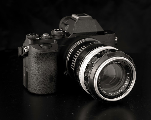
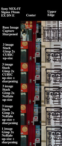
I have a well-used Sony NEX-5T that I'm not sure what to do with.  Should I sell it?  Well, yes, but there have been no buyers.

Could I convert it to monochrome?  Maybe.  What stops me is for the cost of conversion I could pick up two mint condition used Sony A7 full frame bodies.

So what to do?  I'm not yet sure.  Maybe I'll just keep the camera and keep smashing on the shutter release to see if I can't improve my "seeing."  To make a few more images.

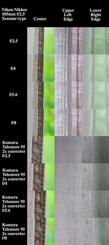
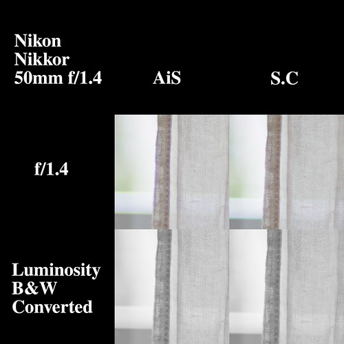
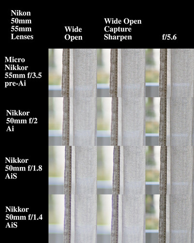
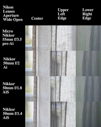
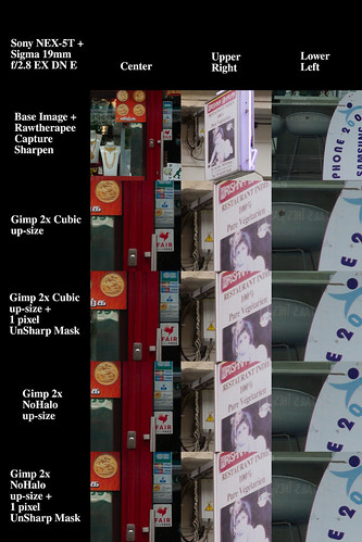
While considering my list of options, including converting the NEX-5T to dedicated monochrome, I came back across Monochrome Imaging Services website.  They have a page that illustrates resolution gains seen by converting an RGB sensor to monochrome.

They make an offer.  "Download any of the RAW files with the links below."  So I did.

Since I've written recently and in more than a few posts about Rawtherapee's "Capture Sharpen" function, I thought I would take the opportunity to see how software "sharpening" compares against native sensor resolution in monochrome.


Comparison

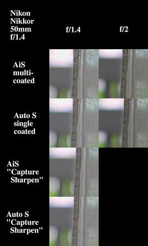
Here is the scene the Monochrome Imaging Services starts with.  I've passed it through Rawtherapee, "Auto-Matched Tone Curve", and downsized to illustrate the starting point.


Monochrome conversion ~ comparison


Now, the comparison image.

[As always, click on the image and open at 100percent to pixel-peep.  In fact, you may need to view this a 400percent to see some of the rather subtle detail differences.

Monochrome conversion ~ comparison


Comments

The monochrome converted sensor image is indeed very sharp.  Adding "Capture Sharpen" to the monochrome image seems un-needed.

Working from the color version I took into consideration two things.  

The first was to confirm how a simple de-saturation worked.  Removing the Bayer color layer of a sensor could, to my way of thinking, make a camera work a lot like a pan-chromatic film.  All color sensitivities of equal energy would give equal exposure values.  

In concept a color de-saturated to B&W image should match a monochrome converted sensor photo.  This is what I see in the comparison.  Moving to a different method of color to B&W conversion is where I see subtle value differences.

To understand B&W tonal separation, one of the things I've been exploring recently is human perception color conversion to B&W.  In this case color values are set to match how humans experience various colors in monochrome.  For instance, we "see" blue darker than we do red or green of equivalent energy levels.

With color images we have various tools to achieve tonal separation when performing a B&W transition.  We can work on images after the shutter has been released.  

Working from a monochrome converted sensor image flips the image creation process back to traditional processes.  It requires us to think ahead on which filters to apply from our old traditional B&W filters set we used when shooting film before the shutter is released.

The second thing in this comparison was to "Capture Sharpen" the color converted into B&W images to see how close I might get to the resolution of the monochrome converted sensor image.

Both de-saturated and human perception converted images experience increases in "sharpness" using "Capture Sharpen."  How close they come to matching the monochrome converted sensor output is a matter of how I "see" things.

At 400 percent image size the "Capture Sharpen" images look "crunchy" compared to the monochrome converted sensor.  The difference is subtle but, to me, clearly visible.  The monochrome converted sensor image is very smooth.

I shot film for many years and in my youth worked as a B&W print technician in Hollywood and Irvine, California.  Using this background as a reference point I feel I have a sense of how current digital compares with film

For instance, based on the size of the noise and looking at light/dark transitions, and smooth fields of color and tone I feel images from a 1inch sensor "look" and "feel" like 120 format output.  The larger APS-C sized sensor can closely match what I used to do in 4x5inch format.  Full Frame digital seems to match my old 8x10inch format output.

Completing this line of thinking and looking at the monochrome converted sensor output I feel this could be like using an old Folmer and Schwing 12x20inch view camera.

Wednesday, March 09, 2022

SuperResolution using Rawtherapee "Capture Sharpen" and Gimp Up-Rez'ing ~ Part Five ~ image stacking

Living where I do, I absolutely know much how fortunate I am to live in peace.  There is mental space and physical safety to do the things I want, like write these little amount to nothing important blog entries.  

Not everyone has this option these days.  We receive daily reminders of this fact and it's downright heartbreaking.  People are being killed for a man's out-sized sense of power, control, and entitlement.  I wish peace for everyone.

-------------------------

Some time back I wrote about trying to achieve a truer than simple up-sized sense of Super Resolution through image stacking.  The idea is to try and create a situation that emulates the little sensor wiggle super resolution function that certain Olympus, Fuji, Hasselblad, Phase One, and Sony cameras provide.  

For instance, Olympus takes a 16mpixel sensor, shifts it carefully in the X and Y directions, and builds in-camera a 40mpixel image. They are trying to add detail to an image with the goal of creating an image that equals a 40mpixel native resolution sensor.  

If we use cameras that don't have this ability, letting small camera movements during fast multiple exposures might give similar results.  If we are careful and do it right.  That's the promise, at least.

Having seen that Gimp CUBIC interpolation is actually "soft", I'm not surprised that my first super-resolution results were less than spectacular.  So with this post I would like to consider the use of NoHalo interpolation and see if it gives better results.

Reusing an image I shared in the last post, let's have a look at image stacking 2x up-rez'ing and see if we can't actually _add_ resolution to an image.  

It should be noted that no one has yet taken me up on my offer for a recommendation for some really good south Indian.  That's OK, of course.  Not everyone loves Indian food like my wife and I do.


Materials -

  • Sony NEX-5T 16mpixel camera (handheld - multiple exposures)
  • 19mm Sigma f/2.8 EX DN E lens
  • Rawtherapee "Auto Matched Tone Curve" function
  • Rawtherapee "Capture Sharpen" function
  • Hugin to align images
  • Gimp to -
    • Stack Hugin aligned images as layers
    • Set opacity levels so each layer gets equal representation
    • Upsize using -
      • CUBIC interpolation algorithm
      • NoHalo interpolation algorithm


Comparison

Here is the scene again.  I didn't put much effort into making the image as my stomach was full and the chai had me jump'n and jive'n.  The Sony NEX-5T/Sigma 19mm output is rather fine, in spite of the caffeine.


Gimp Cubic vs NoHalo up-sizing


[As always, click on the image and open at 100percent to pixel-peep.]


3 image aligned stack GImp CUBIC vs NoHalo 2x up-size


Comments -

Starting with the base "Capture Sharpen"ed image we see that it is nice and "sharp" across the entire field.  At low ISO and processed in this way this little Sony NEX-5T/Sigma 19mm f/2.8 EX DN combination is sharp.  If I can't pull a great print from this setup, I'm not trying hard enough.  They are simply glorious, these cameras and lenses.

Looking at the image stacked 2x (going from 4900 pixels on the long side to 9800 pixels) CUBIC up-rez'd images, they appear "soft" to my eyes, just as I've come to expect.  The 1 pixel UnSharp Mask doesn't look much better.  These two image sets (simple CUBIC up-rez and 1 pixel USM) look very similar to the kind of output I had in my earliest posts on the subject, too.

An image stacked 2x NoHalo interpolation up-rez, on the other hand, looks better than the 2x up-rez'd USM'd CUBIC image.  Adding a 1 pixel USM to the 2x image stacked NoHalo up-rez looks clean.  Very clean.

The question is, do these NoHalo image actually contain more information than a one image 2x NoHalo up-size?  To try and answer this I added another set of images at the bottom of the above comparison.  They are from a single exposure up-sized 2x using NoHalo interpolation.

What do I see?  There are two ways of approaching an answer.  In terms of apparent resolution the single image 2x NoHalo up-size appears to me to be "sharper" than the multiple-image stacked effort.

On the other hand, the image stacked 2x NoHalo rendition is "smooth."  The noise has been averaged out of the final composite.  This might be useful for something I'll talk about in the next post.

After all is said and done, however, I don't see it worth the effort to image stack to try and emulate the "sensor wiggle" functions some cameras come with these days.  I'm right back to thinking that if (and that's a really strong IF) I need super resolution that it's better to shoot over-lapping sections of a scene and to stitch them into a large photo.

Monday, March 07, 2022

SuperResolution using Rawtherapee "Capture Sharpen" and Gimp Up-Sizing ~ Part Four ~ a real image

Living where I do, I _know_ very much how fortunate I am to live in peace.  There is mental space and physical safety to do the things I want.  Like write these little blog entries.  Not everyone has this option these days.  I wish peace for everyone.

-------------------------

OK.  Enough background, theory, image simulations, and newspaper "tests".  It's time to see if this thing has any legs.

Let's have a look at a simple snap I made on the streets of Paris recently after lunch up in the area we call "Little India."  As an aside, if you need a recommendation for some really good south Indian dosa let me know.  I might be able to suggest a place or two.


Materials -

  • Sony NEX-5T 16mpixel camera (handheld)
  • 19mm Sigma f/2.8 EX DN E lens
  • Rawtherapee "Auto Matched Tone Curve" function
  • Rawtherapee "Capture Sharpen" function
  • Gimp to take Rawtherapee output and upsize using -
    • CUBIC interpolation algorithm
    • NoHalo interpolation algorithm


Comparison

Here is the scene.  I didn't put much effort into making the image.  My stomach was full and the chai had me jump'n and jive'n, rather than concentrating on my surroundings.  Still, I think is sufficient for the task here.


Gimp Cubic vs NoHalo up-sizing


[As always, click on the image and open at 100percent to pixel-peep.]

Gimp Cubic vs NoHalo up-sizing


Comments -

Redundantly Noted: Keep in mind that we are _not_ adding detail to an image by performing an up-size.  In this way, I feel uncomfortable talking about Up-Rez'ing an image.  Up-Sizing, yes.  Up-Rez'ing, no.  If the information isn't there in the base file, then it certainly will not be there in the up-sized image, either.  

Another Note: I realize it may sound like I'm bashing Canon sensors in the following comments.  Photography, however, is seldom just about the sensor.  Witness the incredible volume of wonderful images that are made using Canon gear.  If it were that bad, who would use it?  But it's not bad and I'm only speaking in terms of comparison.  

The first thing is that when I saw the first images out of a Sony A6000 APS-C camera some years ago, I immediately switched systems and sold all my Canon full frame and APS-C gear.  

The second thing is a comment by Brooks Jensen noting that images readers sent to be considered for publication were sharpest when Nikon gear was used.  Out of curiosity he was looking at the EXIF data to see if there were any trends, and apparently there were.

Starting with the base "Capture Sharpen"ed image we see that it is nice and "sharp" across the entire field.  At low ISO and processed in this way this little Sony NEX-5T/Sigma 19mm f/2.8 EX DN combination is sharper than any of the old Canon DSLR L-glass'd gear I used to own.  If I can't pull a fabulous print from this setup, I'm not trying hard enough.  They are simply glorious, these old cameras and lenses.

Looking at the 2x (going from 4900 pixels on the long side to 9800 pixels) CUBIC up-size'd images, they appear "soft" to my eyes.  Even the 1 pixel UnSharp Mask looks like it could be better.  This confirms my earlier thoughts.  Perhaps the Gimp's CUBIC isn't the best up-size interpolation algorithm?  Well, if it was all we had, right?, but these days we have other options.

The NoHalo interpolation algorithm, on the other hand, looks better straight out of the up-size than the USM'd CUBIC image.  Adding a 1 pixel USM to the NoHalo up-size?  Well.  Yes.  This looks rather good, doesn't it? 

The 2x up-sized NoHalo image reminds me very much of how my old Canon 5D MkII images looked in the Canon RAW viewer I used years ago.  To be redundantly repetitive, this from an APS-C NEX-5T 16 mpixel image that is 2x up-sized to 9800pixels!

Saturday, March 05, 2022

SuperResolution using Rawtherapee "Capture Sharpen" and Gimp Up-Sizing ~ Part Three ~ a "test" image

Living where I do, I _know_ very much how fortunate I am to live in peace.  There is mental space and physical safety to do the things I want.  Like write these little blog entries.  Not everyone has this option these days.  I wish peace for everyone.

-------------------------

The distance from my first post on "SuperResolution" to the present is rather long and the path is fairly twisted.  

In this latest series of posts I explore using the Gimp's new(?)/recent(?) NoHalo Image Scale up-sizing function.

Recall from Graphic Design that -

Gimp NoHalo interpolation - "...NoHalo level 1 consists of one diagonal straightening subdivision followed by bilinear interpolation..."

In my last post I looked at a black and white synthetic image and the various effects of up-sizing and UnSharp Mask sharpening.  I found that NoHalo is sharper than Cubic interpolation and had none of the artifacts that the Cubic function did.  And after applying a 1 pixel USM to the NoHalo interpolated image, things, frankly, looked quite good.

Test Image -

For this blog entry we will consider the NoHalo interpolation using my current favorite "test" target, a copy of the French Canard Enchaine newspaper.  It's a great read, if you're ever interested in French politics and all the in's and out's of what it's like to try to govern a First World nation.

To make things more "interesting" I will present two comparisons, side by side (as seen below).

The left hand image was taken using a pretty Nikon Nikkor-P 105mm f/2.5 shot wide open at f/2.5.  I felt this might be a good "test" to see how the slight softness seen wide open behaved when "Capture Sharpened" and then up-sized.

The right hand image was created using the very same lens, but this time shot at f/8.  I felt it could be interesting to see what might happened when I up-sized a demonstrably pixel-sharp base image, and even to compare this against f/2.5 images.

[As always, click on one or both of the images and open at 100percent to pixel-peep]


Super Resolution ~ Nikon Nikkor-P 105mm f/2.5 at f/2.5 Super Resolution ~ Nikon Nikkor 105mm f/2.5 at f/8


Comments -

Note: Again, keep in mind that we are _not_ adding detail to an image by performing an up-size of this kind.  You can see this by my use of the word "up-size" in place of "Up-Rez."  If the information isn't there in the base file, then it certainly will not be there in the interpolated larger image, either.  So saying any of this is found under the heading of "SuperResolution" can be mis-leading.  In general, I've found that if I _really_ need extremely high resolution that it's better to shoot overlapping scene sections and then to stitch them together into a larger image.

We can easily see that RawTherapee's "Capture Sharpen" function works the treat on a base image.  In both the f/2.5 and f/8 cases, the 100 percent pixel-peep'd base images look and feel sharper after "Capture Sharpen."  Additionally, there's not much difference between the "Capture Sharpen" base images shot at the two apertures, either.

Starting with the 1.5x linear Cubic Up-Rez'd images, the edges are slightly "soft" after the interpolation to 9000 pixels.  Then, with a 1 pixel wide UnSharp Mask applied, it appears to me as if the image "cleans up" fairly nicely and is quite usable.

With the 2x linear Cubic up-sized images we begin to see the phenomenon that started me down the path of considering other image scaling interpolation algorithms.  The edges of the transition zones look slightly "soft."  This remains true after applying a 1 pixel USM as well.  

Looking at NoHalo straight out of the interpolation step, the 2x linear up-sized image looks sharper than the Cubic Up-Rez.  This, by going from a 6,000 x 4000 pixel image (24mpixel sensor) to a 12,000 x 8,000 pixel image size.  Crazy, isn't it?

Adding a 1 pixel USM to the NoHalo up-sized image seems to help it go from looking good to looking great.  And there are no obvious artifacts.  

This is what I was looking for when I started down the path of increasing an image's file size.