Readers may already be aware of something key to understanding Black and White photography and human vision. For myself, it has taken a very long time to sort any of this out. Alas, here I am. Finally.
It is already well understood that taking a color digital image and de-saturating it creates an all too often uninteresting mess. What occurred to me is that Black and White film, too, could be a complete and utter mess. It was always a struggle to get something we called "tonal separation" between the grays.
Back in the day I understood
how a panchromatic emulsion was different from orthochromatic. And I
thought I understood how filters could be useful when shooting
panchromatic film. But, still, film took years of working with to try and get something "interesting" out of. As I say this, I'm thinking of all the "special" developer setups (Rodinol at 200:1 dilution instead of 25:1) and process methods ("semi-standing" for 30 to 45 minutes so as to "bring up" shadow details). What alchemical insanity it all was just to try and get some "tonal separation."
What took me forever to understand is that human perception has something very important to say about how we see color tones in Black and White. Tim Soret clearly illustrates the importance of understanding and using the principals of human perception in imaging. With this in mind, what I have come to learn and appreciate is that digital Black and White image quality can _exceed_ that of Black and White film.
Such a shocking realization, this.
On the other hand, I naively thought that digital in-camera Black and White image conversions were simply de-saturated color images. So I learned how to apply human perception corrections on the computer.
Recently, a friend sent me his wee-Point and Shoot Sony HX90V 30x small sensor plinkey-plinkey camera. It's kind of a fun camera, what with the long zoom range and all that. The poor dear delivers only jpgs and I quickly searched for ways to get the best out of the small setup.
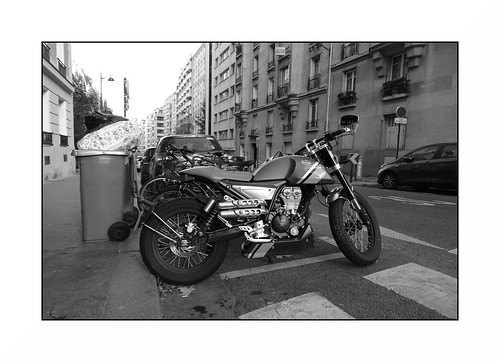
Wandering the Paris streets during our second Covid-19 confinement I made an image my friend and I thought was actually pretty nice. Fortunately, I took two shots. One in color and the second using Sony's in-camera "Black and White Style" (_not_ the High Contrast nor the Rich Tone conversions).
Straight out of the camera the Black and White "Style" image looks really nice (see the following image).
To consider what was going on I took the color version of the image and did a human perception conversion on it to compare against the out of the camera version. Guess what? They matched. Perfectly.
Confirming that Sony is, indeed, using the human perception model for their in-camera Black and White "Style" conversions, I took an A7, stacked three different colors with a bit of yellow and re-ran the comparison.
Note: The human perception model is implemented in the Open Source Software the Gimp as "Lch Color" channel and in RawTherapee as "Luminance."

How do Nikon, Canon, Fuji, Olympus, Panasonic, or perhaps rather interestingly Leica with their Black and White only bling-bling in-camera conversions work? Interested parties should have a look.
For myself I've confirmed that Sony has "hit this one out of the park!"
Here are a few more images nearly straight out of the HX90V plinkey-plinkey - One Two Three Four
No comments:
Post a Comment