Wednesday, June 28, 2017

50mm lenses - Nikon f/2, Nikon f/1.8, Sony f/1.8 SEL

Just before heading out south of town to the Bievre Photo Foire I'd read where double Gauss lens designs "draw" better than other designs.  I'm not sure what "draw" means, but I'm intrigued and want to find out.

As luck would have it, I picked up a pair of Nikon Nikkor 50mm lenses that implement the classic double Gauss design.  So I thought I'd start my investigation by looking at their resolution and compare them to my now standard reference, a Sigma 30mm f/2.8 EX DN E, as well as the beautiful Sony 50mm f/1.8 SEL OSS (APS-C only).

The Nikon lenses in question are Nikkor 50mm f/2 H pre-Ai and Nikkor f/1.8 Ai-S.  These are inexpensive and commonly available. 

While I had them out I though I'd also see how they behaved when combined with a Zhongyi Lens Turbo II focal reducer adapter.  

Here is the nice, boring, but richly detailed 2D (ie: flat) comparison setup.


Nikon 50mm Double Gauss comparison


Camera setup -

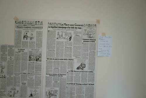
  • Some pages out of a recent mailing from a local newspaper taped to the bedroom wall
  • Sony A6000 set to "A", 100 ISO, 2second delay
  • Massive Manfrotto tripod
  • No sharpening applied to the RAW output

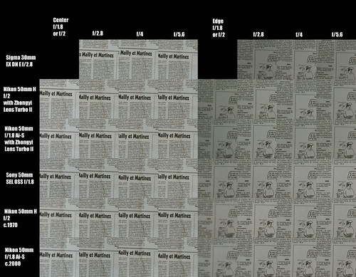
Here are the comparisons.  Look at this image at full resolution to note differences between the various elements.


Nikon 50mm Double Gauss comparison

My observations are that the Nikkor 50mm f/1.8 Ai-S is a very fine optic.  It's just a touch softer wide open than it's older sister, the 50mm f/2 H pre-Ai.  The f/1.8 lens is sharp to the edges, which means it has a very flat field, just like the Sigma 30mm f/2.8 EX DN E.

The Nikkor 50mm f/2 H pre-Ai is very slightly sharper wide open than it's younger sister.  The edges never really match the other lenses compared here, but this might be due to field curvature.  As we've seen with the copy of the Sony 16mm f/2.8 SEL I've looked at, field curvature can play an important role in how a sharp a scene appears at the edges.

The Sony 50mm f/1.8 SEL OSS (APS-C only) is a very nice optic.  I can see why people like this lens.  It's sharp from wide open, offers AF and OSS (image stabilization), and while we can't see it here, wonderful out of focus rendition at all apertures.

There you have it: Two inexpensive lenses what perform rather well from wide open, with or without the Zhongyi Lens Turbo II focal reducer.

Wednesday, June 14, 2017

Portraiture ~ Art Logic

I debated writing more about the art of portraiture.  In the back of my mind there was something that begged to be said, so here are a few additional thoughts on the topic.

In the original blog entry on Artistic Considerations I said "Viewing Position is, perhaps, the most important feature of any portrait you will ever make.  What I mean by this is you must make a conscious decision as to exactly where you place the lens with respect to your subject. "

I found that over my 50 years of taking pictures of people that I completely ignored the importance of making a conscious decision as to exactly where to place the lens with respect to my subject.  Simply said, I would stand in front of my subject and snap the shutter.  Where the lens was placed was quite often at eye level.  That is, the lens was placed at the level of my eyes and I would frame the subject from this point of reference.

There are a couple problems with taking this approach.  One of the more obvious problems is that to take a photo from the subject's waist to the top of their head, the lens needed to be pointed down.  This causes what we call keystone distortion.  The waist of the subject is narrower than if you looked at the subject from a position that does not introduce image distortions.

A second, perhaps more subtle, problem is that the power of the subject photographed at eye level never matches the power of the portraits of the Old Masters.  Where the artist views his subject from (ie: at which height) is a key difference between a painting (or photograph) and the thing we call art.  It's an effect of psychology and if you are a serious artist or craftsperson you need to be fully aware of it. 

The prior paragraph is a complex one and is filled with important truths.  It might take time to work out exactly what I mean.  It took me 50 years, so don't worry.  Here are three ways illustrations that might help.

"Selfies", at one extreme, tend to be filled with image distortions which are direct consequences of where the lens is placed in relation to the subject.  Cell phones tend to be placed at or above the subject's eye level and the torso and waistline are heavily keystoned.   If the lens is too close to the subject, features such as the nose and lips take on a certain distorting prominence. 

Fashion photography is another extreme example.  I remember reading an interview with Francesco Scavullo where he said he loved photographing models full length at floor level, or sometimes from inside an orchestra pit as a means of making their legs appear longer than they are in real life.  Optical distortions, for him, were a stock and trade item.

One more example of what I'm referring to when I say it's important to consciously place the lens with respect to your subject can be seen in Hollywood movie posters.  Action films, in particular, try to convey as sense of motion, purpose, and power.  Photographs of actors and actresses in these kinds of posters and promotional materials are seemingly never photographed at eye level nor from the position an Old Master would have chosen.  Comic book or graphic novel based movies tend to photograph their subjects at near fashion points of view.

Once recognized and understood you can now quickly sort through images (painting or photographs, it doesn't matter) and recognize Masterworks by where the subject was viewed from at the time the artifact was created.  This shouldn't be confused with where a portrait is placed on the wall (painting or print) or on display.  What I'm talking about is where the artist or craftsperson (at which height) viewed the subject.

There are two photographers who have photographed from an Old Masters points of view.  The first photographer might not have intentionally placed his lens where he did.  He might have stumbled onto this effect by using cameras that he looked down into the viewfinder (such as Rolleiflex or Hasselblad).  Still, Robert Mapplethorpe's portraiture is well known and well received.  Look carefully at what height he placed the lens.

The second photographer who I feel embodies the spirit of the Old Masters is Joel Grimes.  In at least one of his YouTube videos he very briefly talks about why he places the lens where he does.  He is the first photographer I've listened to who consciously places his objective exactly where he wants it.  It's not a haphazard "artistic", "feeling", "emotional" decision.  Yet his work can invoke strong emotional responses.

Understanding what we do as artists and applying appropriate solutions is, to me, always the preferable starting point.  If you want to make beautiful portraits or if you want to be an iconoclast and "break the rules" of art in pursuit of your own fame and fortune, perhaps it would help to fully understand what the rules are.

I hope this series of blog entries on portraiture has been helpful.

Sœur Vampire ~ Paris

Friday, June 02, 2017

Portraiture ~ Lighting Logic

Continuing my series on portraiture and the logic behind the set of instructions I'm sharing, we will now turn our attention to lighting.  For each detail I will try to provide a short explanation of it's importance.

Ninja ~ out of the Age of Steam

Camera Setup - 
  • Set the Exposure by using 
    • Manual Mode (typically "M" on most cameras)
    • 1/125th of a second for the shutter speed
    • f/5.6 or f/8 for the aperture
    • 100 for the ISO (or whichever is the lowest sensor sensitivity your camera offers)
    • Daylight for the White Balance
Manual Mode is selected because we need to bypass the in-camera metering system.  In fact, we want the flash to provide enough power that it itself determines the exposure.  Said another way, we should have enough light from the flash to make the impact of ambient light on our scene irrelevant.

1/125th of a second shutter speed is selected because many imaging devices come with a shutter curtain (physical or electronic) and the flash sync speed is typically 1/160th of a second.  Some systems will do better than this, but many flash/camera setups require additional setup and management to achieve the higher sync speeds.  In my experience, there is nothing to be gained.

I recommend setting the lens aperture to f/5.6 or f/8 as these apertures will accomplish two things.  First, when you subjects eyes are in focus, the depth of field at these apertures will get the nose to the back edge of the head in focus.  With this technique we are not trying to achieve the currently trendy limited depth of field kind of scene.  We want the full Rembrandt/Titian/Rubens/Lebrun painters portraiture details.

Secondly, using f/5.6 or f/8 will ensure that even if you are using the cheap kit lens that comes with many cameras, you will have eliminated the worst of the chromatic aberrations and gone beyond the apertures where spherical aberrations might be influential.  In short, these apertures will be the sharpest apertures your lens can operate at.  If things are too sharp for your artistic sensibilities, you can always soften the scene during image processing later.

I recommend you set the lowest ISO your camera is capable of because that is typically where your image will experience the least sensor noise and the greatest highlight and shadow details.  Keep in mind that as the ISO increases the dynamic range of your imaging system narrows and you will lose highlight and shadow details.

And lastly, I strongly suggest you set your white balance to Daylight.  Many imaging systems come with a Flash white balance option, but there's a problem when using an off-camera flash.  In my many experiences in using a broad variety of systems, skin tones are rendered too red when setting the White Balance to Flash.  Yet when White Balance is set to Daylight, skin tones are correctly rendered with every system I've ever tried.  Strange, perhaps, but true.


Set the Exposure -

By using the in-camera histogram to help set the flash intensity, you can ensure there is enough detail in the highlights and shadows.  We don't want either end "clipped" because that means we would have no information to work with during image processing later.

In the end and when you're all done processing an image you might want one end or the other of the exposure range "clipped", but it's best to begin with a file filled with detail because you might just as easily change your mind and want to use the information in those areas after the shoot.  The goal in setting the exposure correctly is flexibility.  Flexibility allows you a broader range of image processing choices.


Lighting Setup #1 -

This lighting setup is mimics Japanese woodcut "lighting."  It's known as Notan light.  William Mortensen and Robert Balcomb used this kind of light for many of their portraits.  The details of the subject are revealed and nothing is hidden.  It perfectly describes the subject.  I like about this kind of light because viewers don't know where the light is "coming from."

It is very good for portraiture where the subject is not in motion (real nor implied).  I like using this kind of light as it is soft, subtle, and lends the subject an air of substance, reality and truth.  
    Lighting Setup #2 -

    This lighting setup is what we commonly see in magazines and fashion work.  We know this kind of light as "chiaroscuro", or cross-lighting.  It's the classic light of certain periods of Italian painting.

    Cross-lighting for portraiture is expected.  It can reveal the shape and some of the depth of a subject.  Many photographers think of this as "Rembrandt light", or light that appears to spill onto one side of the subject as if through a window.  This setup is the one that will give you that "triangle" of light on the cheek on the off-side of your subject.

    Lighting setup choice -

    I've been giving this, perhaps, far too much thought and here is what I've come to.

    I've found it very interesting to see which kind of light has been used in which situation by looking at the works of the Old Masters.

    As an exercise to help us decide which kind of light to use, let's take a look at a few pieces of art.  Closely observe the following paintings and try to determine where the light is coming from and which light setup you would use to recreate that effect.  Ready?  Here we go -

    • Leonardo da Vinci - Mona Lisa (aka: la Joconde)
    • Titian - any of his portraits
    • Rubens - any of his portraits
    • Vigee Lebrun - any of her portraits
    • Auguste Renoir - any of his portraits
    Do you see a pattern here?  Which light do you think was used for all of this fabulous, timeless, portraiture?

    What about these artists?  Which kind of light did they use?  What was their subject?  How do these make you feel?
    • Gerard van Honthorst - almost anything he did (with a few exceptions)
    • Rembrandt's Nightwatch
    • Caravaggio - Supper at Emmaus,  Calling of Saint Matthew, Incredulity of Saint Thomas, etc.
    • Trophome Bigot - Allegory of Vanity
    • Gerard van Honthorst - Supper With The Minstrel And His Lute
    While the history of art and painting might not be quite as simple as I make it out to be (though it really does look like it could very well be), it comes down to considering just these two approaches.  You needn't rely on me to suggest how things are.  Walk the galleries of any museum in the western world and test this for yourself.  Here is how I see the effect of lighting for use in photography.

    Lighting Setup #1 (Japanese woodcut/Notan) is a calm, pleasant, elegant light.

    Lighting Setup #2 (Chiaroscuro) is a dynamic, active, dramatic light.


    In the next post on the logic behind my portraiture instructions I would like to talk about the art of portraiture.