Thursday, December 24, 2015

Sony SEL kit 18-55mm, Sony SEL 16mm f/2.8, Sigma 19mm f/2.8 EX DN - Comparison

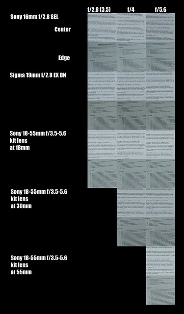
I've read where the first Sony APS-C mirrorless kit lens is pretty bad.  Of course I own one.  It came with one of the first NEX5 cameras I bought.  The other NEX5 came with a 16mm f/2.8 SEL, which is also known to be a poor optic.

After a recent comparison between the Sigma 19mm and Sony 16mm, I started to wonder whether field curvature might be the culprit behind the seemingly poor corner performance.  The comparison image on my Flickr pages has recently seen a dramatic rise in viewer volume, so I'd better get this right.

In the past couple years I've acquired a Sony APS-C mirrorless that comes with software that corrects for optical performance issues (chromatic aberrations, distortions).  I wanted to see if the new software could "clean up" some of the 18-55 kit lens issues, as well as to take a closer look at the Sony 16mm to see if it really is field curvature that's the source of problems for that little pancake optic.

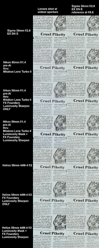
My standard references for image quality has become the Sigma EX DN E/Art lenses.  I own one of each and they are simply the finest optics I've ever owned, regardless of who's name is on the front ring.  After watching a recent interview with Sigma's CEO I'm even more impressed by what they've been able to achieve in the marketplace and hope they come out with more lenses for the Sony mirrorless cameras.  As a company they are certainly passionate about what they're doing and seem to understand customer desires and needs.


Comparison setup -

  • Some pages out of a recent mailing form our Anglophone group taped to the bedroom wall
  • Sony A6000 set to "A", 100ISO, 2second delay, +1EV
  • Massive Manfrotto tripod
  • Sony 16mm f/2.8 SEL - manual focused first in the center, then focused for a second photo at the extreme edge
  • Sony 18-55mm f/3.5-5.6 SEL OSS (turned off due to the use of the tripod), compared at 18mm, 30mm, and 55mm

Sony Sigma Lens Comparison

Comments -

The Sony SEL 16mm f/2.8 pancake optic I own is just OK wide open at both the center and edge.  Stopping down improves the image quality to quite nearly match the Sigma 19mm f/2.8 EX DN I also own.  By f/5.6 the 16mm Sony lens performs very adequately, indeed.  The lesson to me is that this lens _does_ exhibit field curvature.  If I'm going to photograph a wall (I don't), this is not the lens to use (the Sigma is).  In the "real world", the 16mm SEL is just fine.  All I need to do is to stop that thing down to f/5.6 (or f/8 - though that's not shown here) and let 'er rip.

The Sony SEL 18-55mm kit lens has rather strange performance.  The center of the image is really only good at f/5.6 (and f/8 - though that's not shown here).  The edges?  Well, at the short end of the zoom range image cleans up pretty well, though it's not as good as the Sigma.  At 55mm the lens exhibits rather unexpected softness in the extreme corners at f/5.6.  It's awful, in fact, even as the center is really quite sharp.  

The Sigma 19mm f/2.8 EX DN E is simply perfect.  No lens from no manufacturer will show better performance at any price than this 100Euro (used mint) lens.  Yes.  I want more small, light, utterly sharp Sigma lenses to play with.

From working with the Sony 18-55mm kit lens for 5 years (at this point) I know I can clean up an image pretty well using a bit of smart sharpening, so it's not as bad as all this might indicate.   If your goal is to make a fine image, this lens will do the job.

Still, for nearly everything I do these days in these focal length ranges, the Sigma and old manual focus Nikon lenses are my optics of choice. 

Sunday, November 08, 2015

2015 Salon de la Photo - Part Two - Images over Equipment

In Part One of  2015 Salon de la Photo I ranted and raved and swung a bat over various camera and lens systems.  I was in a very cranky mood.  


Shocking as it may seem to some people, photography is more than selecting, collecting, and talking about equipment.  As we all could/should know, the reason for all this gear is to be able to make images.

Fortunately, the Salon de la Photo was (barely?) more than just a trade show.  This year there were a couple areas devoted to the works of well known artists.


Near the entrance to the show was an exhibition of mid to late 20th century images.  All were printed in black and white to silver paper.  The imaging themes were various.  I could see that there was a certain aesthetic that I could clearly identify as being a Japanese view of the world.  I felt that some of the images "worked" well and I enjoyed seeing them.

Toward the back of the building was a second show.  This consisted of a small show of somewhat large, again, black and white silver-based prints.  A quick look confirmed for me that the street photographer was American and I could see a classic New York point of view being expressed.  I'm not sure I enjoyed what I saw.  Perhaps it was too familiar.


Nearby were several booths devoted to the works of photographers who purchased space to hang, show, and sell their images.  Browsing this area revealed to me a certain European aesthetic.  The "look", regardless of the subject or theme, felt stark and somewhat remote.  This was capped by a long wall filled with images of naked women holding strategically placed bloody organs and entrails of farm animals.  I wondered why an artist would trade purely on shock value?  Where would a person hang such images?  On the living room wall??  Certainly not in my house.

Considering current imaging practice there were at least two areas in the middle of the show which caught my attention.  They contained large prints of yet again black and white landscapes and portraits.  The processing seemed to have made liberal use of Hipstamatic's Wetplate app.  The effect wasn't bad, actually.  I really enjoyed some of the portraits.  But more than anything else I could see where cell phone image capture and processing has already taken over enormous areas of imaging responsibilities from traditional approaches.


And you would you like to know something?  The large prints made from what were likely 8 mpixel cell phone cameras were very fine, indeed.  Shocking, isn't it?  But that's the truth.  Apple and Google (Android) have done a phenomenal job at taking the place of traditional imaging tools manufacturers.  Sure, Canon and Nikon will try to sell you on "flexibility" and "image quality".  But so what?  Very few of us ever shoot sporting events nor wildlife which might require long, big, expensive, large apertured optics.  I could clearly see there is no need for such lavish tools when something so small, so light, and so readily available can do the task for Us Mere Mortals.  I can easily see why Sony's QX series, Olympus' similar product, and DxO Mark's new device are starting to attract users.

I compared my visual experiences between the traditional and the current digital.  The earlier silver-based black and white images have a certain "feel" to them.  I feel in the highest expression of the art, prints can give a scene a "creamy" somewhat soft "look."  Images like these elicit a "warm" feeling from me, regardless of the subject, content, or theme.  Even many of St. Ansel's stark, cold, carefully controlled contrasty print style can have a certain "warmth."


Current digital print technique is far more flexible than the old silver-paper process.  Digital can easily match black and white film-based imaging "warmth".  It should be obvious there are a broad range of print papers and surface textures to choose from.  Then there are the high definition book publishing (with image qualities indistinguishable from an "original" print) and network based distribution and sharing options.  Each can way of sharing an image can lead a sensitive viewer in whatever direction the artist desires.  All of which puts ever greater pressure on an artist.

Gone are the days when commercially available materials and tools narrowly defined the limits of what was possible.  The Great Yellow Father (Kodak), Fuji Film, Agfa, and Ansco no longer set the limits of image capture and print making.  Viewers are no longer constrained to poor reproduction quality books, nor are they required to visit a small number of galleries to see an original high quality print.  


With an infinite variety of digital image processing outcomes, and a wide range of image print and networked distribution options, current practitioners of the photographic arts might feel a little overwhelmed.  An artist needs a clear idea of what they want to accomplish, otherwise image making can quickly become a struggle and can be a "hit or miss" visual expression (that is, some images are "better" than others and the artist might not understand why).

Wandering the large show at Salon de la Photo, Paris left me with a better understanding of why so many "photographers" concentrate their time and energies on the tools and materials.  It seems easier to talk about tools and materials capabilities as doing do sets boundaries and limits.  A person can get lost talking about the minutia of this setting or that ISO or another lens.  It probably feels "safe" to think materials and tools providers "will take care of them" by setting limits and boundaries that could induce a feeling of comfort, knowledge, and artistic competence.  


I would like to consider the topic a little deeper in my own work.  To feel a little more fulfilled as an artist I'd like to try to see the art and craft from other perspectives than from the point of view of a commercially driven trade show.

Given such vast imaging capabilities and possibilities, where might be the words that express what is creatively possible? 

Even as it's too easy to place our faith in providers of tools and materials, how do we find a way to place faith in ourselves as artists?

Friday, November 06, 2015

2015 Salon de la Photo - Part One - Cameras and Lenses

Wherein I Pontificate in a most Pontificative Manner.  That is to say, here in image and word are my Rather Highly Opinionated views of the 2015 Salon de la Photo, Paris.

Warning: I'm more than a little cranky.

Leica


Great toys for those with money to burn and a need to impress The Great Unknowing Unwashed.

But why?  Because Leica can sell enough to keep production lines open?  Because the world economy is doing well enough that Every Man can dream of owning one and there are enough Hedge Fund Thieves and an enormous emerging Chinese Upper Class?  I can't understand what they're doing outside the context of wealth doing what wealth does.

Maybe it's the price one pays for Bragging Rights.  But to brag over what?    Images coming from these devices are virtually indistinguishable from any other imaging device.  Seriously.  Look anywhere in the world at any image and tell me "... now _that_ was made with a Leica..."  You can't.  So there.

Sigma

Sigma makes some very nice optics and sells them for nearly reasonable prices.  It was good to see my old 300-800mm f/5.6 EX HSM.  I miss that old lens, but it was impractical to use here in France.  It's long, big, and heavy.  Yet I dream of the days when I photographed Bufflehead ducks on the run.  For those dreams I've picked up a smaller and nearly as long Bigron 150-600mm SP, so life isn't all woe and pain.


Sigma had their new 24mm f/1.4 Art lens on display.  It looks like the other lenses in the family of Art optics for DSLRs.  It's big, heavy, and sharp (from what other people report).  If I could put up with the mass and size of a DSLR, one of each of Sigma's Art lenses could do the trick.


As if to prove Sigma can keep up with other players in the lens market in terms of size, weight, and Other Insanity, the team showed off their ever popular 200-500mm f/2.8 Monster.  Yep.  Just what one needs... um... when?  I have no idea, when.  Huh.  Silly, this.  Just because you can, does it mean you should?  [see Zeiss in the following section]


Zeiss


Et voila!  More True Insanity.  You can't see it here, but this lens is nearly the size of a small child.  Zeiss seems to be showing they can build the Very Best lenses commercially available.  Still, this is ludicrous.  I suspect the Very Well Heeled will be the only folks ever to buy these.  The question is, will they ever use them?  As I said, just because you can, does it mean you should?

To balance this snarky attack, I was happy to see Zeiss is still capable of building small if not still expensive lenses in various sizes and shapes.  While one must come from the Rather Well Heeled Upper Classes to be able to buy them, at least a few aforementioned persons can carry them somewhere.  This means those lenses stand a chance of actually being used to, well, photograph something.

Panasonic

It's interesting to me that Panasonic and Olympus have selected the same spec sensor, a micro 4/3rds.  It's even more interesting to me just how different the two manufacturers have approached the same format.  Panasonic feels to me much more like a video than a stills imaging company.  Their GX7 and GX8 cameras feel larger and heavier in the hand than a Canon SL1/100D DSLR.

I also checked out Panasonic's FZ300 and FZ1000 "bridge" superzoom cameras.  [shaking my head]  What's going on?  These things are as big and heavy as any of Nikon or Canon's entry-level DSLR.   Why would a person buy a "bridge" camera when the flexibility of lens interchangeability of a DSLR package is no heavier nor larger?  What's the differentiation/market placement story?  Price?  Nope.  Size/weight?  Nope.  Flexibility?  Tough call.  Bizarre, me-thinks.


Fuji

Back when men were men and cameras used film, Fuji was a great film manufacturer and offered sometimes interesting cameras in which to load their great film.  Fast forward to the Digital Era and it seems as if Fuji's old camera tooling have been pulled out of mothballs and pressed into further use.  The sizes of their cameras and lenses really haven't changed in, what?, 40 years.  From what I read, their sensors haven't changed all that much, either.

So, what do we have in Fuji?  Well, if you're an Old Fart like me, then these devices can seem familiar and I'll bet you'll know instantly how to use one.

In fact, if I didn't mind the Old Film Era camera size and if I could only own one camera for, say, the next 5 years, I might be tempted by Fuji's X100T.  But only as long as I could have the two focal length converters on offer as well.  The shutter is silent and the flash sync speed goes to the moon, which can come in handy when shooting in full, er, sun.

Canon

Where to begin?  What is the company willing to do to enter into a new century?  When are they going to wake up?  Yes, the 20D, and 5D MkII were ground breaking devices in the way they opened markets and wallets and enabled image making creativity, but times change.

Take the SL1/100D, for instance.  Indeed, it's the smallest DSLR currently available.  But that's it.  No WiFi.  No GPS (for those who don't mind the NSA and Apple tracking them).  No swivel LCD display.  No top of industry sensor (it relies on a rapidly aging-fab 18mpixel APS-C).  Why would anyone want one when they could have something at similar prices that give broader capabilities?

It was fascinating to see all the "Pros" walking the show with their "Pro" badges on lanyards around the neck and Canon 5DSR + battery grip + 24-70 f/2.8 L-glass slung over the shoulder.  When they set them on a countertop to talk "shop" with makers of smaller, more capable cameras it was obvious Canon is selling to dinosaurs.  Sure, there are a LOT of dinosaurs out there.  Yet in two years I doubt Canon will be the Pro Camera of Choice.

Sony

Everyone was swooning over Sony's new A7rII Super Toy.  It's nice.  It's feature packed.  It's heavy.  It felt like picking up a semi-pro camera from Nikon or Canon.  Where is the mirrorless size/weight advantage?  And don't give me that "big hands" argument requiring big cameras.  That's _not_ what the Mirrorless Revolution was about.  I find this camera just plain silly heavy.

I took a moment to check out Sony's RX10II "bridge" camera.  As with Panasonic's product offerings in this space I'm gob-smacked.  The camera is huge and rather heavy.  An entry-level DSLR...  um... I've already covered what I feel about that (see "Panasonic" above).


By contrast, Sony's RX1 is an absolute jewel of a photographic imaging device.  It's nice and small.  It's powerful.  It's feature packed.  The new version even comes with EVF built in.  Yes, it has a fixed focal length lens, but how many lenses do you really want and need?  Yes, it's expensive.  Um, and that's why I can't have one.  I have to put this one on the lower end of Pure Camera Bling.  It's on the same scale where I put Leica (with those German devices much nearer the upper end of the Camera As Bling Insanity).

Olympus

Lovely little cameras, these.  Like Fuji, Olympus seems to have dusted off their old film camera tooling when they started making these.  But in the case of Olympus, they started out with small cameras in the first place and their modern image makers remain pleasantly small and comfortable in the hand.


Last year Olympus announced a wonderful looking little lens.  It's an f/2.8 zoom that would be interesting when coupled to their 1.4x teleconverter.  The setup is small for this kind of telephoto magnification.  I'd be tempted if I wasn't already heavily invested in my Sony gear.


IMNSHO, Olympus offers wonderful gear for making stills images.  While I'm sure their video capabilities are more than adequate, it's their Old Time film camera feel that seem "right."   They're smaller than Fuji and not much larger than the Masters of Small Sony APS-C NEX.  Olympus has put an impressive level of technology into a small and supremely capable package.  If you're truly an Old Fart and want film-camera era "feel" to your gear, these guys seem to do the job the way the Photographic Gods meant it to be.

Conclusions

It's obvious that consumers of imaging/video products have many many wonderful products to choose from.  The manufacturers are doing their best to get you to separate you from you money in exchange for a nice camera and lens.  Competition is sharp.  Any of these devices is quite capable of helping a photographer achieve very high levels of image quality.

One way at looking at choosing a new imaging tool is to decide if you want a camera from a traditional gear manufacturer or if you prefer the networking interconnect capabilities provided by electronics suppliers.  I can see where Old Farts (like myself) could take the first approach and where newer generations of folks could feel more comfortable with something from an electronics company.

In this vein, I think traditionalists could be very very happy with something from Olympus.  If they don't mind a slightly larger package, Fuji makes some great things.  Watching how images are consumed leads me to believe that Canon and Nikon's pools of "pro" consumers backed by Big Wads of money for Big Telephotos with Big Apertures are living on borrowed time (even as they're loosing their high paying photography jobs at a horrific pace).

For those who grew up on electronics (or in my case, helped develop the tech in the first place), gear from someone like Sony could be a safe bet for stepping further down the road into a well networked high image quality future.  Like so many people I'm working with little APS-C mirrorless cameras to capture something, WiFi it to a tablet, process it, and then upload it directly to the 'net.  This, as far as I can see, is where image making "lives."  Present, not future, tense.

Thursday, October 29, 2015

Sign of Insanity?

In my last post I mentioned having too many 85mm lenses.  What I didn't mention is that two of them had problems of one kind or another.  One had oil on the aperture blades which were only was reliable wide open (that is, completely out of the line of light, as it were).  The other's focusing mechanism sounded like it was an old straight cut tooth gearbox grinding itself to death.


After watching a few lens disassembly videos over on YouTube I realized these problems weren't really all that hard to correct.  I just needed to pick up a couple tools from the local bricolage (hardware store in this part of the world).

The aperture blade cleaning cleansing operation took 30mins from start to finish.  The Nikon 85mm f/2 Ai is now fully operational.  Happiness ensued just before lunch.


Lunch consisted of a salad, bread, figs, and chocolate.  This was good armament for the next task.

Field stripping an old Nikon 85mm f/1.8 K is rather different than working on a newer model optic.   I was a little surprised at the suddeness of seeing a whole heavy collection of glass resting in my hand.  All I'd done is remove the forward retaining ring.  That was all.  I was concerned, but still I was able to quickly sort things out.

Once inside the focusing mechanism I could see the lens had spent far too much time at the beach.  Sand was working it's way into the threads.  Ack!  Out came the denatured alcohol and the Q-tips.  An hour later everything was put to right and the lens was reassembled.


I pursued Nikon's early 85mm design "H" and "K" (same optical formula) because they behave very similarly to the Helios 40 Russian lenses in the treatment of the out of focus areas.  That is, they all "look" very similar to the 1800's Petzval lenses.  Yes, this has been all the rage, recently.  Which is, no doubt, why I felt I needed to "check it out" for myself.  OK.  Call me a Fad Follower.  ;-)

I really enjoy fixing mechanical things like this and today was particularly successful.  I now have three fully functional toys of, well, all the very same focal length.  What to do?  Until I figure that out, it's a champagne kind of night, me-thinks.  It's time to celebrate.


Saturday, October 24, 2015

Yet another lens comparison... 50 to 85 millimeters...

I can't help myself.  Really.  I can't.  I should probably seek help.

I found a very very nice Nikon Nikkor 85mm f/1.8 K multi-coated c.1977 optic.  Legion are the comments by people who claim this is the most amazing 85mm Nikkor ever made.  The claim is that the sharpness is incredible.  It's supposed to be superior to modern glass, according to some pundits.

When we returned to the US to clear out our storage unit I picked up an earlier single coated "H" version of the lens.  The one I picked up is much sharper then the first copy I owned some years ago., and it's resolution is very similar to the Nikon 85mm f/2 Ai and Pentax 85mm f/1.9 Takumar (which I sadly sold).

I was, therefore, interested in seeing how the God of Gods (the "K" version of the Nikkor) behaved.  If the talking heads were right, the "K" lens would demonstrate optical qualities "to die for".

And while I was at it, why not take Yet Another Comparative Look at a few 50mm lenses, too?

Using a Sony A6000 mounted to a very stout tripod with the shutter released on a 2 second timer, here is a list of the lenses I compared ->

  • Sigma 60mm f/2.8 Art DN - this acted as my "control", since it's perfect from wide open
  • Nikon 85mm f/1.8 "K" - the new multi-coated c.1977 toy
  • Nikon 85mm f/1.8 "H" - the old single coated c. 1971 toy
  • Nikon 50mm f/1.8 E - a 25Euro lens I picked up at the Bievre photoswap this year
  • Nikon 50mm f/1.4 pre-Ai - I've had this forever and wish I'd sold it and kept the 50mm f/1.2
  • Helios 58mm f/2 44M-4 - a 24Euro lens I picked up a couple years ago
  • Sony 55-210 SEL OSS - a cheap compact zoom I picked up at Bievre this year, too


Take a look at the comparison at 100% resolution to more clearly see subtle and not so subtle differences between all this glass.


50 to 85mm Lens Comparison

Findings -

  • With old manual focus glass, stopping down one stop brilliantly clears up the center of a scene.  Even the cheapest lenses perform very well stopped down one click from wide open.
  • Modern AF glass (Sigma, Sony) can be wonderously glorious from wide open.
  • The focal reducer I own (Zonghyi Lens Turbo II) introduces rather obvious focus shift as I stop lenses down from wide open.  The lesson is to focus at the aperture setting I shoot at when using the Lens Turbo II.
  • The biggest differences between the various lenses is how quickly, or not, the edges of a scene clean up as I stopped the lenses down.
  • Optical performance neither degrades nor improves with the use of a focal reducer.
I like debunking myth and legend by direct comparisons.  This leaves little room for interpretation.  Either something is clear superior to something else, or it's not.  So what do I feel I've debunk?  Two things, actually.

First, I was led to believe the "K" lens was a Gift from the Gods.  I read this on many sites after doing a little research using the Force (Google).  Reviewing my results here the Nikon Nikkor 85mm f/1.8 K Ai is not demonstrably "better" than other not so legendary lenses.  Yes, it's good, but it's not that good.  Just look at the Sigma and Sony cheap zoom performance and you may see what I mean.

Second, claims are often made that focal reducers can improve resolution by shrinking the area of coverage (in this case going from full frame coverage to APS-C).  People think it's logical that when you shrink optical coverage that resolution would increase (in this case by 1.5x), but that is not how optical physics work.  Look at the 85mm "K" lens comparison between the Zonghyi Lens Turbo II and the lens mounted on an adapter that comes without focal reducing optics.

Yes, I need another project to take my mind off such silliness.  Lenses are lenses.  It's hard to find a bad one in the bunch.

Don't believe everything you read on the 'net, no matter how "right" nor how "good" something might feel.  Do your own comparisons and you might see that reality is a bit different than all that.

Sunday, October 11, 2015

Ever onward...

OK.  Don't say you've not been warned.  Things may change.  Again.

Here's an interesting idea for integrating multiple optics, multiple sensors, and software to create a flexible very high resolution imaging solution in a very small space.

What got my attention was their article that predicts the death of DSLRs by 2025.  While such statements are easy to make from the point of view of the adoption of mirrorless cameras, I think it's possible that both camera styles could very well go out of style if this new device catches on.

Of course it'll be fun to see if these guys actually succeed or if their product fails to capture the minds and hearts of image-makers.


Zombie Walk ~ Paris ~ 2015

Sunday, September 27, 2015

Coming attractions...

So... what to do in the coming months?  Here are a few ideas -

  • DONE - 3 October, 2015 - Paris Zombie Walk - Looking for people with bits falling off in the most ghastly manner possible?  Then this will be the place to be!  If the weather holds I'll likely try my hand at erecting a backdrop and posing the recent near dead in front of le fond.
  • DONE 5-9 November, 2015 - Salon de la Photo - Looking to fondle and touch camera gear and maybe see a few good images or buy some new piece of kit?  This is a huge trade show and all the big photo-companies have their wares on display.  I bought my lovely Sony A6000 at this show last year.  Seriously, all the tasty stuff is here.
  • DONE 27-29 November, 2015 - Vingerons Independent - Looking for a good time or to get lost sampling wine from over 1,100!!! independent producers?  Looking for a reason to walk funny after a few hours of sampling the goods, as it were?  Looking to stock up the cave for the winter? Besides, you _know_ you need help processing those images and the Gift of Bacchus could be just the new "app" you need to "enhance" your sense of creativity.
  • 10 January, 2016 - la traversee de Paris - Old cars.  Old motorcycles.  700+ vehicles running the streets of Paris.  Free.  Liberated.  Fun.  Fun.  Fun.  This will be the winter edition and the past three years have been surprisingly dry, if not a little cold.  I hope by saying this I don't jinx the next year's event.
  • 3-7 February, 2016 - Retromobile - Old cars.  Old motorcycles.  LOTS of photo-opportunities. I've visited this place every year since moving here.  It's just wonderful.
  • 7 February, 2016 - Carnival Parade - Paris is trying to revive it's ancient tradition of celebrating Mardi Gras.  Last year the best groups were from the Americas and boy did they put on a show!
  • 6 March, 2016 - Fetes de Femmes - I missed this event last year.  Can't remember why.  But... women and men show up dressed as a queen.  It sounds like fun.  We'll have to see... er... wait.  Hold on.  I'll be away for the month of March.  Something about needing to replenish our supply of porto.  Damn!  Well, a person needs to do what a person needs to do, right?  Good luck.  Have a great time.  

That is all.

Gods and Goddesses ~ Louvre
This is a rather odd position
to be giving a loved one a
scalp massage, isn't it?

Sunday, September 20, 2015

Textures...

Sometimes an image making theme just shows up all on it's own.  There's nothing I can do when this happens, or so it seems.

Saint Vincent - Paris

This week saw my wife and I on an early metro headed north so she could make an appointment she'd made well before the summer heat had hit us hard.  It was now Fall cool. I tagged along as we enjoy each others company.  Packing my super cheap super small super light camera and lens I wandered off to find something interesting to do.  Inevitably this lead me to a cemetery.

I can spend hours wandering around a good cemetery.  Europe seems to be filled with them so I'm well entertained.  They tend to be quiet and unvisited by tourists and the place I found myself in was just steps away from one of the most tourist crowded places on Planet Earth.  Yet, there I was, all alone with a few feral cats, a couple of squawking crows, and a commanding view of the backsides of rather old artists lofts.  In short, I had the place to myself.

Saint Vincent - Paris

After the usual 20 minutes that it takes to enter into an artist's "mind-space", I discovered one interesting thing after another.  There was something about the light and shapes that captured my mind's eye.  I knew there was a thing or two to be revealed in processing the works later, but I wasn't sure exactly what.

We met friends visiting from our old home town after my wife's appointment.  The man is a photographer too.  He was the one who introduced me to a man who taught me to make hand coated platinum/palladium prints.  He also introduced me to a group of photographers who enjoyed, once a month, sitting around talking "shop" and drinking beers.  I learned a lot from everyone and wish I could meet a group nice people like that here.  It was good to see Patrick and his wife, Mary Jo, again after our several years of living overseas.

The next day I started working on the cemetery images.  I played with the processing just a bit, et voila, suddenly I saw what I'd felt when working the cemetery.  Texture!  Oh, and what pretty texture it is, too.  I had a whole collection of beautiful texture images.

Saint Vincent - Paris

I have to smile at this.  Most of the time I have a very clear idea of what I want and how I will proceed before I start a photo-session.  Not this time.  Serendipity had her way with me.  All I had to do was follow her lead.

The album of images from my hour and fifteen minutes I spent in this magical place can be found on my Flickr site.

Friday, September 18, 2015

Perspectives...

Death ~ Cyanotype (in the style of)

I very much enjoyed the video found in Luminous Landscapes recent article on image making.  I particularly liked Brooks Jensen's point of view.

Have a look and see what you think.

I learned something that I hadn't realized.  Until recently, photo reproduction in magazines and books seldom matched original print quality.  This influenced _how_ we looked at images.

It's pretty easy to understand that even as original print and book or magazine publishing quality approach eachother, _how_ we look at images is strongly influenced by the technologies we now use.

There are some very important insights in these things.  The challenge is how to understand them and use them in my own work.

Carved Stone ~ Chartres Cathedral

Yesterday I saw something linked from SonyAlpha Rumors that made me smile.  A German blogger shared his realization that even cheap camera gear can make wonderful images.

It sounded like something I might have said more than a time or two over the years.

Friday, July 24, 2015

Pausing for just a moment...

I tend to push myself.  Hard.  Seldom do I feel my work is "good enough."  Good enough for what? you might ask.  Well, good enough to please me.


MotoGP Le Mans ~ 2015

The benchmark of excellence are published images in major media journals (of course) as well as, and more importantly, coming from a carefully honed sensibility that I have developed over my 50 years of pushing the little shutter release button.  Er, am I really that old?  I guess so.  Nevertheless, I have what I feel is a very clear idea of what's "good" and what most definitely is not.

So when I stop just a moment a take a look back I'm sometimes surprised.

Take, for example, my recent trip au Mans to try taking a few photos of the Grand Prix de France MotoGP.  I went equipped with all the things I felt were needed for successful image making.  My little sweet Sony A6000 shot in RAW on Continuous AF flipping along at 10fps was the foundation.  Add to this a Tamron 150-600mm SP superzoom and a Sony adapter with translucent mirror (which gets the AF speed up to "acceptable") and a very sturdy (good enough for 8x10inch large format film cameras) Manfrotto tripod.

MotoGP Le Mans ~ 2015

My hope/desire was to make the kinds of images I drooled over in Cycle magazine in the decade before they went suddenly and very sadly out of business.  Cycle World took over, if memory serves, but the articles and photos were never ever the same again.  There was a certain panache about Cycle that I dearly miss.  There are certain articles about a Kawasaki 550cc GPz motor'd Bimoto as well as a very lovely Ducait 851 that stand out in my mind, even after all these years, as truly outstanding articles illustrated by equally fine photographs.

I'm not sure where to find these kinds of images these days.  The old magazine publishers have different goals these days.  Instagram, Tumblr, and Flickr don't seem to carry the kinds of reportage images of major sports events I like, either.  The on-line sports outlets offer mainly videos to illustrate and report on events.  The format of those sites isn't suited to the need/desire for high quality stills.  Yet, in my Mind's Eye I can still see and clearly (hopefully) remember how things Used To Be.

MotoGP ~ Grand Prix de France ~ le Mans ~ 2015

I thought a lot about how to proceed once I was track-side.  I had no special Press Pass, so I needed to shoot from the spectator's areas.  These tend to be a long ways away from the action, which meant the Tamron super-zoom would be pressed hard into use at the long end of it's focal length range.  This would be a challenge as AF speeds tend to slow at smaller (f/6.3-ish) apertures and the bikes would be circulating at a great rate of knots (as Henry Manny was known to write in Road and Track during the 1960's).  I needed to think carefully about aperture, shutter speed, and ISO, too.  I didn't want too much "noise" to show up in the shadow areas and I knew that I'd be working under a thick cloud layer (it even rained for a short time), but there wasn't much I could do about that, other than to rely on careful image processing.

Of the thousands of images I took that day in le Mans only a few are sharp enough to express the kinds of things I wanted to say.  At first I was disappointed at the "hit rate" being so low.  Giving the whole experience time to unfold, however, I've come to realize just how happy I am with the results.

MotoGP ~ Grand Prix de France ~ le Mans ~ 2015

Gods! many of these are critically sharp and would print very easily to 30x40inches.  I'm not sure how much better I could get.  Well, perhaps with a little faster AF capability (PDAF on a future Sony A7000 comes quickly to mind) I could improve my "hit rate."  But as for basic, solid images that give me pleasure and might "stand the test of time", my current setup and the images I now have in hand are just fine.

When I review my work now it's easy for me to remember the sights and sounds of the whole experience of being at le Mans to watch one of my favorite pastimes; motorcycle racing.

This was a dream come true.  I have a few photos that go some ways to sharing this experience with others, too.

MotoGP Le Mans ~ 2015

Saturday, July 11, 2015

Working backwards...

Laying in bed the other nigh musing my typical musings I thought how nice it would be to emulate the old Pictorialist's work.

On our last visit to the Orsay Museum I found a copy of the Taschen published complete series of Camera Work.  In the check-out line there were two people in front of us.  We waited and watched as a tourist had their credit card several times rejected, followed by a long conversation of how the purchase could be completed, with even more tongue wagging, and I could feel my impatience rising like a bonfire.  I put the book back on the shelf and my wife and I walked out leaving the tourist and the vendeuse to work things out.

The images in the Camera Work publications are beautiful.  Well, they are to me, at least.  I may have a copy of the Taschen re-release some day soon.  I've seen it on sale around the city this year.  Until then I can simply "use the Force" (Google) to find examples of the Camera Work photogravures.

Today before lunch that old Wild Hair hit me hard.  We had pears.  We had a little light.  I had my really inexpensive photo-setup (250Euro Sony A5000 + 100Euro Sigma 30mm f/2.8 EX DN E).  So, why not try my hand to something?  Anything.

Here's the image I chose to emulate.


Here's my original straight out of the camera image.


Passing this through the Gimp - Colors - Components - Channel Mixer, I played with the RGB channels to get a set of tones similar to the inspirational photo.


Looking at the target image you can see a texture that looks a lot like paper.  So I opened a photo that I'd taken of a page I found in an old book, put it in a layer over my work in progress, converted it to pure black and white and set the Blend Mode to Grain Merge.  Using the Opacity slider I tried to find a "nice balance" between the texture intensity and my work in progress so as to not hide the details I wanted to retain.


Then I opened the Gimp - Colors - Curves and looked at the target photo's tonal range.  Returning to my image I matched as closely as I could the inspirational photo's curve.  

I worked deliberately in this order so that the textured image tonal range could be made to match the inspirational image in this early step.  As I take further steps I'm able to re-match the inspirational images tonal range by making small Curves adjustments.


I felt my work in progress was still a little to modern and sharp.  So I passed it through the Gimp - FX_Foundary - Light and Shadow - Gothic Glow filter.  I again chose different opacities for the various filter layers so as to not overpower my base work in progress.


I checked the softened image's tonal range against the inspirational photo and made what I'll call minor tweaks to bring it into line one last time with the target result.  Then using the Gimp - Color - Map - Sample Colorize I "borrowed" the inspirational image's tones and put them on my work in progress.

My work (top) and Ed Steichen's inspirational photo (bottom) -


With this I was able to declare victory and look forward to the image next project.  The total project time from image capture through to final product was less than 5 minutes.

Looking critically at the inspirational image and you'll see that my photos' tones contain just a little too much micro-contrast in the shadow areas and the highlights are not quite as muted as the inspiration photo, either.  Still, I'm very happy I was able to get as close as I could to the original.


Wednesday, July 08, 2015

Vividly - II ~ portfolio release

Colors ~ Paris

A month ago I released "Vividly", a portfolio of dramatic color.  Since then I have made additional expeditions around the city and found color waiting for me nearly everywhere I went.  So, I am releasing a second body of work.  It's called, naturally enough, "Vividly - II".

Additionally, the first version of "Vividly" has been very slightly re-worked.  I wanted to bring some of the text forward on the page, so I changed the background images.  I also made minor tweaks here and there and re-released the work (quietly) to Dropbox.

You can find "Vividly" the first (now slightly re-worked) portfolio, here.

While working on "Vividly" I realized that much has changed in my technical approach to image making.  For years after first entering digital photography I used big, heavy image making tools from the then leading manufacturer of such things.  I used their big, heavy, and hugely expensive lenses, too.  I would carry perhaps 10 or more pounds of camera gear.  Yes, I was pleased with the results, but the dent in my shoulder from hauling all that stuff around grew rather deep and tended to ache as I aged.

Times change.

I now find myself using small, very light weight tools.  Shooting "Vividly" consisted of a single camera and a single lens. The kit weighs less than 1 pound and the dent in my shoulder has gone away.  No more aches and pains after a day spent searching for artistic opportunities.  More importantly to my viewers my images are now crisper and sharper.  This improvement in image quality comes as a direct result of continued research, development and application of sensor technologies.

The new tools allow me greater flexibility than my old technique.  This frees me up to concentrate on the final image by more fully experiencing the world around me.  The changes in photo-technique allow me to enjoy the city and to concentrate on life, the universe, and everything (thank you, Douglas Adams).  And to think that back in the Age of Dinosaurs, long before digital photography, I used to pursue my art with very large format film cameras that weighed up to 60 pounds.

Yes, times change.

I enjoyed creating the first "Vividly" portfolio so much that as I discovered more bold colors around here I knew I had to create a second portfolio.

This second work seems to me to be a slightly stronger than the first as there is more consistency between the images, composition, and subject matter.  While some of the colors are not quite as bold as in the first portfolio, the details and tones still seem to nicely fit the overall structure of the work.  To me this second portfolio "flows" better than the first.

As always, I appreciate feedback.

With that, here is a link to my latest 44 image portfolio entitled "Vividly - II".

Wednesday, June 10, 2015

Vividly and Somnathpura ~ two rather different portfolios released

It is a little unusual that I'm able to release two completed bodies of work at the same time.

First is a free teaser to much longer work of platinum tinted images of the temple at Somnathpura, Mysore District, Karnataka, India.

The link to the Somnathpura work is found here.

Somnathpura - Mysore, Karnataka, India

The second is a work of 36 bold color images.  The portfolio contains small scenes of bold color details I found in Paris.  This is distributed for free in it's entirety for personal viewing only.

The link to Vividly is found here.

Both portfolios seem to view well on high resolution tablets.  The works fit the common Android screen aspect ratio, and commonly available viewing software make these equally beautiful to view on iPad tablets, too.

If you have any questions or feedback for me, please feel free to contact me.

Thanks for looking.


Les Frigos ~ Paris

Friday, May 15, 2015

Another thought...

I think looking for the "perfect" camera or lens allows people to engage in the research while never having to lift a finger to make a decent image.  It's like a painter looking for the "perfect" brush and saying that until he finds it, he can't make a great painting.

I'm glad I'm looking for understanding and not perfection.  Now how's THAT for rationalization???   :-)

Tuesday, May 12, 2015

... before we set off on another project...

When we think about "sharpness" in a photographic image, we can look at two things.  The first is "resolution".  The second is "contrast".

Resolution should be by now obvious to readers of this blog.  I've talked long and hard about it.  In short, it's the ability of an imaging system to accurately render a scene to the limits of the sensor. A USAF Resolution Test Chart can be used to measure resolution. Optical effects generally play little part in resolution, except where a lenses spherical aberrations or chromatic aberrations are clearly visible.  Other than this, the image sensor is the limiting factor to image resolution.

Contrast should also by now be obvious to readers of this blog.  It's the transition from light to dark.  The steeper the transition, the more contrast a scene is said to have.  The ability of an imaging system to accurately render the original contrast of a scene can be measured using Modulation Transfer Functions (or MTF).  Many manufacturers publish MTF charts for their various lenses.  But, and this is important, an image's contrast can be modified during processing.

Interestingly enough, the human eye sees both resolution and contrast as "sharpness."

Armed with this information and before I launch off into Yet Another Large Photographic Project Of My Own Insane Design I wanted to see what role image processing might play in creating the illusion or enhancing the reality and perception of "sharpness."

The material -
  • Sony A6000 24mpixel APS-C camera
  • Sigma 30mm f/2.8 EX DN E
  • Nikon 50mm f/1.4 pre-Ai
  • Helios 44M-4 58mm f/2
  • Manfrotto tripod that could support the god Atlas
The comparison -
  • Shoot the Sigma wide open at f/2.8 (just to illustrate how good it is at that setting) and at it's highest resolution aperture at f/5.6.
  • Shoot the Nikon and Helios lenses wide open
  • Find a section of the scene where the old manual focus lenses visibly "fall off", that is to say, where they begin to display large amounts of spherical aberration that reduces the sense of "sharpness"
  • Copy the Sigma f/5.6 image section and place it adjacent to each image sample from the Nikon and Helio so as to enable a direct comparison at each processing step
  • Take three steps with the old lenses.  
  • First, show the image as it appears straight off the sensor.  
  • Second, apply FX Foundary's "Luminosity Sharpen" in the Gimp.  
  • Third, using Luminosity Masks dark dark layer (DD), snug up the black end of "curves", while leaving the highlight regions un-modified (creating a selectively "contrastier" image).  Then apply FX Foundary's "Luminosity Sharpen".
A quick note about FX Foundary's Luminosity Sharpen:  
I found this particular sharpening tool after looking at many of the options available in the Gimp.  I started with "unsharp mask" and worked my way through various G'Mic options and some of FX Foundary's sharpening tools too.  None of the other sharpening tools provided the kind of controls and effects I was looking for.  What I was looking for was a sharpening tool that would not increase noise in the smooth areas of a scene.  However this tool works, it does what I want and I've become rather "addicted" to using it.

A quick note about Luminosity Masks:
I started using Luminosity Masks after reading a post on Google+ by Patrick David about a tool he and another David programmer created.  The tool separates an image into nine masks of various intensity.  They are broadly broken into highlights, mid-range, and shadows with three masks for each range.  I can selectively apply changes to specific tonal ranges to an image by copying the base image, adding a Luminosity Mask, and altering the layered image.


The results -
  • At first blush, the Nikon and Helios lenses look rather awful when shot wide open and compared against a modern multi-aspheric element AF lens.  Both image sections are low contrast and visibly "softer" than the Sigma image sections. The first time I saw these I felt I needed to buy "better" lenses.
  • Applying Luminosity Sharpen does little to increase the sense of resolution in the two old lenses.
  • By selectively applying contrast to the images from the old lenses, _then_ applying the Luminosity Sharpen, I can see where the "sharp" portions of the image are very nearly, but not quite, as good as the native Sigma image.  Thinking about this a moment, the old cheap manual focus lenses weren't the entire answer to my image making question.  Careful processing was just, if not more so, important.  I'm happy with how close I was able to come to the Sigma's performance after taking just two simple, quick image processing steps.
Processing Sharpening Comparison
Click on this image and head over
to the original Flickr page and look
at this file at 100percent resolution
to inspect the image sections

Why all these machinations?  After reading something about old Petzval lenses where I was reminded that the center of a scene would be "sharp" and the edges would fall off into an interesting "swirling" effect, I wanted to see if I could come somewhat close with current digital processes.  This was the first step in understanding how "sharp" I could make the center of a scene.

The next step is to understand how much "swirl" can actually be delivered by various lenses.