After learning about how to correctly emulate black and white film using a digital file, I've been wondering about all the different ways of applying this new (to me) knowledge.
One of my favorite subjects is people. I've worked with creative costumers in Steampunk, Tribal Fusion, and Victorian Gothic communities in the US and Europe over the past 15 years and enjoy it. While most people I work with are wanting something "unique" (meaning colors and textures and "interesting" lighting), I've had it in the back of my mind that I'd like to explore the late 1800's imaging esthetic. A good example of the goal I would like, someday, to shoot for is the style of the work of Alex Timmerman.
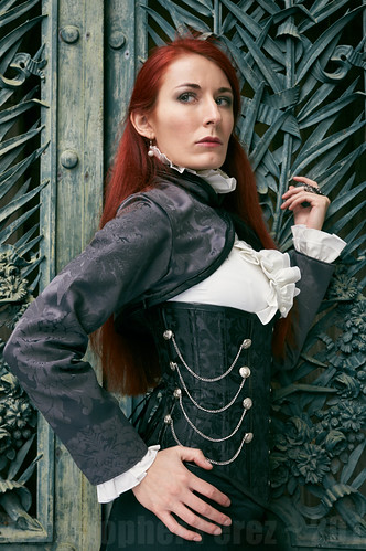
Taking an image from a series of photos I did recently with Hua Costumes, I set about seeing how a black and white treatment might be approached.
Here is a processed color version of the image in question.
And here is the black and white conversion.
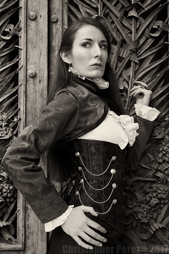
By desaturating the color file, making sure the blacks are deep enough and that there is plenty of detail in the highlights, I simply moved the center of the "curve" up a little. That is to say, I made the mid-tones lighter.
I could have combined this technique with the black and white filter selections to lighten or darken the skin (red/yellow to lighting, blue to darken). In this case lightening the skin seemed to ruin the effect I was looking for and darkening the skin seemed to turn it to mud.
The reason I mention skin lightening/darkening is that this is what I was required to pay close attention to when I worked in a photo lab making black and white prints in Hollywood. The images were used in the local parade of the stars tabloids and lightening the skin-tones hid many of the star's natural blemishes. High-key skin tones were all the rage at the time and the approach seems to be well entrenched in image making, even today.
Which brings me to another point about converting color digital files to black and white for portraiture. The skin tones do _not_ need to be high-key for an image to be effective. In fact, I rather like having tone and texture in the skin. It can give an image a sense of depth and dimension (roughly the saying the same thing, isn't it?).
Here is an example of deep skin tones.

This image was made during la Traversee de Paris Estivale 2016. The gent was driving a very early deDion Bouton and he was well dressed for the part. I shot this against a very bright sky using an old manual focus (therefore rather difficult to focus in rapidly changing situations) and extremely sharp Nikon Nikkor 80-200mm f/4.5 that was mounted on a Sony A6000 body. The camera metered for the highlights (fortunately) and this kept the sky from "blowing out."
Once again using the technique of raising the mid-tones when converting a color digital file to black and white I was able to bring the darker areas of the scene up to what you see here. The skin is obviously darker than in the images from the Hua Costumes vampiress shoot. Yet to my way of looking at this image, the darker skin tones don't seem at all out of place.
In summary, it appears that deep, richblack and white portraiture that emulates the beauty of film can be achieved. The more I work at this, the more I'm liking what I see.
One of my favorite subjects is people. I've worked with creative costumers in Steampunk, Tribal Fusion, and Victorian Gothic communities in the US and Europe over the past 15 years and enjoy it. While most people I work with are wanting something "unique" (meaning colors and textures and "interesting" lighting), I've had it in the back of my mind that I'd like to explore the late 1800's imaging esthetic. A good example of the goal I would like, someday, to shoot for is the style of the work of Alex Timmerman.
Taking an image from a series of photos I did recently with Hua Costumes, I set about seeing how a black and white treatment might be approached.
Here is a processed color version of the image in question.
And here is the black and white conversion.
By desaturating the color file, making sure the blacks are deep enough and that there is plenty of detail in the highlights, I simply moved the center of the "curve" up a little. That is to say, I made the mid-tones lighter.
I could have combined this technique with the black and white filter selections to lighten or darken the skin (red/yellow to lighting, blue to darken). In this case lightening the skin seemed to ruin the effect I was looking for and darkening the skin seemed to turn it to mud.
The reason I mention skin lightening/darkening is that this is what I was required to pay close attention to when I worked in a photo lab making black and white prints in Hollywood. The images were used in the local parade of the stars tabloids and lightening the skin-tones hid many of the star's natural blemishes. High-key skin tones were all the rage at the time and the approach seems to be well entrenched in image making, even today.
Which brings me to another point about converting color digital files to black and white for portraiture. The skin tones do _not_ need to be high-key for an image to be effective. In fact, I rather like having tone and texture in the skin. It can give an image a sense of depth and dimension (roughly the saying the same thing, isn't it?).
Here is an example of deep skin tones.

This image was made during la Traversee de Paris Estivale 2016. The gent was driving a very early deDion Bouton and he was well dressed for the part. I shot this against a very bright sky using an old manual focus (therefore rather difficult to focus in rapidly changing situations) and extremely sharp Nikon Nikkor 80-200mm f/4.5 that was mounted on a Sony A6000 body. The camera metered for the highlights (fortunately) and this kept the sky from "blowing out."
Once again using the technique of raising the mid-tones when converting a color digital file to black and white I was able to bring the darker areas of the scene up to what you see here. The skin is obviously darker than in the images from the Hua Costumes vampiress shoot. Yet to my way of looking at this image, the darker skin tones don't seem at all out of place.
In summary, it appears that deep, richblack and white portraiture that emulates the beauty of film can be achieved. The more I work at this, the more I'm liking what I see.