Tuesday, July 27, 2021

Sony NEX-7 back button focus setup

Here is how I setup the back button focus on a Sony NEX7.


Menu -> Setup -> Custom Key Settings -> AF/MF Control

Menu -> Camera -> AF/MF Select -> Manual Focus

Menu -> Setup -> AF/MF Control -> Hold

Menu -> Setup -> Function Settings -> Function Settings 1 -> Focus Settings (though I really don't use this one at all)


I like using this setup for nearly all situations when using this NEX.  The only problem with the Sony NEX-7 AF system is that it is slow compared with the Sony A6000.  If memory serves, the 7's AF system is contrast detect and not phase lock.

For this reason I tend assign the heavy lifting for motorsports activities to the A6000.  I quite happily use, on the other hand, the NEX-7 in low stress, slow change situations, such as travel. 

Eze ~ in B&W ~ 2021

Monday, July 26, 2021

Sony A6000 back button focus setup

I see that I need to document for future reference how I set my Sony A6000 to back button focus.  I have reached the age where I forget things.

The whole "back button focus" interest started when I found the camera would select something of stronger contrast in the background to focus on when the subject was smooth and of lower overall contrast.  

For example, when I photograph cars they tend to be smooth, broad areas that the AF system might have trouble locking onto when something in the background is so much easier for it to acquire.

Diving into the menu system...

  • AEL button ~ AF On
  • AEL w/ shutter ~ Off
  • Pre-AF ~ Off
  • AF w/ shutter ~ Off
  • Lock-On AF ~ Off

Then I set the AF system to the smallest center point.  The "wide" and "center" selections are too broad and things in the background might be selected instead of the precise thing I want.  Hence the selection of an AF "point".

When I want to focus, I press the AEL button on the back of the camera.  There is no AF when I press the shutter release.

The usage steps are -
  • Place the center "point" over the thing I want precise focus on
  • Press the AEL button on the back of the camera and watch for when the "point" bracket outlines turn green, then release the AEL button
  • Recompose the scene as needed
  • Press the shutter release

I like this approach when using AF lenses.  It is a way of emulating the point of focus of a manual lens without the hassle of toggling the magnifier, focusing, then turning the magnifier off before re-composition.

Once I got into the habit of using back button focus on certain subjects, I found it was easiest for me to simply use this approach for nearly everything.  It makes me think a moment or two about what I want in best focus before hitting the shutter release.


Senlis ~ 2021


Sunday, July 18, 2021

New vs Old ~ a little experience

Readers likely by now know how much of a nut I am about optics and minutia and details and things that really don't seem to matter to normal people.  

Certainly I've learned a lot over the years by poking and prodding at the subject, including that well designed optics are a result of balancing trade-offs. However, explanations of these trade-offs are all too often are missing from the marketing literature.  It seems as if there is a distinct disconnect between engineering and marketing.  

Helpful descriptions like what makes a good portrait lens are very rare.  In fact, I only know of one document that a manufacturer produced that guided users.  That was with the specialized Kodak Portrait lenses.

More normally interested parties are left to sort things out for themselves.  

A good example of this is Nikon's famous 105mm f/2.5 Nikkor-P.  It was commonly accepted that it is a wonderful optic, but no one could tell you _why_.  The marketing literature of the day is woefully lacking in explaining the unique property of that lens.  

It is only relatively recently with Nikon's 1000 and 1 Nights lens history series that we learn the designers controlled the under-corrected spherical aberrations behind the point of focus.  Here is how Nikon now explains it.

"... The lens also has characteristics of spherical aberration and coma. Basically close-range aberration variation is small, but at portrait distances the correction for aberration seems to be slightly insufficient. The insufficiency as far as spherical aberration in particular is what makes defocus background appeared beautiful. The aberration balance has been calculated carefully for use in portraits. When the aperture is open contrast is good, and delineation is soft..."

That, right there, is why that 105mm lens is so gorgeous. 

Being left to sort things out for myself, with years, experience, and patience, I think I've hit upon the things that make a lens interesting to me.  Resolution is a given.  As it turns out that is probably the easiest quality to design into a lens.  Even sub-$100 kit lenses are "sharp."

Field flatness is not all that important to me, unless, as in the case of the Nikon Nikkor 35-105mm f/3.5-4.5 zoom, the field curvature is extreme.  There is also the case of the Zhongyi LensTurbo II focal reducer with, with certain lenses, such as the Nikon Nikkor 24mm f/2.8 Ai, introduces an obvious amount of curvature to the field.  Other than that, field curvature is just one of those things to think about in specialized applications, such a document photography where a flat field might be helpful.

Other lens "faults" such as chromatic aberration can now be corrected in image processing software.

Which leaves me with the aforementioned spherical aberration.  When a designer deliberately uses this form of aberration in a lens, it can help lead to "creamy" smooth out of focus rendition.  This, I've come to learn, is what Nikon carefully considered in their manual focus lens designs.  I'm thinking of the fabulous 85mm f/1.8 H/H.C./K and famous 105mm f/2.5 P lenses, as well as, perhaps surprisingly, Nikon's 75-150mm f/3.5 and Nikkor 100-300mm f/5.6 AiS optics.

As I said, it can take time to sort out which properties might matter to you.  This is why I'm pretty sure why Leica once advised that photographers use a lens for a year before deciding if they liked it or not.   

Et voila! this is how I settled on Nikon lenses.  I've been using them consistently for many years after having used Canon lenses for even longer.

I recently picked up an attractively priced very low "mileage" (less than 800 clicks on the shutter) Sony A7 to use with a rather too big a stack of Nikkor manual focus lenses that I have.  Since I'd convinced myself that I'd find no better out of focus rendition than with these lenses, wouldn't it be nice to be able to use them without a focal reducer to get in the way of things?

 
Lens Portrait ~ 2021

~ Stack of Nikkors ~
Too many choices?
Worse, I've added two lenses
to this stack since the photo
was made.


Shortly afterward, in search of a lens that I could take on our travels and that was demonstrably better than the Sony APS-C mirrorless kit lenses, I bought off that auction site an inexpensively priced Zeiss 16-70mm f/4 OSS ZA.

The Zeiss has a very very small mark on the front glass.  It's really difficult to see the defect and it might only be a rub on the coating as the glass looks to be OK.  The lens has proved to be a good choice, being well constructed and pleasingly sharp and all that.  

However, I hadn't taken it as "seriously" as I do the Nikkors. The new to me Zeiss lens remained "just another lens." 

In fact, just the other day I enthused over a beat-up Micro-Nikkor 105mm f/4 Ai and its out of focus rendition.  So many project possibilities came to mind and I was excited to haul this thing into the wild to make a few images with it.

An opportunity to photograph a music group plopped into my lap and I wanted to confirm which lens(es) I would use.  Wanting the most flexible solution for this studio photoshoot I thought perhaps I should use the 16-70mm ZA.  And I'd better check things out beforehand.  As "beautiful out of focus" references I used my 85mm and 105mm Nikkors to compare them with the new to me Zeiss ZA.

I didn't expect much out of the Zeiss for out of focus rendition.  I'd read, for instance, that Zeiss' 24-70mm f/4 lens for full frame Sony cameras had "busy" out of focus rendition.  Could the little ZA lens really be any different?

... er... yes... I was in for a little surprise... and I like good surprises... so yipee!!!  Looking at the results at 70mm f/4 with the smaller APS-C 16-70mm Zeiss forced me to evolve my thoughts on the subject.  

Take a look at the following images, and as always, click on and enlarge them to 100percent.  Pay particular attention to the lettering/numbering around the inside front ring as well as the out of focus qualities of the rear cap.


Nikon Nikkor 105mm f/2.5 (Xenotar version) ~ Lens Stories

Nikon Nikkor (Xenotar version) 105mm f/2.5
photographed with
Sony A6000 - ISO100
Zeiss 16-70mm f/4 ZA OSS

Lens Stories ~ Nikon Nikkor-P 105mm f/2.5
 
Nikon Nikkor (Xenotar version) 105mm f/2.5
photographed with
Sony A7 - ISO50
Micro-Nikkor 105mm f/4 Ai

The differences are rather subtle between the images.  Yet to my eyes the Zeiss is "smoother" in the out of focus regions than the Micro-Nikkor 105mm f/4.  The "edges" rendered with the ZA lens are "rounder."  

Don't get me wrong.  The Micro-Nikkor is quite wonderful and I'm certainly not in any hurry to kick it to the curb. It's just that the Zeiss does something that I find "special."

To continue my little exploration I took a look at the out of focus rendition with subject matter a couple meters from the lens and at other focal lengths across the Zeiss' zoom range.  What I found with the closeups at 70mm holds true when photographing at greater distance.  This Zeiss' out of focus rendition is "smooth" nearly everywhere and at nearly all focal lengths.

It turns out the 16-70mm f/4 ZA OSS is actually a very nice lens.  Whoever designed it really put effort into it to get so many details "right."

What a find, eh?


Lens Stories ~ 16-70mm Zeiss ZA OSS 
Sony NEX-7
Zeiss 16-70mm f/4 ZA OSS
~
Which is not much bigger
than the same camera with
Sony's 18-55mm kit lens.


Monday, July 12, 2021

Digital "Copy Stand" ~ magnification studies

In a prior article I took a look at copying 4x5inch black and white negatives using a 24megapixel full-frame digital camera and an old film-era macro lens.

It left me to ponder the question of how much more "resolution" could be gotten by moving the lens closer to a negative and stitching several image sections together.  It could be interesting to find the point where the digital system would start recording film grain and give no further "resolution" increase by moving even closer.

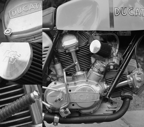
The subject is a lovely 1975 Ducati 750GT.  I bought this from a friend who had made it into a quasi-"750 Sport."  It was a gorgeous bike and I loved riding that Duc.  One year I rode it to the Steamboat Springs motorcycle racing event from Oregon.  She delivered 55miles per gallon a 75 miles per hour.  Talk about efficiency!

This version of the 750cc 90 degree V-twin came with spring actuated valves, not the more legendary desomodromic valve train that Ducati is rightfully famous for.  Still, the motor was sufficiently powerful, easy to control, and had nothing to rate against it as far as I was concerned.

Fabio Taglioni had designed or specified nearly everything about these bevel-drive bikes. The layout, engineering, and manufacturing were outstanding.  My bike worked like a beautifully made watch.  There was a finesse that seemed missing from all other motorcycles i ever rode (and I've ridden just about every road bike ever made from 1973 through to the late-1980's).

I owned another interesting spring valve Ducati.  It was a 1977 860GT.  Few people liked the bike and I can remember seeing new, unsold examples sitting of showroom floors well into the 1980's.  

Never sure why people didn't like it, I found it had "grunt" on the road.  It felt like a person could pull tree stumps out of the ground with one.  I rode mine for years without experiencing any problems.  It, too, had a finesse that was undeniable.

Even if I find such details interesting, these have nothing to do with photography.  So back to is, shall we?

The following image is a single photograph taken of the entire negative using an early model Sony A7 24mpixel camera and an ancient Nikon Micro-Nikkor 55mm f/3.5 lens.

[As always, click on the images and then enlarge them to 100percent]


4x5inch negative to digital conversion

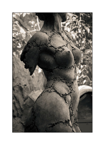
Entire negative in one shot -
Scene on the right
100percent enlarged sections on the left

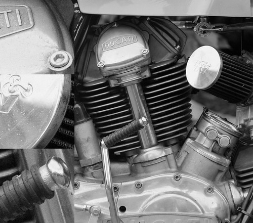
The following image is a single photograph that represents approximately 50 percent of the area of the entire negative.


4x5inch negative to digital conversion

50percent negative -
Scene on the right
100percent enlarged sections on the left

Lastly, the following image is a single photograph that represents approximately 25 percent of the are of the entire negative.


4x5inch negative to digital conversion

25percent negative -
Scene on the right
100percent enlarged sections on the left

As you can see, film grain is just becoming visible in the 50 percent enlargement.  A stitched image of this magnification would be approximately 10,000 pixels across on the long dimension from a 4x5inch negative.  Image details look pretty good to my eyes. 

From the last image we can see that film grain is clearly visible in the 25 percent area enlargement.  I'm not sure how useful it would be to make an image 15,000 or 20,000 pixels across on the long dimension with this grain size, but, as you can see, such a thing would be easily possible.

If I were to make prints larger than 20x24inches, perhaps I would "feel better" about photographing a negative in sections, and then stitching them into a rather large file. 

I'm not sure how this would look in practice as I no longer have a printer and no place to store prints.  On the other hand, for sharing some of my old work, I think a single full negative digital image should work just fine.

Wednesday, July 07, 2021

Digital "Copy Stand" ~ working with old B&W negatives

Even as we are opening up over here after 18+ months of a pandemic I find I still have a bit of time on my hands.  

I also have a medium sized box filled with black and white film negatives that I brought back with me the last time we were State-side.  What better thing to do than to see if my work has at all progressed over the decades?

To find out what I wanted to find out I needed to make digital "scans" of a few negatives.  I was concerned that 24mpixels would be "enough" resolution to make a "one shot" copying effort worthwhile.  It's all I have on hand at the moment as the higher megapixel cameras are well out of my financial reach. 

My fear was that I might need to photograph each negative in sections, then stitch them together into a larger file to get the kind of "resolution" I felt large black and white negatives were capable of.

Here is the "copy stand" setup I used -

  • Sony A7 24mpixel full-frame camera - ISO50 + 2sec delay shutter release
  • Nikon Micro-Nikkor f/3.5 pre-Ai shot at f/8
  • Lens adapter
  • Mamiya RB67 compendium lens shade - to eliminate reflections coming from behind the camera
  • 77mm to 52mm filter thread adapter - to mount the Mamiya lens shade
  • Big Beefy Bogen tripod
  • White translucent "scrim" - to provide soft/even light behind a negative
  • Negatives taped to glass - with the scrim behind the neg as per above
  • In-camera "level" function to square things up

Negative Copy Setup

The first train image is of SP4449, a 1941 Lima manufactured streamlined 4-8-4 Northern class steam locomotive.  She was the locomotive that pulled the "Freedom Train" around the USA in 1976.  

The film is Polaroid Type55 Positive/Negative.  I wish someone could reliably reproduce this film.  If they could I'd be sorely tempted to buy another 4x5 camera and a lens or two.  This was wonderful material to work with.

As you no doubt are already aware, this film gave a print and a negative at the same time.  I loved working with this material.  To get decent density in the negative I usually shot it at ISO32 or ISO25.  This would leave the print slightly over-exposed, but this didn't matter to me as what I was really after was the neg.

I lived for 18 years in Hillsboro, Oregon.  Occasionally the city of Portland's big steam locomotives could be heard on the tracks that ran to the south of the house.  Often I'd grab a camera and jump into the car to head over to see what I could see.

Coming to the subject of deciding if 24mpixel is enough "resolution" to capture something decent off an old 4x5inch negative in a single shot, here is a photo of SP4449 at rest during one of its Hillsboro runs.

Train Resolution ~ 4x5 negative

SP4449 ~ Hillsboro
Schneider 110mm XL f/5.6
Full Scene on top
100percent crop sections across the bottom

To my eyes things don't look too bad.  In fact, this looks entirely usable.  Just to confirm this I would like to look at a second image.

The city of Portland owns another steam locomotive.  SPS700 is an "E1" 4-8-4 Northern class steam locomotive that was built by Baldwin Locomotive Works in 1938.  She is physically larger than her SP4449 sister.

After I started chasing these around Hillsboro I made a concerted effort to find the roundhouse that I heard they lived in.  It wasn't exactly easy and one had to be careful about visiting.  At that time the roundhouse was on heavily rail-trafficed BNSF property and the steam locomotive crews were only on site at the roundhouse on certain days of the week.

Once I sorted all this out, I found the roundhouse to be a magical place.  There were actually three steam locomotives housed there, along with several early diesel electric locomotives, passenger cars, with various parts and pieces laying all around.

Train Resolution ~ 4x5 negative

SPS700 ~ Roundhouse
Schneider 110mm XL f/5.6
Full Scene on the left
100percent crop sections down the right

I have to say that, yes, this "works."  And, yes, those are backlit/sidelit raindrops you see hanging off the bell.  The resolution is, again to my eyes, outstanding.  The dynamic range of that old Polaroid film is truly outstanding, too.

What I have on hand is a small fraction of the film I had up until a few years ago when I whittled everything down to just what I could carry back to Europe with me.  I tried to keep the most interesting images. A lot has been left behind in a landfill somewhere.  Fortunately I still retain a satisfying number of negatives. 

A larger project, or series of projects, now appears on the horizon. I'm really enjoying working with these old train photos.

Friday, July 02, 2021

Godox MS300 + XT16 ~ communications setup

I recently purchased a new studio strobe and remote trigger and had trouble getting the system set up to communicate between the trigger and the strobe.

This article documents a setup that seems to work for me.  At least for now.

The strobe is a Godox MS300.  The instructions on its use are found here.

The trigger is a Godox XT16.  The instructions on its use are found here.

Looking at the back of the trigger I saw a dial that goes from 0-F and is labeled POWER. Hmmm.  What does _that_ mean?

I found a video on YouTube, but my Hindi isn't up to scratch.  I turned the sound off and tried to follow along with the button pressings.  I kind of got the hang of it, but I watched a second video that proved to be a little more helpful, even though the remote trigger was not the model I have.

Godox MS300 XT16 setup

Shown here are
the Godox XT16 remote controller
mounted on a Sony NEX-5T and
MS300 strobe side by side
so I can see both display
and button systems

In short, here is what I found - 

On the MS300 strobe -

  • Pressing the GR/CH and S1/S2 buttons simultaneously turns on/off the strobe radio.  In my case I wanted the strobes radio turned on.
  • Pressing the GR/CH button with a short duration press causes the GROUP indicator to blink.  Turing the strobes dial changes the GROUP.  Selecting a GROUP is confirmed by pressing the center of the dial (it pushes down).
  • Pressing the GR/CH button for 2 seconds causes the CHANNEL indicator to blink.  Selecting a CHANNEL is confirmed by pressing the center of the dial (it pushes down).

On the XT16 remote trigger -  

  • Set the POWER dial to the GROUP number/letter selected on the MS300 strobe.  I think the dial is mislabeled and really should have been labeled as GROUP.  The actual On/Off power is a slider button the side of the remote trigger.  Again, I think the engineers/designers screwed this up.

    Godox MS300 XT16 setup


  • Set the dip-switches to the CHANNEL selection made on the MS300 strobe.  As a guide there is an indication on the strobe to how the dip-switch settings are to be made on the remote trigger.

    Godox MS300 XT16 setup

There are two things that remain a mystery to me.

On the XT16 remote trigger there is a button labeled SET.  Pressing it for 2 seconds changes the display.  Pressing it again for 2 seconds changes to something different on the display.  

It appears there are three modes or styles for displaying the light output of the MS300 strobe, if indeed these are what the three different numbering systems refer to.  One display style representation is a fraction of the overall light output (ie: 1/32 +0.3EV).  Another style starts with the number 1 and the other starts with the number 5.  

I can't find a clear indication of how these three XT16 display labeling styles correspond to the MS300

A second thing that confuses me is that there doesn't seem to be any way of controlling the light output display value on the strobe.  I have seen the MS300 display two different light output styles - the fractional light output and the display style numbering system that starts with "5."  

Worst still, the MS300 light output display style changes randomly.  Even worse than that, these display styles appear to be independent of what is displayed on the XT16 remote trigger.  

I expected that once I'd selected the display style on the XT16 that these would be communicated to the MS300, but they are not. Or, minimally, I thought I would be able to select the light-output display style on the MS300, but I can't find the magic incantation.

Nowhere is there any description of how these things should or could inter-relate.  There is no indication of their meaning, other than what is clearly implied by the fractional light-output style of display.

[rant on] The inconsistencies in these products bother me.  From an engineering, marketing, and product integration perspective the Chinese could have done a far better job.  This isn't complex stuff, really.

They are very good at ripping off western product implementations, but the Chinese still have seemingly zero understanding of the importance to also rip off western designers sense of what it takes to build a system of well integrated products.  Based on my initial experience, usability and labeling is a mess chez Godox.

Further, there isn't enough "tribal knowledge" that comes with use that can help guide newbies to this kind of product set such as myself.  So I'm left thrashing things out as best I can.

In the end, I feel I got exactly what I paid for.  I have an adjustable light output remote controllable strobe with rather little to guide me as to how the system actually works nor what parts of the display system are trying to communicate. [rant off]