I remember a great blog entry from some time back that showed the Sony 50mm f/1.8 SEL OSS to be as sharp wide open as a Leica 50mm f/2 lens. That link is unfortunately broken. Searching around I found another site that effectively shows the same thing.
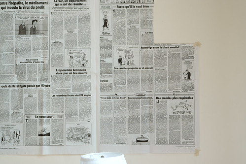
So, I couldn't help myself. Attracted by the Sony 50mm f/1.8 SEL OSS (I'm getting old and shaky) and interested to see how it stacked up against my "reference" lens, the Sigma 60mm Art DN, I taped le Canard Enchaine to the wall and had a wee-peek at things.
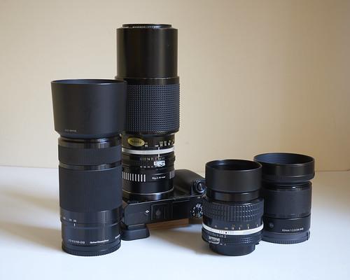
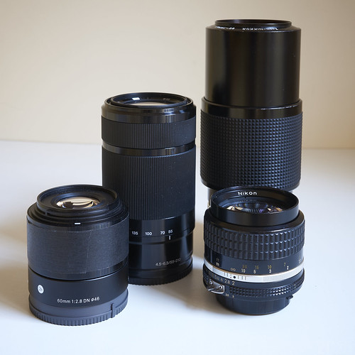
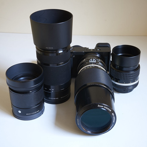
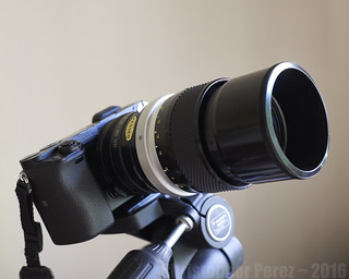
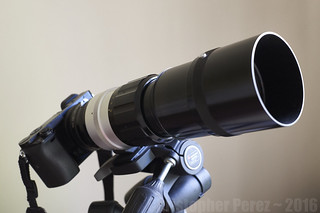
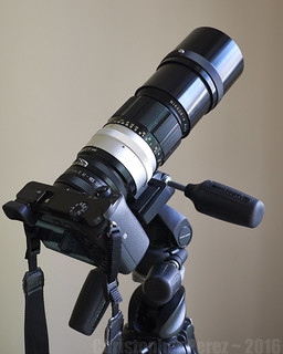
My by now standard comparison setup -
So, I couldn't help myself. Attracted by the Sony 50mm f/1.8 SEL OSS (I'm getting old and shaky) and interested to see how it stacked up against my "reference" lens, the Sigma 60mm Art DN, I taped le Canard Enchaine to the wall and had a wee-peek at things.
My by now standard comparison setup -
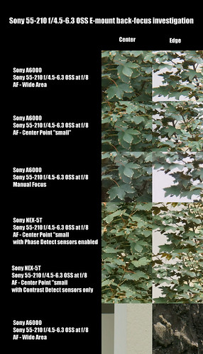
- Sony A6000, "A" mode, ISO100, 2 second delay trigger, very sturdy tripod
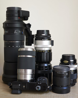
- Sony 50mm f/1.8 SEL OSS - shot in AF mode
- Sigma 60mm f/2.8 EX DN E - as my standard reference shot in AF mode
- Nikon 85mm f/2 Ai - just because, shot obviously as a manual focus lens
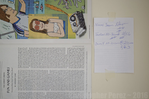
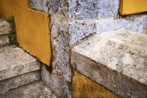
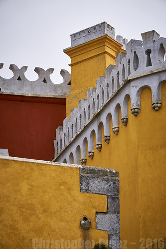
Here is the scene -
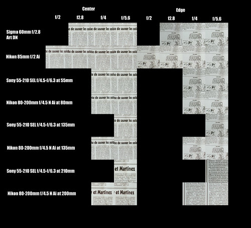
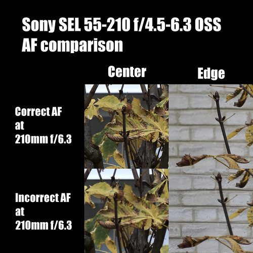
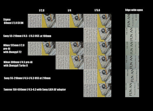
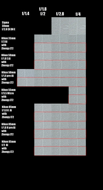
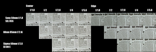
Here are the comparison results (be sure to look at these at 100% over on Flickr)
Here are the comparison results (be sure to look at these at 100% over on Flickr)
My (yet again rather obvious) observations include -
The Sony 50mm f/1.8 SEL OSS appears to be a nice lens. From wide open it controls aberrations quite nicely (particularly compared to the old Nikkor f/2). The resolution seems adequate to just about any task. And yet it simply doesn't match the Sigma in terms of hard resolution at f/1.8 or f/2 (apertures that the Sigma doesn't offer). By f/2.8 the Sony and Sigma lenses are nearly indistinguishable.
Looking at the luminosity curve of the RAW files straight out of the camera reveals something interesting in the way these two lenses behave. With the Sony I can see highlight regions spread the luminosity range more broadly than the Sigma. The Sigma's file shows a distinctive bump toward the highlights and falls off like a cliff. It's amazing to look at the differences between the two curves and remember how contrast is a very important element to understanding how humans perceive resolution. And this right here is very likely why the Sigma looks to perform so brilliantly compared to other lenses. It's how the optic passes contrast to the sensor.
The Nikon 85mm f/2 Ai is outstanding from wide open and corner to corner. However the contrast is lower than the modern lenses due to spherical aberrations at wide apertures. You can see the effect in this comparison. Look carefully at the f/2 center square. See how sharp the letters are, but how a light "fog" overlays the scene? That's the effect of spherical aberration. Things clean up a stop or two down from wide open and is indistinguishable from currently designed optics.
My by now standard disclaimer:
I've learned long ago that I can very nearly match image resolution between just about any lens set by making adjustments to the luminosity curve. Rarely is a lens so bad that it's resolution would be clearly worse than a high quality modern lens. So if all a person has or if all a person can afford is something old and manual focus, there's no need to fret. No one will be able to walk up to a big print and say "well, gosh, you should've used a sharper lens." Why? Because no matter what a photographer uses, it's always Always ALWAYS the mind, the creativity, and concepts of a photographer that viewers (even "educated" fellow photographers) will respond to. There is not a single person on Planet Earth who can tell you what lens made what image (except maybe the photographer). It simply does not "work" that way.