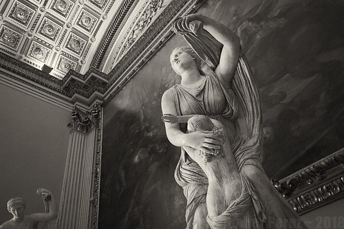
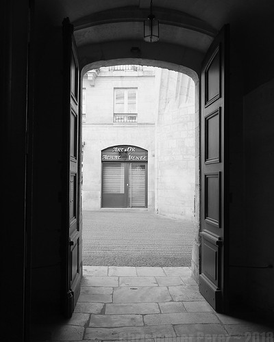
I recently visited the Henri Cartier-Bresson Foundation (a museum) here in Paris to have a look around. The current show was a disappointment as the prints were gray and muddy. On the top floor, however, a close associate of HCB had some of her images on display. They were gorgeous. Deep, rich blacks with creamy highlights that seemed to "glow."
So it was a bit of a surprise to see the subject of black and white image "glow" come up on
The Online Photographer's blog. One of
Mike Johnson's blog entry caught my eye. He writes concerning creating "glow" -
"
Use an older lens. An old, fast "long normal" lens‚ a 58mm ƒ/1.4 or ƒ/1.2‚ works wonderfully. Various makers made 'em and you can get 'em on eBay for a song. One nice new one is the Ricoh 55mm ƒ/1.2 that costs very little money [NLA]. A Noct or a Summarit will serve well enough if you only have Leica lenses. Don't use most current 50mm ƒ/1.4s, which are more "harsh-sharp." Stay away from Nikon lenses, too. If you want a cheap sample that will work wonders, pick up an old Pentax Spotmatic and an Pentax M42 screwmount (not Leica screwmount) 50mm ƒ/1.4 Takumar. And if you think that different lenses don’t have different tonal ranges, shoot that lens side-by-side with a 50mm ƒ/1.8 AF-Nikkor. That'll open your eyes!
Use a K2 filter—Wrattan #8, medium yellow, whatever you want to call it. This will require another stop or so of exposure. You meter will probably tell you you only need an extra 2/3rds stop, but use a whole one."
He followed up with a
nice article on the current state of technologies and how black and white image makers can continue to make wonderful images.
These articles seemed to form the basis of a digital process that could accurately emulate good black and white film images. Old single coated lenses and a K2 Yellow filter were the starting points.
Two unexplained things bothered me, however. First, why couldn't a person use Nikon Nikkor lenses to generate a wonderful black and white image that glowed? I've seen Nikon work for decades that easily equalled anything ever made using a Leica or Zeiss lens.
Second, why 58mm? What was magic about that focal length? Old 58mm lenses tend to be soft wide open. The exception being the cheap and widely available Helios 44 which can to be razor sharp in the center of the field from wide open. Is that the optical corrections (or more properly the lack thereof) in those old optics helped enhance the "glow" effect?
Thinking back to my old black and white print days in Hollywood and Irvine, California and feeling like I could take a few steps more to recreate that fabulous black and white silver print "look" in digital I took to scrounging around the Toy Box. I hauled out a number of lenses, mainly the much hated by The Online Photographer Nikon lenses (since that's what I'm particularly rich in).
Thus started another Round of Madness, photographically speaking.
Lens "Look"
Beginning with the statement "
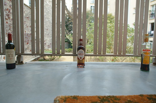
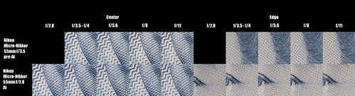
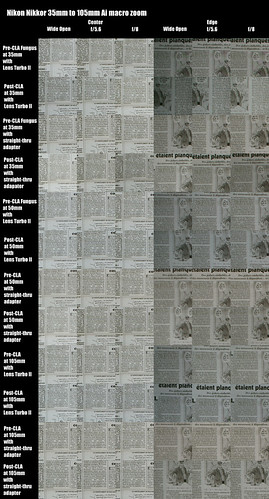
...And if you think that different lenses don’t have different tonal ranges, shoot that lens side-by-side with a 50mm ƒ/1.8 AF-Nikkor. That'll open your eyes!..." I just happen to have lenses of a couple different designs and at least one that is single-coated (as in at least 50 years old) as well as a Nikon 50mm f/1.8 (though mine is in the original manual focus mount - the AF and MF lenses are identical optically). To test the statement about tonal ranges, here is what I compared -
- Lenses
- Sony 50mm f/1.8 SEL OSS
- Nikon Nikkor 50mm f/1.8 Ai
- Nikon Nikkor 50mm f/2 H (single coated) non-Ai
- Nikon Nikkor 50mm f/2 Ai (multi coated)
- Nikon Micro-Nikkor 55mm f/3.5 (single coated?) non-Ai
- RawTherapee to convert the RAW input files into
- Black and White
- Yellow Filter - found in BW channel controls
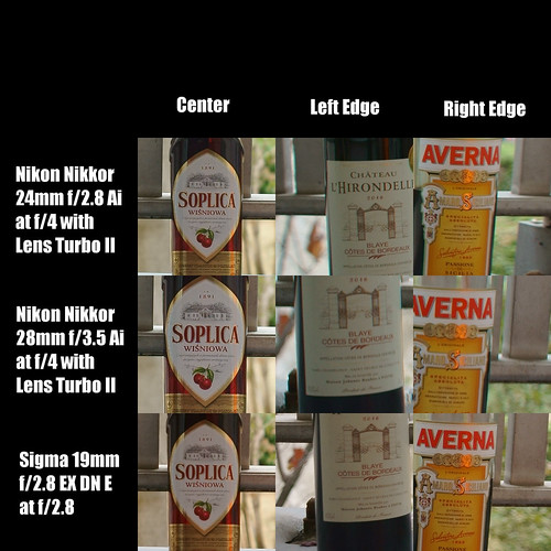
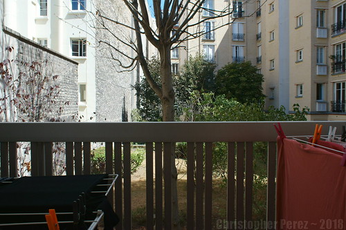
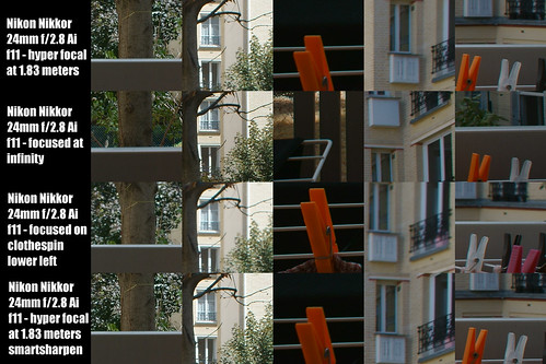
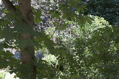
First, here is the yellow filtered RawTherapee comparison, complete with the basic scene and results from the conversion to black and white.
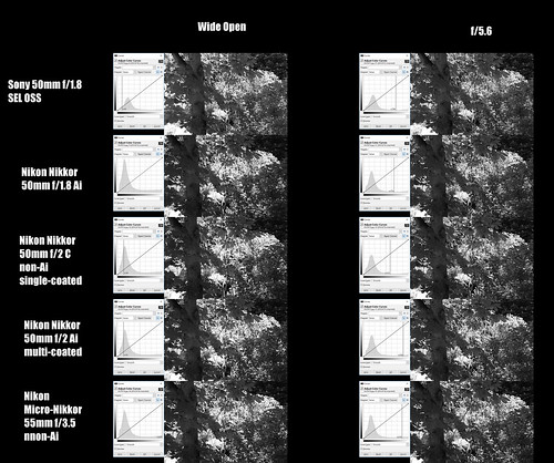
Take a look at the various curves for each of the lenses shot wide open and at f/5.6. Wide open most lenses show strong peaks on the dark end of the curve, and little "bump" of information up near the white end of the curve. I attribute this to the limited depth of field and that the highlights don't contain as much information in them as when a lens is stopped down.
Next, compare the "thickness" of the center regions. As the lenses is stopped down to f/5.6 there is more information in the mid-tones than when most lenses are shot wide open. The exception to all this is the Micro-Nikkor which is very sharp from wide open and spreads it's information across the curve at any aperture.
Now consider the curves from each lens and at the two apertures in total. Indeed, each lens shows a unique set of characteristics, don't they? The differences may be subtle, but there they are.
For the first time I clearly see how lenses can have their own individual "footprint." I'm not yet sure why, but this surprises me. Perhaps I've always thought I could make just about any lens "look" like any other. But that thinking was "inside out." Maybe I missed the opportunity to celebrate uniqueness by pursuing sameness? In any event, I think there might be something here to explore.
Creating "Glow"?
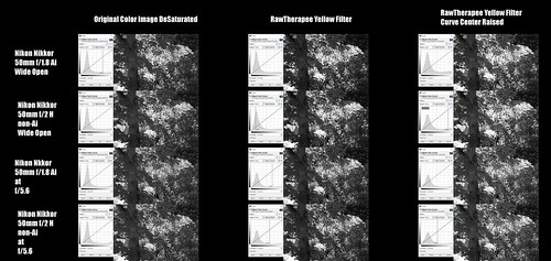
Using the Yellow Filter recipe in RawTherapee I went back and raised the mid-tones of a few images thinking that this would get the "glow" I was after. My assumption was that digital black and white mid-tones tend to "open up" nicely by doing this, and building "luminosity" in the highlights as well. Afterall, it was
another of The Online Photographer's blog entries that suggested doing just that when working in black and white to create digital images that rivaled silver halide film.
Here is a look wide-open and at f/5.6 using the yellow filtered RawTherapee output and then raising the mid-tones (using the secondary parameter cage curve).
Looking For Glow
The "glow" effect is starting to be seen with the 50mm f/2 H (single coated) lens shot wide open. But the subject was holding me back. The effect I was looking for isn't particularly evident in the scene of the leaves and trees and I needed to stop and think a bit about where to go next.
Using the basic recipe of Yellow Filter plus raising the mid-tones, I took a long hard look at the curve from the Nikon 50mm f/2 H. Then something came to me. Working with two additional parameters I quickly had what I feel is a flexible, repeatable process as a good answer to capturing the classic black and white silver print "glow."
Process - A Modest Proposal
What I am about to describe is not the only, nor might it even be the "best" way to process digital files for that elusive old fashioned silver print "glow." I'm convinced that with a little care and attention, the same results could be achieved by only manipulating the curves function, but the actions are currently too subtle for me to successful manipulate. So bare this in mind as you follow along.
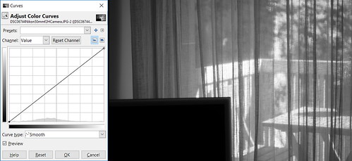
Step One - Convert to black and white using a yellow filter. The filter may add a bit of contrast to the scene. Here is an example a basic curve output from this step.
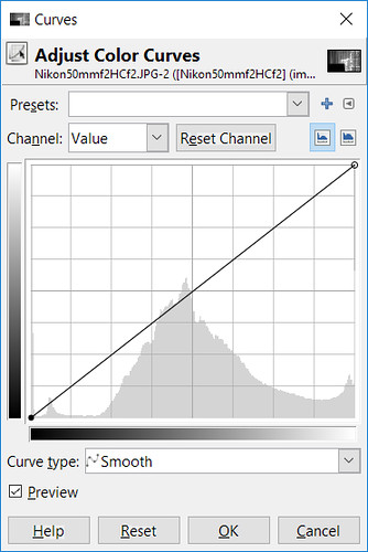
Example Curve
Step Two - Using the "exposure" function, move the slider until the very top edge of the tonal range highlights are not "clipped." The further down the range you move the highlights, the more "creaminess" you could see in the final result.
At one extreme, tintype recreations move the highlights roughly half way down the tonal range. Normally I don't move the highlights that far.
For the processed image examples below I moved the top edge to just about 10% under pure white. This allows the highlights to hold a "hint" of tonality.
Step Three - Then I open the curves function and set the curve shape depending on whether I used a single coated lens or a modern multi-coated optic. Here is what I mean -
 Example
Single Coated lens curve
simply raise the mid-tones
This process was recently described
in another article by The Online Photographer
Example
Single Coated lens curve
simply raise the mid-tones
This process was recently described
in another article by The Online Photographer
 Example
Multi-coated lens curve
preserve the highlights
and raise the mid-tones
Step Four
Example
Multi-coated lens curve
preserve the highlights
and raise the mid-tones
Step Four - The image at this point will likely look pretty dark. To correct for this I use the "luminosity/brightness/lightness" slider (the actual name of the slider depends on the application you are using). I move the slider to lighten the image to the point where the image starts to please me.
If you look at the image histogram you could see a pretty even distribution of tones through the mid-range. The image starts to look "correct" in terms of brightness and there may be a lot of "creaminess" or "glow" in the highlights, but the overall tonality may be too flat and gray.
Step Five - Too much grayness in an image is easily solved by adjusting the contrast. I try to avoid "overcooking" the contrast as a way to retain as much "richness" in the image as possible. It seems like there is a balance to be found between "too gray" and "too contrasty."
Note - The "luminosity/brightness/lightness" and "contrast" sliders need to be moved to the point the image pleases you. There is no hard and fast rule for how much either of these are moved.
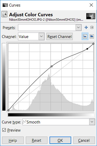
Final Result -
Here is how the curve of the finished image looks. Pay particular attention to how the highlights are held within the curves region, and similarly the blacks, as well - shown by the red bars on the right and left sides of the curve.
The "glow" in a black and white image, I contend, comes from the nice smooth transition of the light areas into the middle tones (which are often also raised). The area of "creaminess" and "glow" is indicated by the blue bar in the following illustration.

Examples -
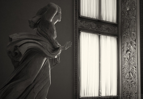
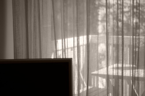
Now for a few examples of the results of this approach. As I said earlier, the scene I started with wasn't really up to the task of finding a lot of "glow." So I closed the curtains and tried again.
I used a single-coated Nikon Nikkor 50mm f/2 H, a Nikon Nikkor 50mm f/2 Ai (multi-coated version of the "H"), and the modern Nikon Nikkor 50mm f/1.8 Ai (which continues in production as an AF lens and is the very lens mentioned in The Online Photographer's comments that I quoted at the start of this blog).
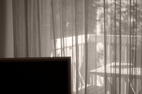
 Nikon Nikkor 50mm f/2 H non-Ai
This was the starting point.
As
you can see the whites are
"blocked up".
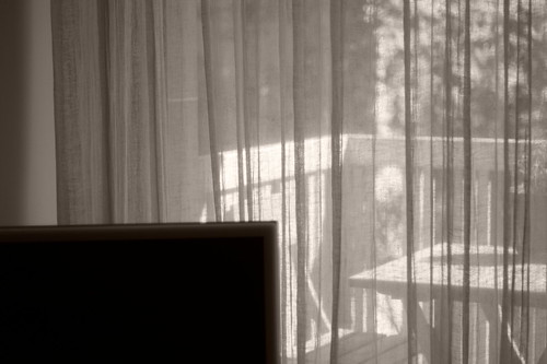
But they weren't
by the time I finished
following
the process I outlined above.
Nikon Nikkor 50mm f/2 H non-Ai
This was the starting point.
As
you can see the whites are
"blocked up".
But they weren't
by the time I finished
following
the process I outlined above.
 Nikon Nikkor 50mm f/2 H non-Ai
Shot Wide Open
To me this image positively "glows"
Nikon Nikkor 50mm f/2 H non-Ai
Shot Wide Open
To me this image positively "glows"
 Nikon Nikkor 50mm f/2 Ai (multi-coated)
While not a perfect match for the
single-coated lens,
it's still not half bad
Nikon Nikkor 50mm f/2 Ai (multi-coated)
While not a perfect match for the
single-coated lens,
it's still not half bad
 Nikon Nikkor 50mm f/1.8 Ai (multi-coated)
This is a little tougher as
he lens is wickedly
sharp and contrasty from
wide open and shows
so little
spherical aberration at f/1.8 which
in old lenses creates a (sometimes not so)
subtle "bleed" from the highlights
into the shadow details
Nikon Nikkor 50mm f/1.8 Ai (multi-coated)
This is a little tougher as
he lens is wickedly
sharp and contrasty from
wide open and shows
so little
spherical aberration at f/1.8 which
in old lenses creates a (sometimes not so)
subtle "bleed" from the highlights
into the shadow details
UPDATE: Indeed, I have worked out how to control the highlights primarily by using "curves" instead of the "Exposure" slider. But controlling the way the highlights render can be as tricky as I feared. If I'm not careful the highlights don't roll off nicely on the top end. Instead they can just drop off, like they've come to a cliff. The effect can be seen in an image as the highlights aren't as "creamy" as with when using the "Exposure"/"Lightness" slider combinations. So I need to be very careful and watch the histogram when using "Curve" only/primarily.