Friday, January 31, 2020
... and speaking of black and white photography...
My father sent me this link about photographers who continue to shoot in black and white. I find this encouraging.
The role of film (or film-like) grain in photography... [part one]
Living in Europe as afforded me the opportunity to study styles of paintings by visiting art exhibitions at some of the worlds finest museums and galleries.
Yet only recently have I begun to appreciate differences in brush-strokes and brush and palette knife techniques. How an artist applies paint has a subtle but significant impact in how I respond.
For example, for hundreds of years many artists used brush techniques that beautifully blended colors in a way that when a finished work is varnished the individual brush strokes seem to disappear. I'm thinking of (just to choose a very few artists) Titian, Leonardo, Vigee le Brun, Messonier, and David.
Looking at paintings in this style I feel as if I am looking thru a window and into a scene. The art can be rather literal, in this sense. For me, this is a key point. This art mimics the real world as we see it.
In the mid-1800's a group of artists seemed to revel in showing their brush-work. This approach was, in part, in response to Japanese woodcut art that had just reached Europe. The art of Manet, Monet, Bazille, Morissot, and most certainly van Gogh are prime examples of this contrasting brush work style.
In this instance I feel as if I am looking at "art" with all its (sometimes amplified) imperfections and nuances that shares, or perhaps illustrates the real world from a potentially more emotional perspective. This kind of work mimics the real world as the artists feels it.
How does any of this relate to photography?
Let's consider large format film and modern digital images as compared to small format film work.
Contact prints and digital "noiseless" images, to me, are like looking through a window into the real world. This kind of photography mimics the "real" as there is no "barrier" between me and "there" (the subject).
Small format 35mm and 120 film photography, on the other hand, is like looking at the world from an emotional perspective. The enlarged grain structure plays the role of clearly visible brush-work in a painting. The grain acts as a "barrier" or "filter" between me and "there."
As an aside, platinum/palladium hand coated prints can celebrate a papers texture as a way of helping an image appear more "art like." So, strictly speaking, large format film photography can still be bent to the task of "art." This aside, I feel awareness of how we respond to images can be helpful.
Looking at the craft of photography in this manner helps me make decisions. Do I want to share something crisp and clear in the classic art and large format film photography manner? Or do I want texture to provide a separation or veil over the subject?
I find it interesting that working in digital photography we can make these kinds of choices well after clicking the shutter. Everything doesn't have to be "pre-visualized" beforehand.
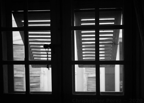
Windows ~ Musee Lascaris, Nice, France
Tri-X film-like grain overlay
Yet only recently have I begun to appreciate differences in brush-strokes and brush and palette knife techniques. How an artist applies paint has a subtle but significant impact in how I respond.
For example, for hundreds of years many artists used brush techniques that beautifully blended colors in a way that when a finished work is varnished the individual brush strokes seem to disappear. I'm thinking of (just to choose a very few artists) Titian, Leonardo, Vigee le Brun, Messonier, and David.
Looking at paintings in this style I feel as if I am looking thru a window and into a scene. The art can be rather literal, in this sense. For me, this is a key point. This art mimics the real world as we see it.
In the mid-1800's a group of artists seemed to revel in showing their brush-work. This approach was, in part, in response to Japanese woodcut art that had just reached Europe. The art of Manet, Monet, Bazille, Morissot, and most certainly van Gogh are prime examples of this contrasting brush work style.
In this instance I feel as if I am looking at "art" with all its (sometimes amplified) imperfections and nuances that shares, or perhaps illustrates the real world from a potentially more emotional perspective. This kind of work mimics the real world as the artists feels it.
How does any of this relate to photography?
Let's consider large format film and modern digital images as compared to small format film work.
Contact prints and digital "noiseless" images, to me, are like looking through a window into the real world. This kind of photography mimics the "real" as there is no "barrier" between me and "there" (the subject).
Small format 35mm and 120 film photography, on the other hand, is like looking at the world from an emotional perspective. The enlarged grain structure plays the role of clearly visible brush-work in a painting. The grain acts as a "barrier" or "filter" between me and "there."
As an aside, platinum/palladium hand coated prints can celebrate a papers texture as a way of helping an image appear more "art like." So, strictly speaking, large format film photography can still be bent to the task of "art." This aside, I feel awareness of how we respond to images can be helpful.
Looking at the craft of photography in this manner helps me make decisions. Do I want to share something crisp and clear in the classic art and large format film photography manner? Or do I want texture to provide a separation or veil over the subject?
I find it interesting that working in digital photography we can make these kinds of choices well after clicking the shutter. Everything doesn't have to be "pre-visualized" beforehand.
Thursday, January 23, 2020
Working in Black and White ~ further refinements
While visiting the Charles Negre photography museum here in Nice,
France, I was able to closely inspect various black and white images. I
was paying particular attention to the grain structure as it varies
with print tones (a topic for a future post, perhaps?) and how the
whites are rendered under various circumstances.
In an earlier post I suggested a conversion process from digital color into black and white that involved rising the mid-tones to match silver halide black and white printing.
Recently I suggested a Rawtherapee filter that helps separate subtle colors in a way that could be pleasing to the eye. It's worth noting that black and white filters vary from software package to software package. I feel it's worth testing whichever software package is used (ie: Lightroom, Photoshop, Darktable, the Gimp, etc) for oneself to find the filter that gives the most pleasing effect.
In this post I would like to illustrate the overall effects of these two steps as they relate to the gray scale. I would also like to suggest a way to "manage" the creaminess of the highlights so that they very closely match those of film printed to black and white paper.
The base for this post is a simple gray scale step wedge (top image).
By rising the center of the "curve" it is easy to see how the mid-tones rise and how the steps between the shades of gray on the white end of the scale "flatten out" (center image).
After returning home from the Charles Negre museum I considered how a digital file can be converted to black and white and nearly perfectly match how silver halide film/print combinations behave, specifically in the highlights. I think I have a suitable answer.
After applying a yellow-green filter and after rising the mid-tones by rising the center of the image "curve" the effect of "creaminess" in the highlights can be enhanced by lowering the "brightness." This "narrows" the gaps between the various shades of white and lowers the absolute/pure white so that it begins to take on a pale gray tone.
The following might illustrate what I mean.

Subscribe to:
Comments (Atom)