Properly adding film-like grain to a digital image takes into account how silver halide prints actually behave.
If you carefully study silver halide prints you may notice two things.
First, the grain structure is not even across the field. There is less visible grain in the highlights and shadows. It is primarily the mid-tones that show grain structure. This is an effect of film.
Second, the highlights tend to "bloom" or "glow" ever so slightly. This is the effect of light passing through print paper gelatin top layers and very gently scattering as it passes these layers. The effect is indeed gentle and might not be noticeable at first glance.
With this as background, here is a process for adding film-like grain to a digital image using the open source software image processing package called the Gimp. You can adapt this approach using Photoshop or other software that allows the addition and manipulation of layers.
Highlight "bloom" or "glow" -
- Copy base image to a new layer
- 1 pixel Gaussian blur upper layer (if you don't like the way this looks, try different blur radius' to find the effect you like best)
- Add a "Grayscale layer mask"
- Adjust curve of mask to allow just the highlights to show the 1 pixel blur
- Flatten the image
Grain (two approaches) -
I use one of two ways to add grain to an image. The first is using the G'Mic "Add Grain" function.
- Open G'Mic - Degradations - "Add Grain"
- Select the film type that appeals to you
- Note the blend mode selection (we will come to this shortly)
The second is building a grain layer from digital noise. This is useful when applying grain to smooth images with large contiguous tone areas. The G'Mic
Add Grain function sometimes gives an obvious non-random repeating pattern in this specific case which we want to avoid.
Using the base image processing software (not G'Mic) -
- Add a new layer with medium tone gray
- Add digital noise to the gray layer
- Gaussian blur the gray layer 2 to 3 pixels (observe the effect at 100% enlargement to find the effect that most closely matches film grain)
Set blend mode -
The selection of the blend mode is critical to how your digital image will correctly mimic film grain structure in a print.
Flatten your image if the tools haven't already done so for you and you're finished.
Here is a look at the output of the highlight "bloom" steps and illustrates why setting the blend mode is so important.

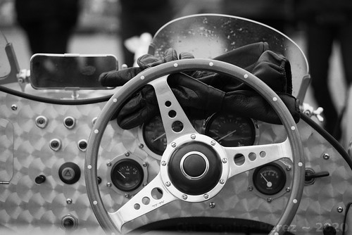
Coming back to the real world, here is a failed attempt that I made by not correctly setting the blend mode. The "grain" looks too harsh in both the highlights and shadows. Old silver halide prints never look like this.
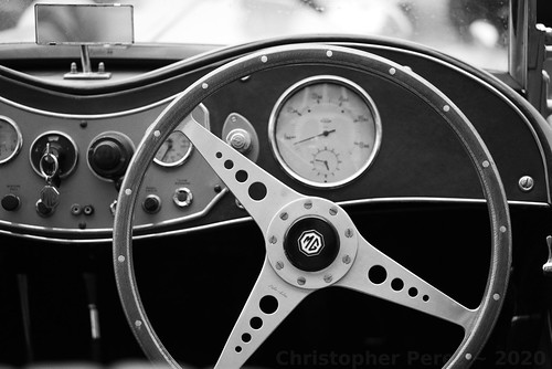
Here is another real world example, this time of how correctly setting the grain layer blend mode can look. As in the above image, the Tri-X 1600
G'Mic "Add Grain" function was used. But as you no doubt easily can see, the difference between the two images is quite noticeable.
Look carefully at how the "grain" behaves in the highlights and shadow areas.