I've been looking at many details and have been exploring several avenues of thought since my last post about discovering how to make digital images look like film.
In this entry I would like to take a brief look at images I made using both imaging mediums.
I kept some of my earlier black and white film negatives and brought them with me. Selecting a couple train images I set about digitizing them. Using a macro lens I shot sections of 4x5 inch negatives, stitched them together, and simply moved the top and bottom of the curve to the white and black points in the stitched file. This gave me large files (on average 8000 x 6000) where the film grain is clearly visible and the full range of luminosity of the original negative was expressed. I made no attempt to modify the shape of the curve (as you might with a digital file where some people might want to apply an "S" shaped curve, or something similar).
For train images shot as digital, I applied the technique described by The Online Photographer. That is to say, I snugged up the black end of the curve, ensured there was a lot of detail in the highlights, and raised the center of the curve to bring up the mid-tones. For both the digitized film and the digitally captured images I applied a platinum/palladium tone that I particularly like.
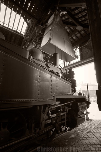
Here is a film-based image. As you can see, it's from a 4x5 inch Polaroid Type-55 P/N negative. I shot it at ISO 25 (the film side was always slower than the print side). The Polaroid output was always more contrasty than Kodak TMax100 negatives, too. I discovered Type-55 P/N very late in the film era and rather wish Polaroid was still around. I'd probably have to have a 4x5 camera and a few lenses just to shoot that wonderful material.
Given the lighting situation in the old Brooklyn Roundhouse in Portland, Oregon it's surprising that the Polaroid negative shows detail in the highlights and shadows. The shadows were very deep and the highlights could be very bright, even on overcast days. I find this remarkable as I remember carping about all manner of silliness and was seldom happy with my results. Yet, take a look at this. I must have mellowed a bit over the years. I now think it's a beautiful image.
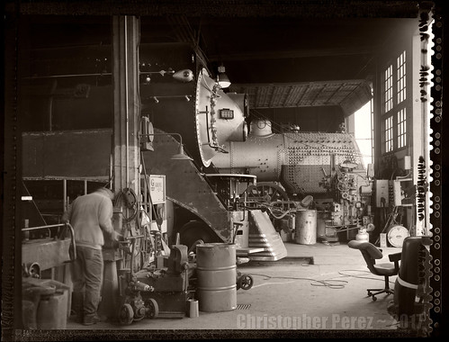
Here is a digitally captured image. As you can see, I used an ultra-wide angle lens and captured the scene under remarkably similar conditions to the Polaroid Type-55 image above. It was an overcast day in Longueville, France and the steam locomotive was pointed head-first out the doors.
The original digital image was actually shot as part of a three image HDR stack. I used Rawtherapee to process the original Canon CR2 raw file. In fact, I chose to work only on the -2EV image to see what I could do to keep sufficient detail in the highlights while raising the shadows.
As an aside, and if you'll recall, the Canon 5D MkII took a beating in the public forums for it's "banding issues." Yet, using a file that was 2 stops _under-exposed_ and leaning heavily on the "shadows" slider shows no "banding issues" of any kind. Additionally, the original 12-24mm Sigma EX HSM lens seldom received much love from the community of online photo-forum commenters. To my eyes the edge to edge resolution and flair control seem excellent.
The "character" of the two images, to me, is remarkably similar. If I hadn't talked about each image before reaching these comments (and ignoring the Polaroid Type-55 edge), would you have been able to tell which imaging medium produced which image?
In this entry I would like to take a brief look at images I made using both imaging mediums.
I kept some of my earlier black and white film negatives and brought them with me. Selecting a couple train images I set about digitizing them. Using a macro lens I shot sections of 4x5 inch negatives, stitched them together, and simply moved the top and bottom of the curve to the white and black points in the stitched file. This gave me large files (on average 8000 x 6000) where the film grain is clearly visible and the full range of luminosity of the original negative was expressed. I made no attempt to modify the shape of the curve (as you might with a digital file where some people might want to apply an "S" shaped curve, or something similar).
For train images shot as digital, I applied the technique described by The Online Photographer. That is to say, I snugged up the black end of the curve, ensured there was a lot of detail in the highlights, and raised the center of the curve to bring up the mid-tones. For both the digitized film and the digitally captured images I applied a platinum/palladium tone that I particularly like.
Here is a film-based image. As you can see, it's from a 4x5 inch Polaroid Type-55 P/N negative. I shot it at ISO 25 (the film side was always slower than the print side). The Polaroid output was always more contrasty than Kodak TMax100 negatives, too. I discovered Type-55 P/N very late in the film era and rather wish Polaroid was still around. I'd probably have to have a 4x5 camera and a few lenses just to shoot that wonderful material.
Given the lighting situation in the old Brooklyn Roundhouse in Portland, Oregon it's surprising that the Polaroid negative shows detail in the highlights and shadows. The shadows were very deep and the highlights could be very bright, even on overcast days. I find this remarkable as I remember carping about all manner of silliness and was seldom happy with my results. Yet, take a look at this. I must have mellowed a bit over the years. I now think it's a beautiful image.
Here is a digitally captured image. As you can see, I used an ultra-wide angle lens and captured the scene under remarkably similar conditions to the Polaroid Type-55 image above. It was an overcast day in Longueville, France and the steam locomotive was pointed head-first out the doors.
The original digital image was actually shot as part of a three image HDR stack. I used Rawtherapee to process the original Canon CR2 raw file. In fact, I chose to work only on the -2EV image to see what I could do to keep sufficient detail in the highlights while raising the shadows.
As an aside, and if you'll recall, the Canon 5D MkII took a beating in the public forums for it's "banding issues." Yet, using a file that was 2 stops _under-exposed_ and leaning heavily on the "shadows" slider shows no "banding issues" of any kind. Additionally, the original 12-24mm Sigma EX HSM lens seldom received much love from the community of online photo-forum commenters. To my eyes the edge to edge resolution and flair control seem excellent.
The "character" of the two images, to me, is remarkably similar. If I hadn't talked about each image before reaching these comments (and ignoring the Polaroid Type-55 edge), would you have been able to tell which imaging medium produced which image?