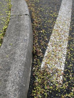
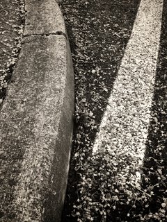
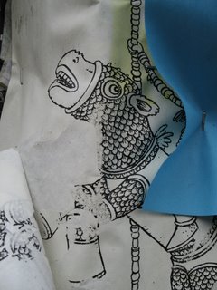
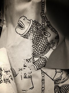
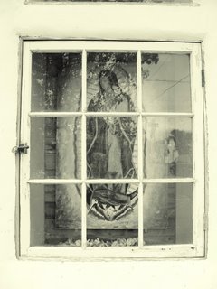
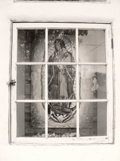
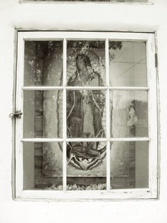
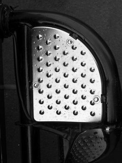
I have a print that has the tones I really love. It's something that's not been made for decades and comes from an original silver-based print. The paper came from Agfa and was labled BS 111 Double Weight.
There were several formulations of this paper. The one I like contains warm tones throughout. I have one surviving print of my grandfather and the image is just about perfect.
Using GIMP Sampling I was able to take a scanned copy of the print (in color, of course), and apply the tone sample to a standardized black and white gradient. I don't know if the scanner was able to faithfully capture the original colors, so I modified the gradient colors slightly to get the gradient to match my monitor's coloration.
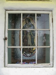
First, here is a copy of the image that uses Ken Lee's Bronze Quadtones.
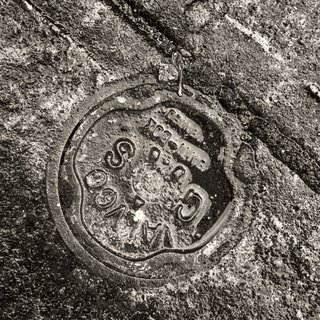
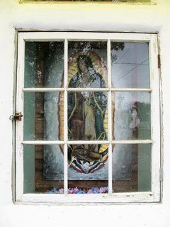
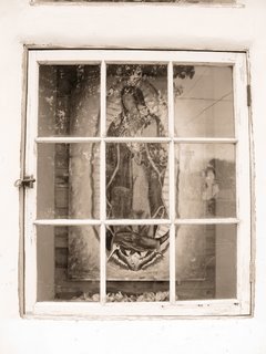
Here is a copy of the image that uses the raw scanned gradient from the Agfa BS 111 warmtone print.
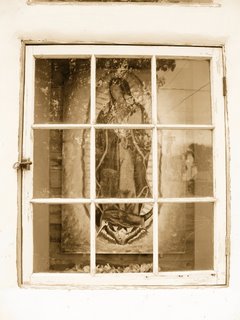
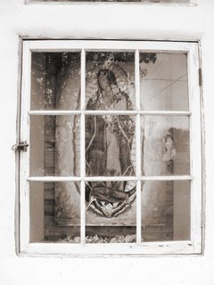
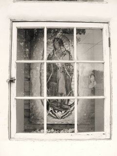
Here is the copy of the image that uses the slight manipulation of the original Agfa BS 111 warmtone gradient.
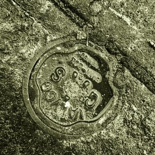
I want to look at this for awhile and consider if any progress has been made in "improving" Ken's original Bronze Quadtone sample.
Looking at a LCD, the "agfa" samples look too green. Ken's Bronze Quadtone sample looks just slightly magenta compared with the original print tones. So, at first pass it appears that the print scan does not match the print tones of the original image. Bummer.
An exploration of random photographic art related ideas, commentary, and useful information
Friday, April 13, 2007
Wednesday, April 11, 2007
Tones - Palladium, Platinum, Bronze Quadtone
I wanted to see how closely the digital toning technique compared with native Palladium hand coated to COT320.
For some time now I have been using Photographer's Formulary Palladium print materials. I love the warm tones and rich details it gives. Sometimes the "dmax" isn't what I'm used to in original silver based prints. Overall, though, the Palladium processes have opened up my print making along new vectors of art.
To compare original alternative print techniques against new digital tones I took two images and sliced them into three parts. The "lower" section would remain the original scanned Palladium tint, the "middle" section would take on a "platinum" tint selected from the GimpGuru, the "upper" section would take the "Bronze Quadtone" tint from Ken Lee's experiments on the topic.
The image of the old steam powered tractor is very instructional. The differences between the three tints are very clear. This leads me to think that digital tints might not duplicate the original Platinum or Palladium print tones.
The image of the old tractor hood is also very instructional. There are practically no differences between the original Palladium tones and the GimpGuru "platinum" colors. Ken Lee's QuadTone tints remain quite different. This exercise now leads me to believe that original alternative print tones may be duplicated in digital. I also learned that there are significant variations in original alternative print tones between prints. While intellectually I "knew" this. "Seeing" the effect first hand was a little startling.
Tuesday, April 10, 2007
Linux and the GIMP - IIa
Linux and the GIMP - II
I have been following the tutorials on the GIMP and found one on vignetting. The description of the technique is found here.
My starting point is the following color original.
Then I converted the Mode to black and white with a little contrast curve manipulation.
I RIP'd Ken Lee's Bronze quadtone colors from here.
Then I followed the vignette example in the tutorial to generate the following.
The image changes with each step and leads to something closer to what I first envisioned when I tripped the shutter on the wee-digi-snapper.
Next exercise? Dodging and burning an image using the increasingly powerful Linux and the GIMP!
Monday, April 09, 2007
Linux and the GIMP
I found that I can apply multiple tones to an image. This is entry is a quick discussion and example of what's possible.
If these hold up to printing through a digital printer (such as HP's B9180 or Epson's 3800), then I'll be really excited! It could be a nice technique for selective toning and quickly generating beautiful B&W prints.
The GIMP discussion on this topic is found here.
Starting with the raw color original digital capture 10mpixel image (size reduced for this blog), we see what the camera recorded. No manipulation was applied.
Now we take a quick look at a little image sharpening and contrast curve changes.
Then I switched the mode to Black and White.
Here are the first two image samples from the toning exercise. Both are "sepia".
Here is one in Platinum and Palladium.
Here are two in Palladium. I think this emulates warm and cold Potassium Oxalate developer.
Here are two more. This time in Platinum. Again, I think the difference is what one might see between warm and cold Potassium Oxalate developer.
Now I need to sit back and study these to see if any one in particular strikes me in a positive manner. From reading the GIMP instructions, if I don't like what I see, I can always create my own toning samples.
This may quickly prove to be really powerful stuff!
Friday, April 06, 2007
Wednesday, April 04, 2007
Metal on Metal
One last thought for the day...
I love motorcycles. They are very freeing. While I no longer ride, there are days when I think about it.
One of the things I see is that my level of enjoyment brings a level of visual awareness that more easily translates into a pleasing image. Well, at least from my perspective.
I love motorcycles. They are very freeing. While I no longer ride, there are days when I think about it.
One of the things I see is that my level of enjoyment brings a level of visual awareness that more easily translates into a pleasing image. Well, at least from my perspective.
Architecture
Still on the theme of how I "see", the digi-snapper allowed me to create this image rather quickly. It took only a matter of seconds for me to "see" the scene, frame it, and to take the image.
If you were to put this side by side with a 4x5 image, I doubt I would be able to tell the difference in composition. I would have taken the vary same image if I'd used a large camera.
Using the Digi-Snapper
Well, I have been using the new digi-snapper as a precursor to my trip to India. I need to become familiar with it's operation so that I can capture what I want when I'm under the stress of overseas travel.
What I'm finding is that I tend to view the world as I do when working with one of my large format cameras. The 4x5, 5x7, and 8x10 cameras have "taught" me to frame the world in certain ways.
This image is a prime example of what I'm seeing is my world view.
What I'm finding is that I tend to view the world as I do when working with one of my large format cameras. The 4x5, 5x7, and 8x10 cameras have "taught" me to frame the world in certain ways.
This image is a prime example of what I'm seeing is my world view.
Tuesday, April 03, 2007
StreetArt
Someone mentioned that in addition to the movie called "Piece by Piece" that another movie called "Style Wars" is worth watching.
I don't understand anything about StreetArt, except to say that I find some of it to be quite beautiful. Certainly it can be more beautiful than any Corporate "message" that's put out there.
StreetArt
Monday, April 02, 2007
Pears
OK. I can't help myself. EVERYONE does fruit and veggies. Well, here's my take on the subject. I have a series of images of which this is but one. See my Flickr site for the full raw dump.
Polaroid Type55 4x5 inch negs contact printed to Palladium. I switched back to using a coating rod in place of the Richeson brush for these small prints. Using Crane's Weston Diploma paper, I find I like the coat better with the rod. Anything larger than 5x7 and the rod becomes problematic on Weston paper. Thus far, to continue the point just a bit more, I have found the Richeson brush to be a required coating tool when printing to COT 320 or Arches Plantine.
Subscribe to:
Posts (Atom)