Wednesday, December 16, 2020

Remembering working with film...

My father sent yet another video.  This time it is on Ansel Adams and the Zone System of exposure.


Of course, with digital equipment most of these considerations have been effectively automated.  We seldom consider these kinds of details and certainly not in this specific way.

Watching the video reminded me of two things surrounding the development (LOL!) and use of the Zone System.

First, Phil Davis wrote "Beyond the Zone System" where he helped us understand that film/developer combinations subtly moved the color spectrum up and down the tonal curve.  While not as flexible as performing human perception conversions of digital color to monochrome, I think that anything that leads to a better understanding and control of one's tool set very helpful.

Second is something I find incredibly ironic about Ansel Adam's Zone System.  It involves the history of the development (2x LOL!!) of this system of exposure control.  

One of the photography professors that he taught with at the California School of Fine Arts had suggested this method to Mr. Adams.  This professor apparently picked up on the idea from William Mortensen.  Reviewing the early Camera Craft books that William wrote where he talks about a very specific series of exposure placement and development perhaps you can see what I'm getting at.

If you know the history of Saint Ansel, the Group 64, and their collective hate for William Mortensen, perhaps you will have already guessed at the irony of the Zone System.  I use the word hate because Mr. Adams wrote in a letter that (that was curiously published in his autobiography) he wouldn't be sad if Mr. Mortensen were dead.  

I have no idea what would provoke such a strong response from certain West Coast Photographers, but there you have it.  A little photo-history drama.

Not to make too much out of the whole episode, here's a video on the works of one of Ansel Adams sudents, John Sexton.  

Viewers seldom care about process.  Good photography should speak for itself, right?


Friday, December 11, 2020

Ansel Adams ~ early film

My father sent me another video -


I didn't realize there had been a movie camera there to record the event.  It's pretty interesting to see how they did the climb and to catch a glimpse the stills camera being set up.

Of course this day led to the making of one of the most iconic images Saint Ansel ever made.

By contrast (pun intended?), our current imaging equipment automates nearly everything to perfection.  Who remembers how to balance shutter speed and aperture against the sensitivity of the light gather materials?  Who cares about film/developer combinations and their effects on local contrast?  No, we have it rather easy these days, don't we?

Then, just the other day, I stumbled on an interview with a photographer I've known nothing about.  I thought she has some rather interesting things to say about technologies and their relation to image creation.

How we "see" appears to be linked to the tools we use.


NOTE: if you haven't already seen this, it, too, is quite good, but from a different perspective.

Sunday, November 29, 2020

Black and White photography ~ an unexpected realization

Readers may already be aware of something key to understanding Black and White photography and human vision.  For myself, it has taken a very long time to sort any of this out.  Alas, here I am.  Finally.

It is already well understood that taking a color digital image and de-saturating it creates an all too often uninteresting mess. What occurred to me is that Black and White film, too, could be a complete and utter mess.  It was always a struggle to get something we called "tonal separation" between the grays.

Back in the day I understood how a panchromatic emulsion was different from orthochromatic.  And I thought I understood how filters could be useful when shooting panchromatic film.  But, still, film took years of working with to try and get something "interesting" out of.  As I say this, I'm thinking of all the "special" developer setups (Rodinol at 200:1 dilution instead of 25:1) and process methods ("semi-standing" for 30 to 45 minutes so as to "bring up" shadow details).  What alchemical insanity it all was just to try and get some "tonal separation."

What took me forever to understand is that human perception has something very important to say about how we see color tones in Black and White.  Tim Soret clearly illustrates the importance of understanding and using the principals of human perception in imaging.  With this in mind, what I have come to learn and appreciate is that digital Black and White image quality can _exceed_ that of Black and White film.

Such a shocking realization, this.

On the other hand, I naively thought that digital in-camera Black and White image conversions were simply de-saturated color images.  So I learned how to apply human perception corrections on the computer.

Recently, a friend sent me his wee-Point and Shoot Sony HX90V 30x small sensor plinkey-plinkey camera.  It's kind of a fun camera, what with the long zoom range and all that.  The poor dear delivers only jpgs and I quickly searched for ways to get the best out of the small setup.

Wandering the Paris streets during our second Covid-19 confinement I made an image my friend and I thought was actually pretty nice.  Fortunately, I took two shots.  One in color and the second using Sony's in-camera "Black and White Style" (_not_ the High Contrast nor the Rich Tone conversions).

Straight out of the camera the Black and White "Style" image looks really nice (see the following image).

Paris around the edge ~ 2020

To consider what was going on I took the color version of the image and did a human perception conversion on it to compare against the out of the camera version.  Guess what?  They matched.  Perfectly.

Confirming that Sony is, indeed, using the human perception model for their in-camera Black and White "Style" conversions, I took an A7, stacked three different colors with a bit of yellow and re-ran the comparison.  

Note: The human perception model is implemented in the Open Source Software the Gimp as "Lch Color" channel and in RawTherapee as "Luminance." 


Black and White Comparison ~ In-Camera vs Post-Processing


How do Nikon, Canon, Fuji, Olympus, Panasonic, or perhaps rather interestingly Leica with their Black and White only bling-bling in-camera conversions work?  Interested parties should have a look.

For myself I've confirmed that Sony has "hit this one out of the park!"

Here are a few more images nearly straight out of the HX90V plinkey-plinkey - One Two Three Four


Monday, November 23, 2020

A photographer Europeans pay little attention to...

My father sent me another video of Ansel Adams.

As I watched it I realized that Europeans don't hold the West Coast photographers in very high regard.  The possible exception being Edward Weston, but even he is not as celebrated as, say, New York street photographers nor Weston's lover, Tina Modatti.

I grew up knowing about and following the life and works of Ansel Adams.  I went to every show I could, including a fabulous exhibition in LA when I worked in a black and white print lab on Sunset blvd (it was the lab for Samy's Cameras, also on Sunset).  He was a central figure in my photographic awareness.

With time I "moved on" to learning about and appreciating other photographer's works.  People who know me know that I have a great appreciation for what William Mortensen did for photography.  If you don't already understand what I'm saying, check out Mortensen's "Camera Craft" series of guides on model posing, negative and print processes and camera technique.

Coming back to Ansel Adams for a moment, I had an opportunity to buy one of his "Moonrise" prints from his gallery in Yosemite Valley.  I had the $800 in my pocket.  Stupid me, I went and bought a used Leica M3 with a 50mm f/1.5 Summarit lens, instead.  I rue the day I made that decision the way I did.

It is fascinating to watch the following video and to see a young Mr. Sexton working as Ansel's assistant.   Sexton was in Portland once on a lecture and book tour and I got to meet him and learn a bit about his approach to seeing things.

Anyway.  Enough of that.  Here is the video.


Sunday, November 15, 2020

Technologies during times of change...

My father sent me the following video.  

I find it interesting as it illustrates, for me, the deep understanding a person needed of their tools and techniques to make a decent image.

Of course, there is an easy comparison to today's cell phones.  I can imagine current image makers wondering what all the fuss was about.

As a person who made the transition from alchemy, through controlling the materials as carefully as I could, to simply pressing a button, I could ramble on for many beer or wine soaked hours.  But, in truth, it all is of little import.

All that matters is the image.


Saturday, November 07, 2020

Seen on YouTube: Bokeh is overrated

I really like what this guy says and did here.  It is making me stop and think a bit more deeply about out of focus rendition and its importance (or lack there-of) in photography.


Sunday, October 11, 2020

Well, yes, things have changed...

I recently snarked and whinged over obvious changes taking place in the community of image makers.  Not knowing what else to do, bored I guess, I decided to see what was on the market.  Which led to an upheaval of equipment chez moi.

The shift started with the Elinchrom flash kit.  Then, like magic, half of my collection of Nikon Nikkor glass was on offer.  Only to be replaced by a couple things.  

Lots going out.  Just a bit coming in.  Better balance of tools and materials?  Maybe.

Animated Spirits - reborn

From a photoshoot I had
shortly after moving to Paris
lit using Elinchrom Bx500Ri

The Elinchrom flash system was used perhaps a dozen times.  I'd purchased the materials new in anticipation of working with models in Paris of the kind I enjoyed working with back in Portland, Oregon.  Alas, things are quite different here, I had a big lesson to learn, and I was never able to get anything serious off the ground.

After nearly three years of sitting idle, I sold nearly everything from the studio kit.  I've kept the backdrop system of poles and stands "just in case" something comes up.  I will use available light should any future opportunities to work with creative people arise.

Lens Stories ~ Lens Lineup

A small sample of the collection of
Nikkor lenses that used to take up
space in the closet

With the Nikkors I rationalized the sales by admitting I had way too much glass in the closet.  I had duplicates and sometimes quadruplicates of nearly every focal length from 20mm up through 300mm.  So a bunch of stuff had to go.

Knowing now what I know about out of focus rendition and how nearly all lenses out resolve film and sensors, I decided to keep a few that I've found have unique properties.  The Micro-Nikkors and an interesting 50mm a/1.8 AiS remain in the closet.  So do the incredible 85mm f/1.8 K and early 105mm f/2.5 P.  I'm weighing keeping the surprisingly good 75-150mm Series-E f/3.5 and an old 35mm f/2 pre-Ai as well.

After a few sales the envelope of resources had grown somewhat large and, lo and behold, I can across an inexpensive nearly mint Zeiss 16-70mm ZA OSS f/4 for the Sony APS-C mirrorless cameras.  

Lens Stories ~ 16-70mm Zeiss ZA OSS

Sony NEX-7 with Zeiss 16-70mm f/4 ZA OSS

What a find this has been!  The 18-55mm Sony kit lens only "comes good" around f/8. Looking at the resolution of the 16-70mm Zeiss from wide open proves to me the value of spending a bit of money for something "decent."  

Then I looked at the out of focus rendition and I find I am very pleasantly surprised.  I contrast the Zeiss experience against my long time use of a Canon 24-105mm L f/4.  The Canon lens was hugely expensive and had more than a few short-comings that became obvious with use.  However, the Zeiss optic is so good that it doesn't seem to have any weaknesses. I might have to spend a year or two using it as my daily "beater" lens. 

Thumbing a bit deeper into the envelope revealed even more resources. So, what to do next?  Well, it turns out I want to solve a specific problem that I was having photographing automobiles at the Montlhery Autodrome.  It is a high banked track that dates from the early 20th century and motor-events are held nearly every weekend there.

Vintage Revival Montlhery ~ 2019

Nikon Nikkor 100-300mm f/5.6 AiS ~
a real beast to manually focus, but when
I nail the focus - woohoo!!!

Previously I used a Nikon Nikkor 100-300mm f/5.6 AiS to reach out and show the steepness of the racetrack's incline.  This lens isn't often talked about, but it is one of the finest optics, fixed focal length or zoom, that I've ever encountered in this range.  The out of focus rendition is "to die for" gorgeous.  The resolution is incredible from wide open.  It really is that good.  But, manually focusing that thing at 300mm is a real bear, even when perched on a monopod.

I'm not sure how it happened, but I rediscovered that Sony recently released a 70-350mm G-Master optic for their APS-C system.  A friend has been sharing some images from airshows in England, where he uses a Canon 100-400mm L.  

Lens Stories ~ Sony 70-350mm G-Master

Sony A6000 with Sony 70-350mm f/4.5-6.3 G-Master

At 350mm's on the long end the Sony isn't quite as long a lens as the 100-400mm Canon, but it might be close enough (what's 50mm's, really now).  It has better reviews than the more expensive full frame Sony 70-300mm G-Master.  The out of focus rendition looks nearly the equal of the 100-300mm Nikkor.  For this old man who is getting a little shaky the very best part is that the Sony 70-350mm comes with auto-focus and optical image stabilization.

I'm looking forward to Montlhery re-opening events to the public (we're in the midst of a pandemic just now).  This coming spring at the Vintage Revival I hear that the Beast of Turin will thunder its way around the circuit.  What a sight that will be!  Maybe my wife and I will be able to go across la manche to see our English friends, too, as soon as things open up again.  There are a few of our friend's airshows that I'd like to see what this lens can do.

All this leads me to the current state.  I really should stop buying and selling things, but it's what I do when I'm bored and photo opportunities are few.  

When the situation changes and I can get out more I know I will be able to concentrate on making images and this Madness will pass.

Oh.  Have I mentioned I've taken up drawing?  Hah.  I must really be bored.


Beast of Turin ~ 1911 Fiat S76

Beast of Turin Fiat S76 at Retromobile 2016


Saturday, September 05, 2020

Have things fundimentally changed?

[A couple days after I posted the following comments, The Online Photographer had this to say.]


Kirk Tuck says it well.

"...blogging sure has changed over the last eleven years. We used to talk as much about gear back then as we do now but it seemed more important at the beginning. People were still transitioning to digital from their filmic pasts. Gear was improving by leaps and bounds. Mirrorless cameras were in their infancy and it seemed that DSLRs would rule forever. LED lighting was on very few peoples' radars. Portable flashes were the hot photo topic - that, and full frame cameras..."

This is my experience, too.  

I look at the three flash monobloc system I paid 1900Euro (TVA included) just eight years ago when my wife and I first moved to Europe and, well, it's worth, if I'm lucky, perhaps 200Euro for the entire thing at this point.  And, truth be told, there are less expensive and more feature laden solutions for lighting.

Lenses are things I've looked at as part of photographic systems since the 1980s. Much as changed here, as well.  Even the cheap glass is capable of outperforming (in certain meaningful ways) earlier, more expensive items. The higher end optics are so outstanding that they are now controlling 11th order effects in optical design, where just a few years ago a lens designer told me it was crazy to think there was much to be gained by trying to control 7th order effects.

Advancements in image processing software have largely nullified the limitations of ultra-small sensors.  Current mobile phones are clear examples of what I mean by this.  Image stacking for noise reduction, as well as increases in resolution are now done in-device and on the fly.

Many of the things that made photography a craft, such as lens selection, focusing, aperture, shutter speed, and ISO (ASA, back in the day) have, again, been nullified by advancements in technology integration.

I'm left with knowing and understanding things that are no longer be necessary to making a decent image.  Wet plate collodion alchemists may have felt something similar when dry plate, and soon thereafter, dry roll film became widely and cheaply available.

As always, the magic ultimately lay not in the alchemy, the chemistry, the lenses, the cameras, nor the techniques, but in the application of these in making a good photograph.  That was always the goal, regardless of how one got there.

Yet, here too, current practitioners are shutting down their blogs.  I'm thinking of Ming Thein as I type this.  While the world is in constant flux, but Ming's and Kirk's recent decisions to shutter their blogs seem somehow related.

Making a good photograph no longer is the goal.  See the billions of images posted to Instagram, Facebook, and Pinterest as examples of what I mean.

In my own case, after many years of engaging social media platforms and discussion forums and photography websites, I have closed nearly all of my accounts.  Some of this was by my choice (I don't like Facebook nor Instagram nor DPReview, and Pinterest seems oddly organized).  Others made choices for me (Tumblr with policy changes, Google shutting down Google+, MySpace users going elsewhere, etc.).  

Only my Flickr account and this blog remain active.  These are my outward facing portals in the on-line world.  As what I know increasingly lacks relevancy, as I run out of things to share and things to say, maybe this, too, will change?


Cimetiere Montparnasse ~ Paris 2020

Thursday, July 30, 2020

"Capture Sharpen" on a super cheap kit zoom

Again, after looking at "Capture Sharpen" in RawTherapee and seeing how it can clean up an image, and after taking a look at images that come from a system that has a strong anti-aliasing (AA) filter (for which "Capture Sharpen" was made for) and a system with a weak AA filter (for which "Capture Sharpen" might not have been designed for, but might have an influence on), I thought I'd have another look at a known "horrible" kitlens and see how it looks over its zoom range to see if there are any "sweet" spots in the focal length range, and if "Capture Sharpen" might work well enough to remove optical defects.

Setup -
  • Using a Sony NEX7, one each image from
    • Sony 18-55mm f/3.5-5.6 SEL OSS
      • Shot at various focal lengths
      • Shot at f/9
  • Process in RawTherapee
    • Lens Corrections
      • chromatic aberrations
      • field distortions
    • "Auto Levels"
    • Set "Curves" black to the bottom end of the image's histogram
    • "Capture Sharpen"
  • Pull 100percent resolution 500x500pixel sections from the image and display them along with a down-rez'd copy of the original image

Images -

[If you click on the following images and then select full-resolution versions of these images you will be able to see differences between the photos]

Starting with a Sony "el-cheap-o piece-o-crap" 18-55mm kit lens image at 18mm -

RawTherapee Capture Sharpen ~Sony 18 to 55 Kit Zoom at 18mm

At 24mm -

RawTherapee Capture Sharpen ~Sony 18 to 55 Kit Zoom at 24mm

At 32mm -

RawTherapee Capture Sharpen ~Sony 18 to 55 Kit Zoom at 32mm

At 55mm -

RawTherapee Capture Sharpen ~Sony 18 to 55 Kit Zoom at 55mm


Comments -

Sony got beat up pretty badly by some writers about the image quality of the 18-55mm f/3.5-5.6 SEL OSS.  I remember reading an article where the photographer felt his Sony NEX-7 with this kit-lens mounted on it was useless.  His claim was that it took a very sharp lens to "wake up" the NEX-7's potential.

Because of this man's comments, for many years I've avoided using the optic for anything "serious."  It was a fun "kicking around lens", but that was the farthest I'd go.  Over the years I've found myself using fixed focal-length lenses as a way to avoid spending "serious money" on Zeiss or higher-end Sony zoom e-mount lenses.

Just a few months ago a friend sent me a photograph of a pretty Ducati 750GT that was at a show up in Washington state somewhere.  I was blown away by the image.  The clarity, the resolution, and the colors were just drop-dead gorgeous.  I had to ask him which lens he'd used to make the photo, so he sent a full-rez version where I could read the EXIF information.  Yes.  You guessed it.  He'd used this super-cheap super-horrible kit-zoom.

Some people might feel shooting anything between f/8 and f/11 or f/13 is too limiting.  Certainly fixed focal length and more costly zoom lenses can perform better wide open.  But if a person finds they can live with shooting at a zoom-lens' best apertures, there will be nothing finer, regardless of cost, regardless of manufacturer.

Saturday, July 18, 2020

"Capture Sharpen" does a nice Sigma and a super cheap kit lens

After looking at "Capture Sharpen" in RawTherapee and seeing how it can clean up an image, and after taking a look at images that come from a system that has a strong anti-aliasing (AA) filter (for which "Capture Sharpen" was made for) and a system with a weak AA filter (for which "Capture Sharpen" might not have been designed for, but might have an influence on), I thought I'd have a look at a known "horrible" lens and see how it compares with a known "good" optic.

Setup -
  • Using a Sony NEX7, one each image from
    • Sony 18-55mm f/3.5-5.6 SEL OSS
      • Shot at 26mm
      • Shot at f/10
    • Sigma 30mm f/2.8 EX DN E
      • Shot at f/10
  • Process in RawTherapee
    • Lens Corrections
      • chromatic aberrations
      • field distortions
    • "Auto Levels"
    • Set "Curves" black to the bottom end of the image's histogram
    • "Capture Sharpen"
  • Pull 100percent resolution 500x500pixel sections from the image and display them along with a down-rez'd copy of the original image

Comparison -

[If you click on the following images and then select full-resolution versions of these images you will be able to see differences between the photos]

Starting with a Sony "el-cheap-o" 18-55mm kit lens image...

RawTherapee Capture Sharpen ~Sony NEX7 18 to 55mm Kit Lens 26mm f10


Following up with a Sigma 30mm f/2.8 EX DN E image...


RawTherapee Capture Sharpen ~Sony NEX7 Sigma 30mm f/2.8 EX DN E  at f10


Comments -

Can you tell any difference between them?  Seriously.  Look carefully.  Any difference at all?  Now think about this.


OK.  Sure.  The kit lens has some "interesting" behaviors when shot wide open, but...  Sure.  The Sigma is brilliant from wide open.  But what's wrong with shooting a lens at its best aperture?  In the case of this Sony kit optic that would be f/8, f/9, f/10, or f/11.

Keep in mind that I'm using the lens correction functions in the image processing application.  Who doesn't these days? Things like chromatic aberrations and field distortions can be corrected.  Add "Capture Sharpen" to the processing sequence and I'm able to re-confirm for myself something that I've been saying for a long time, now.

Have a lens?  Good.  Use it!  No excuses.  None.

Crazy, isn't it? 

Friday, July 17, 2020

"Capture Sharpen" - AA filter and optical comparison

After having experienced "Capture Sharpen" in RawTherapee and seeing how it can clean up an image, I wanted to take a look at how it works on images that come from a system that have a strong anti-aliasing (AA) filter (for which "Capture Sharpen" was made for) and a system with a weak AA filter (for which "Capture Sharpen" might not have been designed for, but might have an influence on).

Setup -
  • One image from
    • Canon 5D MkII
      • strong AA filter
      • 24-105mm f/4 L IS
      • shot wide open
    • Sony A6000
      • weak AA filter
      • Sigma 60mm f/2.8 Art DN
      • shot wide open
  • Process in RawTherapee
    • Lens Corrections
      • chromatic aberrations
      • field distortions
    • "Auto Levels"
    • Set "Curves" black to the bottom end of the image's histogram
    • "Capture Sharpen"
  • Pull 100percent resolution 500x500pixel sections from the image and display them along with a down-rez'd copy of the original image
Comparison -

[If you click on the following images and then select full-resolution versions of these images you will be able to see differences between the photos]

Starting with a Canon 5D image...

RawTherapee Capture Sharpen ~Canon 5D 24 to 105mm f/4 L at 50mm


Following up with a Sony A6000 image...


RawTherapee Capture Sharpen ~ Sigma 60mm Art Example


Comments -

Starting with the Canon image we see that the photo looks nice and seems to have fairly decent resolution.  Without the "Capture Sharpen" processing step, however, the image is rather soft. Knowing the Canon system as I do I can say that there are two things to take into account.

First, the AA filter Canon uses is strong.  It deliberately softens an image so as to get around any moire effects that might crop up.  Looking at a Canon image all by itself I doubt people would be displeased with their results, but...

Second, the 24-105mm f/4 L IS (version 1) was highly touted at the time I purchased it.  I thought nothing of its performance and assumed it was as good as I could get, regardless of price (at the time the 5D MkII was introduced a kit was rather expensive at 3500USD).  Over time and with many many photoshoots under my belt I started to uncover subtle performance degradations. 

When I shot it side by side with a Sony mirrorless system I was instantly struck by how soft images were with my Canon gear.  The following is a hint of how I came to the decision to sell my Canon equipment. 

Take a look at the second image and the differences between the two systems (Canon and Sony) should be readily apparent.  The Sony A6000 + Sigma 60mm f/2.8 Art DN is fabulously sharp.  And under the treatment of "Capture Sharpen" the overall image "sharpness" is over the top incredible.

I bought a Sony A6000 body new at the local Salon de la Photo some years ago and paid 450Euro (less than 500USD at the time).  Shortly after I bought the body I picked up a new Sigma 60mm f/2.8 Art Dn for less than 200Euro (around 220USD).

You can see where I'm going with this, right?

Before anyone gets upset about me comparing a Canon zoom against an aftermarket prime, my overall experience of using the Canon DSLR was very consistent.  It didn't seem to matter if I used a prime lens or a zoom on any Canon I ever owned (and I owned a lot of them).  The strength of the Canon AA filters over-ride pure optical resolution.  The 24-105L proved to be less than satisfying in addition to the AA effects.

What I see here is that taking a camera with a strong AA filter and passing it through "Capture Sharpen" can bring an image the appearance of "sharpness."  It is by comparison with other systems that one might question the use of strong AA filters in general photography.

What I see here in taking a camera with a weak or non-existent AA filter and mating it with a sharp lens (remembering, of course, that it is difficult to find a lens that is _not_ sharp) and passing it through the "Capture Sharpen" process can yield images that are sharper than I could ever have imagined.


Sunday, July 05, 2020

Does software level the playing field? [2]

I previously shared my thoughts that, yes, software and the "capture sharpen" function in particular, can indeed "level the playing field" in terms of "sharpness" in an image, independent of which lens is used.

Before moving on to see how this compares and works in the real world I would like to confirm what I have come to understand by looking at three more lenses

In this comparison I look at two Nikon Nikkor 85mm lenses with a LensTurboII focal reducer and one Sony 50mm SEL OSS.  These lenses were commonly touted as being good "portrait" lenses.  In fact, the Nikkor K 85mm f/1.8 is a gorgeous "portrait" lens.  It is not as wickedly sharp as some of my other lenses when shot wide open, but the overall wide open rendition, I find, is just amazing.

Setup -

  • Big Beefy Manfrotto tripod (so big that it is suitable for stabilizing an old 8x10inch view camera)
  • Sony NEX-7 - 2 second delay, ISO 100
  • Lenses - shot wide open and at f/2.8 only
    • Sony 50mm f/1.8 SEL OSS - effective full frame focal length of 75mm
    • Nikon Nikkor 85mm f/1.8 K pre-Ai + Lens Turbo II - effective APS-C focal length of 56mm
    • Nikon Nikkor 85mm f/2 Ai + Lens Turbo II - effective APS-C focal length of 56mm

Scene -

What I setup was a simple situation of a tree that had complex, beautifully detailed bark.

Sony 50mm, Nikkor 85mm Capture Sharpen Comparison


Comparison -

Click on the following image and find the full resolution image to inspect the image at 100percent.

Sony 50mm, Nikkor 85mm Capture Sharpen Comparison


Comments -


In general, "soft" or out of focus image areas will remain so after passing the "capture sharpen" step.

I have to say, I'm particularly happy to see how well the Sony 50mm f/1.8 SEL OSS did from wide open.  As we will see in a future blog entry, I had a Sigma 60mm f/2.8 Art that I nearly regretted selling, until I saw this, that is.  In any event, this Sony lens is truly the "cat's meow" of a lens and it's a "keeper."

The Nikon Nikkor 85mm f/2 Ai + LensTurboII focal reducer is really quite nice from wide open, too.  It isn't all that far behind the incredible Sony.  With this I think I can re-confirm that the "capture sharpen" function "levels the playing field" rather nicely.  This old Nikkor is a very usable optic.

Finally, the Nikon Nikkor 85mm f/1.8 K pre-Ai + LensTurboII focal reducer remains softer than the other two lenses when shot wide open.  Not that the wide open "capture sharpened" image is bad, mind you.  It's only by comparison that one can see any difference.  However, by f/2.8, the "playing field has been leveled" and this early f/1.8 Nikkor is just as brilliant as it's sister lenses compared here.

Do lenses actually matter?  It's turning out to feel as if it might not matter at all which lens you use, just as long as you "sharpen" an image correctly during processing.

Now there's some potential heresy for you.

Friday, July 03, 2020

Does software image processing "level the playing field?"

We were in in southern France this winter and taken the TGV.  This allowed me to pack a rather heavy suitcase.  But coming back north meant flying.  Suddenly the suitcase was a bit heavy.  My wife tried to pick up my carry-on and immediately asked what the h*ll I had in there.  It contained two computers and three cameras with Nikon Nikkor manual focus lenses.

My wife's question was a good one and I've now come to question that I should carry all my fun, preferred "stuff" when we're away from Paris.  Instead I might want to carry something light.

So... let's have a look around and see what I have... ah... yes... Sony E-mount autofocus lenses... and... some software... and... why not once more and without hesitation confirm that a lens is a lens is a lens... and... let's have a look at the impact of image processing on image "sharpness" to see if any differences between lenses remain after cleaning up an image with some software...

Recently RawTherapee has come bundled with something called "Capture Sharpen".  It is an image pre-sharpen module that works to reverse image softness that comes from imaging sensors that use anti-aliasing (AA) filters. 

This function is automatically applied, I understand, in popular non-open source software image processing applications such as Lightroom and Capture One.   

This makes sense as, for instance, Canon uses strong AA filters with their cameras to combat moire patterns.  This tends to hide optical resolution.  Canon digital images often appear softer before the "capture sharpen" image processing step than competitors imaging systems.

Sony is one of those competitors and based on personal experience they use weaker AA filters, and in some cases uses no AA filtration at all.  So it's easy to see lenses of varying degrees of "sharpness", particularly when shot wide open.

So I wondered if "capture sharpen" might clean up optical effects similarly to the way this function tries to reverse the effects of AA filters.

In this comparison I grabbed some of my beloved Nikon Nikkor glass (which tend to be soft wide open) and compared their images against a few small, sharp, auto-focus Sigma and Sony SEL lenses.

Setup -

  • Big Beefy Manfrotto tripod (so big that it is suitable for stabilizing an old 8x10inch view camera)
  • Sony NEX-7 - 2 second delay, ISO 100
  • Lenses - shot wide open and at f/8 only
    • Nikon Nikkor 24mm f/2.8 Ai + Lens Turbo II - effective APS-C focal length of 16mm
    • Sony 16mm f/2.8 SEL
    • Sigma 19mm f/2.8 EX DN E
    • Sigma 30mm f/2.8 EX DN E
    • Nikon Nikkor 35mm f/2 + Lens Turbo II - effective APS-C focale length of 35mm

Scene -

What I setup was a high contrast situation with strong highlights and deep shadows.

Sigma 30mm f/2.8 EX DN E scene setup


Comparison -

Click on the following image and find the full resolution image to inspect the image at 100percent.

Nikon Sony Sigma "Real World" Comparison


Comments -


In general, "soft" or out of focus image areas will remain so after passing the "capture sharpen" step.

Comparing my Nikon Nikkor 24mm + LensTurboII setup against a Sony 16mm after the "capture sharpening" step I see that the centers are pretty much equal in terms of apparent sharpness.  The edges, however, of the 24mm + LensTurboII remain softer than the 16mm Sony.  In fact, at f/8 the 16mm Sony is really quite good, where it matches the performance of the brilliant 19mm Sigma EX DN E.

The Sigma 19mm and 30mm lenses are brilliant across the field at both wide open and f/8 after the "capture sharpen" step.  Not much more to say than this.

Which leaves us with looking at one last Nikkor, the 35mm f/2 pre-Ai.  I really like this lens.  When coupled with the LensTurboII focal reducer I find this focal length is nearly a perfect match for how I "see."  Wide open it tends to be just slightly "soft" compared to the Sigma 30mm.  However, after the "capture sharpen" step apparent "sharpness" the Nikkor cleans up beautifully.

Old, many times softer lenses can be made to look like their modern counterparts.  It's pretty easy to see that "capture sharpen" levels the playing field, as it were.

Returning to the question of camera system weight and portability, I'm now re(?)-convinced that I don't have to carry the Nikon Nikkors if I don't want to or if I find myself in a situation where less weight becomes important.

Friday, June 26, 2020

Super Selective toning ~ finale

I've taken three steps (step one, step two, step three) to reach this level of understanding around what is possible with selective toning of black and white images using Open Source Software image processing applications.

In this, the fourth and for now final step in my process of understanding I look at preserving as much image information as possible as the means to keeping  histogram as smooth as possible.

As you will recall, when processing jpg images there are only 256 luminosity steps.  Any changes made to the image quickly introduces gaps/spikes in the histogram.  This indicates lost information. 

Most of the time this is beyond the ability of the untrained human eye to perceive.  But, to me at least, this is intellectually unsatisfactory.  More practically there are many cases where we would like to preserve as much information as possible when we make any changes (strong or otherwise) to an image in processing.

For these reasons I turned my attention to using the image toning functions in RawTherapee.

This Open Source Software application handles a vast array of RAW formats and provides 16bit image color spaces as default, with the possibility of dealing with 32bit floating point color spaces, too.

Limiting our attention to three functions we will see how easy it is to selectively tone an image while keeping the histogram very smooth.

Step One - Open a RAW format image in RawTherapee

In this example I pressed the "Auto Levels" button and let the application sort out how to arrange the image tones automagically. 

Then I opened "Tone curve 1" and snugged up the blacks and raised the whites in anticipation of emulating old silver halide prints.

RawTherapee black and white image toning


Step Two - Convert to black and white (I like "luminosity" conversions, but you may prefer something different, like de-saturation or RGB conversions).

RawTherapee black and white image toning


Step Three - Tone the image using "Color Toning"

Example A

RawTherapee black and white image toning

Note the settings I used.

The highlights remain neutral in this example.  So specular highlights in the image will remain pure white.

The mid-tones in this example are strongly Yellow, with a hint of Red and Green.

The shadow tones are just slightly blue to emulate a cool tone shade that we experience in nature (the color temperature of shadows are typically must lower than the color temperatures of highlights).


Example B
RawTherapee black and white image toning

Note the settings I used.

The highlights again remain neutral in this example.  So specular highlights in the image will remain pure white.

The mid-tones, however, are now slightly Yellow, with a hint of Red and, in this example, Magenta.

The shadow tones are stronger blue than the first example to more strongly emulate a cool tone shade that we experience in nature (again, the color temperature of shadows are typically must lower than the color temperatures of highlights).

Comments -

In your own work, I would suggest opening a toned image that appeals to you in a separate window.  Then work on your RawTherapee image toning sliders until you match the tones of your favorite toned image(s). 

If you save these settings you can then quickly recall them to be applied to any image.  RawTherapee has a good set of instructions on how to do this.

Monday, June 22, 2020

Super Selective toning in the Gimp ~ Part Three

In a prior blog entry I described a means of using the Gimp to tone the mid-range of a black and white photograph while keeping the blacks black and the whites white using Luminosity Masks.

This can be a rather complex process.  We will now try to dramatically simplify the entire toning procedure.  At the end of this post we will have a look as to whether this is a satisfying answer.  So stay tuned.


Setup -

Processing -

I will give a very specific set of instructions here.  However, keep in mind there are many combinations and variations that might help you express your intentions better.


Step One -

Open a black and white step wedge in the Gimp


the Gimp ~ converting gray scale with subtle tones

Now open three previously sample colorized step wedges.  Open cool tone wedge and two warmtone color wedges.  We will use this starting in Step Four.


Step Two -

Create 9 Luminosity Layers and Masks with one click

Select Filters -> Generic - Luminosity mask setup and watch as new masked layers are generated. 

Note how they are arranged with the "Darks" layer set of three grouped layers labled "DDD", "DD", and "D".  Similarly, note how the "Mids" and "Lights" are organized.  We are about to rearrange them.

But before we do, take a close look at how each set of three sub-layer masks are slightly different from one another.  They define how much of a region will be affected when we make changes to the layer image. 

Said another way, each mask uniquely describes what portion of the image will be affected by any changes we make to each layer image that each mask is attached to.


the Gimp ~ converting gray scale with subtle tones


Step Three -

Re-Ordering the Luminosity Mask Layers.

When we add color to these Luminosity layers, their arrangement and order will be important.  How the colors will blend and transition between the layers will be determined by the order you choose. 

We will now rearrange them to prepare for sample colorizing.

Click on the "Mids" top of group layer (where the "MMM", "MM", "M" sub-layers are organized just below it) and select the up arrow carrot.  When you click on the up arrow carrot after selecting "Mids", the entire "Mids" layer structure will move.  The up arrow carrot is found on a tool bar just below the base image.  Verify that "Mids" collection of three layers and masks are now positioned above the "Darks" collection of three layers.

Click on the "Mids" "M" layer and move it above the "MMM" layer (as seen in the example below.

Now click on the "Lights" collection of three layers and masks and again using the up arrow carrot click twice to move "Lights" first above "Darks" and then above "Mids".  "Darks" will now be the first Luminosity layer collection above the base image.  We have simply reversed the order of the layers and their masks.

There is one final task before moving onto the next step.  Deselect the "LL", "L", "MM", "DDD", and "D" layers. Your layers and masks should now look like the following.

the Gimp ~ converting gray scale with subtle tones


Step Four -

Select the "DD" layer image (not the mask - you can't colorize a mask).

Open Filters -> Map -> Sample Colorize and in the "Sample" pull-down menu select the cool tone step wedge.

Select Get Sample Colors

Select Apply

Select Close

the Gimp ~ converting gray scale with subtle tones


Step Five -

Adding a Mid-Tone Color select the "MMM" layer image (not the mask - you can't colorize a mask).

Open Filters -> Map -> Sample Colorize and in the "Sample" pull-down menu select a mid-tone sample colorized stepwedge.

Select Get Sample Colors

Select Apply

Select Close

the Gimp ~ converting gray scale with subtle tones


Step Six -

Adding a hint of color over the "MMM" layer by using the second warmtone stepwedge.

Select the "M" layer image (not the mask - you can't colorize a mask).

Open Filters -> Map -> Sample Colorize and in the "Sample" pull-down menu select the second of your two mid-tone sample colorized stepwedges.

Select Get Sample Colors

Select Apply

Select Close

the Gimp ~ converting gray scale with subtle tones


Step Seven  -

File -> Export the newly tri-tinted step wedge saving it using a meaningful name so you can easily identify and retrieve it in the future to tone your images.

From now on, all you have to do is open your image and open the step wedge in the Gimp and to sample colorize your image using that step wedge.  No need to use luminosity masking to get the detailed color tints you want.

Simple.


Summary -

You may have noticed that we have done nothing with any of the "Lights" layers.  Because of the way we ordered the layer stack, these keep the whites from the base image and will keep the whites white in final saved tri-toned step wedge.  In this example the "LLL" layer has the narrowest band of white of the three "Lights" layers.  By selecting other "Lights" layers you can extend the white and light grays further down the step wedge.

All you need to do is create one of these altered step wedges and you can consistently apply this exact range of tints to any image by sample colorizing using the newly created wedge.

However, let's think this a bit deeper. 

In 8 bit JPG images we have four channels to work with.  We have red, green, blue, and a black and white channel.  In converting to black and white we end up with only _one_ channel's worth of information, the black and white channel.  So when we add color _back_ to the black and white channel we have only 256 shades of gray to work with, even though we are adding color to the RGB channels.

What we've done is gone from an 8bit by 3 color channel color space down to just 256 bits of information to work with.  Most of the time the human eye can accept this and may find an image pleasing.

Looking at four channel curves in an image processing software reveals the fragility of using this limited amount of information.  This is readily seen when the "curves" are modified.  We can see in a histogram that information is at various points quickly lost.

I know.  Deep subject.  Is it worth all this thrashing?  I think so.  Here's why.

There might well be a very nice solution where we can easily work the black and white channel in a 14 or 16 bit RGB color space.  This has the promise of giving us a much smoother histogram "curve" and might help us experience images in a rich and, dare I say, gorgeous large format film nearly analog "look" and "feel" kind of way.

Onward to Part Four.


Sunday, May 31, 2020

Super Selective Toning in the Gimp - Part Two

Continuing the search for subtle toning based on selective tone ranges, here is a second method a person can use in the Gimp.

In Part One I laid out a process for selecting unique colors for selected Luminosity Mask regions.

In this, Part Two, I would like to share a process for using a unique feature found in the Gimp.

Under Colors -> Map at the end of the drop-down list is something called "Sample Colorize".  When used with a step wedge you can specify a range of colors that spread from pure black to pure white that apply tints to an image.  In analog photography terms you can think of this as a sophisticated toning mechanism.

There used to be a collection of step wedges you could download to work from, but I can't seem to find them anymore (it's been a number of years).  So I create my own step wedges from tinted images with color ranges that I like.  I tend to work from scanned carbon tissue, or platinum-palladium, or chocolate toned images.  I also have step wedges I created from scanned cool tone silver gelatin prints (I used to be a black and white photo print tech back when dinosaurs roamed the earth and still have some of my earlier works).

Looking at these step wedges you may quickly realize the subtleties in colors that are possible.  Here-in lay the promise for even finer tonal gradations when combined with the Luminosity Mask technique previously described.

I can't stress enough that there are any number of valid ways of achieving these kinds of results.  I am simply following a process path that seems obvious to me.  You mileage will vary (as they say).


Step Three - Get your step wedges ready

Continuing in the Gimp, open three step wedges.  I would suggest a cool tone wedge, a chocolate tone wedge, and a yellow-ish tone wedge.  These will open as separate files next to your base image tab.

Step Four - Cool down the shadow/dark tones

Return to the image to be toned and make the "DD", "MMM", and "LLL" layers the only _active_ (visible) Luminosity Mask layers.  We won't need the other masked layers so we need to make sure they are de-activated.

Working with your base image, select (for this example) the "DD" layer image (not the mask as you can not Sample Colorize masks).

Open Colors -> Map -> Sample Colorize

In the upper right corner of the dialog box, find and select the cool tone step wedge. 

"X" use subcolors ("smooth colors" should already be selected just to the right)

Select "Get Sample Colors"

Select "Apply"

Select "Close"

You should now see the image you are working on has taken on the cool tones of the step wedge in the dark regions.

Step Five - Warm up the middle tones

Select (for this example) the "MMM" layer image (not the mask as you can not Sample Colorize masks).

Repeating the Colors -> Map -> Sample Colorize steps outlined in Step Four, apply the chocolate toned step wedge colors to the mid-range tones of your image.

Step Six - Make the highlights "sing"

Select (for this example) the "LLL" layer image (not the mask as you can not Sample Colorize masks).

Repeating the Colors -> Map -> Sample Colorize steps outlined in Step Four, apply the yellow-ish toned step wedge colors to the mid-range tones of your image.

Your image should now be toned using portions of three colorized step wedges and three Luminosity layer masks.

If upon close inspection you find one region or another is too strongly tinted, you can lower the opacity of that layer/mask to something you find more pleasing.  I tend to do this in the shadows/dark tones as my colorized step wedge tends too be too blue to my eye.  So I tend to set the "DDD" layer/mask opacity to 50 percent.

Super Selective tone mapping in the Gimp


In the example screenshot image you can see how I have modified the process just slightly from what is written above.  Note the layer/mask arrangements and visibility settings (the "eye" found just to the left of each layer/mask).

In this example I have set the "LLL" layer/mask above everything else.  This will keep the whites white as I did not tint the "LLL" image.

I moved the "M" layer/mask above the "MMM" layer/mask and tinted both layers.  As you can see, the "M" layer/mask has a grayer mask than "MMM."  This means the "M" layer/mask is more subtle and for it's effects to be seen it has to be placed above the stronger "MMM" layer/mask.

Lastly, the "DD" layer image is cool toned and the opacity of that layer/mask is set to around 50 percent.

This is a lot to take in, but it helps understand why we will do what we do in the next Part Three example where we greatly simplify the entire process.

Tuesday, May 26, 2020

Super Selective Toning in the Gimp - Part One

In a prior blog entry I described a simple means of toning the mid-range of a black and white photograph while keeping the blacks black and the whites white.

Some years ago I remember reading where one of the attractions to using carbon tissue layers in registration to create a black and white photographic print was that a person could vary the colors of each layer.  That is, each carbon tissue layer represents some narrow range of overall image intensity and by carefully selecting the colors of each layer a printer could, for example, use cool tones in the shadows and warm tones in the highlights.

We can achieve the same effect with perhaps even finer tonal controls than carbon prints by using digital black and white images. 

Here is another of perhaps many valid methods for achieving the carbon tissue colorizing controls in digital image processing.

Setup -

Processing -
I will give a very specific set of instructions.  However, keep in mind there are many combinations and variations that might help you express your intentions better.

Before we begin, I want to note that in this example I'm using three strong primary colors so that you can see the blending transition effects from light to dark.  For a proper black and white image we would like never do something like this.

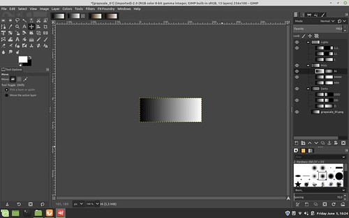
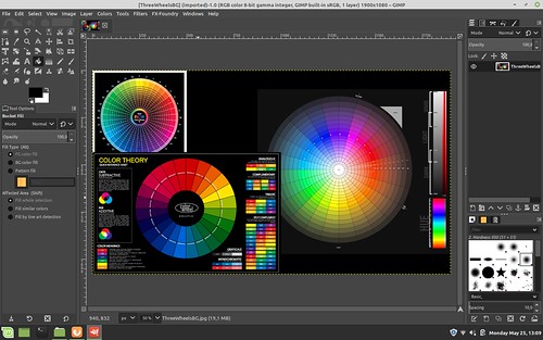
Step One - Create the Base Black and White Image

Open an image in the Gimp.

Mid-Tone color generation and blending using Luminosity Masks


Add a black layer over the base image and set the blend mode of the black layer to "Lch Color".  Flatten the image in preparation for the next steps.

Mid-Tone color generation and blending using Luminosity Masks


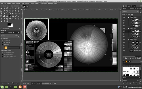
Step Two - Create 9 Luminosity Layers and Masks with One Click

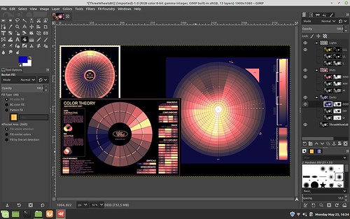
Open Filters -> Generic - Luminosity mask setup and watch as new masked layers are generated.  Note how they are arranged with the "Darks" layer set of three grouped layers labled "DDD", "DD", and "D".  Similarly, note how the "Mids" and "Lights" are organized.  We are about to rearrange them.

But before we do, take a close look at how each set of three sub-layer masks are slightly different from one another.  They define how much of a region will be affected when we make changes to the layer image.  Said another way, each mask uniquely describes what portion of the image will be affected by any changes we make to each layer image that each mask is attached to.


Mid-Tone color generation and blending using Luminosity Masks


Step Three - Re-Order Luminosity Mask Layers

When we add color to these Luminosity layers, their arrangement and order will be important.  How the colors will blend and transition between the layers will be determined by the order you choose.  We will now rearrange them to prepare for sample colorizing.

Click on the "Mids" top of group layer (where the "MMM", "MM", "M" sub-layers are organized just below it) and select the up arrow carrot.  When you click on the up arrow carrot after selecting "Mids", the entire "Mids" layer structure will move.  The up arrow carrot is found on a tool bar just below the base image.  Verify that "Mids" collection of three layers and masks are now positioned above the "Darks" collection of three layers.

Mid-Tone color generation and blending using Luminosity Masks

Now click on the "Lights" collection of three layers and masks and again using the up arrow carrot click twice to move "Lights" first above "Darks" and then above "Mids".  "Darks" will now be the first Luminosity layer collection above the base image.  We have simply reversed the order of the layers and their masks.

Mid-Tone color generation and blending using Luminosity Masks


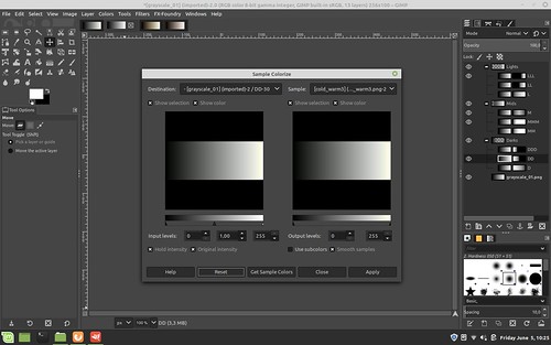
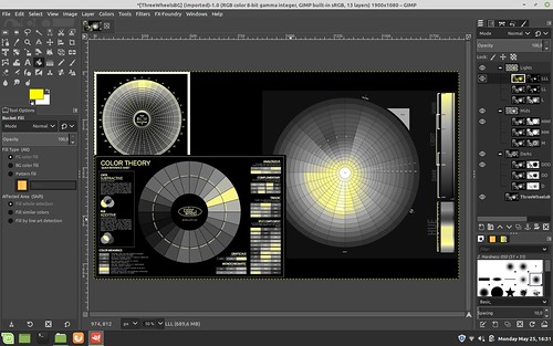
Step Four - Add Highlight Color

Select a foreground color.

Mid-Tone color generation and blending using Luminosity Masks

Deselect visibility (the "eye" found just to the left of the layer image) of the "LL" and "L" layers.

Select the "LLL" layer image (and not the "LLL" mask since we cannot add color to a mask).  In this example we are selecting the layer who's mask most narrowly describes the highlight region of the image.  Selecting "LL" or "L" would broaden the colored highlights further down the tonal range.  This is something to keep in mind as you work with this technique as you can use this to introduce subtle gradations of colors within the tonal region defined by these Luminosity masks.

Select Filters -> Map -> Sample Colorize 

Select Sample: From Reverse Gradient

Select  Get Colors (perhaps not strictly required)

Select Apply

Select Close

Mid-Tone color generation and blending using Luminosity Masks


Here is how the image looks after adding color to the "LLL" highlights layer.  You can begin to see where we are going with all this by looking carefully at the various color wheels in the image we are working on to observe what just changed.

Mid-Tone color generation and blending using Luminosity Masks


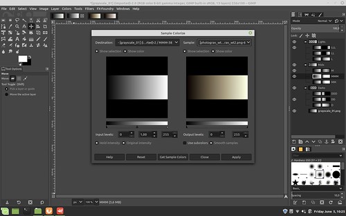
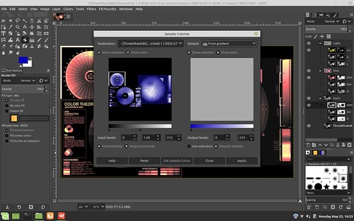
Step Five - Add Mid-Tone Color

Select a new foreground color.

Mid-Tone color generation and blending using Luminosity Masks


Deselect visibility (the "eye" found just to the left of the layer image) of the "MM" and "M" layers.

Select the "MMM" layer image (and not the "MMM" mask since we cannot add color to a mask) under the "Mids" layer grouping. 

Select Filters -> Map -> Sample Colorize

Select Sample: From Reverse Gradient

Select  Get Colors (perhaps not strictly required)

Select Apply

Select Close

Here you have a choice and you will need to try both to see which mid-toning works best for you.  In this example I have continued to select Sample: From Reverse Gradient though you could use Sample: From Gradient.

Mid-Tone color generation and blending using Luminosity Masks


This is how the mid-tones are colorized and blended with the "Lights" "LLL" layer that we added in the prior toning step.

Mid-Tone color generation and blending using Luminosity Masks


Step Six - Add Low-Tone Color

Select yet another new foreground color.

Mid-Tone color generation and blending using Luminosity Masks

Deselect visibility (the "eye" found just to the left of the layer image) of the "DD" and "D" layers.

Select the "DDD" layer image (and not the "DDD" mask since we cannot add color to a mask) under the "Darks" layer grouping.

Select Filters -> Map -> Sample Colorize 

Select Sample: From Gradient  (note the change of this field value from the prior two steps)

Select  Get Colors (perhaps not strictly required)

Select Apply

Select Close

Mid-Tone color generation and blending using Luminosity Masks


Here is how the "Darks" look after following this, the final step, in this example.  Carfully observe how the colors transition between colorized regions.  This may have important consequences for the colors you choose in your own work.  There is potentially a lot to consider here.


Mid-Tone color generation and blending using Luminosity Masks


Summary -

As you can see, we have successfully added different colors to the highlight "LLL", mid-region "MMM", and shadows "DDD".  We did this by sample colorizing copies of the base image that are included in each of the 9 layers that were generated by the "Luminosity mask setup".  Each Luminosity layer has a unique mask that defines the region and extent to which the sample colorization will be applied.  In this way we can control the exact colors of, in this example, three different regions - highlights, mid-tones, and shadow.

Remember, we have 9 masked layers to work with.  So we have the possibility to further "finesse" the colors and their transitions.  If/when you choose to take advantage of the 6 masked layers that we did not use in this example, I suggest that you will want to invert the order of "Mids" under the top layer grouping.  That is to say, instead of ordering the "Mids" sub-layers as "MMM", "MM", and "M", reverse this too "M" first, you can leave the "MM" where it is, and move "MMM" to the top. 

The "Lights" and "Darks" sub-layer ordering can be left alone.  As a potentially mind-bending exercise I will leave the reasoning for this to the reader.  On second though, maybe I should cover it here.

If you look at the masks for the "Lights" and "Darks" sub-layers you will see that the most restricted mask is on top, with the following two layers expanding the regions affected by color changes.  So you will want the most restricted color mask on top in the "Mids" so that its color effects will be seen and not hidden _below_ upper more expanded layer mask.

In any event, as you add colorized layers, re-select the visibility "eye" found just to the left of each layer image to make that layer "active" and its effects visible in the overall image.

There you have it.  A potentially mind-bending, mind-exhausting way of subtly controlling colors of different tones across an image.  All this in the pursuit of old carbon tissue photographic image style.

Now, honestly, wasn't that fun?  Well, maybe not.  But at least you have real control over your image, right?