[adapted from the description section of my Flickr images from Rome]
We were recently away in Brittany for a week and Italy for five weeks. I didn't take the laptop and so I was rather constrained in image processing options. But I thought a 10inch Android Tablet with Snapseed should be just fine. Well, it should have been.
I shoot RAW and my images from this trip look "meh" after WiFi'ing them from the camera to the tablet and working them in Snapsee.. After 4 weeks it finally occurred to me to look at the file size. Lo and behold, thumbnail jpgs were what were being transferred. Ugh. I felt stoopid.

Explored on Flickr
29 November, 2022
This easily explained why my cellphone images looked sharp on Flickr and the A6000 images do not.
Thinking about it a bit I tested shooting RAW + JPG. Good, full Rez JPG were suddenly transfering. Lesson learned, but only as we were reaching the end of or Roman Covid Holiday. Have I mentioned how giving Romans are? They were so kind they shared some damnable version of the Dreaded Lurgy with us. I know, this has nothing to do with JPGs, except is does. I lost 10 days of good full rez images due to the require downtime to recover.

While we were trying to recover, an interesting image processing approach came back to me.
I read about how Norman Seeff used to print high contrast images with a twist. He used a black stocking between the enlarger lens and paper to give a interesting softness to some of his images. He wasn't by any means the only one to do this.
When I worked at Samy Cameras photo lab on Sunset Blvd in Hollyweird we used to do this at client request. It was really no big deal, but the effect was good for some subjects.

What was a bigger deal was our use of Agfa Portriga Rapid 111 Glossy paper. It gave a gorgeous deep walnut brown tone. We used this for may of the gallery shows we printed for various then famous photographers.
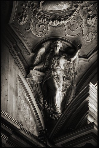
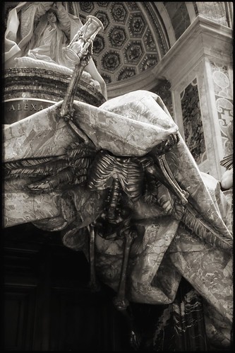
Taking the black stocking idea and borrowing tones from Portriga Rapid, it turns out, expresses pretty well how I feel about Rome. So I created a series of images done in this old, outdated, likely not very hip manner.

The Snapseed process was straightforward.
- Import an image
- Convert to monochrome using the Black and White "high contrast" option
- Adjust the contrast as needed
- Add a border
- Dive into "Glamour Glow" and set "Glow" to around 35 or 40
- Slide the color to +50 to add warm tones
- Export the image
If I set the in-camera "Style" to Black and White with appropriate constrast, I can side-step the monochrome conversion in Snapseed.
The "Glamour Glow" color slider seems to be tied to the "Glow" setting. The higher the "Glow" the more warm tone color is added. Not sure why this is, but I think that's what I'm seeing.
Now that I'm home and using RawTherapee, I see just how smooth I can get my Black and White images. Snapseed feels "gritty" in how it outputs images. This isn't a bad thing, mind you. It's just different.