I tend to push myself. Hard. Seldom do I feel my work is "good enough." Good enough for what? you might ask. Well, good enough to please me.

The benchmark of excellence are published images in major media journals (of course) as well as, and more importantly, coming from a carefully honed sensibility that I have developed over my 50 years of pushing the little shutter release button. Er, am I really that old? I guess so. Nevertheless, I have what I feel is a very clear idea of what's "good" and what most definitely is not.
So when I stop just a moment a take a look back I'm sometimes surprised.
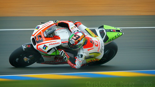
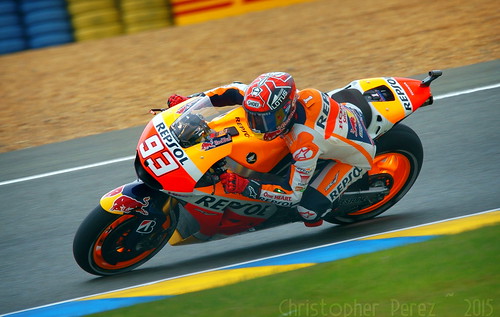
Take, for example, my recent trip au Mans to try taking a few photos of the Grand Prix de France MotoGP. I went equipped with all the things I felt were needed for successful image making. My little sweet Sony A6000 shot in RAW on Continuous AF flipping along at 10fps was the foundation. Add to this a Tamron 150-600mm SP superzoom and a Sony adapter with translucent mirror (which gets the AF speed up to "acceptable") and a very sturdy (good enough for 8x10inch large format film cameras) Manfrotto tripod.
My hope/desire was to make the kinds of images I drooled over in Cycle magazine in the decade before they went suddenly and very sadly out of business. Cycle World took over, if memory serves, but the articles and photos were never ever the same again. There was a certain panache about Cycle that I dearly miss. There are certain articles about a Kawasaki 550cc GPz motor'd Bimoto as well as a very lovely Ducait 851 that stand out in my mind, even after all these years, as truly outstanding articles illustrated by equally fine photographs.
I'm not sure where to find these kinds of images these days. The old magazine publishers have different goals these days. Instagram, Tumblr, and Flickr don't seem to carry the kinds of reportage images of major sports events I like, either. The on-line sports outlets offer mainly videos to illustrate and report on events. The format of those sites isn't suited to the need/desire for high quality stills. Yet, in my Mind's Eye I can still see and clearly (hopefully) remember how things Used To Be.
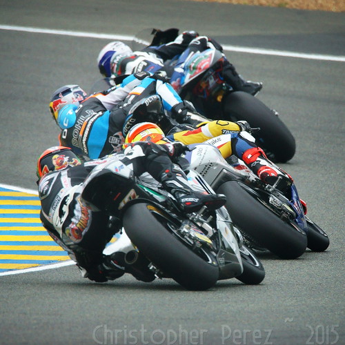
I thought a lot about how to proceed once I was track-side. I had no special Press Pass, so I needed to shoot from the spectator's areas. These tend to be a long ways away from the action, which meant the Tamron super-zoom would be pressed hard into use at the long end of it's focal length range. This would be a challenge as AF speeds tend to slow at smaller (f/6.3-ish) apertures and the bikes would be circulating at a great rate of knots (as Henry Manny was known to write in Road and Track during the 1960's). I needed to think carefully about aperture, shutter speed, and ISO, too. I didn't want too much "noise" to show up in the shadow areas and I knew that I'd be working under a thick cloud layer (it even rained for a short time), but there wasn't much I could do about that, other than to rely on careful image processing.
Of the thousands of images I took that day in le Mans only a few are sharp enough to express the kinds of things I wanted to say. At first I was disappointed at the "hit rate" being so low. Giving the whole experience time to unfold, however, I've come to realize just how happy I am with the results.
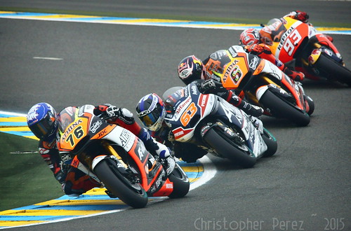
Gods! many of these are critically sharp and would print very easily to 30x40inches. I'm not sure how much better I could get. Well, perhaps with a little faster AF capability (PDAF on a future Sony A7000 comes quickly to mind) I could improve my "hit rate." But as for basic, solid images that give me pleasure and might "stand the test of time", my current setup and the images I now have in hand are just fine.
When I review my work now it's easy for me to remember the sights and sounds of the whole experience of being at le Mans to watch one of my favorite pastimes; motorcycle racing.
This was a dream come true. I have a few photos that go some ways to sharing this experience with others, too.


The benchmark of excellence are published images in major media journals (of course) as well as, and more importantly, coming from a carefully honed sensibility that I have developed over my 50 years of pushing the little shutter release button. Er, am I really that old? I guess so. Nevertheless, I have what I feel is a very clear idea of what's "good" and what most definitely is not.
So when I stop just a moment a take a look back I'm sometimes surprised.
Take, for example, my recent trip au Mans to try taking a few photos of the Grand Prix de France MotoGP. I went equipped with all the things I felt were needed for successful image making. My little sweet Sony A6000 shot in RAW on Continuous AF flipping along at 10fps was the foundation. Add to this a Tamron 150-600mm SP superzoom and a Sony adapter with translucent mirror (which gets the AF speed up to "acceptable") and a very sturdy (good enough for 8x10inch large format film cameras) Manfrotto tripod.

My hope/desire was to make the kinds of images I drooled over in Cycle magazine in the decade before they went suddenly and very sadly out of business. Cycle World took over, if memory serves, but the articles and photos were never ever the same again. There was a certain panache about Cycle that I dearly miss. There are certain articles about a Kawasaki 550cc GPz motor'd Bimoto as well as a very lovely Ducait 851 that stand out in my mind, even after all these years, as truly outstanding articles illustrated by equally fine photographs.
I'm not sure where to find these kinds of images these days. The old magazine publishers have different goals these days. Instagram, Tumblr, and Flickr don't seem to carry the kinds of reportage images of major sports events I like, either. The on-line sports outlets offer mainly videos to illustrate and report on events. The format of those sites isn't suited to the need/desire for high quality stills. Yet, in my Mind's Eye I can still see and clearly (hopefully) remember how things Used To Be.

I thought a lot about how to proceed once I was track-side. I had no special Press Pass, so I needed to shoot from the spectator's areas. These tend to be a long ways away from the action, which meant the Tamron super-zoom would be pressed hard into use at the long end of it's focal length range. This would be a challenge as AF speeds tend to slow at smaller (f/6.3-ish) apertures and the bikes would be circulating at a great rate of knots (as Henry Manny was known to write in Road and Track during the 1960's). I needed to think carefully about aperture, shutter speed, and ISO, too. I didn't want too much "noise" to show up in the shadow areas and I knew that I'd be working under a thick cloud layer (it even rained for a short time), but there wasn't much I could do about that, other than to rely on careful image processing.
Of the thousands of images I took that day in le Mans only a few are sharp enough to express the kinds of things I wanted to say. At first I was disappointed at the "hit rate" being so low. Giving the whole experience time to unfold, however, I've come to realize just how happy I am with the results.

Gods! many of these are critically sharp and would print very easily to 30x40inches. I'm not sure how much better I could get. Well, perhaps with a little faster AF capability (PDAF on a future Sony A7000 comes quickly to mind) I could improve my "hit rate." But as for basic, solid images that give me pleasure and might "stand the test of time", my current setup and the images I now have in hand are just fine.
When I review my work now it's easy for me to remember the sights and sounds of the whole experience of being at le Mans to watch one of my favorite pastimes; motorcycle racing.
This was a dream come true. I have a few photos that go some ways to sharing this experience with others, too.
