Sunday, June 23, 2024

What to do in late 2023 into 2024

Here's a list of potentially interesting/fun things to do around l'isle de France.

Art/History/Automobile Photography Opportunities

21 September - l’Autodrome Italian Meeting Montlhery

12-13 October - 100 year celebration Montlhery UTAC

Calendar of Montlhery events - 2024


-------------- DONE ---------------

30 June - la traversee de Paris (a month earlier this year - went to Meudon where there were hundreds of cars - album on Flickr)  


la traversée de Paris estivale ~ 2024


22 juin 2024 ~ la 6ème édition du Festival Lotus Montlhery (WONDERFUL  event, Flickr album here

Club Lotus France ~ Montlhery 2024

25-30 May - Rallye des Princesses 2024 (I wasn't here for this)

1-12 May - Foire de Paris Spaced out and forgot this was even taking place.  Ugh.

11/12 May - Vintage Revival Montlhery 100 year celebration!  Double Ugh!! I sat in the queue to enter the circuit for 2 hours.  As it approached midday I gave up and went home.  There were so many people and cars trying to get in, I still can't believe it.  Just insane.  I've been waiting two years to attend this event.  Such a huge disappointment.

21-27 April - Tour Auto 2024 a la porte de Versailles, Parc des Expositions  (Flickr set here)

le tour auto ~ le tour de France Automobile 2024

14 April - rassemblement Vincennes en Anciennes old car show

14 Avril 2024 ~ Rassemblement Vincennes en Anciennes

17 March ~ Photo Foire ~ Chelles  ~ a GREAT show, but I didn't buy a thing

Chelles Audiovisuel Photo Foire ~ 17 March 2024

3 March ~ le carnival des femmes ~ depart pl. du Chatelet 14h30 (No Go)

24 February - 3 March ~ Salon International de l'Agriculture (No Go - way too many political issues)

11 February ~ Carnival de Paris ~ Promenade de Boeuf Gras ~ depart pl. Gambetta - No Go (wet, cold)

31 January - 4 February - Retromobile 2024  (Flickr

Ferrari ~ Retromobile ~ 2024

14 January - la traversee de Paris 2024 (Flickr

la traversee de Paris 2024

15 December 2023 ~ Noir et Blanc, BnF (Flickr

Bibliothèque nationale de France ~ 2023

6 December 2023 ~ Van Gogh - (Flickr)

1 December 2023 - Nicolas de Staël ~ City of Paris Museum of Modern Art (Flickr)

Musee d'Orsay ~ Paris 2021

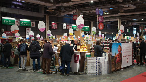
30 November - 3 December ~ Salon des Vins des Vignerons Indépendants (Flickr

Salon des Vignerons Independents ~ 2023

November 2023 ~ Les halles Saint Pierre - Two shows (Flickr)

La Halle Saint-Pierre, Paris ~ 2023 


Musée international d'Art naïf Anatole Jakovsky

RIP Ben Vautier 2024

Thursday, June 20, 2024

Example ~ Sony "High Key" Creative Style recipe

Certain Sony model's Creative Style list is rather short.  I have a NEX-5T and A5000.  Neither come with "Deep" nor "Light" Sony Creative Styles.  I rather like "Deep" and "Light" as I feel the "Deep" Style matches Hasselblad "Natural Colors" and that "Light", when desaturated after export, does an outstanding job of creating a BW Print Quality image.

OK.  So two of my devices don't offer my current favorite in-camera styles.  Does this mean I'm dead in the water for "film simulations" on very early Sony cameras?  What are my in-camera color grading options?

Here's something I tried with an old Sony NEX-5T.


Parc Bagatell, Paris ~ 2024


Sony "High Key" Creative Style recipe ~

Creative Style ~ 

    Standard

        +1 Contrast

        -3 Saturation

        0 Sharpness

    White Balance ~ 

    C Temp./Filter ~ 6200k

        A-B: B3

        G-M: G1

    Exposure Value ~

    variable +0.3EV to +1.7EV <- to get the "high key" effect


-------------------- Additional Recipes ----------------------

The above recipe is just one example of a wide variety of possible recipes.  Here's a list of in-camera jpg engine tools and a short description of what they might do to stretch and alter the color space. 

Creative Style -

Under each Creative Style we have...

Contrast - Some possibly interesting recipes involve the lack of contrast.  It's worth trying this setting -3.

Saturation - Softer tones seem to be all the rage these days, hence the "-" setting.  Furthering this idea it could be a good exercise to develop a recipe based on the "Neutral" Creative Style.

Sharpness - Looking at many of the Fuji "film emulation" recipes there is the thought that to look more like film it's a good idea to drop the sharpness.  I don't buy into that, but it's here as a selection to help give a softer image expression.

White Balance ~

High Kelvin temperatures bring warm tones, while low brings cold.  In the above recipe I set to the WB to 6200K and shot that regardless of the scene.  Full sun, shade, and building interiors were all shot at this WB value.  This approach can add further variability to images.

There is a potentially interesting WB, and that is one of the Florescent selections.  One of these gives nearly daylight WB, but stretches the color range.  It might be worth exploring.

White Balance editor ~

On any WB selection, there is an additional tool that can be brought into play.  While in the WB selector, tap the right side of the control wheel or the "options" button (depending on the Sony camera model) to bring up a color palette.  Using "up" and "down" arrows, we can move the tones in any direction.  So, for instance, if you are using a very warm tone WB and you want to add blues and/or greens, we can move the center point of the palatte in those directions.  This opens the door to a wide variety of in-camera colors.


-------------------- Additional Information ----------------------

Sony Creative Style ~ basic knowledge


Friday, June 14, 2024

Example ~ Sony "BW Print Quality" Creative Style recipe

Until recently I've been rather skeptical of being able to generate in-camera jpg's that had any decent sense of black and white imaging.  Between my complete lack of trust of any in-camera jpg processing engine and my utter disregard for the bulk of digital black and white work, I've stuck to what I've learned about RAW processing black and white images.

And then... an interesting thing happened when working with Sony "Picture Profile"s.  I found that I could meet in-camera the three base criteria that I hold to be self-evident (but which likely aren't at all self evident) for making a digital image that can rival the old black and white film chemical film/print process.  These criteria being...

  1. Raise the mid-tones  
  2. Dark regions are "open" with detail 
  3. Retain a hint of tone in gently rolling off highlights  

With these criteria in mind, I wanted to see if there was a Sony "Creative Style" that allowed me to get around "Picture Profile" stills work limitations and make a beautiful black and white image that retains old film print-like qualities.  

Surprisingly, it didn't take much research to see that the Creative Style "Light" might fit the bill.  This style raises the middle of the luminosity curve in a way that satisfies all three of the aforementioned criteria.  Though...

To make this work, I needed to make one concession to my attempt to only use in-camera "min-lab" capabilities.  In the case of using "Light" for black and white work, I need to completely desaturate the image after image export since this Creative Style is really a color "look".  I'm not aware of a way fully desaturating Creative Styles in-camera.  Therefore, I would rely on whatever image processing app is available to me on the tablette or cellphone to perform the desaturation step.


Snapseed processed BW

Sony "BW Print Quality" recipe
Sony NEX-7, Sigma 30mm f/2.8 EX DN
f/6.3, 160th sec, -0.7EV
Snapseed desaturation, -20 vignette


Sony "BW Print Quality" Creative Style recipe ~

Creative Style ~ 

    Light

        0 Contrast <- contrasty sun/shadow scenes
        +1 Contrast <- normal contrast scenes   
        +2 or +3 Contrast <- flat illumination

        0 Saturation

        0 Sharpness

    White Balance ~ 

        C Temp./Filter ~ AWB

    Exposure Value ~

        -0.3EV ~ +/- this value depending on overall
            scene brightness, paying close attention to
            the dominant tone (light or dark)

Exported Image Operations ~

    Use a suitable image processing application to desaturate into BW


-------------------- Comments  ----------------------

This has been a rather fruitful adventure.  

What started as an exercise to attempt to match Fuji in-camera "Film Simulations" ends up with me understanding, borrowing, and creating a broad range of recipes that implement an interesting series of color-gradings to work with, as well as instilling in me a renewed appreciation for the power and flexibility of Sony's in-camera tools for jpg generation. 

I'm enjoying the in-camera color-gradings, and I'm particularly happy to see that I can actually make a correct black and white image as well.  Is there any wonder why I've taken to referring to my cameras as mobile "mini-labs?"  I can take the above example image straight to print, publishing, or sharing on the internet.

Ultimate flexibility remains in the use of RAW processing software on the Big Computer.  Certainly I can control the results to a much greater degree than I can using the in-camera "mini-lab." But with care and a bit of knowledge and experience, I'm finding in-camera results more than acceptable.

Perhaps for the kinds of images I make these days, all that Big Computer heavy lifting isn't necessary.  I'll see what happens next.  Obviously, shooting RAW+jpg could pay off in having the best of both worlds in imaging flexibility.  Fortunately memory is cheap these days.


Limitation ~

Unlike with the "BW Print Quality" Picture Profile recipes, Sony Creative Style Light doesn't provide a direct way of creating in-camera black and white filters, though I've yet to fully explore the possibilities of modifying the white balance.


-------------------- Additional Information ----------------------

Sony Creative Style ~ basic knowledge

RawTherapee "BW Print quality" RAW processing recipe

Sony Picture Profile "BW Print quality" in-camera jpg recipe

Wednesday, June 12, 2024

Example ~ Sony "Natural Colors" Creative Style recipe

What started all this looking into Sony color grading recipes is that the Fujifilm Folks and Hasselblad Haulers seemed to be having a LOT more fun than the rest of us.  They claimed to have colors and recipes that were easily available to them that couldn't be duplicated.

Such is the power of marketing, or so said my Little Internal Voice of Skepticism.  I was determined to find a way to configure Sony in-camera jpg processing tools that met or exceeded the "filmic looks" of the well heeled "influencer in-crowd."

I've already proved to myself that Sony Picture Profiles could be used for stills and could compete head to head with Fujifilm "Film Simulations."  I also proved to myself that Hasselblad's "Natural Colors" could be had with a specific Picture Profile recipe.  All that was "missing" from my list of color-grading desires was easier in-camera contrast control, auto-exposure bracketing, and silent shutter support.

I took a look at Sony "Creative Styles" to see if there were any useful styles.  There are two, in fact.  I'll cover "Deep" here and "Light" in a future post.

It's too easy.  I can't believe it.  "Deep" matches Hasselblad Phocus color-grading at the 3FR format file to FFF demosaic step in the following first recipe.  The second recipe posted here matches the color-grading at the 3FR to FFF demosaic step with a Hasselblad "Nature" preset enabled.

Sony "Natural Colors Nature" Creative Style recipe 

Sony "Natural Colors Nature" recipe


Sony "Natural Colors" Creative Style base recipe ~

Creative Style ~ 

    Deep

        -1 Contrast

        -1 Saturation

        0 Sharpness

    White Balance ~ 

        C Temp./Filter ~ AWB

            A:B: A1

            G-M: M1

    Exposure Value ~

        variable depending on overall scene brightness, but usually simply 0EV


 --------------------------- recipe # 2 --------------------------------

Sony "Natural Colors Nature" Creative Style recipe ~

Creative Style ~ 

    Deep

        0 Contrast

        0 Saturation

        0 Sharpness

    White Balance ~ 

        C Temp./Filter ~ AWB

            A:B: A1

            G-M: M1

    Exposure Value ~

        variable depending on overall scene brightness, but usually simply 0EV


-------------------- Comments  ----------------------

I feel it might be helpful to describe what I've learned and how I've gotten to this so that others can quickly/easily sort this out for themselves if so inclined.

First, I loaded Hasselblad's Phocus software to understand how it manages colors.  It turns out to be a rather simple piece of software and the "magic" of 'blad "Natural Colors" is in the tone curve and gently soft color palette.  The tone curve is set for deeper/richer tones than, say, other camera manufacturer's "Standard." The color palette is subtly de-saturated.

Second, Hasselblad's Phocus "Nature" setting claims to use a "Standard RGB" curve modification.  Except the curves function is not "Standard RGB."  They've actually implemented something called "Weighted Standard RGB."  This prevents the colors from distorting as badly as the real "Standard RGB" algorithm, and gives a gentler increase in color contrast as luminosity contrast increases.

Next, I found that <RentWare> Standard camera profiles implement the same thing Hasselblad's Phocus software does.  This was a pleasant surprise.  It's a very simple exercise, then, to use <RentWare> Standard .dcp files in RawTherapee. Voila! I instantly have Hasselblad's ultra-magic "color science" [snark] on any camera I chose to use. 

Note: <RentWare> Standard camera profile is in a separate directory from manufacturer/model specific .../Camera/Standard.  They are _not_ the same thing.

Coming to Sony in-camera jpg processing, I made a Picture Profile recipe that matches Hasselblad "Natural Colors" and <RentWare> Standard, but with a few camera-imposed limitations. Looking a just bit further, I discovered that Sony's "Creative Style Deep" does an excellent job of matching Hasselblad/<RentWare> as well.

Bottom line

Sony "Creative Style Deep" = Sony Picture Profile "Natural Colors" = <Rentware> Standard camera profile = Hasselblad Phocus "Natural Colors"


Limitations ~

Sony Creative Style Deep is not available on my NEX-5T, nor on my A5000.  But it does come on the early NEX-7, A6000, A6300, and A7 cameras up through current models.


-------------------- Additional Information ----------------------

Sony Creative Style ~ basic knowledge

RawTherapee "Natural Color" RAW processing recipe

Sony Picture Profile "Natural Color" in-camera jpg recipe

Tuesday, June 11, 2024

Sony Picture Profiles ~ limitations

Beer Selection ~ Potton, England


It's clear to me that Sony Picture Profiles are designed for video work.  Once setup, I imagine they are meant to be left alone. Because of this when working on an A6300 I've come across a few limitations in using the profile system for stills.  Here are four limitations.

Contrast control is a bit awkward.  In Picture Profiles contrast is managed in part by the Gamma black point.  "+" raises the shadows and "-" deepens the shadows.  That's not all.  There's the influence of the Knee function that sets the highlight rounding point and densities.  This is not a "show stopper", but changing these settings on the fly is a bit more complex than I'd like to tackle while working in the field.

The automated exposure bracketing feature is disabled when Picture Profile is selected.  Using the "mini-lab" in-camera processing that profiles enable, I want to get an exposure correct before exporting/uploading.  I don't want to have to adjust image densities on the tablette or cellphone, either of which only works in an 8-bit color space in any event.  I don't like the color distortions that come with even subtle "Curves" changes.  While not exactly a "show stopper," since I can manually adjust EV settings, the lack of auto exposure bracketing is something I've noted and wish were implemented differently.

Picture Profiles are not available when shooting on the silent electronic shutter.  I can't sort out why this would be the case, but on the A6300 it's not available.  This is a bother for the times I want to shoot something nicely color-graded and do it in absolute silence, such as when photographing in museums.  This is somewhat of a "show stopper" to me.

Picture Profiles are only available on certain models, starting with the A6300, A7II, A7RII, A7S, and the RX100IV cameras.  The problem is, with the exception of the A6300, I'm heavily invested in camera versions prior to those just listed.  While on the road I have no problem simply using the A6300.  Yet, what if I wanted to take advantage of the in-camera "mini-lab" on my other devices?  This is more of a "show stopper" as I'm not in a financial position to roto-till 95% of my camera body selection for the sake of gaining Picture Profile capabilities.  The costs are simply too high for this Old Guy living on a fixed income.

After returning from a trip to England I carefully reviewed the imaging results from the adventure.  Some Picture Profile recipes I found or created were more to my liking than others.  Discovery of what is possible was part of the whole exercise of shooting RAW+jpg.  If something fails, then I could process the RAW on the Big Computer back home.  For the works that I found acceptable, I could post straight to Flickr while on the road.  That was, afterall, the goal of this entire exercise.  Posting on the fly.

Lightly mulling over the subject of "film emulations" and in-camera color-grading I realized something that must be obvious to other people, but was entirely lost on me until now.  Back in the day when the Canon 5D MkII was introduced I very quickly learned that the in-camera jpg processor was junk.  It was such junk that I've assiduously avoided making in-camera jpgs ever since.

I "sorta" knew the following a decade ago when I picked up my first Sony A6000,  the Sony in-camera jpg engine is infinitely better than the earlier Canons.  When I looked at the file sizes of the A6000 in-camera jpg, they were smaller than RAW converted to jpg work.  I thought there had to be useful information missing from the Sony in-camera jpgs, so I've avoid until now using this in-camera jpg engine too.

The mind-changing thing that struck me was that I could accept Sony Picture Profile output and be content with the results straight out of the camera.  This, even with the smaller jpg in-camera file size.  Which led me to ask:  So why remain stuck with my avoidance of Sony's in-camera jpg engine?  Yes.  Ultimately, shooting RAW give more flexibility and all that.  But perhaps I'd not given the in-camera "mini-lab" it's proper due.  Maybe there was another way "to get there from here" that didn't involve the aforementioned "show stoppers."  

Again, it seems obvious now, but didn't while I was on this little Adventure.  Why not have another look at Sony "Creative Styles?"

If I got this right, perhaps I could color-grade the designed for stills work Creative Styles to look similar to the Picture Profile recipes and re-gain easily accessible contrast controls, exposure bracketing, and silent shutter.  And if I were really lucky, the Creative Styles I modified would be available on all my cameras going back to the NEX-5T and NEX-7.

The hope is that the in-camera jpg "mini-lab" processing is better than I've given it credit to be.

Monday, June 10, 2024

Example ~ Sony "Wet Plate Collodion" Picture Profile recipe

Here's a recipe that tries to emulate wet-plate collodion spectral response and soft early print tonalities.

Sony Wet Plate Collodion Picture Profile recipe


Black and White Early Negative and Print Techniques recipe ~

Sony "Wet Plate Collodion" (hand rolled)

Picture Profile -


Black level: -15
Gamma: Cine2 <- which opens the shadows a bit more than Movie I used in the black and white recipes
Black Gamma: Middle 0
Knee: Auto, Max Point 100%, Sensitivity High <- to retain tone in the highlights
Color Mode: Black and White
Saturation: 0
Colour Phase: 0
Colour Dept: R+7, G-3, B-7, C , M 0, Y+7 <- blue filter effect where "+" makes a color darker and "-" makes a color lighter
Detail: Level 0

Additional Camera Settings -
 

variable EV <- depending on scene brightness, using the EVF to confirm overall brightness

AWB

Taking this a small step further, I wanted to confirm that I could vignette the edges and tone the image outside the camera on a computer and retain the proper overall tonalities.  As we can see, the blue filter is very harsh on old skin.


Sony Wet Plate Collodion Picture Profile recipe


---------------- Additional Information ---------------

Sony Picture Profile Help Guide - essential for understanding this Sony in-camera image processing tool

"Film Emulation" recipes - found on Reddit (which I don't care for, but this was the only place I've found these) 

"Kodak Portra 400 film emulation" recipe - Gered Hickey provides clear explanations for the choices made in creating this Picture Profile

"Tri-X film emulation" - Andrea Pizzini's AI generated B&W recipe (I prefer my version)

 #SonyPictureProfiles #FilmEmulations

Sunday, June 09, 2024

Example ~ Sony "Black and White Orange Filter Print" Picture Profile recipe

After understanding that the Sony "Movie" Gamma selection in Picture Profile did the necessary heavy lifting of the mid-tones that make a digital black and white image nearly indistinguishable from a good silver-based chemical print, I took a quick look at how to implement in-camera B&W filters.

This turns out to be a trivial exercise as long as I remembered that Sony Picture Profile Color Depth "+" color shifts make specified colors darker and "-" color shifts make specified colors lighter.  Once this is understood, we can make just about any in-camera B&W filter we like.

As with my other examples posted to this blog, the following is straight out of the camera.  It's of course a jpg, and it is using the in-camera "mini-lab" image processing tools.


 Sony BW Print Orange Filter Picture Profile


Black and White Print with Raised Mid-Tones Picture Profile recipe ~

Sony "Black and White Orange Filter Print" (hand rolled)

Picture Profile -


Black level: 0
Gamma: Movie
Black Gamma: Middle 0
Knee: Auto, Max Point 100%, Sensitivity High
Color Mode: Black and White
Saturation: 0
Colour Phase: 0
Colour Dept: R -3, G+3, B+7, C 0, M 0, Y -7
Detail: Level 0

Additional Camera Settings -
 

variable EV <- depending on scene brightness

AWB


---------------- Additional Information ---------------

Sony Picture Profile Help Guide - essential for understanding this Sony in-camera image processing tool

"Film Emulation" recipes - found on Reddit (which I don't care for, but this was the only place I've found these) 

"Kodak Portra 400 film emulation" recipe - Gered Hickey provides clear explanations for the choices made in creating this Picture Profile

"Tri-X film emulation" - Andrea Pizzini's AI generated B&W recipe (I prefer my version)

 #SonyPictureProfiles #FilmEmulations #BlackandWhiteFilmEmulation


Saturday, June 08, 2024

Example ~ Sony "Black and White Print" Picture Profile recipe

There are ways to process beautiful BW images from RAW files using RawTherapee (and many RentWare).  When I'm on the road I no longer carry the Big Computer with RT and I really don't want to spend the time processing images when I could be out and about doing other things.

Looking at Picture Profile color-grading leads naturally to the exploration of BW and what might be possible using in-camera tools. So, carefully reading the Sony Picture Profile guide, I wanted to see if I could accomplish three things:

  1. Raise the mid-tones.  
  2. Make sure the dark regions were "open".  
  3. Retain a hint of tone to the highlights.  

Each of these goals are what we printed for working professional photographers back when dinosaurs roamed the earth and well before simple digital color image desaturation came to pass for black and white imaging.  Anything less than deep, rich, well expressed tonal ranges were unacceptable back in the day and prints could fail to be approved by customers unless "properly" made.  The lessons were deeply ingrained in how I see the black and white world.

To begin with, I took a look at an "AI generated" recipe.  There is _no_ magic in "AI", but it seemed as good a point departure as anything else.

Starting Recipe ~

Sony "Tri-X" (by Andrea Pizzini using an AI - YouTube video)

Picture Profile -


Black level: -5
Gamma: Cine2
Black Gamma: Middle -2
Knee: Auto, Max Point 100%
Color Mode: Black and White
Saturation: -5 <- not sure why this is the value the AI chose
Colour Phase: 0
Colour Dept: R 0, G 0, B 0, C , M 0, Y 0
Detail: Level -5

I find for the environments I photograph in that this recipe is simply too flat and "mushy" due to the soft rendering of "Cine2."  The results remind me of the vast majority of digital "BW film" emulations.  There is no pop and the BW is all too often dreck.  However, maybe people who've never professionally printed B&W film might find the above recipe acceptable.

I realize times have changed and many people don't know nor don't care about BW images that express rich tonal gradations.  Me being me, and yes, still being stuck in the past, I kept my fingers crossed and hoped I could find something in the little Sony A6300 camera/lens/minilab tool kit.

Here is what I came up with.

Sony BW Print Picture Profile recipe

Black and White Raised Mid-Tones Recipe ~

Sony B&W Print (hand rolled)

Picture Profile -


Black level: 0
Gamma: Movie
Black Gamma: Middle 0
Knee: Auto, Max Point 100%, Sensitivity High
Color Mode: Black and White
Saturation: 0
Colour Phase: 0
Colour Dept: R 0, G 0, B 0, C 0, M 0, Y 0
Detail: Level 0

Additional Camera Settings -
 

variable EV <- depending on scene brightness

AWB

---------------- Additional Information ---------------

Sony Picture Profile Help Guide - essential for understanding this Sony in-camera image processing tool

"Film Emulation" recipes - found on Reddit (which I don't care for, but this was the only place I've found these) 

"Kodak Portra 400 film emulation" recipe - Gered Hickey provides clear explanations for the choices made in creating this Picture Profile

"Tri-X film emulation" - Andrea Pizzini's AI generated B&W recipe (I prefer my version)

 #SonyPictureProfiles #FilmEmulations

Friday, June 07, 2024

Examples ~ Sony "Canon Portrait" Picture Profile recipe

Here are two images that I very quickly snapped that illustrate the Canon Portrait Picture Profile recipe that I found on-line.  

The setup was a Sony A6300, Nikon Nikkor-S 50mm f/1.4, and Lens Turbo II.  The very shallow depth of field was a challenge when trying to get my eyes somewhere near the proper focus.


Sony Picture Profile Portrait

AWB chose 3238 degrees Kelvin


Sony Picture Profile Portrait

AWB chose 4214 degrees Kelvin


It's easy to see that white balance plays an important role in how this recipe renders. I prefer the warmer tones and would need to pay close attention to what the AWB is doing when using this Picture Profile.


Canon skin tones (from rami6a5 • May 8, 2021)

Picture Profile -

Black level: -15

Gamma: ITU709

Black Gamma: Narrow +4

Knee: Manual, Point:75%, Slope:0 

Colour Mode: ITU709Matrix

Saturation: +3

Colour Phase: -4

Colour Dept: R-3, G-7, B-4, C-6, M-7, Y-5

Detail: Level +7


---------------- Additional Information ---------------

Sony Picture Profile Help Guide - essential for understanding this Sony in-camera image processing tool

"Film Emulation" recipes - found on Reddit (which I don't care for, but this was the only place I've found these) 

"Kodak Portra 400 film emulation" recipe - Gered Hickey provides clear explanations for the choices made in creating this Picture Profile

"Tri-X film emulation" - Andrea Pizzini's AI generated B&W recipe (which I don't care for, but set the foundation for something I later learned)

 #SonyPictureProfiles #FilmEmulations


Thursday, June 06, 2024

Example ~ Sony "High Key Professional Negative" Picture Profile recipe

The following recipe at its base is much more subtle than the others I've posted here.  The trick to using this is to modify the exposure and white balance.

Increasing the exposure between +0.7EV and +1.7EV gives a "high key" effect.  The "knee" function keeps the highlights just within the tonal range of the final image.  Altering the white balance, for instance, in daylight to around 6000 or 6300 Kelvin can give certain effects that all the "cool cats" of today seem to drool over.

OK.  Certainly I exaggerate.  But not by much.  The colors from the altered white balance show up in the over-exposed yet tone retaining highlights.


Paris 15eme


"High Key Professional Negative Negative" (hand rolled)

Picture Profile~

Black level: -15

Gamma: Still

Black Gamma: Middle -7

Knee: Auto, Max Point 100%, Sensitivity Mid

Colour Mode: S-Gamut3.Cine

Saturation: -5

Colour Phase: 0

Colour Dept: R 0, G+2, B+5, C+3, M 0, Y +4

Detail: Level 0

Additional Camera settings ~

<tending toward over-exposure> EV *

AWB **

* Overexposure is essential for creating the "High Key" effect.  On a Sony A6300 I found that anything from +1EV to +1.7EV to be interesting.

** This recipe is very flexible.  For recreating an old Kodak Portra "feel", lower the Kelvin temperature a couple hundred degrees from what the AWB sets.  For creating something warm, increase the Kelvin temperature by several hundreds of degrees.


---------------- Additional Information ---------------

Sony Picture Profile Help Guide - essential for understanding this Sony in-camera image processing tool

"Film Emulation" recipes - found on Reddit (which I don't care for, but this was the only place I've found these) 

"Kodak Portra 400 film emulation" recipe - Gered Hickey provides clear explanations for the choices made in creating this Picture Profile

"Tri-X film emulation" - Andrea Pizzini's AI generated B&W recipe

 #SonyPictureProfiles #FilmEmulations

Wednesday, June 05, 2024

Example ~ Sony "Professional Negative" Picture Profile recipe

Fuji has an interesting "film simulation" they call "Pro Neg Hi."  I thought about it a bit and came up with what I feel is a pretty good Sony version of the concept, but I'm not yet happy with the results.  I'm posting it here as a work in progress.


Paris 15eme

Recipe ~

Sony "Professional Negative" (hand rolled) in-camera color grading

Picture Profile -


Black level: -6
Gamma: Still
Black Gamma: Middle -6
Knee: Auto, Max Point 95%, Sensitivity Mid
Colour Mode: Still
Saturation: -1
Colour Phase: +6
Colour Dept: R0 , G+7, B+6, C+2, M+2, Y+1
Detail: Level 0

Additional Camera Settings -


EV -0.3

AWB

So what's wrong with this?  In short, the color phase is shifted too strongly from red to pink (and all the other colors shifting with it).  If I knock the Color Phase back, the recipe becomes too similar to the other recipes that I'm working on and there's too little differentiation. 

In working on a "high key" color palette I think I've stumbled across something that'll be different enough from the other recipes and at the same time provide the foundation for something very flexible.  I'll post that recipe with comments next.


----------------- Additional Information ---------------

Sony Picture Profile Help Guide - essential for understanding this Sony in-camera image processing tool

"Film Emulation" recipes - found on Reddit (which I don't care for, but this was the only place I've found these) 

"Kodak Portra 400 film emulation" recipe - Gered Hickey provides clear explanations for the choices made in creating this Picture Profile

"Tri-X film emulation" - Andrea Pizzini's AI generated B&W recipe

 #SonyPictureProfiles #FilmEmulations


Monday, June 03, 2024

Example ~ Sony "Classic Chrome" Picture Profile recipe

As I look down at the camera and lens I have in my hand, it suddenly occurs to me what a marvelous tool this is.  It comes complete with a portable "mini-lab."  Which is to say, in-camera processing engines can be very useful and rather interesting.

Back when dinosaurs roamed the earth and all we had was film and paper, it took an enormous "eco-system" of materials and labor to get an image from the camera into a viewable form.  Now?  Well.  It's amazing, isn't it?

For example, take the following recipe.  It comes from Reddit and closely matches Fuji's "Classic Chrome" colors.  For an exact match all we need to do is drop the White Balance temperature a few hundred degress and use the White Balance tuner to move the center point into the yellow/red region.  Then it's impossible to tell if an image was made using a Fuji camera or a Sony, but takes more thinking and setup time.

A "mini-lab" in the palm of my hand.


Paris 15 - in camera color grading test


Sony "Classic Chrome" (based on a recipe found on Reddit)

Picture Profile ~

Black level: -2

Gamma: Still

Black Gamma: Middle -2

Knee: Auto, Max Point 100%, Sensitivity Mid

Colour Mode: Still

Saturation: -2

Colour Phase: +1

Colour Dept: R+2, G+2, B-2, C+1, M 0, Y 0

Detail: Level -3 (though in truth I prefer the sharpness of the "0" setting)

Additional Camera Settings ~

EV -0.3  <- to keep the colors nice and rich

AWB  <- except when you need an exact Fuji "Classic Chrome" match where you drop the White Balance temperature a few hundred degrees and use the White Balance tuner to move the center point into the yellow/red region

----------------- Additional Information ---------------

Sony Picture Profile Help Guide - essential for understanding this Sony in-camera image processing tool

"Film Emulation" recipes - found on Reddit (I don't care for the site, but it was the only place I found Sony Picture Profile recipes based on Fuji "looks") 

"Kodak Portra 400 film emulation" recipe - Gered Hickey provides clear explanations for the choices made in creating this Picture Profile

"Tri-X film emulation" - Andrea Pizzini's AI generated B&W recipe <- which I don't care for, but, it turns out, provided an interesting starting point for something I hand rolled after considering what Sony Picture Profile tools are capable of

 #SonyPictureProfiles #FilmEmulations


Saturday, June 01, 2024

Example ~ Sony "Natural Colors" Picture Profile recipe

I could have started this series of examples with following, a hand rolled Sony Picture Profile that is subtle and beautiful in a Hasselblad Phocus "Natural Colors" with "Nature" setting enabled kind of way.

It's surprising to me just how closely the following recipe matches RentWare's "RentWare Standard" _and_ Hasselblad Phocus' demosaic'd color managed color palette.  95% of the time there is no visible/useful/meaningful difference between any of them.


Lille

Bloom'n
Lille, France 2024

The naming of the following recipe is mostly arbitrary but obviously hints at what my goal was.  When I want to use in-camera color management for creating jpg's (as opposed to shooting just RAW and processing later on the Big Computer) I find I prefer this to Sony "Creative Look - Standard."


Sony "Natural Colors" Recipe (hand rolled)

Picture Profile~

Black level: -1

Gamma: Still

Black Gamma: Wide 0

Knee: Auto, 100% Mid  <- corrected from earlier posting

Colour Mode: Cinema

Saturation: -1

Colour Phase: 0

Colour Dept: R+1, G+2, B+2, C+2, M 0 Y +1

Detail: Level 0

Additional Camera settings ~

-0.3EV <- for color "richness"

AWB

----------------- Additional Information ---------------

Sony Picture Profile Help Guide - essential for understanding this Sony in-camera image processing tool

"Film Emulation" recipes - found on Reddit (which I don't care for, but this was the only place I've found these) 

"Kodak Portra 400 film emulation" recipe - Gered Hickey provides clear explanations for the choices made in creating this Picture Profile

"Tri-X film emulation" - Andrea Pizzini's AI generated B&W recipe

 #SonyPictureProfiles #FilmEmulations