Saturday, January 13, 2024

Random Thoughts on Photography [8] ~ color management and color "science"

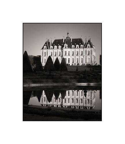
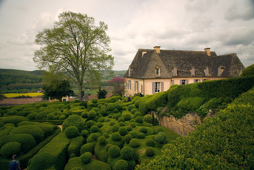
Chateau de Sceaux ~ 2023


I've been thinking and poking and looking at the topic of color management in light of manufacturer claims.  Certain camera companies claim to have a "secret sauce" that is called "color science."  I wanted to consider this and see if there might be ways of pollinating these much vaunted "color sciences" across other manufacturer flowers, er, cameras. 

Background ~

I smile as I remember the battles that were waged on-line over who had the "better color science", Canon vs Sony.  I still read comments from Fuji users who've fallen in love with Fuji's film profiles.  Leica users wax poetic about a certain "Leica look."  And for years I've read how Hasselblad has the "color science" of any of the commercial camera manufacturers.

Is it real or is it marketing blather?  Perhaps only real "color scientists" know for sure.

On a practical level and before I dove into this topic, what I experienced was that my old Canon images are always redder than my very neutral looking Sony output.  Reviewing carefully Fuji X or GFX images I can't see where they are demonstrably different nor better than any other products on the market.  I can't look at an image and "see" any Leica Magic coming out of Leica products.  Nor am I convinced that Hasselblad has a better understanding than anyone else in the industry about how to make colors.

Yes.  I'm a "color science" skeptic. Why?  Well, it's a very long explanation.  So sit down, strap in, and hold on tight.  Here I go.  Yet again.  Bashing some drum or other.  This time it's "color science."

In-Camera Pipeline ~

Here is how I understand digital imaging to work, from start to finish.

  1. Light hits a light sensitive diode
  2. Diode spits out a tiny electrical signal
  3. Hardware applies gain to amplify the signal (ISO sets the amplification level) 
  4. Amplified signal enters an analog to digital converter (ADC)
  5. Digitized information exits the ADC (may receive additional signal processing as in the cases of extended ISO settings)
  6. Now there is a fork in the process ~
    1. Digital information passes through an ASIC that processes digital data and write it into an in-camera generated JPG file
    2. Digital information is written into a RAW file

We now have two file possibilities, RAW and/or JPG. 

A JPG file is the result of what the manufacture implements, purely and simply.  It has passed through an in-camera de-mosaicing algorithm of the manufacturers specification as well as other imaging algorithms (where various "looks" can be applied).  

JPG image processing decisions have been made by the manufacturer, so if there's a special "color science", it can be applied here.

Off-Camera JPG Pipeline ~

It is potentially important to note that further processing on a JPG will start with the  limited color range of 8 bits as found in the file. Heavy processing can distort colors, destroying any special "color science" that had been "baked" into the JPG file.

Off-Camera RAW Pipeline ~

RAW files require additional processing.  If your software has the possibility of displaying true RAW file information, you'll see a strongly green cast mushy image sort of thing that has red and blue dots evenly sprinkled around the image field.  In short, it's an ugly mess and it's easy to see why we need software to sort things out for us.

Here is the Bayer RAW format pipeline.

  1. RAW file is loaded into software
  2. De-Mosaic is most-often the very first function performed on a RAW file, where individual "pixels" of RGGB (red, 2x green, blue) information is processed using surrounding "pixel" data to calculate color and luminosity such that there is now a different kind of information (de-mosaic calculated) for each "pixel", changing each and every original red, 2x green and blue locations into full color with brightness
  3. De-Moscaic'd images still look ghastly as the colors are still "off", so...
  4. Software "massages" a de-mosaic'd image and displays it to the user
  5. User can now begin performing additional modifications using the tools the software provides

Where's the "color science" in RAW image processing?

There are a couple candidates for where a manufacturer can add their own "special sauce."

The first place we can ask "what has a manufacturer" modified? is the de-mosaic stage.  From what I've read, this step would be an incredibly difficult place to add a dash of "special sauce".  The algorithms are complex and varied.  Have a look at the de-mosaicing possibilities in the Open Source Software RawTherapee and you'll see what I mean.

It turns out there are very good reasons to use the various de-mosaicing approaches, but if you are a RentWare user, I suspect you have zero control over the de-mosaic stage.  Please tell me if I'm wrong.

In any event, I feel that "color science" is not applied at the de-mosaicing stage.

The next stage is where things can get a little more interesting.  This is where camera (better said, sensor model) specific color management comes into play.

Some RentWare and Open Source software use .dcp format files to store camera-specific color corrections.  Hasselblad embeds camera-specific color corrections in proprietary XML formatted files.  I'm not sure what Sony, Canon, Nikon, Fuji, Olympus, or Panasonic proprietary software use, but rest assured, both de-mosaic and color management functions are "baked" into them.

In nearly all cases, camera-specific color corrections are hidden from the user.  However, there are instructions on how to generate .dcp color management files for RawTherapee.  Reading these instructions is insightful and related directly to the question at hand.

Taking industry standard color charts, camera model to camera model variations can be corrected.  If you use RawTherapee, for example, have a look at the Color Management tool and compare the colors between "Camera Standard" and the automated camera specific colors and no corrections.  The differences are illustrative.  Then look at properly color managed files from different cameras and tell me where you see any differences.  Using non-manufacturer software tends to eliminate the effects of any "special sauce." 

If a camera manufacturer is to inject some special "color science" during RAW image processing the color management stage would be an excellent place to do so.

What Else? ~

It is _after_ the de-mosaicing and the subsequent color management stages that color look-up tables can be applied.

Color grading (not to be confused with color management) can be a one button exercise in many software.  Many times these can be implemented as LUTs.  Video software as well as still photography RentWare come with many LUTs pre-installed.

With proprietary and RentWare software you get the de-mosaiced, color managed file displayed after RAW file import.  Then there is this  thing that they provide that adds a special "look."  For Sony it's things like "Neutral", "Standard", "Vivid", "BW", etc.  That's the color look-up table (LUT) stage.

What's potentially interesting here is that as a user you can generate your own LUTs.  Of course you can buy them, too.  What's nice is that the user controls the output.

Last Question ~

Might it be possible to somehow "borrow" from one software to another and preserve a manufacturers recipe?

Maybe.  It depends on several things.  If we can import an industry standard color diagram and have a manufacturers color management applied to it, then yes, there's a possibility we can duplicate a "special sauce" and move it to another software.

Yet I have my suspicions.  I see manufacturers have generated closed system software where the early image processing steps are hidden from the user.  We don't know exactly what parameters are being used and we're in the dark about many potentially important details.  So, in the end, I'm not sure how successful we can be, but we might be able to get surprisingly close.

Another approach could be to open a manufacturers proprietary software with an image who's processing we like, then next to it open another software and change processing settings until the image look the same, then save the actions or generate a LUT.  This is much more "hit and miss" and would not be very accurate.

By hiding what manufacturers are doing behind the wall of proprietary software they can make any marketing claim they want.  To make matters worse, RentWare does exactly the same thing. There is no way of verifying any of these claims.  Further, such claims can then be picked up by communities of photographers where they can take on a life of their own.

On the other hand, what I'm experiencing these days is that by more deeply understanding each and every step in a RAW file processing pipeline that I am at liberty supported by increasing knowledge to create images that are pleasing to me.  Matching one companies "color science" to something I'm working on has become a fun and interesting challenge and I'm very happy when I get very very close, if not precisely spot-on, to something that's been "secret sauced" hidden behind a proprietary/marketing "color science" wall.

Wednesday, January 10, 2024

Random Thoughts on Photography [7] ~ SuperResolution, a better solution

I spent a bit of time looking at single image and multiple image stacking UpScaling.  As a friend suggested several years ago, there's a simpler way.

If one has the time, image stitching for true SuperResolution is a very fine solution.  Having a tripod helps.

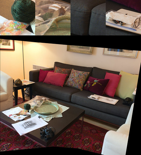
Consider the following.  I used a Sony A6300, a Sigma 19mm f/2.8 EX DN E, a tripod, and a small "L" bracket that I made before moving to place where access to materials and tools is very difficult to non-existent.

There's a trick to using the "L" bracket and it's simply this: I have to make sure I put the pivot point directly under the lens' nodal point.  In practical terms, make sure the tripod head mount screw sits under/aligns with the lens aperture location.  When done in this way and by swiveling the tripod head to capture overlapping sections of the scene, image stitching is a breeze and all image elements quickly align.

The dimensions on the long side is well over 9,000 pixels.  100% crops are along the top.  The full scene is under the crops.  There's no lack of definition/resolution.  

My friend was, of course, correct.  There is a simple/inexpensive way of achieving SuperResolution and this is it.


Image Stitching for Increased File Sizes


Tuesday, January 09, 2024

Random Thoughts on Photography [6] ~ Sigma 24mm f/3.5 DG DN vs Nikon Nikkor 24mm f/2.8 Ai

I've had a nice Nikon Nikkor 24mm f/2.8 Ai up for sale for quite some time now.  The reason is that last year I decided to put together a full frame kit based on AF lenses.  So I sold nearly all of my manual focus Nikkor glass.  I'm getting old and focusing the MF optics, no matter how brilliant they are, present focusing challenges that I'd rather not spend my time dealing with.  So, home came a Sigma 24mm f/3.5 DG DN to replace the Nikon 24mm.

Not having compared the two lenses I thought I ought to, just in case I discovered a "need" to hang onto the Nikkor.  So using a couple lens test charts that I printed I set out to see whatever there was to see.

Mind you, I'm not measuring anything.  Other people do a better job of such things than I.  However, by comparing one lens against another using the exact same setup I should be able to illustrate any differences.

What I find is that the 

  • Nikon, without software intervention, is a little soft in the corners compared to the Sigma, but...
  • Nikon appears to have just a hint of something sharper/contrastier in the center of the frame.  Maybe.
  • Sigma has software intervention correctable pincushion distortion 
    • There seems to be little to no impact on "resolution" in correcting the Sigma's distortion in software
       
  • RawTherapee software sharpener intervention called Capture Sharpen pretty much levels the field

Recently I had a Wild Hair to try IR imaging and the Nikkor would be perfect for that.  It has an IR focus mark, whereas with any AF lens I have would be a guessing game as to where critical focus is in the IR range.  So, if I can't/don't sell/trade away the Nikkor perhaps I'll eventually be able to put it to good use.

Until something happens the old Nikkor rests peacefully in the toy closet.


Sigma 24mm f/3.5 DG DN, Nikon Nikkor 24mm f/2.8 Ai ~ Comparison Capture Sharpen


Sunday, January 07, 2024

Random Thoughts on Photography [5] ~ 50+ year old lens vs very recent

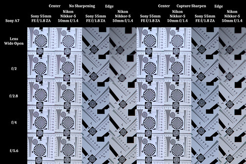
One of the side-trips I took while twisting and turning around a question of how best to upsize images was to take a slightly different look at comparing two lenses.  One 50+ years old.  The other is fairly recent.  It is Nikon Nikkor-S 50mm f/1.4 (c.1972) vs Sony Zeiss 55mm f/1.8 ZA.

The Nikkor-S was Nikon's first 50mm f/1.4.  It's a plasmat design, single coated, manual focusing, and is about as simple as they can get.  They can be fairly inexpensive, if you keep your eyes open.

The Sony Zeiss 55mm f/1.8 ZA needs zero introduction.  I've taken to wandering about with this lens mounted on an old Sony A7 (original).  Used prices have fallen precipitously.  I found a mint example for rather reasonable money..

The difference for this comparison is that I printed a few lens test charts and taped them to a wall.  The comparison setup was what I've been using for years - tripod mounted camera, 2 second delay timer, 100ISO, Aperture mode, processed in RawTherapee, etc.

Comparing results and starting at f/2.8, can anyone tell a meaningful difference between these two lenses?  Seriously.  At f/4?  Or f/5.6 on down through the aperture range?  

Add a bit of Capture Sharpen and what do I have?  Insanity, I tell you.  Insanity!!  Can't get any sharper than this, can we?

OK. Clearly (har!) there are differences at wide open and at f/2.  The Sony is gorgeous and I imagine this is what 50+ years of consumer optical design will get you.

On the other hand, wide open and at f/2 the Nikkor looks like an early Voigtlander Heliar f/4.5 large format lens.  Soft-ish wide open, but with sharpness underlying the veiling spherical aberration.  There has to be a way of taking advantage of this, right?

Just as importantly, could we say the old Nikkor-S is still fully usable, 50+ years on?


Capture Sharpened ~ Sony 55mm f/1.8 ZA vs Nikon Nikkor-S 50mm f/1.4

Friday, January 05, 2024

Random Thoughts on Photography [4] ~ SuperSize Me!

Upsizing articles are targeting me.  I know it.  It's clickbait.  Yes.  But I can't help myself.  I read an article that had my mouth wide open, ready for the hook, line, and sinker.

Could it be true?  The images in the article were rather small, so it was difficult to tell.

I've been looking at this question for years.  It's appealing to take a single image and upsize it, while retaining a certain pleasing sense of "sharpness."  The thing that had me blocked was pixelation.  Cubic, NoHalo operators found in the Gimp are good, but I never was able to get rid of certain forms of pixelation.

Thinking that "SuperResolution" stacked imaging might provide the answer, I worked hard on the process until I was finally able to declare success.  But that process did not remove pixelation any better than Cubic and NoHalo on single or stacked images.  There was always some little raggedy edge somewhere that caught my attention.

Before going to sleep I often look around the 'net looking for solutions to various photographic problems that I encounter.  Lighting, composition, the physics of diodes, and such silliness.  One night I happened to put into the search engine a properly formatted question and lo and behold, a possibility.  An answer.

Back in 2015 there was a conversation in the G'Mic discussion forum about the very problem that had me stumped.  Someone gin'd up an implementation and suddenly DCCI 2x was incorporated into the G'Mic suite of tools.  I already added many years ago G'Mic to my Gimp toolset.

DCCI 2x upsizes bi-directionally, one scan 90 degrees from the other.  There is no choice on how much upsize one gets.  It's fixed at 2x and this clue is embedded in the name of the function.  But there's nothing stopping anyone from doing two 2x upsizes back to back, or more, should they want.  

In any event, pixelated edges on upsize seem to have vanished into thin air.

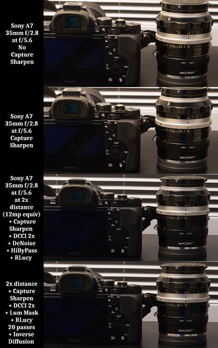
So I set up a scene similar to the clickbait that had me.  Using a tripod, setting the ISO to 100 and aperture to f/5.6, the 2 second timer lit off on frame 70cm from the subject to the camera.  Then I backed up the tripod another 70cm and took another photo.

There was now one 24mpixel image, and another that was equivalently 12mpixel (when cropped to the closer image field).  Image processing was pretty straightforward.  For one of the images I did not use Capture Sharpen in RawTherapee.  But for the other three Capture Sharpen was applied.  The 12mpixel (equiv) images were then opened in the Gimp for further processing.

For one of the DCCI 2x (G'Mic) images I added de-noise on the DCCI'd image, then added a hi-bypass filter (G'Mic) as a first sharpen step, then added a single pass Richardson Lucy sharpen (G'Mic).

For the second DCCI 2x (G'Mic) image I created a Luminosity Mask to isolate the edges of the various elements in the scene so that the next step with Richard-Lucy sharpen (G'Mic) would act locally, and then, finally, I did a light global sharpen using Inverse Diffusion (G'Mic).

What did I find?  The clickbait isn't entirely full of BS.  It's not quite what was promised, as I can see differences between the standard images and the DCCI'd work.  The original size images are clear and crisp and filled with detail.  Pixel-peeped DCCI'd images are just a touch softer, even after several rounds of sharpening.

Further work would certainly improve the DCCI'd photos.  On the other hand the DCCI'd photos are already surprisingly pretty close to the 24mpixel no Capture Sharpen output.

What the recipe came down to is simply this -

  • Starting with a sharp image
  • Capture Sharpen to reveal as much detail as possible (PS does this in their SuperResolution tool)
  • DCCI 2x the image (in PS is the upsize selectable?)
  • Reduce noise as needed (PS has this option, too)
  • Selectively sharpen (not sure how PS handles this, if it's global or if it's local to the edges of a scene)

Sharing my homework - 


 UpSize Comparison - Z

Thursday, January 04, 2024

Random Thoughts on Photography [3] ~ SuperSize yet some more

When I read this PetaPixel article I thought, well, maybe here's a justification for picking up a really cheap Sony A7S.  The clickbait title had me at "Super Resolution Eliminates the Advantage of High-Megapixel Cameras". 

If SuperResolution is a real "thing", then why spend money on more megapixels?  Besides, I could use high ISO performance and an all electronic shutter for some of the things I do in museums.  I don't want to disturb the fine citizens and visitors with a clacking shutter.  And something that didn't get filled with noise would certainly make image processing easier.  So I set off, AGAIN! to examine what's possible and to try and understand what's really going on.

The goal of all this thrashing was to see if there was a way of using Open Source software and match the perceived performance of something for pay, like Topaz's Gigapixel AI (or whatever they call it these days).

You see, I have more than a small beef with for-pay software, and particularly for-rent products like anything Adobe, or Capture One, or the other rentable image processing software that's out there (and there's a surprising amount of it).

I go back to a time when you could buy something, cash on the barrel head, and walk away with something that was durable and would last for decades.  Mechanical cameras.  Stereo systems. Music (vinyl or CD).  You didn't rent anything if you could avoid it, other than an apartment.

Working with Capture One was frustrating.  I had been using their image processing suite and left as soon as I realized they were transitioning to rent-ware.  It drove me nuts.  

I submitted bug reports and, while the bugs were quite valid, I was told to wait for a future update, or, as in one case, avoid using hardware acceleration.  For that kind of aggravation I might as well go elsewhere.  I have no tolerance for such things.  I know how engineering can/should work, and they weren't even trying from what I could see.  Jeter l’éponge, I voted with my money and my feet.

The timing worked out well, actually.  One of the hard drives toasted itself and I had a new one installed.  Being a several decades advocate for Linux I performed a clean Linux OS install, complete with all my favorite image processing software.  I was thrilled.  Everything ran visibly faster than it ever did on WinDoze.  I knew all this from my work years, but someone had convinced me that the better stuff was on WinDoze and SnApple.  I should never have listened to them.

OK.  So that's a long way of saying I don't like rent-ware.  Suffice it to say, I would be happy to find a workable Open Source image upsizing solution that performed anywhere near what the for pay packages do.  At which point I entered a rather long series of examinations looking for a process/tool combination that gave acceptable results.

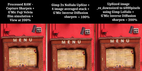
If you're interested in the twisted, rocky, strange road I took, here it is.  I was convinced that image stacking would change the edges of contrast and color transition zones, and that this would be beneficial to upsizing/upscaling images in preparation for big, huge, enormous prints.

Sony A6300, Sigma 30mm f/2.8 EX DN, Single Image vs 5 Image Stack plus Gimp NoHalo upsize and varioius sharpeners.

Maybe Full Frame would be better?  Here's a Sony A7, Sony 35mm f/2.8 single Capture Sharpened and 5 image stack NoHalo upsize comparison all the way to 24,000 pixels on the long dimension. 

Then I re-ran the Sony A7 single image comparison using a different image sharpener.  And, again, this time using 5 image stacks.  All looking for a way to smooth the edges of angular hard contrast transition edges.

I slipped to the side when, in the Dark of Night, I got to wondering how good/bad a 50+ year old Nikon Nikkor-S 50mm f/1.4 was, and, while I'm at it, why not add a little rigor by using lens test charts?  Oh, and, gee, RawTherapee has a Lanczos upsize operator in it, too, doesn't it?  So let me try that as well.

All this was driving me nuts! as I juggled the matrix of possibilities to find as direct a path to success as I could.  Independent of my Dark of Night musings.

Remember what I wrote about the value of study and research?  At this point, the skies parted, the light shown through, and... what's that?  Argh.  It's a Paris winter.  But there's plenty of time to stumble around the "internets" when the light is low.

In my next post on Random Thoughts, I'll try to share what I found.  And because I'm at this point 9 years late, most of you likely already know these things and many others, but if on the off-chance you're not already familiar, stay tuned.

Chateau de Sceaux ~ 2023


Wednesday, January 03, 2024

Random Thoughts Photography [2] ~ Super-Resolution vs Noise

I recently read Keith Cooper's article on making a giant print from one of his 11mpixel Canon 1Ds files.  When the job was done, he said "I couldn’t resist asking a few bystanders what they thought, and the look on people’s faces when I told them it was from an 11MP camera made it all the more worthwhile."

What those early 11 and 12mpixel sensors had, in general, was low for their time noise.  Yes, you have to be careful about upsizing images for display/printing where 24mpixel to 100mpixel would be a lot easier to process.  There seems to be something still very relevant about knowing what the camera is capable of, being careful during image processing and to learning how various image processing tools effect the final output. 

Currently we the consumers are blessed with quiet sensors from Sony.  Nikon and Fuji use them.  Canon uses a Sony 1inch sensor in some of their Point and Shoot devices, too.  Noise is less of an issue than it once was, even just a decade ago.

In my various stumblings around looking at stuffs and things seeking as much color and resolution perfection as possible I've come to understand that starting from Base ISO 1 there is subtle noise.  There's a fancy name for it: Photo Response Non-Uniformity (PRNU).  This includes (if I grok it all correctly) the subtle variations in pre-Analog to Digital Converter (ADC) response to light.  This kind of pre-ADC noise can cancel through image stacking.

Jim Kasson wrote about the Sony A6300.  He says it takes about 64 images stacked and averaged to fully eliminate this form of noise.  When I look at his graphs I see that there is a 3x reduction in PRNU induced noise in a relatively simple 4 image stack.  I don't currently feel any need to stack 16 nor 65 images.

This on a practical level is exactly what I've experienced.    The sharp contrast transition zones (luminance or color, doesn't matter) "smooth" out with image stacking at native file resolutions as the noise is averaged out.  One might feel these are perhaps "softer" images than a single shot, but this is not at all the case.  Subtle noise adds "crunchiness" to an image that can be seen as "sharpness."

Taking all this into consideration, and in the Dead of Night (no, not the Dead Knight), a heretical thought came to me.  What if the "Super Resolution" handheld camera technique, with all the fun of aligning 4 to 20 images (depending on who you read), really comes down to noise reduction as the most important operator that helps make a super clean image, rather than "pixel shift"?

If Keith Cooper's 11mpixel giant print is any indication and outside of being an nerdy narrowly focused (har!) intellectual curiosity, I'm not quite sure how any of this matters. 

Chateau de Sceaux ~ 2023

Tuesday, January 02, 2024

Random Thoughts on Photography [1] ~ Steve McCurry and print size

Last year I visited the Steve McCurry exhibit at the Musee Maillol. Seeing his images in person was a moving, emotionally charged experience. 

I mightily appreciated his early Nikon FM Nikkor 105mm f/2.5 Kodachrome images. Printed to what looked like at least 20x30inches in size and they were glorious. It did not matter to me that the original image format was "small." The subjects with that particular camera/lens/film combination "worked." 

As we progressed through the show I could tell when M.McCurry went to digital. The prints were less saturated, perhaps due to the matte surface choice and/or color management decisions. But I also saw the overall sense of sharpness was still "there." Of course the subject matter continued to bring the impact of his earlier work. It was a matter of a style shift, more than anything else, the clued me into the transition. 

It was a little less apparent to see the transition from 12mpixel (Nikon D700) to 45mpixel (Nikon D850). I could tell, but most of the people around me didn't notice, nor did nor should they care.  There was zero pixelation in any of the digital prints.

I see that the D700 is now considered by some to be a "legend." There's nothing mystically magic about 12mpixels. The sensor does what it does and overall image quality has since improved. Progress in sensor technologies have seen to that to the point where current 61mpixel and 100mpixel dynamic range and noise match or better the original Nikon D700 12mpixel output.  Have a look at Photons to Photos to confirm this for yourself.

There was something interesting in the PetaPixel article.  Someone said that in working with a 12mpixel image "Printing is often used as an excuse for why someone needs a very high-resolution camera, but the reality is that — aside from very finely textured papers or those intended to be viewed from several inches away — resolution is far less critical for printing than many people suggest." 

That really got me to thinking. Steve McCurry's show certainly proved that point. Hammered it home, in fact. The proof was right there for everyone to see in all those beautiful prints.

Bibliothèque nationale de France ~ 2023

Thursday, December 28, 2023

-2EV shadow noise ~ further comments

After I posted something on Push-Processing from -2EV yesterday I realized I hadn't even said the most obvious and potentially most important things.

Ugh.  I'm getting old.

To review, here's the image I comment from.

[As always, click and view at 100% to see whatever there is to see]


-2EV Image Stacking Comparison ~ shadow area noise reduction?


Obvious/More-Better Comments -

Here's what I _should_ have said yesterday, and didn't:

The ISO100 -2EV 5 image stack looks nearly as good as the single shot ISO100 properly exposed image.  Image information recovery in the Push-Processed -2EV  5image stack looks good to my eyes.

The single image ISO400 properly exposed image noise looks very nearly as good as the properly exposed single ISO100 output.  Taking just this observation alone, the Sony A6300 has a very nice, clean, quiet sensor between ISO100 and ISO400.  Have a look at the A6300 and A7 Sony cameras on Photons to Photos. [Update: The APS-C A6300 sensor actually does better than the original A7 over ISO400.]

Now here is the "Doh!" part.  The -2EV Push-Processed 5 image ISO100 image noise looks nearly as clean as the single properly exposed ISO400.  There.  That is what I was looking to see.  This is what I wanted to experience.  Image stacking can "work."

One more tidbit of yesterday's missed opportunities are the ISO3200 noise reduced comparisons.  The single properly exposed noise reduced ISO3200 image looks better than the Capture Sharpened 5 image stacked -2EV Push-Processed ISO400 and the Capture Sharpened single shot ISO400 images.  

Lastly, the -2EV Push-Processed noise reduced Capture Sharpen turned off 5 image stack ISO3200 output looks better than any of the -2EV Push-Processed noise reduced Capture Sharpen turned _on_ ISO400 images.

So why bother doing such things?  It seems like a lot of Monkey Motion, and for what?  Well, think about a situation where you want to protect the highlights in very high contrast situations.  Here's a way to guard overall image quality under extreme image processing situations.  It's a way of potentially expanding the dynamic range of a scene.

Wednesday, December 27, 2023

-2EV shadow noise ~ a look

A friend asked me if I'd tried under-exposing an image, push-process and then stack images to reduce shadow noise?  I have, but I'd not really shared anything on this blog.  Until now.

As always, please keep in mind that what I do is anything that someone with more than a passing interest might be able to duplicate.  I try to keep things as simple as absolutely possible.

There are testers who measure things from a more serious engineering, test and measurement perspective.  Turn to them if you really want to dig into these kinds of topics.  There's a lot to be thought about and pondered that can related directly to carefully managed image making.

Setup -

  • Sony A6300
  • Sigma 30mm f/2.8 EX DN
  • Manfrotto tripod
  • 1 normally exposed image to set as a comparison
  • -2EV images to stack using 
    • Camera 2 second delay timer
    • Camera then quickly fired off 5 images
  • Processed RAW in RawTherapee
    • Capture Sharpened (most series)
    • One pass at no Capture Sharpen, but with Noise Reduction (one 3200ISO series)
       
  • Image stacked in the Gimp 16bit color space

Comparison -

[As always, click and view at 100% to see whatever there is to see]


-2EV Image Stacking Comparison ~ shadow area noise reduction?


Comments -

It can be seen that I shot three different ISOs, 100, 400, and 3200.  I deliberately shot this way as ISO400 is Base ISO 2 on the Sony A6300, and ISO3200 is the last ISO before Sony starts some rather heavy signal conditioning. A person can review Jim Kasson's measurements and comments starting here.

Working with the -2EV under-exposed images, I show a single shot properly exposed, single -2EV Push-Processed image, 3 -2EV image stack, and 5 -2EV image stack results.  At ISO100 I see the shadows clean up nicely, even using Capture Sharpen and push processing (using curves in this case) to ISO400.

Images shot at ISO400 aren't quite as clean.  Noise is clearly visible in all images.  The stacked images seem to try and clean up the -2EV Push-Processed shadows.  But I'm not helping myself by having Capture Sharpen turned on.  Through, frankly, I'd convinced myself that there might be less noise at Base ISO 2 (400 on this camera) than I actually see.

Working on the ISO3200 files I see that Capture Sharpen is definitely not the appropriate image processing choice to make here.  I learned something in having proceeded this way.  By comparison, I can see where Capture Sharpen turned off and Noise Reduction turned on is a much better way to go.

The single properly exposed ISO3200 image with Noise Reduction doesn't look too terrible.  I went purposefully light on the NR to see if random noise in the stacked image would better average out.  In some ways it does exactly this.  The ISO12800 Push-Processed 5 image stack is starting to clean up and is almost usable.

With this small APS-C sensor I'm not surprised with the strong analog gain at ISO3200.  Anything over ISO3200 becomes very salt and peppery.  If you know what I mean.

The underlying lesson for me is that, yes, I can Push-Process images, stack them, and reduce deep shadow noise.  But I have to be careful and intelligently select operators that do what I want. And one good way to achieve that is through careful study, image inspection and comparison.  Which is what I re-started here.

Sunday, December 10, 2023

SuperResolution ~ FINALLY got it to work!

Gawds!  Will it ever end?  I have a seemingly bottomless well of curiosity that I dip into when photo-opportunities are slim.  

When I revisited something I'd read some time back, it triggered another round of trying to come to grips with SuperResolution.  I was curious to see if I could get the kind of results people have for years talked about.

Carefully re-reading the DPReview page I realized I could have a closer look at the up-size operators in the Gimp.  Early on I'd used the "cubic" upsize method and found it gave slightly "fuzzy" results in both 2x and 4x area image upsizing.  

Then I found a newer method called "nohalo".  It seemed to work fairly well in 2x area image upsizing, but lacked a bit of "crispness" in 4x area stacked images.  The DPReview article talked of using a "linear" method.  It turns out that the Gimp has that, too.

So, I grabbed an old Sony NEX-7 24mpixel camera that a friend very kindly gave me, put on the sharpest APS-C lens I own (a Sigma 30mm f/2.8 EX DN), set the shutter to "splatter" mode (ie: 10fps), and wandered the streets looking for an "interesting" subject.  A local pizza restaurant seemed to have enough detail of the kind that might lend itself to SuperResolution.

Here is the process/method I used.

Camera -

  • Sony NEX-7
  • Sigma 30mm f/2.8 EX DN
  • Set to "Program" mode
  • Set the ISO to 100
  • Set the shutter to 10fps (focus once, shoot many)

Processing 1 - RawTherapee

  • Select four individual images from the "splatter-fest"
  • Process using the exact same parameters
    • Color Management set to "Automatic"
    • Color Management "curves" selected
    • Lens distortion set to "Automatic"
    • Lens distortion "vignetting" de-selected
    • Capture Sharpen selected
    • Set contrast and Saturation to taste

Processing 2 - Gimp

  • Import four images as layers
  • Upsize using either "linear" or "nohalo" methods
  • Hand align layers *see Note
  • Set Opacity of each layer to blend
    • Base layer - 100%
    • Layer 1 just above the Base - 50%
    • Layer 2 just above Layer 1 - 33%
    • Layer 3 just above layer 2 - 27%
       
  • Flatten image
  • Duplicate image as another layer and sharpen
  • Viewed at 100 or 200percent, set Opacity of sharpening layer to remove possible "over-sharpening" effects

*Note:  Hand aligning layers in the Gimp is somewhat easy.  Using the Base Layer as the reference "registration" layer...

  • Keep the Base Layer Opacity at 100%
  • Making visible one layer at a time...
  • Set layer Opacity to 50% on the layer being aligned so as to see how two images align compared to the base layer
  • Viewed at 400% and in one corner find an image detail, select the move operator and align the layer over the base exactly using the detail reference point
  • Select the rotation operation for the layer being worked on
  • Set the rotation point directly over the newly aligned reference detail
  • In the opposite corner of the image...
    • View at 400%
    • Click and rotate the Layer to align another reference detail over the Base Layer
  • Deselect the Layer just worked on and repeat this process on another Layer 

Results -

Here is the base scene followed by the results

Scene for SuperResolution Studies

[Best viewed at 100%] 

UpSize SuperResolution Comparison


Comments - 

The SuperResolution process does, in fact, work.  In the past I simply wasn't working carefully enough.  I'd either relied too heavily on the Hugin align image operator, or I wasn't zooming in far enough to see how details were aligning.

I am reminded that this SuperResolution technique does more than add resolution.  It does something that I find to be just as important.  The process averages out noise.  Aligned images are clean and smooth.  Here is what I mean.


Noise Redcution Effects UpSize/DownSize SuperResolution Comparison


For this little study I deliberately used the early Sony NEX-7 24mpixel camera because it has stronger base ISO noise than the A6000 and A6300.  So I was pleasantly surprised to re-learn the potential usefulness of eliminating noise by stacking and blending images.

One interesting thing about re-working this process is that I think I found the "Linear" ups-size function is ever so very slightly "sharper" after stacking/blending images than "NoHalo."  But I think I have to stand on one toe while the full moon shines and sing three choruses of "Hair" before I'd fully swear by that.  All things being equal, at this point I feel either up-size operator can do the required work and yield pleasing results.

I'm not ready to downsize from 24mpixel sensors just yet.  Though I had thought seriously about picking up a Sony A7S, just for grins.  Northlight has an interesting article about processing an old 11mpixel Canon image that "had me going" for a moment or two.  And that image wasn't stacked/blended, either.  Pretty incredible work, that.

No, I think 24mpixel is kind of a "sweet spot" for me and the kind of work I do and for the kinds of things I enjoy.  It's not too heavy on the computer and RAW files don't take up an enormous amount of space.  And if I wanted to make a huge print of, say, a classic automobile and if I had the luxury of planning ahead, it might be interesting to try image stacking/blending and maybe even use this SuperResolution technique.

Sunday, September 03, 2023

Looking more deeply ~ Six

la traversee de Paris estivale ~ 2023

Question: Was this photo of a WWII re-enactor taken using a Linhof Tech II 5x7 view camera, a Fujinon-A 240mm f/9 (wide open), and Ilford FP4+ 125ASA film? 

Answer: Maybe.

Shadows look good. The highlights look well-managed.  The resolution of the subject can't be beaten.  Yes, you can see this is a contemporary image by the dress of the subjects in the background.  So it must be recent. The base of the obélisque in the place de la Concorde is seen, too.  We know where this was taken. 

The quality of the out of focus regions are very smooth creamy, just like we'd expect from a large format lens of decent quality, which the Fujinon-A series most definitely were.  Kodak (Commercial Ektars), Nikon (Nikkor-W, Nikkor-M), and Schneider (Symmar and G-Claron) could all render this well, too.

Truth:  If by now you haven't clicked on the image to read the EXIF data, you'll not be surprised to learn that, no, this was in fact taken using a digital camera.  I know.  Shocking, isn't it?  Well, not really.

The Sony Zeiss 55mm f/1.8 is legendary for it's wide open resolution and out of focus rendition.  The Sony A7 (original) has excellent dynamic range (even a decade on from first introduction).  No matter how hard camera companies try to get me to buy their latest stuff, my old digital gear still does the needful.  

New stuff is simply too expensive for this Old Fart who lives on a fixed income.  Besides, what benefit would I gain by being able to shoot at 20fps with an AF system that can accurately track a flying pigeons eyelash?  

Further, lenses are so good these days that it's difficult for me to tell any difference between them.  The designers are calculating their designs out to 9th and 11th order effects and I've had optical designers tell me going beyond solving for 5th order effects is Shear Madness.  Obviously that comment was made back when dinosaurs roamed the Earth, yet it's something to think about.

Which leads me to the last thing.  Image processing.

I do not let the software decide for me what's "best."  I ignore the automated adjustments (of which there are at least four to choose from, not counting all the "specialized" filter-like arrangements).

I set the black and white points, raise the mid-tones, manage the overall tonal scale using a second set of "Curve"s (thank you RawTherapee), vignette the edges, and add a tint that I created myself.  All this is a conscious effort on my part.  I know what I want and that is to emulate film-era print tonal ranges.  

For me this is a Worthy Goal.

All too often at photo exhibitions here in the City of Light I can tell from a mile away which images were digitally printed and which are original film prints.  Many image processors today feel all they need to do is take a digital file, convert to B&W and call it done.  And if they start with film, that all they need to do is make a digital copy of a negative and invert the digital image.  But that's not how film prints to paper responded to a negatives tonal range.

Those common digital conversion approaches are enough to drive me from a building.  I can't stand it.  Crushed blacks, dark/muddy/undifferentiated mid-tones, and blown-out highlights are not The Way.

There.  I have spoken.  Now that I've gotten that off my chest... um... where was I?

Friday, August 18, 2023

Looking More Deeply ~ Five

Whenever I'm around and la traversée (winter or summer) is running I try my best to get down to see the event.

One of the difficult things about living where I do is that it's not easy for me to find creative people to work with.  Looking through my portraiture/people work I realize most of it was generated over a decade ago.  

The city I live in feels like it's too expensive for our economically under-advantaged creatives.  Additionally, those who might be creative have a rather curious way of presenting themselves.  They remain in hiding, as it were.  Few risks are ever taken.  It's just the nature of the culture, I guess, because I don't see this in Spain, or England or Italy.

Not having the kind of creative access I used to when I lived in the US has led me to go in search of other subjects.  The car is one thing that I've taken a much stronger interest in.  It turns out, old cars are something of a passion for the locals.  They quickly became an easier target for me and it seems as if there's often something interesting and colorful going on.

I enjoy planning my photographic automobile adventures.  I enjoy thinking about the approach I'll use.  I enjoy reviewing the works of some of my favorite photographers.  I enjoy searching for new (to me) paths to photographically wander down.  It give me something to look forward to.

In late July 2023 la traversee de Paris estivale was run with 700+ old vehicles participating in the event.  After thinking long and hard, I decided that this time I wanted to explore flipping the idea of automobile on its head.

Most of the time it's the cars that are in motion. It's why we own them, right?  They get us from one place to another.  I've done a bit of work attempting to express that.  

I'm not sure how it came to me, but what if it were the cars that were at rest and what if the environment around them was what was in motion?  That was one of the ideas I wanted to explore.

Have a squint at this.  It shares what I was after.


la traversee de Paris estivale ~ 2023


Looking a little more deeply at this work of mine, I find I'm enjoying several things about it that for me "work" on several different levels.

The Alfa Romeo Spyder Veloce is needle sharp.  The red paint is pure and rich.  The wheels are as still as can be.  Automobile as sculpture.  And what a beautiful sculpture it is (to me, at least).

There is a passing bus that gives some part of the scene a sense of motion.  I can see through the windows of the bus to catch glimpses of street lamps and other architecture.  The effect is fun and unexpected.

There is a hint of a reflection of the Alfa in the passing bus, too.  The reflection looks to me as if the the spirit of the little Alfa is in motion, dreaming of a time soon to come. 

The ancient Egyptian obélisque is as still as the car.  It stands there, timeless, watching the passing histories being made.  The Alfa and obélisque feel like anchors in a world filled with motion.

Then there are the color relationships.  The blues along the side of the blurred bus are very similar to the blue on the following bus.  There's just a hint of blue in the sky, too, where the clouds are ever so slightly parted.

More subtly, the green tinted windows of the first bus seem to announce the arrival the greens on the second.  The green of the insurance tag in the window of the Alfa are similar to the greens of la traversee plaque seen just behind the windshield wipers.

Which leads, of course, quite obviously to the red.  There's the red of the car. There's the hint of red in the reflection of the Alfa on the bus.  There's the red hat of the driver.  And there's the red in the following double-decker bus behind everything.  Red seems to announce the Italian nature of the Alfa.

The photograph was done in one "take."  One exposure.  This is what I was looking for. I feel there is a certain success after spending so much time plotting and planning.  I find it all to be absolutely delightful. 

Monday, August 07, 2023

RawTherapee Color Management ~ validating a potential solution

Opening Comment: In talking with a friend, I realize I should mention how narrowly defined this color management problem and solution are.  I've limited myself to trying to get the colors to match between cameras with different sensors at the initial stage of image processing.  I have done _nothing_ to address the issues of display to display, nor display to print color variations.  Those two topics are equally thorny and well beyond the scope of this series of blog entries.

After uncovering a hole in the color management camera list, I worked on generating the needed .dsp color "offset" files.  Now I need to take a look at the results to see it's been worth the effort.

As an overview, I took DPReview RAW files for cameras I was interested in creating .dsp files for, ran the RAW files through a two application process, then transferred the results into a Linux system where the RawTherapee image processing application lives.  Have a read through the two blog entries linked in the prior paragraph for a more complete description.


In this blog entry I compare images of the XRite Color Checker Chart with different Color Management selections.  Without further ado, here are the results. 

[As always, click on the following image and have a look at the image at 100 percent resolution to see whatever there is to see.]


RawTherapee Color Management Comparison


Comments -

Starting with the "No Color Management" option we can see that the Sony A6300, A7, NEX-5T, and A7S images of the XRite ColorChecker Chart are a little "dull" looking and the colors don't look like what we'd expect them to.  They are "off" and not correct.

The RawTherapee "Camera Standard" selection helps the image colors appear brighter and clearer.  I know, these are non-technical terms, but I think they get the point across.  There are slight camera to camera color variations even though I did the very best I could to get the white and darkest gray patches to match between the images.  This is what I observed to begin with.  This is the arrow to the rabbit hole I fell down for these three blog entries.  It was this subtle camera to camera color rendition variation that made me wonder what was wrong.

Coming to the Custom DSP Color Management solution I see that the images align very closely.  These images use the files I generated based on DPReviews XRite ColorChecker RAW files.  The A6300 yellow patch looks just ever so slightly "dull" compared with the other Custom DSP images.  The difference is very very subtle.

The A6300 has a dual luminant .dsp file built into RawTherapee.  It includes Look Table and Curves options.  The base image with Look Table enabled yellow patch appears "duller" than in the Custom DSP Color Management A6300 image.

Enabling Curves brightened the yellow patch to a more vibrant state.  It's still very very slightly different than the Custom DSP Color Management images from the other cameras.

Yes, color management is a rather tricky business.  Just the slightest differences in setting image Curves outside the Color Management system changes colors surprisingly quickly.  Further, using the Curves function inside the Color Management system changes things yet again.

All this taken into consideration, I feel the Custom DSP Color Management "offset" files give a pleasingly consistent, common color rendition between various sensor outputs.  The Adobe and XRite software appear to work.  Further, I feel it's more consistent between different sensor outputs than, say, "Camera Standard", so, therefore, worth the effort.

For the cameras that are supported with dual luminant .dsp files, I think I can accept the slight color differences between them and the Custom DSP images on my unsupported by this higher color management specification cameras.

Truth be told, my color management requirements aren't that stringent.  However, if they were, and if it were for some reason critical that I get absolute color accuracy, I could do a couple things.  The first would be to buy an XRite ColorChecker chart and create my own dual luminant daylight/tungsten temperature files.  The second would be to include an XRight ColorChecker chart in my photographs.

As I'm happy with the current updated solution, I think I'm presently "good to go."


Resources -

Adobe Color Management System

RawTherapee Color Management System

How to get LCP and DCP files into RawTherapee

Creating dual luminant .dsp files

Saturday, August 05, 2023

RawTherapee Color Management ~ looking for solutions to a problem

Opening Comment: In talking with a friend, I realize I should mention how narrowly defined this color management problem and solution are.  I've limited myself to trying to get the colors to match between cameras with different sensors at the initial stage of image processing.  I have done _nothing_ to address the issues of display to display, nor display to print color variations.  Those two topics are equally thorny and well beyond the scope of this series of blog entries.

I use RawTherapee to convert SONY RAW and to do most of the image processing "heavy lifting".  

The software became my preferred image processing application after years of hoping the good people at the Gimp could expand the color space and add RAW support on file open.  A few years ago they successfully expanded the color space (up to 32bit floating-point), but continue to recommend using RawTherapee to open and convert RAW files.

Among many many wonderful features, RawTherapee comes with a very powerful Color Management system.  It uses single and dual luminant .dcp files, has a "Curves" option and an additional "Lookup Table" that can, when available, further refine image colors.  There is a default color scheme for cameras that aren't directly supported.

To recap, .dcp files are used to take whatever information the sensor stores for colors and luminosity and modifies them to a reference set of colors and luminances.  It's like using a well controlled set of "offsets" to go from the sensor colors in a RAW file to something that matches reality.  In this way, the colors across different sensors, camera models, and camera manufacturers can be corrected and matched.

My color management problems are several fold.

I do not use Adobe products.  They cost too much for not much additional benefit.  LightRoom and PhotoShop both use .dcp color management configuration files, which could be of benefit.  Adobe has to keep up with all the latest/greatest imaging devices so they tend to provide color management support as soon as cameras are available.  

On the downside, Adobe provides _single_ luminant .dcp support, only.  As we'll recall, single luminant .dcp files provide sensor corrections for daylight color temperatures only.  So the further a scene's color temperature wanders from 5500 to 5700 kelvin, the greater the chance that the .dcp file "offset" information is not as accurate as it could be.

Dual luminant capable RawTherapee can use files that specify color "offsets" at daylight and tungsten Kelvin temperature values.  These specify more accurate color "offsets" across a broader range of white balance temperatures.  Having two points on a slope is more accurate than having just one.

But, and this is my second problem, it turns out that RawTherapee does not come with as complete a set of .dcp files as Adobe products.  In my case, the Sony A7, NEX-7, NEX-5T, and A5000 cameras are not supported with their own .dcp files.  These cameras default to something called "Camera Standard."  "Camera Standard" is a generalized color "offset" corrector that attempts to make things "better" without knowing what a specific sensor requires.  Close, perhaps, but not "spot on" accurate.

There are at least two ways to resolve the .dcp RawTherapee problem  One would be to borrow the Adobe files.  I can't find an online resource for them, so that's completely out. The other solution would be to make them myself.  Fortunately someone posted a nice set of instructions on how to do this.

I followed the outline of the process.  The details are a bit different as the software listed have been updated.  Further, I tried doing all this using Wine on Linux, but failed.  So... here is specifically what I did.

Starting with an old Windows 7 box:

1) .dcp file generation requires two applications, Adobe DNG Converter and ColorChecker Camera Calibration.

  • Search for and download Adobe DNG Converter from Adobe's website
  • Install Adobe DNG Converter
  • Search for and download ColorChecker Camera Calibration software from XRite's website
  • Install ColorChecker Camera Calibration software

2) Downloading RAW files with XRite color chart embedded.

Repeat for the cameras you want to ultimately create .dcp files for.

3) .dcp file creation

  • Open Adobe DNG Converter
  • Select the directory the RAW file(s) is(are) downloaded to
  • Create DNG file(s)
  • Open ColorChecker Camera Calibration
  • Drag and drop one of the DNG files just created
  • Run "Create Profile" being sure to select an output directory you know how to get to

Repeat this for as many times as there are .dng files.

4) Write the .dcp file(s) somewhere/somehow that can be read by Linux.  Because I'm an Old Fart I used a thumb-drive.  You can just as easily send it to yourself as an email attachment or upload it somewhere on a cloud-drive.

Moving to Linux and RawTherapee -

  • Copy the .dcp file(s) to a location in the Linux file system that you can easily access (ie: easily remember where it is so you can grab the correct file when the time comes).
     
  • Open RawTherapee
  • Open desired image file
  • Click on "Color" tab (commonly found between "Detail" and "Advanced" tabs)
  • Scroll down to "Color Management"
  • Select "Custom"
  • Click on "Select your own DCP..." box what has a directory symbol on the right edge
  • Navigate the directory structure of your system and select the .dcp file for the camera that made the image

To confirm that the colors are indeed changing, you can click back and forth between "Custom" and "Camera Standard."  The differences may be subtle. 

What this implies is that for cameras that don't have out of the box .dcp support in RawTherapee, you'll need to specify the correct color management file each time you load images from the unsupported camera.

There are, of course, ways of making this easier to set up.  If you don't already know how to use the various image settings management tools, let me know and I'll try and point you in the right direction.

Which leaves us with one last question.  Does all this Monkey Motion yield better color correlated images?  That will be the topic of the next post.


la traversee de Paris estivale ~ 2023


Resources -

Adobe Color Management System

RawTherapee Color Management System

How to get LCP and DCP files into RawTherapee


Thursday, August 03, 2023

RawTherapee Color Management ~ a problem

Colors between identical scenes taken with different cameras vary from sensor to sensor.

I first noticed this when comparing the RAW file output of a Sony A7S to a Sony A7R.  The A7S was visibly "cooler" looking on my Linux-based RawTherapee system.  I had _assumed_ that colors were being correctly managed by the software and that what I was seeing was differences between the sensors.

This color difference therefore puzzled me as I thought a Sony sensor was a Sony sensor and the colors and luminance would match across their product line.  The software wouldn't need to do much, and if it did, there certainly would've been a decent correction applied.

Years ago when working with Canon 5D MkII RAW files that I made in the studio I could see they were visibly redder when selecting "Flash" color temperatures using Canon software than when I set the color temperature to 5500Kelvin (which is the temperature where many flash units operate).  Canon had made a color choice and I assumed (there's that word again) that all that had been baked into the system and was somehow "correct" by the manufacturer's standards.

For years I've read where one sensor gave a beautiful rendition that others couldn't match.  There's been a long and hairy discussion over the years about Sony's "color science" compared with Canon's.  Some fanboys adore Canon, while others point out certain strengths in Sony "color science."

I felt Sony cameras dealt with this out of the box "color science" much much better than Canon.  Honestly, I don't think all that much of Canon's often vaunted "color science."  I thought Sony and Nikon do a better job out of the box.  Well, it's actually not that easy and the babbling brawling masses who've taken it upon themselves to comment at length on the topic are, well, under-informed.

Recently I noticed subtle color and luminance variations between my various Sony cameras, such as between the early NEX-5T, NEX-7, A7 and the more recent A6000 and A6300.  It was never anything that stopped me from doing what I do, but it is something I noticed and wondered about.

Digging around a bit I had the opportunity to learn a lot.  For instance, there is no standard for colors and luminance.  It's up to the hardware and software designers to decide how to handle these things.  Image processing software does its best to make things look "good."

One of the ways Photoshop and Lightroom have done this is to take a known set of colors (think XRite, Panatone, etc) and to tune an image to match the colors in a chart.  The result is written to a file that is then referred to in the software's Color Management System.  The file type is specified as .dcp. 

In my case, I use OSS applications and rely heavily on RawTherapee for my RAW file processing.  It uses the .dcp filetype to tune the colors of an image.  So, in concept, RawTherapee could come with .dcp files from Adobe (assuming there are no sharing restrictions) and all the colors should be the same between the various sensors and camera models.

Interestingly, RawTherapee implements a broader set of color management specifications than does Adobe.  RawTherapee comes with three additional features that can be specified in a .dcp.  One is something called dual luminant.  Another is a lookup table the fine tunes colors.  A third is the specification of a luminance curve.  

The look-up table and curves capabilities should be self-explanatory.  The difficult sounding dual luminant spec, it turns out, is pretty easy to understand.  All it is the inclusion of two color management specs, one for daylight and the other for tungsten color temperatures.  It turns out that different sensors react differently to variations in color temperature.  The dual luminant specification allows color management software to more accurately place colors by interpolating color information using two color temperatures.

With these additional capabilities, RawTherapee could, if properly configured with all the right .dcp files, be more color accurate than the industry standard Lightroom and Photoshop applications.

So, what's the problem?  The Sony sensors I have vary from model to model in what I assumed (ack! that word again!!) was a fully color managed software.  To confirm this I went looking for the .dcp file list to see which cameras my version of RawTherapee supported.

On my system, .dcp files are in the following directory - 

/var/lib/flatpak/app/com.rawtherapee.RawTherapee/current/active/files/share/rawtherapee/dcpprofiles

Scanning the list I saw that several of my Sony cameras were not in the directory.  Specifically, there is no file for the NEX-7, nor the NEX-5T, nor the A5000, or, surprisingly, the Sony A7 (generation one) cameras.  This, then, pointed to the subtle color variance I was seeing.  It also explained how the old Canon 5D MkII and Canon 7D images looks differently from my Sony files.

The question quickly became, how do I solve the problem?  Can I find .dcp files pre-made that I could copy directly into RawTherapee?  If not easily acquired, how do I create them?  

Here are the topics for the next RawTherapee Color Management blog entry.  

Stay tuned.


les jardins Marqueyssac ~ Perigord Noir 2023


Resources -

Adobe Color Management System

RawTherapee Color Management System

How to get LCP and DCP files into RawTherapee

Tuesday, August 01, 2023

Activites for 2023

As I have sometimes done in the past, here is a list of potentially fun car and motorcycle related things to do in 2023 should you find yourself around Paris...

Completed Events -

30 Juillet - la traversee de Paris estivale - Paris (Flickr album)

la traversee de Paris estivale ~ 2023


June 2 thru 8 - Rallye des Princesses, Paris (Flickr album)

Rallye des Princesses ~ Paris 2023


CANCELLED - June 17 thru 18 - Cafe Racer Montlhery

Did Not Attend - May 13 thru 14 - God Save The Car, Montlhery

April 16 thru 22 - Tour Auto - Zagato specialty year, though there weren't all that many Zagato in the flesh.

Red ~ Tour Auto 2023 ~ Paris


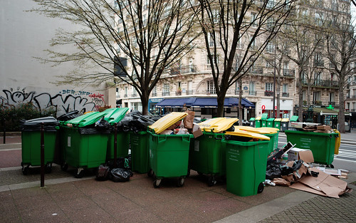
March 21 - La gréve des éboueurs (garbage haulers strike)

 La grève des éboueurs ~ Paris 17 March 2023

 As of 22 March the strike
appears to be continuing


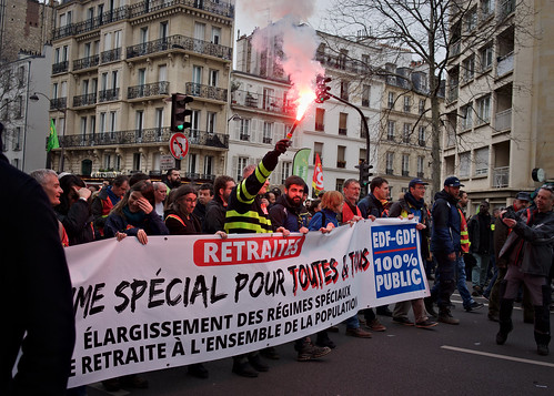
March 15 - Manifestation "...450.000 personnes ont défilé dans les rues de la capitale..." (protest march) through Montparnasse 

15 March manifestation ~ Paris

It was incredible to see hundreds of
thousands of people take to the streets
in protest


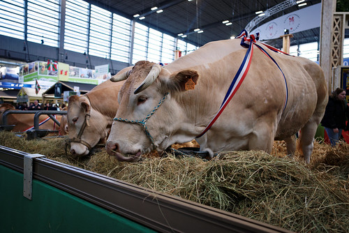
February 24 - March 3 - Salon International de l'Agriculture (Flickr album)

Salon International de l'Agriculture ~ 2023

Beautiful animals, one and all


February 1 thru 5 - Retromobile (Flickr album)

 Retromobile ~ 2023

Unexpected Renaissance Painting???


January 15 - la traversee de Paris (Flickr album)

la traversee de Paris ~ 2023

--------------------------------------------

With new photographic tools to play with, perhaps I'll get a decent shot or two and improve my output?  Regardless, I'll be looking to have as good a time as possible.

See you there!


Vintage Revival Montlhery ~ 2022

Saturday, July 29, 2023

Looking more deeply ~ Four

Taking my time and looking more deeply at photographs (see part 1, part 2, and parts 3.[1, 2, 3]) I've come to re-realize, re-appreciate the value of study, observation, and experience.

When it comes to study I used to live in a culture where people would often say things like study is for school children.  Only nerds do that.  Besides, it's boring.  Observation is for astronomers and bird watchers.  Experience is what we get from watching Disney movies where we learn important life lessons and are left with a feel good positive uplifting ending after an hour and a half.

Certainly not all of US culture is like that.  Some of the best philosophers, scientists, and thinkers come from there.  Though you'd never know it from what passes as public conversation.  You seldom hear anything accurate or correct about these kinds of people if you hear anything about them at all.

I experience this when I compare the content of media content in the US to, say, something like LCI here in France.  Even if you don't understand French a person can hear the tone of the presentation and know it's not stressed and pressed and out of breath in its delivery.  It's calm, centered, and well-reasoned.  It's not a passionate plea for attention.  It's a sharing of knowledge and information. For me LCI is like returning to the days of Walter Cronkite in the US.

Photography can be like that in the US, too.  Looking at social media feeds what do we see?  Billions and billions of selfies.  It seems like it's feeding a never ending insatiable narcissistic need.  I find the vast majority of images to be badly composed, badly lit, badly processed and completely banal.

Have none of the contributors to the World of Narcissism ever studied (!!!) how to make a good portrait?  Have they never looked at art history to observe the eye level of the viewer in relation to the subject and what it "means"?  Do people not understand the human psyche and how we interpret these kinds of things?  

If you want to make a person look good, intelligent, beautiful or strong, you place the point of view lower than the subjects eye level.  Sure, this is classic art, but it's classic for a reason. If your point of view is higher than the subjects eye level the subject will feel subservient, weak, vicitimized, and incapable.  Standing over someone implies very different things than looking up to someone.  Our reactions are built into us.

To understand this and to apply a decent solution might require education, study, observation, and experience.  Perhaps this is why so much of what passes for photography these days feels to me to be so damned insipid and banal.  People refuse to help themselves to freely, widely available knowledge.

It was something of a surprise, then, when I stumbled across a video about a NY-based street photographer.  His name is Reuben Radding.  Listening to him helped me realize there are some rather deep thinkers on the subject of photography in the US.  The first 10 minutes or so of the above linked video was like the heavens had parted and a seriously strong light had cast through.  It's inspiring to me to see what this guy does and how he's reacted to various cultural and societal challenges of photographic interpretation and experience.

There are similar voices of knowledge and understanding in all aspects of image making.  There are people like Reuben Radding in the fields of portraiture, still life, landscape, nude, and sports photography.  Depending on ones temperament and thirst for understanding, these photographers can be well worth seeking out and listening to.

I've found it helps me understand what I do photographically and why.

la Serres aux Papillons ~ la Queue-lez-Yvelines

Thursday, July 27, 2023

Looking more deeply ~ Three.Three

The history of the reclining nude in art is long and often honored.  Or, depending on the time and place, dishonored and denigrated as pornography.


Rome - 2022


In previous posts I followed a little of history and shared details surrounding one famous work.  

With this post I would like to look at the reclining nude as a subject in photography in four distinctly different styles.  I'll begin with the Pictorlialists.

In the early days of the 20th century USA censorship boards managed what the public could see and read.  This had an important impact on how the reclining nude was treated in photography.  It came down to this - if an image of a nude was clear and sharp, it would be censored.  If an image looked like "art", if it was shot with a soft focus lens, then the chances were that such a photograph would remain uncensored.

Clarence White and his friends and colleagues photographed reclining nudes.  The images made using a soft focus lens were shown publicly.  Sharp images were privately held until surprisingly recently.

Those photographers who made sharp images often disfigured or scratched away the face.  A prime example being the surviving works of E.J.Bellocq.  Many of his negatives have removed the models faces.  They are clearly scratched.  His images were censored.

So it's unsurprising to me that even now, images of the reclining nude are difficult for critics and viewers in the US.

Sally Mann's "Venus after school" is particularly problematic for the gatekeepers of morals in the public space.  In her autobiography "Hold Still" Mme Mann writes of her relief to learn the FBI wasn't going to treat her the way they had Jock Sturgess and raid her home to remove any and all "offending" materials.

For a couple decades there was a photographer who had quite an impact on nude photography around the world.  He was very famous, sold lots of books, made a few movies, and photographed ad campaigns for some of the biggest luxury goods houses on the Continent. David Hamilton is said to have been inspired by the works of Lucas Cranach the Elder, which indicates his approach and style were based in part on well established art forms.


Rome - 2022

Each time I visit the Galleria Borghese in Rome I climb the stairs and head to a room that's far away from just about everything.  It's there that one particular Cranach is found.  Displayed next to it are paintings in a similar style by other artists.  But it's the Cranach that holds my attention.  Every single time.  It's called "Venus and Cupid with a honeycomb."

It's now impossible for me not to see the parallels between the Cranach paintings and M. Hamilton's photographs.  Art informing photography.  And yet, that's not at all what the photographer is presently remembered for.

David Hamilton's choice of subject acted like a lightening rod for bad things to happen.  In 2005 in the UK a man was arrested for having a collection of images that included those made by the famous photographer.   In 2016 the photographer was accused of inappropriate behavior by four of his previous models.  He was shortly after found dead in his apartment in the 15eme Arrondissement in Paris.

The drama continued after M.Hamilton's death.  Olivier Mathieu wrote on his blog, in Defense of David Hamilton (a site that has recently been taken down) that it might have been a case of murder, not suicide.  Conversations about the merits of Hamilton's work as art have stopped, to be supplanted by many public figures taking a strong moralist stance against the dead photographer.

While David Hamilton's works from the 1970's and 1980's played a strong role in the conversation of "is it art or is it pornography", there was seldom any question about which side Playboy centerfolds came down on.

And yet, if we look at these images from the perspective of history, craft, lighting, and composition, I'm not so sure some of these works shouldn't be considered full blooded honest to gawd geez this is beautiful art.   

Ken Marcus, one of many now famous Playboy photographers, spoke about what it took to light, compose a scene, and expose a piece of film.  He talked about the importance of 1/3rd an f-stop and getting everything exactly correct.  Here is just one definitely NSFW image that illustrates how, as a photographer, Ken got everything, every detail, every nuance "correct."

Which brings me to something I hadn't fully considered before.  That is that I find myself living during a time of self-censorship.  I've said it before and I'll say it again; the subject of the reclining nude, while being a well-found, well-respected art form for at least 3 thousand years, it is something I could never bring myself to explore photographically.

I grew up in a time with the censorship boards were being shut down, but their influence remained strong.  I grew up in a time when a photo-lab would call the police if they found nude images on a roll of film you brought in to have developed.   I grew up in a time when American culture was calling into question any and all restrictions, limits, barriers, only to live to see the social pendulum swing in recent decades to the far right with the re-installation of restrictions, re-setting of hard limits, and the rebuilding of social and cultural barriers to artistic expression and appreciation.

Meanwhile, here in Europe things haven't (yet?) gone so hard right.  I have the opportunity to see, appreciate, and research some of the best expressions of any art form the world has ever seen.  One of the things that strikes me most these days is that history and time have a way of leeching away details that might be important at the time a work is created.

I'll give a couple examples of what I mean by that.

When we look at a work by Caravaggio, do we know, and if we do, do we care that he was a pimp and murderer?  Writing this exactly the way I just did exposes the moral, ethical, and cultural conditioning that I find myself subjected to.

Do we know and care that Fransisco Goya heard voices and was mentally ill?  Was his craziness a "good" thing or a "bad" thing?  Or is there "something" about his art that makes us feel as if he were actually and after all a great artist?

Much more recently, do we know or do we care that Salvador Dali supported the Spanish Fascist Franco?  Well, actually, I do.  It's partly due to the fact that Spanish Fascism still lays just below the cultural and political surfaces of Spain.  It's impossible to ignore, actually.  When Catalunya has the power to make kings (figuratively speaking) I have the opportunity to remember the role Franco played in murdering tens of thousands of people in and around Barcelona.  The wounds have not healed.

Similarly, do we know or do we care about how poorly Picasso treated the women in his life?  Or do we stress his "goodness" in remembering the role he played in saving the fabulous Prado art collection from certain destruction by advancing Franco Fascist and German Nazi forces in 1939?  Perhaps these two examples are too recent for time to have leeched away the disturbing sub-text of two large artistic bodies of work?

One last example and then I'll call an end to my ramblings on the topic.  This underscores how the ethics and morals of a time set the tone for how art is viewed, discussed, and appreciated.  Renoir's canonical work is receiving a lot of criticism for his nudes.  I don't understand it.  Why Renoir?  Why now?  Am I too dense to understand?  What's going on here?  And if people have "serious" problems with Renoir, why aren't they taking to task the works of Luis Ricardo Falero?

All this gives me some idea of what might happen to currently controversial photographic works.  I am certain that society and culture will do what society and culture has often done.  It will sift through the social-cultural dramas of the present time and get to the essence of what will by then be (perhaps dramatically) different socially and culturally views.  

I hope that someone, sometime, somewhere will see it good to rise the photographic reclining nude above the demeaning word of "pornography" to more fully appreciate excellence and stunningly beautiful images as an artistic expression that paintings already can be.