Sunday, May 31, 2020

Super Selective Toning in the Gimp - Part Two

Continuing the search for subtle toning based on selective tone ranges, here is a second method a person can use in the Gimp.

In Part One I laid out a process for selecting unique colors for selected Luminosity Mask regions.

In this, Part Two, I would like to share a process for using a unique feature found in the Gimp.

Under Colors -> Map at the end of the drop-down list is something called "Sample Colorize".  When used with a step wedge you can specify a range of colors that spread from pure black to pure white that apply tints to an image.  In analog photography terms you can think of this as a sophisticated toning mechanism.

There used to be a collection of step wedges you could download to work from, but I can't seem to find them anymore (it's been a number of years).  So I create my own step wedges from tinted images with color ranges that I like.  I tend to work from scanned carbon tissue, or platinum-palladium, or chocolate toned images.  I also have step wedges I created from scanned cool tone silver gelatin prints (I used to be a black and white photo print tech back when dinosaurs roamed the earth and still have some of my earlier works).

Looking at these step wedges you may quickly realize the subtleties in colors that are possible.  Here-in lay the promise for even finer tonal gradations when combined with the Luminosity Mask technique previously described.

I can't stress enough that there are any number of valid ways of achieving these kinds of results.  I am simply following a process path that seems obvious to me.  You mileage will vary (as they say).


Step Three - Get your step wedges ready

Continuing in the Gimp, open three step wedges.  I would suggest a cool tone wedge, a chocolate tone wedge, and a yellow-ish tone wedge.  These will open as separate files next to your base image tab.

Step Four - Cool down the shadow/dark tones

Return to the image to be toned and make the "DD", "MMM", and "LLL" layers the only _active_ (visible) Luminosity Mask layers.  We won't need the other masked layers so we need to make sure they are de-activated.

Working with your base image, select (for this example) the "DD" layer image (not the mask as you can not Sample Colorize masks).

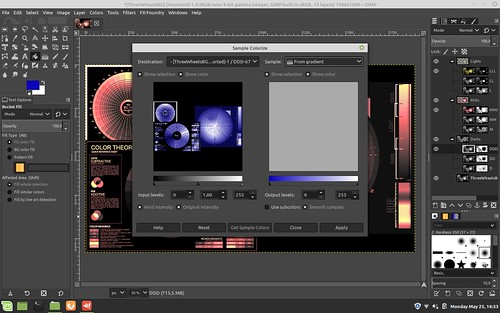
Open Colors -> Map -> Sample Colorize

In the upper right corner of the dialog box, find and select the cool tone step wedge. 

"X" use subcolors ("smooth colors" should already be selected just to the right)

Select "Get Sample Colors"

Select "Apply"

Select "Close"

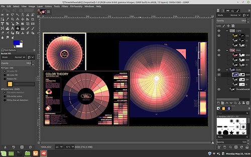
You should now see the image you are working on has taken on the cool tones of the step wedge in the dark regions.

Step Five - Warm up the middle tones

Select (for this example) the "MMM" layer image (not the mask as you can not Sample Colorize masks).

Repeating the Colors -> Map -> Sample Colorize steps outlined in Step Four, apply the chocolate toned step wedge colors to the mid-range tones of your image.

Step Six - Make the highlights "sing"

Select (for this example) the "LLL" layer image (not the mask as you can not Sample Colorize masks).

Repeating the Colors -> Map -> Sample Colorize steps outlined in Step Four, apply the yellow-ish toned step wedge colors to the mid-range tones of your image.

Your image should now be toned using portions of three colorized step wedges and three Luminosity layer masks.

If upon close inspection you find one region or another is too strongly tinted, you can lower the opacity of that layer/mask to something you find more pleasing.  I tend to do this in the shadows/dark tones as my colorized step wedge tends too be too blue to my eye.  So I tend to set the "DDD" layer/mask opacity to 50 percent.

Super Selective tone mapping in the Gimp


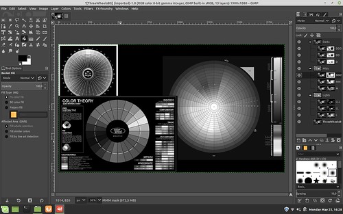
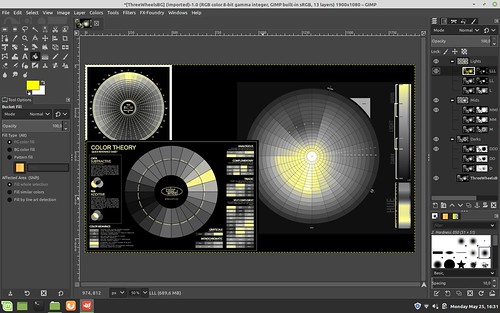
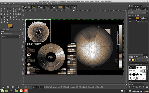
In the example screenshot image you can see how I have modified the process just slightly from what is written above.  Note the layer/mask arrangements and visibility settings (the "eye" found just to the left of each layer/mask).

In this example I have set the "LLL" layer/mask above everything else.  This will keep the whites white as I did not tint the "LLL" image.

I moved the "M" layer/mask above the "MMM" layer/mask and tinted both layers.  As you can see, the "M" layer/mask has a grayer mask than "MMM."  This means the "M" layer/mask is more subtle and for it's effects to be seen it has to be placed above the stronger "MMM" layer/mask.

Lastly, the "DD" layer image is cool toned and the opacity of that layer/mask is set to around 50 percent.

This is a lot to take in, but it helps understand why we will do what we do in the next Part Three example where we greatly simplify the entire process.
Tuesday, May 26, 2020

Super Selective Toning in the Gimp - Part One

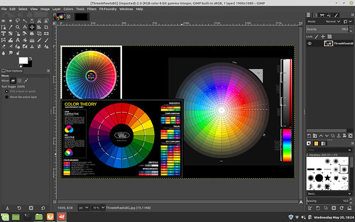
In a prior blog entry I described a simple means of toning the mid-range of a black and white photograph while keeping the blacks black and the whites white.

Some years ago I remember reading where one of the attractions to using carbon tissue layers in registration to create a black and white photographic print was that a person could vary the colors of each layer.  That is, each carbon tissue layer represents some narrow range of overall image intensity and by carefully selecting the colors of each layer a printer could, for example, use cool tones in the shadows and warm tones in the highlights.

We can achieve the same effect with perhaps even finer tonal controls than carbon prints by using digital black and white images. 

Here is another of perhaps many valid methods for achieving the carbon tissue colorizing controls in digital image processing.

Setup -

Processing -
I will give a very specific set of instructions.  However, keep in mind there are many combinations and variations that might help you express your intentions better.

Before we begin, I want to note that in this example I'm using three strong primary colors so that you can see the blending transition effects from light to dark.  For a proper black and white image we would like never do something like this.

Step One - Create the Base Black and White Image

Open an image in the Gimp.

Mid-Tone color generation and blending using Luminosity Masks


Add a black layer over the base image and set the blend mode of the black layer to "Lch Color".  Flatten the image in preparation for the next steps.

Mid-Tone color generation and blending using Luminosity Masks


Step Two - Create 9 Luminosity Layers and Masks with One Click

Open Filters -> Generic - Luminosity mask setup and watch as new masked layers are generated.  Note how they are arranged with the "Darks" layer set of three grouped layers labled "DDD", "DD", and "D".  Similarly, note how the "Mids" and "Lights" are organized.  We are about to rearrange them.

But before we do, take a close look at how each set of three sub-layer masks are slightly different from one another.  They define how much of a region will be affected when we make changes to the layer image.  Said another way, each mask uniquely describes what portion of the image will be affected by any changes we make to each layer image that each mask is attached to.


Mid-Tone color generation and blending using Luminosity Masks


Step Three - Re-Order Luminosity Mask Layers

When we add color to these Luminosity layers, their arrangement and order will be important.  How the colors will blend and transition between the layers will be determined by the order you choose.  We will now rearrange them to prepare for sample colorizing.

Click on the "Mids" top of group layer (where the "MMM", "MM", "M" sub-layers are organized just below it) and select the up arrow carrot.  When you click on the up arrow carrot after selecting "Mids", the entire "Mids" layer structure will move.  The up arrow carrot is found on a tool bar just below the base image.  Verify that "Mids" collection of three layers and masks are now positioned above the "Darks" collection of three layers.

Mid-Tone color generation and blending using Luminosity Masks

Now click on the "Lights" collection of three layers and masks and again using the up arrow carrot click twice to move "Lights" first above "Darks" and then above "Mids".  "Darks" will now be the first Luminosity layer collection above the base image.  We have simply reversed the order of the layers and their masks.

Mid-Tone color generation and blending using Luminosity Masks


Step Four - Add Highlight Color

Select a foreground color.

Mid-Tone color generation and blending using Luminosity Masks

Deselect visibility (the "eye" found just to the left of the layer image) of the "LL" and "L" layers.

Select the "LLL" layer image (and not the "LLL" mask since we cannot add color to a mask).  In this example we are selecting the layer who's mask most narrowly describes the highlight region of the image.  Selecting "LL" or "L" would broaden the colored highlights further down the tonal range.  This is something to keep in mind as you work with this technique as you can use this to introduce subtle gradations of colors within the tonal region defined by these Luminosity masks.

Select Filters -> Map -> Sample Colorize 

Select Sample: From Reverse Gradient

Select  Get Colors (perhaps not strictly required)

Select Apply

Select Close

Mid-Tone color generation and blending using Luminosity Masks


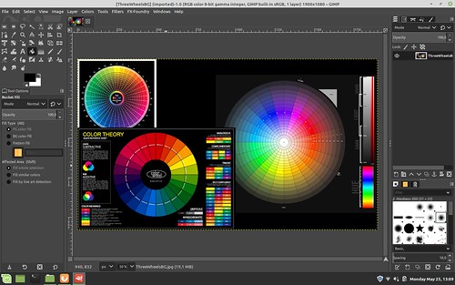
Here is how the image looks after adding color to the "LLL" highlights layer.  You can begin to see where we are going with all this by looking carefully at the various color wheels in the image we are working on to observe what just changed.

Mid-Tone color generation and blending using Luminosity Masks


Step Five - Add Mid-Tone Color

Select a new foreground color.

Mid-Tone color generation and blending using Luminosity Masks


Deselect visibility (the "eye" found just to the left of the layer image) of the "MM" and "M" layers.

Select the "MMM" layer image (and not the "MMM" mask since we cannot add color to a mask) under the "Mids" layer grouping. 

Select Filters -> Map -> Sample Colorize

Select Sample: From Reverse Gradient

Select  Get Colors (perhaps not strictly required)

Select Apply

Select Close

Here you have a choice and you will need to try both to see which mid-toning works best for you.  In this example I have continued to select Sample: From Reverse Gradient though you could use Sample: From Gradient.

Mid-Tone color generation and blending using Luminosity Masks


This is how the mid-tones are colorized and blended with the "Lights" "LLL" layer that we added in the prior toning step.

Mid-Tone color generation and blending using Luminosity Masks


Step Six - Add Low-Tone Color

Select yet another new foreground color.

Mid-Tone color generation and blending using Luminosity Masks

Deselect visibility (the "eye" found just to the left of the layer image) of the "DD" and "D" layers.

Select the "DDD" layer image (and not the "DDD" mask since we cannot add color to a mask) under the "Darks" layer grouping.

Select Filters -> Map -> Sample Colorize 

Select Sample: From Gradient  (note the change of this field value from the prior two steps)

Select  Get Colors (perhaps not strictly required)

Select Apply

Select Close

Mid-Tone color generation and blending using Luminosity Masks


Here is how the "Darks" look after following this, the final step, in this example.  Carfully observe how the colors transition between colorized regions.  This may have important consequences for the colors you choose in your own work.  There is potentially a lot to consider here.


Mid-Tone color generation and blending using Luminosity Masks


Summary -

As you can see, we have successfully added different colors to the highlight "LLL", mid-region "MMM", and shadows "DDD".  We did this by sample colorizing copies of the base image that are included in each of the 9 layers that were generated by the "Luminosity mask setup".  Each Luminosity layer has a unique mask that defines the region and extent to which the sample colorization will be applied.  In this way we can control the exact colors of, in this example, three different regions - highlights, mid-tones, and shadow.

Remember, we have 9 masked layers to work with.  So we have the possibility to further "finesse" the colors and their transitions.  If/when you choose to take advantage of the 6 masked layers that we did not use in this example, I suggest that you will want to invert the order of "Mids" under the top layer grouping.  That is to say, instead of ordering the "Mids" sub-layers as "MMM", "MM", and "M", reverse this too "M" first, you can leave the "MM" where it is, and move "MMM" to the top. 

The "Lights" and "Darks" sub-layer ordering can be left alone.  As a potentially mind-bending exercise I will leave the reasoning for this to the reader.  On second though, maybe I should cover it here.

If you look at the masks for the "Lights" and "Darks" sub-layers you will see that the most restricted mask is on top, with the following two layers expanding the regions affected by color changes.  So you will want the most restricted color mask on top in the "Mids" so that its color effects will be seen and not hidden _below_ upper more expanded layer mask.

In any event, as you add colorized layers, re-select the visibility "eye" found just to the left of each layer image to make that layer "active" and its effects visible in the overall image.

There you have it.  A potentially mind-bending, mind-exhausting way of subtly controlling colors of different tones across an image.  All this in the pursuit of old carbon tissue photographic image style.

Now, honestly, wasn't that fun?  Well, maybe not.  But at least you have real control over your image, right?


Thursday, May 21, 2020

Selective toning in the Gimp

A friend asked how we might be able to selectively tone an image using the Gimp.  His goal was to make the whites white and the blacks black, but have the mid-tones hold some interesting color.

As with everything digital, there are a gazillion ways of doing things.  For mid-range toning, here is just one way.


Step One - load a color image into the Gimp.  This will be the base layer.

Mid-tone tint steps ~ Gimp


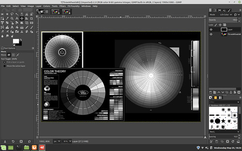
Step Two - convert to Luminosity (human eye tonal intensity matching) black and white.  You can do this by adding a BLACK layer over the base color image and setting the blend mode to "Lch Color" (shown below prior to flatten image) and then flatten the image in preparation for the next step. 

As an aside: I see that by using Luminosity curves in a black and white conversion that I get the kind of tonal separation that I prefer in my black and white images.  In fact this approach, to me, is so good that old silver halide film can not match this.

A simple digital de-saturation (which is what old film used to try and achieve with its "panchromatic" product offerings) makes things muddy.  A filter over RGB curves doesn't give exactly what I wish.  Your mileage will vary, of course.

So once you have a black and white image, however you get there, you can move on to step three.

Mid-tone tint steps ~ Gimp

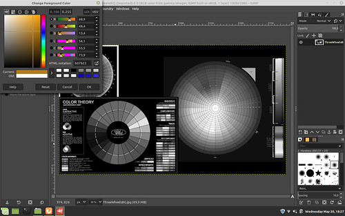
Step Three - Set the foreground color to something "interesting".  There are a number of colors that emulate things like cold silver, warm tone palladium, sepia toning, etc, etc, etc.  Choose something you like.


Mid-tone tint steps ~ Gimp


Step Four - Add a layer over the base black and white image using the foreground color you just selected

Mid-tone tint steps ~ Gimp

Step Five - Put the new color layer over the base black and white image.  Then select Layer -> Mask -> Add Layer Mask and add a white mask to the color layer.

Mid-tone tint steps ~ Gimp


Step Six -
Select the base image (in this example the color wheel image in the base layer) and select Edit -> Copy Image

Click on the White color layer mask to make it active.  Then select Edit -> Paste.  This will add a copy of the base image as a Mask to the Color Layer.

Now set blend mode of the color layer to either "Lch Color" or "HSL Color" - your choice

Mid-tone tint steps ~ Gimp


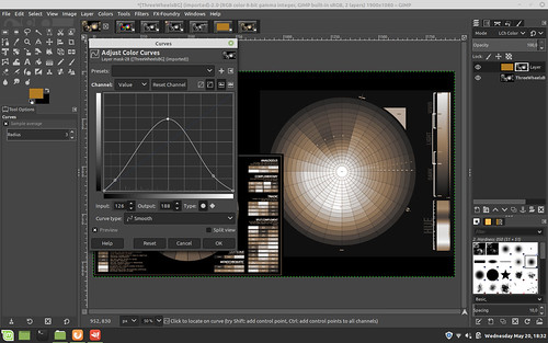
Step Seven - Open "Curves" on the Mask image and set the curve as seen below

NOTE: by raising the center of the curve, you _add_ more color to the mid-tones, but only if that's the effect you want.  Play with this to see how your base image toning changes.

NOTE 2: By lowering the ends of the curve you make the whites whiter down the tonal range and the blacks blacker up the tonal range.  For myself, I  don't mind a bit of color in the blacks, so I raise that black end of the curve - to taste, of course

Mid-tone tint steps ~ Gimp

Step Eight - Verify your results.  Flatten your image and save.

Mid-tone tint steps ~ Gimp


Wednesday, May 20, 2020

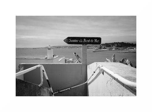
A photo from Nice...

I received the following email.  I'm thrilled.  A big thank you to "Don't Take Pictures" magazine -

Congratulations on being accepted to The View From Here online gallery through Don’t Take Pictures magazine! Thank you for sharing your art with us. 50 outstanding images by photographers from around the globe were selected for display on our website through August 18. Please visit the gallery page to view your work and click on the thumbnail image to enlarge the photograph (hover over the enlarged image to display image information). 

Sunday, May 17, 2020

How much does that weigh???

As we were leaving Nice at the end of April to catch a "dawn patrol" flight to Paris my wife offered to help me with the baggage and picked up my carry-on bag.  It was stuffed with one large laptop and two tablets, power supplies, documentation and three of my small Sony NEX cameras with manual focus Nikon Nikkor lenses.  She asked how on earth I could carry such a heavy thing as I watched her leave the bag right where it was.

She had a point.

We went to Nice by TGV and I knew I could overload the baggage a little as we would be taking taxis between the rail stations and our apartments.  I never figured we would be trying to get a flight anywhere.  I would never have packed my camera gear the way I did.

So when we got home and after we settled back into our apartment I brought out the little food scale my wife uses for measuring food stuffs.  Here is what I found.

940grams - Sony A6000 with Lens Turbo II focal reducer and a Nikon Nikkor-P 105mm f/2.5 pre-Ai - This was one of the camera/lens combinations in the bag in Nice.  That is 2 pounds of equipment right there and I had two more image makers in the side pocket next to this one.

662grams - Sony NEX-7 with Lens Turbo II focal reducer and a "pancake" Nikon Nikkor 50mm f/1.8 AiS - This was another of the cameras in my carry-on bag the morning that my wife tried to lift it.

586grams - Sony NEX-5T with Lens Turbo II focal reducer and a Nikon Nikkor 28mm f/2.8 Ai - this is very similar to one of the other cameras in my bag where I had a pretty little Nikon Nikkor 24mm f/2.8 Ai.

347grams - Sony NEX-5T with Sony 16mm f/2.8 SEL

409grams - Sony NEX-5T with Sigma 30mm f/2.8 EX DN E

422grams - Sony A5000 with Sigma 19mm f/2.8 EX DN E

542grams - Sony NEX-7 with Sony 18-55mm /f/3.5-f/5.6 SEL OSS kit lens

587grams - Sony A6000 with Sony 50mm f/1.8 SEL OSS

The Nikkor lenses are built like tanks.  They are rugged and the housings and barrels were machined from brass and aluminum.  The optics tend to be large compared with super-light weight plastic barreled modern APS-C format auto-focus lenses.  Image quality is pretty consistent across the range of Nikon lenses, too.  The way they treat the out of focus transition behind the point of focus is nothing short of gorgeous.  I really enjoy using these old lenses.

Yet, all image quality things being equal (which I will revisit in another blog post or two), in the future I can carry two cameras with modern AF optics for the weight cost of just one of my Nikon Nikkor manual focus setups.

While on the road, this kind of weight savings could be good to experience.


Nice ~ in black and white ~ 2020