Friday, June 26, 2020

Super Selective toning ~ finale

I've taken three steps (step one, step two, step three) to reach this level of understanding around what is possible with selective toning of black and white images using Open Source Software image processing applications.

In this, the fourth and for now final step in my process of understanding I look at preserving as much image information as possible as the means to keeping  histogram as smooth as possible.

As you will recall, when processing jpg images there are only 256 luminosity steps.  Any changes made to the image quickly introduces gaps/spikes in the histogram.  This indicates lost information. 

Most of the time this is beyond the ability of the untrained human eye to perceive.  But, to me at least, this is intellectually unsatisfactory.  More practically there are many cases where we would like to preserve as much information as possible when we make any changes (strong or otherwise) to an image in processing.

For these reasons I turned my attention to using the image toning functions in RawTherapee.

This Open Source Software application handles a vast array of RAW formats and provides 16bit image color spaces as default, with the possibility of dealing with 32bit floating point color spaces, too.

Limiting our attention to three functions we will see how easy it is to selectively tone an image while keeping the histogram very smooth.

Step One - Open a RAW format image in RawTherapee

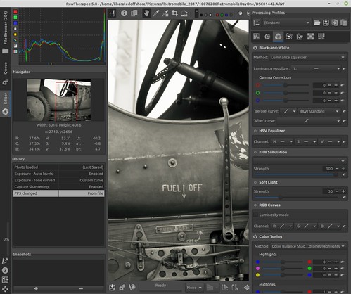
In this example I pressed the "Auto Levels" button and let the application sort out how to arrange the image tones automagically. 

Then I opened "Tone curve 1" and snugged up the blacks and raised the whites in anticipation of emulating old silver halide prints.

RawTherapee black and white image toning


Step Two - Convert to black and white (I like "luminosity" conversions, but you may prefer something different, like de-saturation or RGB conversions).

RawTherapee black and white image toning


Step Three - Tone the image using "Color Toning"

Example A

RawTherapee black and white image toning

Note the settings I used.

The highlights remain neutral in this example.  So specular highlights in the image will remain pure white.

The mid-tones in this example are strongly Yellow, with a hint of Red and Green.

The shadow tones are just slightly blue to emulate a cool tone shade that we experience in nature (the color temperature of shadows are typically must lower than the color temperatures of highlights).


Example B
RawTherapee black and white image toning

Note the settings I used.

The highlights again remain neutral in this example.  So specular highlights in the image will remain pure white.

The mid-tones, however, are now slightly Yellow, with a hint of Red and, in this example, Magenta.

The shadow tones are stronger blue than the first example to more strongly emulate a cool tone shade that we experience in nature (again, the color temperature of shadows are typically must lower than the color temperatures of highlights).

Comments -

In your own work, I would suggest opening a toned image that appeals to you in a separate window.  Then work on your RawTherapee image toning sliders until you match the tones of your favorite toned image(s). 

If you save these settings you can then quickly recall them to be applied to any image.  RawTherapee has a good set of instructions on how to do this.

Monday, June 22, 2020

Super Selective toning in the Gimp ~ Part Three

In a prior blog entry I described a means of using the Gimp to tone the mid-range of a black and white photograph while keeping the blacks black and the whites white using Luminosity Masks.

This can be a rather complex process.  We will now try to dramatically simplify the entire toning procedure.  At the end of this post we will have a look as to whether this is a satisfying answer.  So stay tuned.


Setup -

Processing -

I will give a very specific set of instructions here.  However, keep in mind there are many combinations and variations that might help you express your intentions better.


Step One -

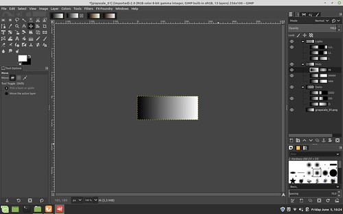
Open a black and white step wedge in the Gimp


the Gimp ~ converting gray scale with subtle tones

Now open three previously sample colorized step wedges.  Open cool tone wedge and two warmtone color wedges.  We will use this starting in Step Four.


Step Two -

Create 9 Luminosity Layers and Masks with one click

Select Filters -> Generic - Luminosity mask setup and watch as new masked layers are generated. 

Note how they are arranged with the "Darks" layer set of three grouped layers labled "DDD", "DD", and "D".  Similarly, note how the "Mids" and "Lights" are organized.  We are about to rearrange them.

But before we do, take a close look at how each set of three sub-layer masks are slightly different from one another.  They define how much of a region will be affected when we make changes to the layer image. 

Said another way, each mask uniquely describes what portion of the image will be affected by any changes we make to each layer image that each mask is attached to.


the Gimp ~ converting gray scale with subtle tones


Step Three -

Re-Ordering the Luminosity Mask Layers.

When we add color to these Luminosity layers, their arrangement and order will be important.  How the colors will blend and transition between the layers will be determined by the order you choose. 

We will now rearrange them to prepare for sample colorizing.

Click on the "Mids" top of group layer (where the "MMM", "MM", "M" sub-layers are organized just below it) and select the up arrow carrot.  When you click on the up arrow carrot after selecting "Mids", the entire "Mids" layer structure will move.  The up arrow carrot is found on a tool bar just below the base image.  Verify that "Mids" collection of three layers and masks are now positioned above the "Darks" collection of three layers.

Click on the "Mids" "M" layer and move it above the "MMM" layer (as seen in the example below.

Now click on the "Lights" collection of three layers and masks and again using the up arrow carrot click twice to move "Lights" first above "Darks" and then above "Mids".  "Darks" will now be the first Luminosity layer collection above the base image.  We have simply reversed the order of the layers and their masks.

There is one final task before moving onto the next step.  Deselect the "LL", "L", "MM", "DDD", and "D" layers. Your layers and masks should now look like the following.

the Gimp ~ converting gray scale with subtle tones


Step Four -

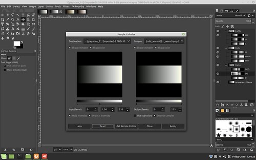
Select the "DD" layer image (not the mask - you can't colorize a mask).

Open Filters -> Map -> Sample Colorize and in the "Sample" pull-down menu select the cool tone step wedge.

Select Get Sample Colors

Select Apply

Select Close

the Gimp ~ converting gray scale with subtle tones


Step Five -

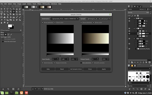
Adding a Mid-Tone Color select the "MMM" layer image (not the mask - you can't colorize a mask).

Open Filters -> Map -> Sample Colorize and in the "Sample" pull-down menu select a mid-tone sample colorized stepwedge.

Select Get Sample Colors

Select Apply

Select Close

the Gimp ~ converting gray scale with subtle tones


Step Six -

Adding a hint of color over the "MMM" layer by using the second warmtone stepwedge.

Select the "M" layer image (not the mask - you can't colorize a mask).

Open Filters -> Map -> Sample Colorize and in the "Sample" pull-down menu select the second of your two mid-tone sample colorized stepwedges.

Select Get Sample Colors

Select Apply

Select Close

the Gimp ~ converting gray scale with subtle tones


Step Seven  -

File -> Export the newly tri-tinted step wedge saving it using a meaningful name so you can easily identify and retrieve it in the future to tone your images.

From now on, all you have to do is open your image and open the step wedge in the Gimp and to sample colorize your image using that step wedge.  No need to use luminosity masking to get the detailed color tints you want.

Simple.


Summary -

You may have noticed that we have done nothing with any of the "Lights" layers.  Because of the way we ordered the layer stack, these keep the whites from the base image and will keep the whites white in final saved tri-toned step wedge.  In this example the "LLL" layer has the narrowest band of white of the three "Lights" layers.  By selecting other "Lights" layers you can extend the white and light grays further down the step wedge.

All you need to do is create one of these altered step wedges and you can consistently apply this exact range of tints to any image by sample colorizing using the newly created wedge.

However, let's think this a bit deeper. 

In 8 bit JPG images we have four channels to work with.  We have red, green, blue, and a black and white channel.  In converting to black and white we end up with only _one_ channel's worth of information, the black and white channel.  So when we add color _back_ to the black and white channel we have only 256 shades of gray to work with, even though we are adding color to the RGB channels.

What we've done is gone from an 8bit by 3 color channel color space down to just 256 bits of information to work with.  Most of the time the human eye can accept this and may find an image pleasing.

Looking at four channel curves in an image processing software reveals the fragility of using this limited amount of information.  This is readily seen when the "curves" are modified.  We can see in a histogram that information is at various points quickly lost.

I know.  Deep subject.  Is it worth all this thrashing?  I think so.  Here's why.

There might well be a very nice solution where we can easily work the black and white channel in a 14 or 16 bit RGB color space.  This has the promise of giving us a much smoother histogram "curve" and might help us experience images in a rich and, dare I say, gorgeous large format film nearly analog "look" and "feel" kind of way.

Onward to Part Four.