As I said at the start of the prior post, someone who's work I'm following and who's PhD thesis on pictorialist lenses I've closely read posted something that captured my attention. I find this and other images of his very charming. As you can see from the EXIF it is an image made using an old single coated lens Zeiss Ikonta B film camera using Orthographic film.
As background information, Ortho film is very sensitive to blue light, minimal sensitivity to green, and zero sensitivity to red. This was the way _all_ black and white images were before the invention of panchromatic film. Panchromatic film is sensitive somewhat equally to all visible colors in the spectrum. It was invented in the early part of the 20th century and is still commonly available. On the other hand, Orthographic film tends to be difficult to find today.
After creating a digital emulation of Ortho I wanted to see how it behaved in the "real world."
Keep in mind that this is just one image. To really "know" and understand something takes a bit of effort and many questions will not be answered in a single photograph. However, I found the following example to be interesting.
The approach I used was to set the exposure/contrast/vignetting levels where I wanted. Then I moved the mid-section of "Curves" up the range to lift the mid-tones and to ever so slightly flatten the highlights. I will explain this further in a moment.
NOTE: I learned several things from a series of articles that Mike Johnson has posted over the years about converting digital color to black and white. In digital conversions to Black and White -
- Expose for the highlights and process for the shadows - this is the exact opposite of what you do in film photography. In fact, digital conversions, what with modern sensors and all that, tend to show more detail in the shadows than in traditional film.
- Luminance - Remember that the human eye perceives same energy colors differently. For instance, we see blue darker than we see same energy green. This is how, in black and white photography, we can begin to see what photographers call "tonal separation." It used to be that "tonal separation" was the Holy Grail of great B&W photography and it was very difficult to control. This isn't surprising as a simple desaturation without taking into account how the human eye sees colors can produce a Muddy Mess. I have taken to using luminance, unless I'm working to achieve a specific "look", such as what I'm trying to illustrate with this Ortho film emulation. With regards to "looks", a good digital B&W conversion can "look better" than film. I know, more heresy.
- Lift the mid-tones - I use "curves" to pull up the mid-tones and to slightly flatten the highlights. This is, actually, one of the "secrets to success" for converting digital color to Black and White. Why? Because in B&W photography we printed our negatives to paper. Paper, it turns out, lifted the mid-tones. If paper did not lift the mid-tones, we would have had a world filled with Muddy Messes of non-luminescent grays. Try it sometime. Take a digital color image and convert it to B&W. Then gently lift the mid-tones and watch what happens. If the image is too bright, bring the "lightness" down Do not use "exposure" to do this. "Lightness" preserves the highlights regions where "exposure" brings the entire exposure range down the curve. Or take an old B&W negative and scan/photograph it and invert the values. You will see the Muddy Mess I'm talking about. And then lift the mid-tones using "curves", et voila! Immediately you will recognize print tone values. It's magic. Trust me on this.

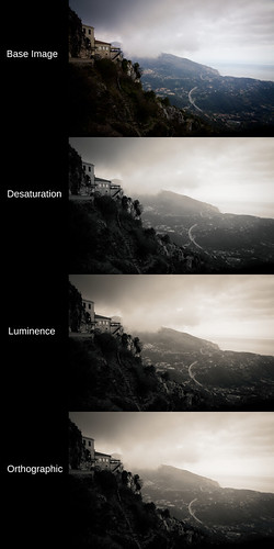
As you can see this scene from a viewpoint at Sainte Agnes, France has muted, mixed colors. The buildings and foreground vegetation are warm in tone. The sky and horizon are blue.
Looking at the simple desaturate method output and comparing it with the human perception model (luminance) conversion shows what we might expect from modern black and white film as well as de-saturation converted digital color images. The desaturate image is nothing to write home about. The luminance conversion shows better tonal separation.
Considering the Ortho image, we can clearly see where the blue portions of the scene are lighter than in the other two conversions. Overall, it looks as if there is more moisture in the air. It begins to have that Orthographic film "look."
If you want to fully emulate the old Ortho film look, study where early photographers placed the exposure value and emulate that. It can be an interesting exercise.
No comments:
Post a Comment