Saturday, December 02, 2017

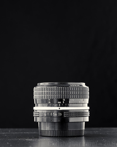
Lens Stories ~ Nikon Nikkor 50mm f/1.8 AiS "pancake"

Lens Stories ~ Nikon Nikkor 50mm f/1.8 AiS


Moments after I acquired the Nikon Nikkor 50mm f/2 H pre-Ai at the Photo Foire in Bievre I spied this little jewel tucked away almost under larger and longer lenses on another seller's table.

At first I thought it was the cheap, plastic, and commonly available series E Nikon.  I've owned several of those and while they are OK lenses, they failed to thrill me.  There was something about the images that failed to "pop", if you know what I mean.

The lettering on the lens that I dug out had it's front ring painted flat black, so it took a moment for me to sort out what it was I was looking at.  It was certainly a "pancake" lens.  And in this way it reminded me very strongly of the series E I originally mistook it for.  The lettering said "Nikkor", however.  No series E Nikon lens was ever labeled "Nikkor."  The moniker was reserved for Nikon's "pro" lenses, or so the story goes.

Thinking a bit more about what I was looking at I realized this must be a fairly late model Double Gauss lens.  I remembered seeing it on a lens chart somewhere.  It was certainly small and light.  So I asked the man behind the table combien?  40Euros came the reply.

Well, why not, then.  Even if I couldn't get the black matt paint off the label ring, it could still be fun to try.  Certainly it might be interesting to compare it against Nikon's much earlier implementation in the 50mm f/2 H that I already had in pocket.

Out whipped two more 20Euro notes and my wallet was getting lighter, but not by too much.  How often does a Lens Nut find a decent lens for 40Euros, let alone two at that price?  OK.  OK.  Indeed, a patient person can find these lenses for a single 20Euro note.  I guess I'm not exactly patient.

It took some time, a little ETOH (denatured), and a lot of scrubbing and rubbing with Q-tips but the gross matt black is mostly gone, now.  While the lens will never be as pretty as the day it left the factory, it's certainly not bad to look at and it's image quality is a surprise.

Comparing it against its older brother, the f/2 H, I see that Nikon re-implemented the Double Gauss design.  That is, the implementation seems to be an update.  Perhaps they used different glass?  Perhaps they reshaped the lens elements?  Whatever they did, this f/1.8 AiS is a very different animal.

To start with, while not as wickedly wickedly sharp wide open as the f/2 H, the f/1.8 is merely wickedly sharp and has a much flatter field from wide open.  What it ever so slightly misses in terms of resolution at f/1.8 compared to the older f/2 is not easily seen, even when pixel-peeping.  Wide open the resolution differences are very subtle.

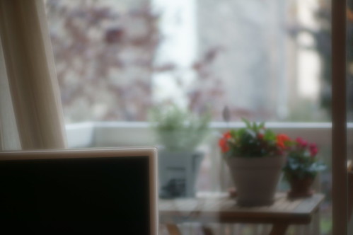
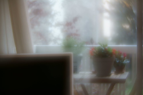
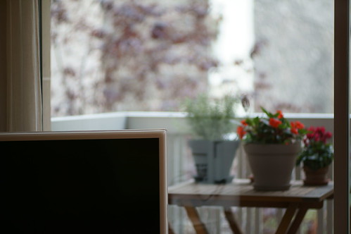
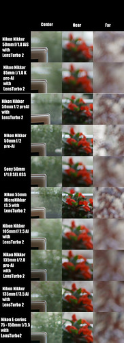
Considering the out of focus rendition, the AiS "pancake" is on a level of it's own.  It's down right gorgeous for a 50mm lens.  I've owned far too many 50mm lenses in my life and have always felt they suffered from "jittery", "ugly", over-corrected out of focus renditions.  Not this lens.  It's surprisingly wonderful.  It is smooth and creamy where the old f/2 H is "soap-bubbly", "jittery", and "ugly". [example1, example2, example3, example4]

Stopped down the f/1.8 AiS is every bit as sharp and contrasty as a modern aspherical objective.  I'm not sure if what I heard is correct, but perhaps the old f/1.8 AiS continues to be manufactured in the form of Nikon's 50mm f/1.8 AF.

Coupled with a Lens Turbo II focal reducer adapter this Nikon Nikkor 50mm f/1.8 AiS practically lives on my Sony APS-C mirrorless cameras.  It was my "go-to" lens during a recent trip to St Malo, Dinand, Dinard, and Mont St Michel.

In fact, I like the overall rendering so much that my newer aspherical AF lenses are presently sitting unused.

Friday, December 01, 2017

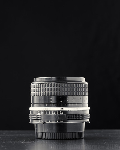
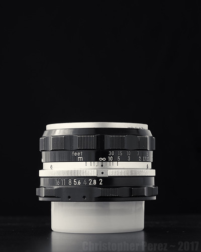
Lens Stories ~ Nikon Nikkor 50mm f/2 H

Lens Stories ~ Nikon Nikkor 50mm f/2 H


Visiting this year's Photo Foire out in Bievre turned out to be a very dangerous thing to have done.  I found this lens for 40Euro.

The lens in question is a Nikon Nikkor 50mm f/2 H pre-Ai.  I bought it after the man showed me a nice minty Ai version, but wanted 80Euro for it.  When I balked at the price he handed me this one and said 40Euro.

OK.  That's fine.  Two 20Euro notes lighter and I had this very small very light weight lens in my pocket.  Yes.  I know.  These can be had for just one 20Euro note.  Impatience will do that to a guy an make his wallet lighter quicker.

The reason I looked for this kind of Nikkor is that it was first built in the late 1950's and implements the by now very classic Double Gauss six element in 4 groups design.  The Double Gauss design itself dates to the latter part of the nineteenth century and was a modification made by Bausch and Lomb to an original Carl Zeiss design from the early part of the nineteenth century.

The design has given rise to some of the finest lenses ever made.  Zeiss, Schneider, Nikon, Mamiya, and nearly all photographic lens manufacturers have built something to this specification.  Plasmat, Xenotar, Biotar, Dallmeyer Super Six, Xenon, Ultron, Ektar, Super Speed Pancro, and Summicron are just a few of the Double Gauss design trade names sold to photographers over the years.  I loved my old Xenotar lensed Rolleiflex TLR's.  The image quality is world renowned.

The Nikon Nikkor 50mm f/2 implemented the classic design with minor modifications.  The forward three elements are slightly larger than the rear groups.  I read somewhere that this was done to compensate for the mirror of the Nikon F series SLRs the lens was made to fit.

Faster versions of the design (ie: f/1.4, f/1.2, f/1.0) are all derivatives of the basic layout.  But the faster versions break from the six element four group implementation by splitting various groups into more, separate elements.  That's why these faster lenses are more complex and seem to have more trouble controlling the various aspects of scene rendition.  Wanting to avoid the increased optical complexities of very fast lenses I sought out the f/2 for it's simpler, basic, classic implementation.

In practice and when used with a Lens Turbo II focal reducer on my Sony APS-C mirrorless cameras the lens is wickedly sharp in the center and contrasty across the field from wide open.  It's sharper wide open than the f/1.4 pre-Ai version at f/2.  The corners are a soft wide open, but some of this comes from field curvature.  In any event the corners clean up fairly well by f/4 or f/5.6 where the field flattens out.
[example1, example2]

The only fly in the ointment is that the highlights are soap-bubble shaped in the out of focus regions.  This is commonly referred to as "bad bokeh".  If memory serves, a Zeiss whitepaper I read some years back suggested that soap-bubble out of focus highlights are caused by over correcting a lens in the out of focus regions.  While I'm not crazy about soap-bubbles, there are lenses that sell for a great many pieces of silver which specialize in soap-bubble effects.

Disaster struck one day when I went to remove a camera from a bag.  The camera strap caught this little lens and flung it across the closet.  Even though the lens was wrapped in a protective cloth and even though the drop wasn't all that far, and even though the lens cap was the first thing to hit, the front rim of the 50mm f/2 was slightly turned.

I checked the resolution after the fall.  There seems to be no change in sharpness nor in overall optical alignment.  Still, I feel ill thinking about having dropped this wee-beasty.  It's only the second lens I've ever dropped.

The first lens I ever dropped was a Canon 200mm f/3.5 FL which I stupidly let slip off my shoulder during an F1 practice session back in the day when the Circus ran at Long Beach.  But that's another story for another time.

Thursday, November 30, 2017

Lens Stories ~ Nikon Nikkor 28mm f/3.5 Ai

Lens Stories ~ Nikon Nikkor 28mm f/3.5 Ai


After the arrival of the 24mm Nikkor I re-realized that Photographic Tool Acquisition is a rather slippery slope.

I say re-realized because hundreds and hundreds of lenses and cameras have passed through my hands over the years.  Hundreds, I tell you.  It's either something to laugh about or to be suspicious of.  What on earth have I done with all that glass?  When I think of the beautiful pieces of gear I've owned, sometimes I nearly weep for not having kept them.

After picking up a few lenses for around 40Euros the Lens Acquisition Bug hit.  Again.  For the 'um-teenth time.  It's a recurring illness.  It's Madness.

This time the parameters of my buying and buying and buying is based on a simple principle: Find the very finest manual focus lenses I can for less than 50Euros.

Recently I've noticed that the bottom of the old lens market has started falling out.  There are some brilliant things to be had for just a few shiny pieces of silver.

My current system is built around Sony APS-C mirrorless cameras.  Manual focus lenses are fitted by way of either a Nikon to NEX straight-thru adapter or a Lens Turbo II focal reducer.

The focal reducer keeps the field of view that a lens would have on a full frame camera by reducing it to fit an APS-C sensor.  In this way I can achieve the full frame 35mm imaging "look and feel" on the smaller sensor system.  But as I've previously noted, not all lenses behave well in the corners when adapted using the Lens Turbo II.  There are limits to this Madness.

Trolling eBay point fr one day I found a 28mm Nikon Nikkor f/3.5 Ai.  It seemed to be in good condition, but folks weren't bidding much on it.  As the clock ticked down I jumped in with a rather low bid.  It stuck.  Now I'm stuck (happily, it turns out) with a 50-ishEuro lens.

I never considered the 28mm f/3.5 as it's an old old design.  It's so old that it is perhaps the first retrofocus design implemented by Nikon for the F-series SLRs.  While Nikon is proud of its achievement, I wasn't sure if it would be sharp.  The maximum aperture was rather slow, too.  A few 'netizens have suggested the f/2.8 and f/2 versions are better.

For so little money it didn't seem like it was such a bad thing to see how it worked.  If I didn't like it, I could flip it and not be out much (if anything) on the deal.  Ah, the Glories of Rationalization.

Once in hand I took a fairly close look at it.  This lens is wickedly sharp from wide open in the center.  And the corners clean up nicely by f/8 or f/11 when used with the Lens Turbo II.  It seems like it's every bit as good as a modern aspheric design lens of similar field of view that I own.  This out of lens design that dates to the late 1950's.

I like the lens well enough that it's become the primary optic for a series of images I'm currently working on.  Here's an example of what I'm doing with this sweet little optic.


Heavenly Music ~ Paris, France

Wednesday, November 29, 2017

Lens Stories ~ Nikon Nikkor 24mm f/2.8 AiS

Lens Stories ~ Nikon Nikkor 24mm f/2.8 AiS


When we moved to France I brought a number of old manual focus Nikon lenses.

One of the lenses in the batch of Fun Things was a 24mm f/2 Nikon Nikkor Ai.  I never used it and sold it.  The reason is I didn't like it.  It was soft wide open and I wasn't convinced that it could match the image quality of the inexpensive AF lenses I used at the time.

After watching a Joel Grimes portrait lighting video I saw that he used a 24mm lens to great effect.    The idea of using an old manual focus lens for portraiture was suddenly attractive.  I felt the desire to try another 24mm full frame lens.

I have two autofocus wide angle lenses that I could use but don't like using AF lenses with their manual focus function "focus by wire."  Justification and rationalizing comes easy to me.

Scanning le bon coin one day I stumbled on a 24mm f/2.8 Nikkor.  The price seemed correct when compared against eBay completed auctions.  After firing off an email to the lens' seller we made arrangements to meet so I could view the object en vente.

The Nikon Nikkor 24mm f/2.8 AiS is a pretty little thing.  It's relatively small and light for a lens that comes mounted in real metal (as opposed to plastic that tends to be used in current AF optical implementations).

The f/2.8 version of the Nikon 24mm lens is most definitely sharper and more contrasty in the center than the f/2 I sold.  But, and this is a huge "but", the corner performance suffers to the extent that it is unusable on my APS-C Sony mirrorless cameras when mated to a Lens Turbo II focal reducer.  Stopped down to f/8 and f/11 the lens never cleans up in the corners.

Ugh.

Mounting the 24mm Nikkor on a straight-thru adapter turns the effective focal length into a 35mm f/2.8 lens on my tiny Sony APS-C mirrorless.  This isn't exactly what I intended.  If I wanted a 35mm lens, I'd prefer to have my old Nikkor 35mm f/2 back.  I foolishly sold the 35mm when I went through a fit of "downsizing" my Collection of Photographic Tools.  Though, I suppose, I could wait until full frame Sony mirrorless prices descend from un-obtainable to somewhat affordable and use the 24mm lens on that.  Someday.  Maybe.

I feel "stuck."  Again.  This is a lens I really want to love.  Yet, here is another 24mm Nikkor that, for one reason or another, I can't use as I intended.


Sunday, November 26, 2017

When everything conspires to succeed...

My father and brother were scheduled to come to Europe on vacation.  Unfortunately my father broke a leg as he was "buttoning up" his home before the trip and they couldn't come.

My wife and I were left with train tickets and hotel reservations to deal with.  We canceled what we could, but we prepaid several things we couldn't back out of.  So we decided to use what we'd already paid for.

Our destination was the beautiful town of St. Malo which is out on the western edge of France in celtic Bretagne.  We'd been there once before, but I was sick that time and wasn't able to fully enjoy the adventure.

It'd been over a year since I'd acquired my French driver's license, so we decided to test it out by renting a car.  Usually we take public transportation everywhere.  We get to see things in relative comfort and ease.  But renting a car would require my attention be diverted and directed in a very different and stressful way.

The day after we arrived we set off for Dinan.  It's an incredible little village that still retains much of its medieval character.  The next day we visited the nearby town of Dinard.  It's a place rich in big old houses that the rich built to create a seaside playground for themselves.  On our final full day, we drove to Mont Saint Michel.

The old monastery is well known for the way it sits on top of a granite rock island.  Iconic photos of place at dusk or sunrise are easily found all over the internet.  Our visit was in broad daylight and I hoped to find a way to share a different perspective of the place since we'd be lacking the drama of the edges of the day kind of light.

Once inside the cathedral at the top of the hill I saw the windows were ablaze with sunlight.  Standing toward the back I took a series of images in the hopes of stitching them together later.  Unable to see the final result in-camera and on-site reminded me of the many years I shot film.  I would have to wait to see if what I saw and felt had been adequately captured.

Once home I opened Capture One and worked on the cathedral images.  I tried to match the exposures and curves between each of the image segments.  I've found taking care of such things sometimes helps in the stitching step.  Files were written out as 8 bit TIFFs and opened in Hugin.

Hugin is an open source image stitching and alignment software.  I recently experienced several failures using Hugin in that it doesn't always align all elements of a scene correctly.  So you can imagine my surprise when the resultant file from Mont St. Michel turned out to be perfectly aligned across the entire file from the very first stitching attempt.

Next I opened the Gimp (another open source software and one that I've been using for over a decade), added a little vignetting, and lightly modified the luminosity of various regions.  As I wrote the final image out to a new file I realized the long dimension was well over 12,000 pixels.  There is a lot of useful and beautiful information in the image.

I feel I have successfully captured something unique.  No, it's not the iconic view of the medieval community, but it is uniquely mine, what I saw, and I think it's beautiful.

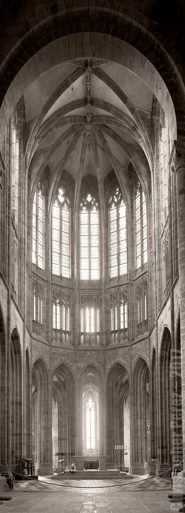
Mont Saint Michel ~ France ~ 2017

Friday, November 24, 2017

Other Optical Properties ~ contrast between new and old lenses

There is, of course, much more to lenses in photography than just resolution (what we usually call "sharpness").  I've spent many many blog posts sharing what I've found in that regard.  It is time to look at a different aspect of optics, cameras, and photography as tools.

Recently I've taken to working with Nikon lenses that in some cases are more than 50 years old. The resolution of the lenses match that of my modern lenses.  They are all manual focus and change my approach to image making by slowing me down.  After seeing some initial images, I was thrilled.

Without any direct evidence I felt the old Nikkors were more "contrasty".  Again without any direct evidence and without understanding how such a thing could be possible I felt that new lenses somehow gave lower overall "contrast" but better "micro-contrast" than the old optics.

Thinking about this a bit, I devised a small comparison.  Here is what I did.

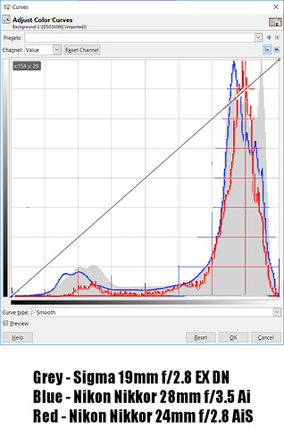
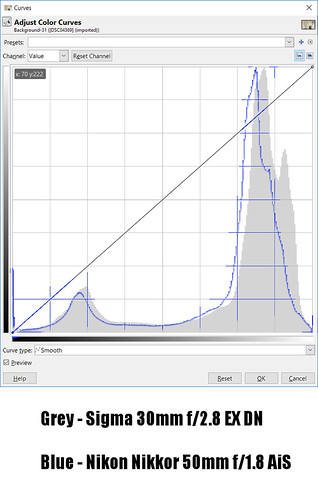
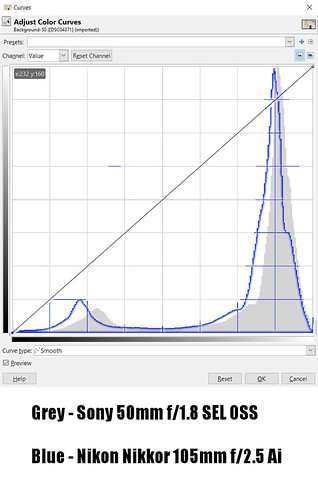
I photographed the same scene with matching in-camera cropping using new and old lenses.  Then I found a way to overlay the RGB/Luminosity "curves" to  compare how lenses handled the light range.

The lenses I looked at were -
  • Sigma 19mm f/2.8 EX DN
  • Sigma 30mm f/2.8 EX DN
  • Sony 50mm f/1.8 SEL OSS
  • Nikon Nikkor 24mm f/2.8 AiS
  • Nikon Nikkor 28mm f/3.5 Ai + Lens Turbo II
  • Nikon Nikkor 50mm f/1.8 AiS + Lens Turbo II
  • Nikon Nikkor 105mm f/2.5 Ai + Lens Turbo II
All lenses were shot at f/5.6.

After photographing the scene I found I needed to match where the top and bottom of the "curve" touched the data recorded by the camera.  I needed to do this because the exposure system in the camera never exactly matched lens to lens, frame to frame.  This step is also rather important to my understanding of what's going on, as we will soon see.

Here are the results -

Curves Overlays ~ various lenses

Curves Overlays ~ various lenses

Curves Overlays ~ various lenses

To begin with, the old manual focus lenses seem to in general place image information slightly lower than modern optics.  The highlight and shadow peaks are consistently behind where the new Sigma and Sony lenses place them.  Could the be an effect of the camera system taking a slightly different path to calculating exposure?  Instead of balancing aperture, shutter speed and ISO, with manual focus lenses only the shutter speed and ISO are directly controllable by the system.

Additionally, I see is that with the shorter focal length lenses there is a slight difference in how the highlights are rendered.  The highlight portion of the curve is broader with the new Sigmas than it is with the old Nikkors.  The longer lenses, on the other hand, appear to have nearly identically shaped curves.  Are the differences in curve shape in the highlights due to optical properties or by the way the camera system, again, calculates exposure by moving the highlight peak up the curve and thereby "spreading" the peak?

Then when I think about how I generated these illustrations in the first place (trying my best to match where the tops and bottoms of the curve first encountered recorded information).  I quickly understand that it is entirely possible to more precisely match the shapes of the curves between any of the lenses.

Even without answering my questions about how the Sony NEX/Alpha cameras calculate exposure with fully automated and old manual no-aperture controlled lenses, I think I can safely share an interesting outcome of little comparison:  After processing there is no meaningful difference in how new and old optics send light to a sensor.  Said another way, in terms of "curves" shape I feel it is very likely possible to make a new lens "look" like and "old" one, and vice versa.

As for what started me down this path, that the old Nikon Nikkor lenses were more "contrasty" than modern optics, and that modern optics were somehow better able to render "micro-contrast", I see no evidence to support my feelings and earlier thoughts.

This is why I take the time to look at these kinds of things.  I learn something nearly every time I take a deeper look at photographic tools.

Wednesday, October 18, 2017

Optical vs Filter "softness"

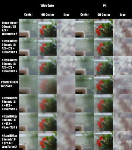
As I'm still somewhat obsessed with the topic of "softness" and trying to learn what I can, I thought I'd take a look at comparing the optical "softness" rendered by the Pentax 85mm f2.2 SMC Soft to the Nikon Nikkor 50mm f/1.8 AiS and 85mm f/1.8 K pre-Ai with two Nikkor soft filters numbers 1 and 2.

Here is the comparison (as always, follow the link, find the all sizes images, and look at this at 100 percent to see everything there is to see).  Please note that the second to last comparison should read "... Nikkor Soft 1".  The comparison will make more sense.

Pentax Soft and Nikkor Soft Filters


What I see is that the Nikon lenses with the Nikkor soft filters simply add softness to the image, just as we would expect.  The number 2 Soft filter is, again as expected, gives a stronger softness than the number 1 filter.  In terms of softness, the number 2 filter more closely approximates the Pentax lens when both lenses are shot wide open.

It may not be entirely clear by looking at the above comparisons that the Pentax 85mm f/2.2 SMC Soft distorts the image in ways that the Nikkors deliberately avoid.  I should, however, be clear that changes in the aperture affects the "sharpness" of the subject focused on to a greater degree than it does out of focus areas around the edges.

Further, as previously noted, the depth of field of the Pentax lens does not appear to change with aperture changes.  This behaviour is dramatically different from the Nikon lenses where the depth of field changes as the aperture changes.  This difference in depth of field behaviour should be clear in the above comparison.

To illustrate what I mean when I say the Pentax lens distorts the scene, here are two photographs that show the difference between the Pentax 85mm f/2.2 SMC Soft and the Nikon Nikkor 85mm f/1.8 K pre-Ai with a Nikkor number 2 Soft filter mounted on the front.  The level of "softness" is similar, but the way the images are rendered are very different.

Nikon Nikkor 85mm K f/1.8 Soft Filter #2
Nikon Nikkor 85mm f/1.8 K pre-Ai at f/1.8
with Nikkor #2 Soft filter


Pentax 85mm Soft f/2.2
Pentax 85mm f/2.2 SMC Soft at f/2.2

Wednesday, October 11, 2017

Out of Focus Rendition ~ a quick look at a few Nikkors and one Sony

Before the Strange Beasty Pentax 85mm f/2.2 Soft landed on my doorstep, I took a look at the out of focus rendition (OFFR) of various lenses that I have on hand.

Here is the incredibly boring but sufficient to the task scene.  It was taken with a Nikon Nikkor 85mm f/1.8 K pre-Ai shot wide open.

Nikon Nikkor 85mm f/1.8 K


Here is the comparison (follow the link and head to the files to select the largest, and then view it at 100 percent to clearly see what I will describe in just a moment).  All lenses were shot wide open.

Bokeh Studies


Organizing my comments by ranking these lenses from doughnut shaped OOFR to the smoothest -

  • Nikon Nikkor 50mm f/2 H pre-Ai
    [huge gap in OOFR]
  • Nikon Nikkor 50mm f/1.8 AiS
  • Nikon E-series 75-150mm f/3.5 AiS
  • Nikon Micro-Nikkor 55mm f/3.5 pre-Ai
  • Nikon Nikkor 135mm f/3.5 AiS
  • Nikon Nikkor 135mm f/2.8 pre-Ai
  • Sony 50mm f/1.8 SEL OSS
  • Nikon Nikkor 85mm f/1.8 K pre-Ai
  • Nikon Nikkor 105mm f/2.5 AiS
Looking at the old double gauss 50mm f/2 H OOFR I see what a Zeiss whitepaper on optical design described as over-corrected rendition.  Before I say the OOFR is "horrible" I would like to note that some people love the soap-bubble rendition.  Recently a manufacturer started selling lenses that deliberately give this effect, so who am I to judge?

What's interesting to me is that the more current implementation Nikon Nikkor 50mm f/1.8 AiS gives a much smoother OOFR (hence the previous note about a "huge gap in OOFR").  Looking at cross section diagrams of the two lenses (the f/2 vs the f/1.8) I see the classic double gauss implementation.  They look to be identical and I would've thought their performance to be more comparable, yet it's clearly not.

Further, if I'm correct in thinking about the cross section diagrams of the other lenses I compared here, all but one (the 75-150 E-series zoom) are in one form or another derivative double gauss designs.

If the goal is to find lenses that give smooth OOFR (that is to say, lenses that melt the OOFRs into creamy smoothness), then all but one (the Nikkor 50mm f/2 H) meet the criteria of "goodness".  The standout of the short, "standard" focal length lenses is the 50mm f/1.8 AiS.  It's OOFR is the best of any 50mm lens I've ever owned.  This one is a "keeper."

One surprise is the performance of the Micro-Nikkor 55mm f/3.5.  Yes, the aperture is somewhat small at f/3.5 so the depth of field is not razor thin when shot wide open.  Yet the OOFR is creamy smooth.  It's really quite interesting to see and might be very usable for shooting portraits where the nose and eyes are in focus.

Another surprise is the 75-150mm f/3.5 E-series zoom.  I read somewhere that this lens used to be a favorite of fashion photographers back in the day.  It was considered a "sleeper" lens, and I can see why.  This is a great lens for OOFR at _all_ apertures.  I don't understand it.  The aperture blades do not form a circle, yet the OOFR remains creamy and smooth all the way down thru f/11.  I'm not convinced Nikon designed the lens this way (it's cheap and not otherwise widely regarded), but the effect is clear.

The sharpest lens in the group when shot wide open is the 135mm f/3.5 Nikon Nikkor AiS.  Period.  There are not enough superlatives to explain just how brilliant the lens is.  The OOFR, however, is not quite as buttery-smooth as it's sister the f/2.8 135mm Q.

Stuck in the middle of all these Nikkors is a little Sony 50mm f/1.8 SEL OSS.  The link has disappeared, but there was a page out on the 'net that showed the Sony to be the equal of new Leica lenses.  Well, it's true (in my experience, at least).  The OFFR, too, is really quite outstanding.  For portraiture on APS-C Sony mirrorless this lens is a "keeper."

The 85mm f/1.8 K gives very nice OOFR and lightly "swirls" the background (ala Petzval).  I would've claimed it the winner in my OOFR comparison except for one lens.  And that lens is the 105mm f/2.5 AiS.  It is the smoothest-butteriest (how's that for making up  new words?) OOFR lens I currently own.  It's reputation appears to be well founded.

Prices on old manual focus lenses seem to be dropping.  Perhaps the market is finally saturated with lenses, new and old?  In any event, to stock up on optics to perform this comparison cost me very little.  The 50mm f/2 and f/1.8 lenses are commonly found for between 25Euro and 50Euro.  The 75-150mm E-Series, the 135mm f/3.5, and the 80-200mm f/4.5 lens (not compared here) were _all_ picked up in mint condition off eBay for around 40Euro each.  The 105mm f/2.5 AiS came as a trade for an 85mm f/1.8 H I had and cost me nothing.  The 135mm f/2.8 was very kindly given to me by a friend who picked up a Zeiss 135mm f/2.

In the end, this comparison is about finding many great lenses with wonderful OOFR, while, at the same time, costing next to nothing.

Monday, October 09, 2017

The Case of the Curious Optical Effect...

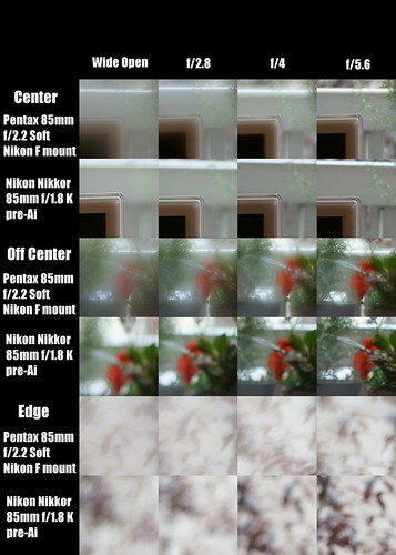
Something strange happened on the way to experiencing "softness" nirvana.  I've stumbled across an optical effect that I can't explain.

In optical designs I'm familiar with, "depth of field" increases as an aperture size is decreased (stopped down, as it were).  That's the commonly expected effect and is partly why lenses often come with aperture controls.

After looking at Jim Galli's soft focus large format images and thinking about how I might achieve similar effects in APS-C digital without returning to large format film, I stumbled across a small Pentax 85mm f/2.2 Soft in a Nikon F mount.  I'd never seen this lens in Nikon F, so I picked it up for not a huge sum of money.

Today I performed a quick comparison between the Pentax and my Nikon Nikkor 85mm f/1.8 K pre-Ai.  I was looking forward to shooting the Soft wide open and controlling the depth of field by stopping the aperture down a bit.

Looking at the comparisons and after the noting that the spherical aberrations decrease with aperture size (as expected), I noticed that the circle of confusion (said another way, the out of focus rendition) did not seem to change with the aperture.

What's going on here?  I have a mystery on my hands.  Perhaps one of my readers can help explain the optical effect?

Pentax 85mm f/2.2 Soft, Nikkor 85mm f/1.8 K Comparison


Here is a Nikkor "control" image where the 85mm f/1.8 K was shot wide open.

Nikon Nikkor 85mm f/1.8 K


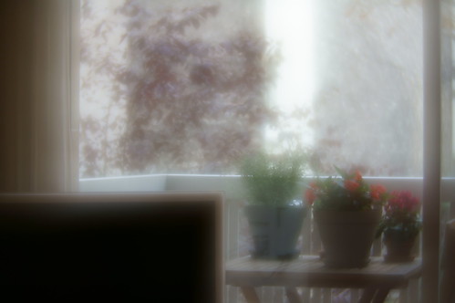
Here is the Pentax 85mm f/2.2 Soft at f/2.2.  As you scroll through the images, look at the "size" of the out of focus bright area situated between the green plant in the center and the red flower just to the right.  You can also look at the "size" of the leaves in the background (upper left region).

Pentax 85mm Soft at f/2.2

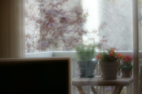
Here is the Pentax 85mm f/2.2 Soft at f/2.8.

Pentax 85mm Soft at f/2.8

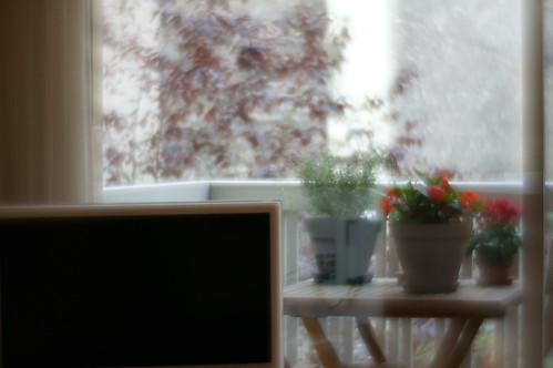
Here is the Pentax 85mm f/2.2 Soft at f/4.

Pentax 85mm Soft at f4

Here is the Pentax 85mm f/2.2 Soft at f/5.6.

Pentax 85mm Soft at f5.6

Thursday, September 28, 2017

Black and White ~ in portraiture

After learning about how to correctly emulate black and white film using a digital file, I've been wondering about all the different ways of applying this new (to me) knowledge.

One of my favorite subjects is people.  I've worked with creative costumers in Steampunk, Tribal Fusion, and Victorian Gothic communities in the US and Europe over the past 15 years and enjoy it.  While most people I work with are wanting something "unique" (meaning colors and textures and "interesting" lighting), I've had it in the back of my mind that I'd like to explore the late 1800's imaging esthetic.  A good example of the goal I would like, someday, to shoot for is the style of the work of Alex Timmerman.

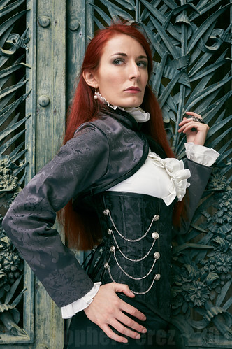
Taking an image from a series of photos I did recently with Hua Costumes, I set about seeing how a black and white treatment might be approached.

Here is a processed color version of the image in question.

Vampire photoshoot ~ Hua Costumes


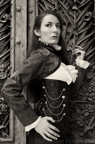
And here is the black and white conversion.

Hua Costumes ~ in B&W

By desaturating the color file, making sure the blacks are deep enough and that there is plenty of detail in the highlights, I simply moved the center of the "curve" up a little.   That is to say, I made the mid-tones lighter.

I could have combined this technique with the black and white filter selections to lighten or darken the skin (red/yellow to lighting, blue to darken).  In this case lightening the skin seemed to ruin the effect I was looking for and darkening the skin seemed to turn it to mud.

The reason I mention skin lightening/darkening is that this is what I was required to pay close attention to when I worked in a photo lab making black and white prints in Hollywood.  The images were used in the local parade of the stars tabloids and lightening the skin-tones hid many of the star's natural blemishes.  High-key skin tones were all the rage at the time and the approach seems to be well entrenched in image making, even today.

Which brings me to another point about converting color digital files to black and white for portraiture.  The skin tones do _not_ need to be high-key for an image to be effective.  In fact, I rather like having tone and texture in the skin.  It can give an image a sense of depth and dimension (roughly the saying the same thing, isn't it?).

Here is an example of deep skin tones.


This image was made during la Traversee de Paris Estivale 2016.  The gent was driving a very early deDion Bouton and he was well dressed for the part.  I shot this against a very bright sky using an old manual focus (therefore rather difficult to focus in rapidly changing situations) and extremely sharp Nikon Nikkor 80-200mm f/4.5 that was mounted on a Sony A6000 body.  The camera metered for the highlights (fortunately) and this kept the sky from "blowing out."

Once again using the technique of raising the mid-tones when converting a color digital file to black and white I was able to bring the darker areas of the scene up to what you see here.  The skin is obviously darker than in the images from the Hua Costumes vampiress shoot.  Yet to my way of looking at this image, the darker skin tones don't seem at all out of place.

In summary, it appears that deep, richblack and white portraiture that emulates the beauty of film can be achieved.  The more I work at this, the more I'm liking what I see.

Friday, September 01, 2017

Black and White ~ more image processing approaches

A recent revelation concerning the making of great digital black and white images has bowled me over.  The technique is where you desaturate an image and grab the center of the "curve" and raise it.  This is quick, straightforward and produces some very lovely results.

There are, of course, more than several ways of creating decent black and white images from digital color image files.  In this post I would like to share an alternative and still simple approach.

Capture One, Lightroom, Rawtherapee and many other image processing software applications provide tools that allow you to manipulate the color response in black and white, just as you might when decades ago you applied a colored filter to a lens while shooting black and white film.  Do you remember using a yellow filter to slightly darken the sky?  It's the same principle used here, but is processed after the image is taken, not while you're tripping the shutter.

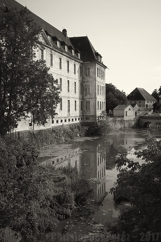
Take, for example, the following image.

Audelange, Jura, France


Using Capture One I added selected  "Black and White" -> "Color Sensitivity" -> "Enable B&W."  This activates a number of color range selections.  The sliders for each selection allow you to lighten/darken colors individually.  I consider this my infinitely variable and all powerful  black and white "filter pack."

For the above image, using "curves" to raise the mid-tones made the building and the sky too bright.  So, instead, I darkened the blues to manage the sky.  This had the additional effect of making the side of the building reveal more detail.  Next, I moved the green slider around until it revealed the reflection of the building as well as the leaves in the trees and plants around the scene.

Using the "let's play around with this" approach to image processing allowed me to lighten the areas I wanted and to selectively darken certain elements of the scene.  In this way I was able to selectively raise certain mid-tone colors.  The overall effect is subtle, and effective.

You might not be able to fully predict how the sliders will behave, so it's good to play around with the sliders in the "filter pack" until you find something you really like.

I enjoy looking at this image as it reminds me of the sensation of warmth of the late afternoon light I felt on that particular day in the village of Dole in the Jura region of France.

Wednesday, August 23, 2017

Black and White photography ~ comparing digital to film

I've been looking at many details and have been exploring several avenues of thought since my last post about discovering how to make digital images look like film.

In this entry I would like to take a brief look at images I made using both imaging mediums.

I kept some of my earlier black and white film negatives and brought them with me.  Selecting a couple train images I set about digitizing them.  Using a macro lens I shot sections of 4x5 inch negatives, stitched them together, and simply moved the top and bottom of the curve to the white and black points in the stitched file.  This gave me large files (on average 8000 x 6000) where the film grain is clearly visible and the full range of luminosity of the original negative was expressed.  I made no attempt to modify the shape of the curve (as you might with a digital file where some people might want to apply an "S" shaped curve, or something similar).

For train images shot as digital, I applied the technique described by The Online Photographer.  That is to say, I snugged up the black end of the curve, ensured there was a lot of detail in the highlights, and raised the center of the curve to bring up the mid-tones.  For both the digitized film and the digitally captured images I applied a platinum/palladium tone that I particularly like.

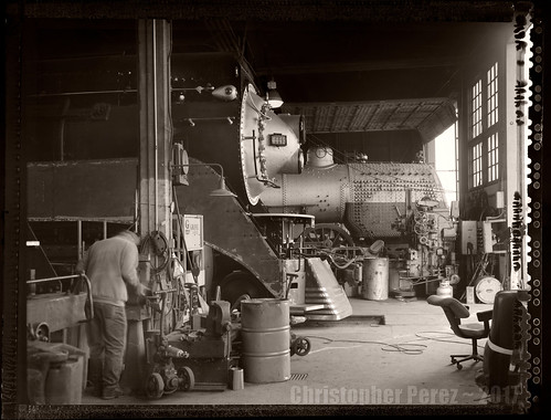
Here is a film-based image.  As you can see, it's from a 4x5 inch Polaroid Type-55 P/N negative.  I shot it at ISO 25 (the film side was always slower than the print side).  The Polaroid output was always more contrasty than Kodak TMax100 negatives, too.  I discovered Type-55 P/N very late in the film era and rather wish Polaroid was still around.  I'd probably have to have a 4x5 camera and a few lenses just to shoot that wonderful material.

Given the lighting situation in the old Brooklyn Roundhouse in Portland, Oregon it's surprising that the Polaroid negative shows detail in the highlights and shadows.  The shadows were very deep and the highlights could be very bright, even on overcast days.  I find this remarkable as I remember carping about all manner of silliness and was seldom happy with my results.  Yet, take a look at this.  I must have mellowed a bit over the years. I now think it's a beautiful image.

SP4449 ~ old Brooklyn Roundhouso


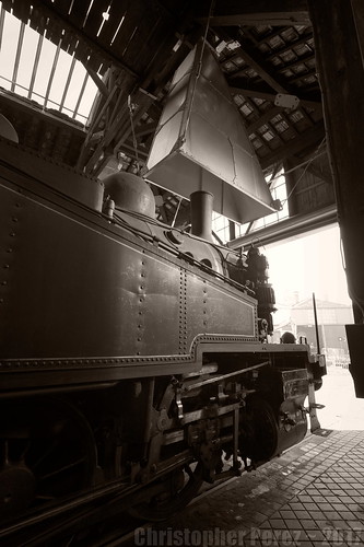
Here is a digitally captured image.  As you can see, I used an ultra-wide angle lens and captured the scene under remarkably similar conditions to the Polaroid Type-55 image above.  It was an overcast day in Longueville, France and the steam locomotive was pointed head-first out the doors.

The original digital image was actually shot as part of a three image HDR stack.  I used Rawtherapee to process the original Canon CR2 raw file.  In fact, I chose to work only on the -2EV image to see what I could do to keep sufficient detail in the highlights while raising the shadows.

As an aside, and if you'll recall, the Canon 5D MkII took a beating in the public forums for it's "banding issues."  Yet, using a file that was 2 stops _under-exposed_ and leaning heavily on the "shadows" slider shows no "banding issues" of any kind.  Additionally, the original 12-24mm Sigma EX HSM lens seldom received much love from the community of online photo-forum commenters.  To my eyes the edge to edge resolution and flair control seem excellent.

AJECTA ~ Longueville, France


The "character" of the two images, to me, is remarkably similar.  If I hadn't talked about each image before reaching these comments (and ignoring the Polaroid Type-55 edge), would you have been able to tell which imaging medium produced which image?

Monday, July 24, 2017

Black and White photography in the Digital Age

Back in the day (yes, I'm that old, but I can assure you I only walked up hill to school in one direction) all I shot was black and white.  Color was too difficult to control and the costs too high.  After years of working in black and white my "eye" became conditioned to a certain "look".  The mid-tones of a nice gelatin print could be a big beautiful sea of wonderful grays.

Time marches on, as they say and I've been less than happy with my digital images when I've tried to convert them to black and white.  I wasn't sure what the problem was, but every conversion and every filter and every film type I applied left me less than satisfied.  Try as I might, I couldn't figure out what the problem was.

So... I shot digital color and found I love it.

However, recently, Mike Johnson on his The Online Photographer blog posted two articles.  The first is titled "How to Cure the Digital B&W Nasties."  Well, there we have it.  The complete problem statement of what I felt I've been encountering since Day One of my transition to digital.  The second blog entry added a few details on how to make a decent B&W image using current tools.  It's titled "Look at Tone as Light."

Moving from "digital nasties" to a near perfect match for old film is much much easier than I'd ever imagined.  The key, for me, was in reading how a photographer who's work I greatly admire dealt with a student's image.

greg brophy: "... I once asked Carl [Weese] to help me with a B&W photo and he basically lifted the midtones."

There you have it.  The Answer.

Certainly there are many things a photographer can do in converting a color digital image into a decent black and white photo.  There are color channels you can manipulate.  There are "S shaped tone curves" you can apply.  And, yes, there are pre-canned film presets you can select.  I've tried them all and was not at all happy with any of them.

After having reconsidered the topic thanks to The Online Photographer, I think I've finally made peace with digital cameras and black and white imaging.  And I'm finding I'm enjoying working in black and white again.

Here is a Flickr album that illustrates my current understanding of the conversion technique.


Audelange, Jura, France

Monday, July 10, 2017

Comparison ~ Sony 16mm, Sigma 19mm, and Nikon 24mm

It seems I'm not yet over the Madness that's taken hold.  Here is a comparison of Sony, Sigma, and Nikkor wide angle lenses.

The lenses being compared include a Sony 16mm f/2.8 SEL "pancake" that sold with the first line of NEX-5 cameras.  Mine came as a reconditioned kit and I can't seem to find a reason nor a way to jettison it from my wee-collection of toys.  Then I added a Nikon Nikkor 24mm f/2.8 Ai-S to the comparison.  My thoughts were that I could put it on a Zhongyi Lens Turbo II and get higher image quality than the 16mm Sony.  I was hoping that this setup would match the very nice Sigma 19mm EX DN E f/2.8 (included here as my control optic).  There are times I like the full frame equivalent of 24mm's and the Sigma is more like working with a 28mm full frame lens on APS-C.  And lastly, two Sony kit lenses are included here.  One has 16mm's on the short end.  That is, of course, the Sony 16-50mm f/3.5-5.6 SEL OSS.  The other has 18mm's on the short end and is the 18-55mm f/3.5-5.6 SEL OSS.  Both are little valued in the marketplace and have received a lot of criticism.

Comparison setup -
  • Some pages out of a local newspaper taped to the bedroom wall 
  • Sony A6000 set to "A", 100 ISO, 2second delay 
  • Massive Manfrotto tripod 
  • No sharpening applied to the RAW output 
  • 500 pixel sections were taken from the various images and organized below 
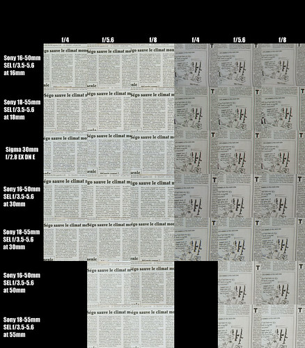
Here are the center and edge of the scene comparisons. As a control, I added a Sigma 19mm EX DN E into the mix. As always, take a look at the following image a full resolution to note the differences between the various focal lengths and apertures.

16mm to 24mm Wide Angle Comparison (Nikon, Sony, Sigma)


Starting with the lens shown at top and moving down to the bottom, here are my comments.

The Sony 16mm f/2.8 SEL is soft wide open.  Every comparison I've performed confirms my copy is less than stellar at that aperture.  However, stopped down one click the lens starts to "wake up."  The center is sharp from f/4 on.  The edges don't sharpen up until f/5.6.  If you're a "critical photographer", this is an inexpensive, widely available, great little "pancake" lens that shoots best from f/5.6 to f/11.

Back in the day, Nikon's Nikkor 24mm f/2.8 Ai-S was taken to be a wonderfully sharp and versatile lens.  As we can see in this comparison, the center is sharp from wide open.  However, when mounted on a Zhongyi Lens Turbo II focal reducer to work on an APS-C sensor'd camera, the edges never ever sharpen up.  I've shot this in the wild and there's just no way of getting the edges sharp.  So much for the idea of using it with the Zhongyi focal reducer.

I've put this on a straight-through adapter and can use it as a 35mm equivalent focal length lens on APS-C.  When used this way it's sharp to the edges from f/4 on down.  While not exactly inexpensive (they're currently running between 100 and 200Euro, depending), it does give that Nikon "look."  To me it's not worth buying a full frame camera to use just this one lens to achieve a single goal, so, I guess I'm not sure what I'll do with it.  Maybe I'll stop looking for a cheap Nikkor 35mm f/2.8 and simply keep the 24mm Nikkor on the non-focal reduced adapter?

Next, we come to the control lens in this comparison.  The Sigma 19mm f/2.8 EX DN E is sharp from wide open straight across the field from the center to the very edges.  What's not to love about this little lens?  It's inexpensive (just a tick north of 100Euro at this point, used in mint condition), light, and comes with AF that's nearly as quick as the Sony 16mm SEL.

The last two optics in this wee-comparison are the two Sony kit lenses.  Starting with the 16-50mm f/3.5-5.6 SEL OSS at 16mm we see that the center is sharp from wide open.  The edges are, however, nearly as bad as with the 24mm Nikkor mounted on the Zhongyi focal reducer.  They never seem to improve, regardless of aperture.  This lens is a bit more expensive than the earlier kit lens.  Maybe people like it because it's nearly a "pancake" optic?  If this were the only lens you owned, I'm sure it'd do a decent job of getting you where you want to go.  But for similar, or possibly less money I'd buy a Sigma 19mm and call it good.

Finally, the Sony 18-55mm f/3.5-5.6 SEL OSS remains the surprise lens of the comparison. It's sharp from wide open and is only slightly less sharp than the Sigma at the very edges.  This is surprising to me as so many people have "trash talked" this lens across the internet.  What I've learned from doing these comparisons is that if there's sufficient sun (or a tripod on hand) that shooting this lens at f/8 or f/11 is the equal (or very nearly the equal) of more highly praised fixed focal length optics.

Saturday, July 08, 2017

Comparison ~ Sony APS-C mirrorless kit lenses

Since I'm on a roll... let's take a look at how Sony's kit lenses compare, shall we?

Kit lenses are traditionally viewed by the punters as being horrid things to be avoided at all costs.  The "common wisdom" is that a "serious" photographer ditches the kit lens as soon as they can to replace them with more "serious" optics.  Since I have two such kit lenses for my Sony APS-C mirrorless cameras, I thought now would be a good time to look at them more closely.

The first is the original 18-55mm f/3.5-5.6 SEL OSS.  I used it for years before I found a beautiful trio of Sigma Art DN lenses.  The lens came with the very first NEX5 that I picked up "reconditioned" off Amazon less than a year after the camera was first introduced.  These days I'm not sure I'd give 50Euro for the lens, that's how bad it's reputation is.

The second is the newer Sony 16-50mm f/3.5-5.6 SEL OSS "pancake" optic.  I've not used the lens, but since it offers 16 mm's on the wide end I got to thinking that it might be a good, flexible lens to use when I didn't want to carry the Sigma DNs nor the Sony 16mm f/2.8 SEL.  The optic came as part of a Sony NEX-5T kit I recently picked up for a rather attractive price.  For the lens alone I see them going for around 100Euro, but I'm not sure that's warranted, given that the wonderful Sigma Art DN lenses can be found in mint used condition for around that price.

Comparison setup -

  • Some pages out of a local newspaper taped to the bedroom wall 
  • Sony A6000 set to "A", 100 ISO, 2second delay 
  • Massive Manfrotto tripod 
  • No sharpening applied to the RAW output 
  • 500 pixel sections were taken from the various images and organized below 
Here are the center and edge of the scene comparisons. As you can see, I looked at the lenses zoomed to their widest focal length, 30mm, and then at their longest focal length.  As a control, I added a Sigma 30mm Art DN into the mix. As always, take a look at the following image a full resolution to note the differences between the various focal lengths and apertures.

Sony Kit Lens ComparisonVariousFocalLengths

My observations are as follows.  The Sigma 30mm f/2.8 EX DN E is a very fine optic.  It's sharp to the very edges of the frame when shooting the 2D comparison subject.  This is why many times I use it as my comparison control.

By comparison, the Sony 16-50mm f/3.5-5.6 SEL OSS is just OK when shot wide open.  It's nearly the same OK-ness at the three focal lengths I looked at.  The center sharpens up as the aperture is stopped down.  The edges, however, never really sharpen up with the copy of the lens I have.  In fact, it's pretty bad at 16mm's.  There may be a lot of field curvature at that focal length, so don't write this lens up completely.  Still, my thoughts are that no amount of distortion nor CA corrections will bring back the edges of the field.

The surprise is the Sony 18-50mm f/3.5-5.6 SEL OSS.  I remember reading something on Photozone.de about how bad this lens was on a NEX7 they tried.  Yet, check out the results from copy I have in my hot little hands.  This lens appears to be as good at f/8 as my Sigma 30mm control lens.  Even wide open, this little kit lens appears to hold it's own.  Looking at the comparison images I feel that this kit zoom would make a great f/8 lens.  If you're a critical photographer who simply can not abide slightly soft corners, set the aperture to f/8, float the shutter speed and ISO, and let 'er rip!

There you have it.  Two cheap, unregarded, commonly available Sony APS-C mirrorless kit lenses.  One is just OK.  The other?  Well.  There are no excuse for not being able to make a very fine image with that one.

Friday, July 07, 2017

Nikon 80-200mm f/4.5 N Ai - a quick look

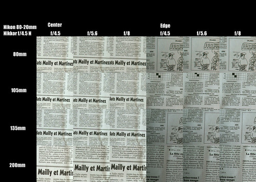
In keeping with my now standard way of looking at resolution and contrast in lenses, I thought I'd put an old Nikon Nikkor 80-200mm f/4.5 N Ai through it's paces and see how it did with le canard enchaine.

I picked this lens up for around 80Euro.  I know.  I paid way too much for it.  To make matters worse, it's well used and the push-pull zoom barrel does not slide entirely smoothly.  It's not bad, but it's definitely not as silky smooth as the 80-200mm f/4 Ai-S that I recently foolishly sold.  Oh well, I was in a house cleaning stage and was looking to downsize my collection of lenses.

Comparison setup -

  • Some pages out of a local newspaper taped to the bedroom wall 
  • Sony A6000 set to "A", 100 ISO, 2second delay 
  • Massive Manfrotto tripod 
  • Zhongyi Lens Turbo II focal reducer 
  • No sharpening applied to the RAW output
  • 500 pixel sections were taken from the various images and organized below
Here are the center and edge of the scene comparisons.  As you can see, I looked at the lens zoomed to 80mm, 105mm, 135mm, and 200mm.  As always, take a look at the following image a full resolution to note the differences between the various focal lengths and apertures.

Nikon 80 to 200 f/4.5 N Compar


So, what do we see here?  Simply, Nikon's old zoom is a very fine objective at all focal lengths and all apertures.  Only at 80 mm's did the lens suffer at the extreme edges of the frame.  Everything else is tack-sharp across the frame.

Looking at the other comparisons that I've performed, can you tell any difference between this lens and fixed focal-length lenses?  Think about that a moment.  Impressive, isn't it?

The primary thing that is given up by using this zoom is maximum aperture speed.  If you want to blur the background by shooting at a wide aperture, use a fixed focal length lens.  If you want sharp images from a variety of focal lengths but only want to carry one lens, it'd be hard to beat this zoom as a one package solution.

Thursday, July 06, 2017

Comparing Nikon 50mm and Helios 44 58mm lenses

Now that time has passed and several 50mm lenses have, well, passed through my hands, I thought I'd take a look back to see if I could figure out which was the sharpest wide open.

I used comparison images of -

  • early '70's Nikon Nikkor 50mm f/1.4 pre-Ai
  • c.1970 Nikon Nikkor 50mm f/2 H pre-Ai
  • c.2000 Nikon Nikkor 50mm f/1.8 Ai-S
  • mid-'80's Nikon 50mm f/1.8 E-series
  • Helios 44-M 58mm f/2
Comparison setup -
  • Some pages out of a local newspaper taped to the bedroom wall 
  • Sony A6000 set to "A", 100 ISO, 2second delay 
  • Massive Manfrotto tripod 
  • Zhongyi Lens Turbo II focal reducer
  • No sharpening applied to the RAW output 
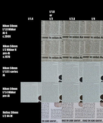
Here are the center of the scene comparisons.  I made no attempt to look at the corners of the frame for this comparison.  Look at this image at full resolution to note differences between the various elements.

50mm Lens Comparison

I found this little exercise rather interesting.

To start, the Russian made Helios 44-M was sharp from wide open.  The lens is typically found for 20Euro or 25Euro.  I had disassembled the lens to tighten various things that had come loose over many years of use.  Once inside I found the Russians had packed the lens with an amazing amount of grease.  So I removed the excess and once reassembled, the lens felt like any well-made optic from Japan.  The lens required it's own set of adapters to work on my Sony mirrorless APS-C cameras, so I sold it.  I didn't want the hassle of carrying a duplicate set of adapters around.

I had a love/hate relationship with the 50mm f/1.4 Nikkor.  I wasn't sure it was sharp wide open.  At near infinity, spherical aberrations seriously clouded the image and there was seemingly no way to "smart sharpen" them away.  However, when used on subjects a meter or two from the lens, wide open the old Nikkor seemed to perform admirably.  Further, by f/2.8 the lens was as sharp as any Sigma Art DN I used.  But I didn't buy it to use it at f/2.8.  Somewhat frustrated and confused with it's performance, I sold it.

A few years ago at the Bievre Foto Foire I picked up a 25Euro Nikon 50mm f/1.8 E.  It was cute.  It was light.  But wide open it just didn't seem all that great.  As with the Nikkor f/1.4, I had a love/hate relationship with the little E-series lens.  I wanted to love the lens, but when shot stopped down, the out of focus rendition was jittery and unpleasant.  So, in a recent fit of housecleaning I sold it.

Which brings me to yet another Round of Insanity.  Reading somewhere on the "internets" that double Gauss design lenses "write" an image differently than other optics (see claims by Zeiss and others), I did a bit of research.  It turns out that the most "pure" renditions of a double Gauss design that I could find in a Nikon mount were the early/old Nikkor 50mm f/2 H/HC and the much more recent rendition found in the Nikkor 50mm f/1.8 Ai-S.  The f/1.4 and f/1.2 lenses are more complex (hence not "pure" to the original flint/crown design concept) versions of the double Gauss.  With careful searching, the f/2 and f/1.8 lenses can be had for a lot less than 40Euro each.

In the center of the scene, the c.1970 f/2 H is really quite sharp.  Image quality drops off dramatically toward the far edges of the frame, but the center holds up quite nicely.  Stopping the aperture down cleans up the corners fairly well.  I was more than a little surprised.  I'm not yet sure how I'll use this lens, but outdoor/environmental portraiture comes to mind.

The f/1.8 Ai-S, on the other hand,  in terms of resolution seems just barely better than the Helios, f/1.4 Nikkor, and f/1.8 E wide open.  In addition, it seems to be very slightly better than the f/1.4 Nikkor at f/2.  What's interesting to see from an earlier comparison is just how well the Ai-S performs across the field and right out to the edges of the frame.  It's as good, if not slightly better than, my much vaunted Sigma 30mm f/2.8 EX DN E.

One last note about the Nikon Nikkor 50mm f/1.8 Ai-S.  There are at least two different barrel lengths that Nikon made.  One looks like just about any old 50mm lens and the other is a "pancake" version.  It looks nearly identical to the cheaper f/1.8 E-series lens.  In fact, many of the vendors I encountered in Bievre did not realize there was any difference.  Those who did priced their lenses accordingly.  If you look carefully for the word "Nikkor" on the front ring, you might get lucky, like I did, and you might be able to score a brilliant little Nikkor-grade optic for E-series lens kinds of prices.

Wednesday, June 28, 2017

50mm lenses - Nikon f/2, Nikon f/1.8, Sony f/1.8 SEL

Just before heading out south of town to the Bievre Photo Foire I'd read where double Gauss lens designs "draw" better than other designs.  I'm not sure what "draw" means, but I'm intrigued and want to find out.

As luck would have it, I picked up a pair of Nikon Nikkor 50mm lenses that implement the classic double Gauss design.  So I thought I'd start my investigation by looking at their resolution and compare them to my now standard reference, a Sigma 30mm f/2.8 EX DN E, as well as the beautiful Sony 50mm f/1.8 SEL OSS (APS-C only).

The Nikon lenses in question are Nikkor 50mm f/2 H pre-Ai and Nikkor f/1.8 Ai-S.  These are inexpensive and commonly available. 

While I had them out I though I'd also see how they behaved when combined with a Zhongyi Lens Turbo II focal reducer adapter.  

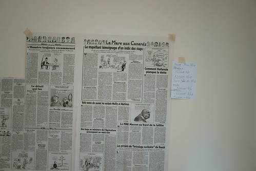
Here is the nice, boring, but richly detailed 2D (ie: flat) comparison setup.


Nikon 50mm Double Gauss comparison


Camera setup -

  • Some pages out of a recent mailing from a local newspaper taped to the bedroom wall
  • Sony A6000 set to "A", 100 ISO, 2second delay
  • Massive Manfrotto tripod
  • No sharpening applied to the RAW output

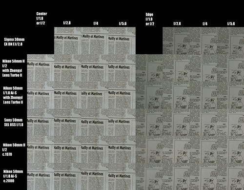
Here are the comparisons.  Look at this image at full resolution to note differences between the various elements.


Nikon 50mm Double Gauss comparison

My observations are that the Nikkor 50mm f/1.8 Ai-S is a very fine optic.  It's just a touch softer wide open than it's older sister, the 50mm f/2 H pre-Ai.  The f/1.8 lens is sharp to the edges, which means it has a very flat field, just like the Sigma 30mm f/2.8 EX DN E.

The Nikkor 50mm f/2 H pre-Ai is very slightly sharper wide open than it's younger sister.  The edges never really match the other lenses compared here, but this might be due to field curvature.  As we've seen with the copy of the Sony 16mm f/2.8 SEL I've looked at, field curvature can play an important role in how a sharp a scene appears at the edges.

The Sony 50mm f/1.8 SEL OSS (APS-C only) is a very nice optic.  I can see why people like this lens.  It's sharp from wide open, offers AF and OSS (image stabilization), and while we can't see it here, wonderful out of focus rendition at all apertures.

There you have it: Two inexpensive lenses what perform rather well from wide open, with or without the Zhongyi Lens Turbo II focal reducer.

Wednesday, June 14, 2017

Portraiture ~ Art Logic

I debated writing more about the art of portraiture.  In the back of my mind there was something that begged to be said, so here are a few additional thoughts on the topic.

In the original blog entry on Artistic Considerations I said "Viewing Position is, perhaps, the most important feature of any portrait you will ever make.  What I mean by this is you must make a conscious decision as to exactly where you place the lens with respect to your subject. "

I found that over my 50 years of taking pictures of people that I completely ignored the importance of making a conscious decision as to exactly where to place the lens with respect to my subject.  Simply said, I would stand in front of my subject and snap the shutter.  Where the lens was placed was quite often at eye level.  That is, the lens was placed at the level of my eyes and I would frame the subject from this point of reference.

There are a couple problems with taking this approach.  One of the more obvious problems is that to take a photo from the subject's waist to the top of their head, the lens needed to be pointed down.  This causes what we call keystone distortion.  The waist of the subject is narrower than if you looked at the subject from a position that does not introduce image distortions.

A second, perhaps more subtle, problem is that the power of the subject photographed at eye level never matches the power of the portraits of the Old Masters.  Where the artist views his subject from (ie: at which height) is a key difference between a painting (or photograph) and the thing we call art.  It's an effect of psychology and if you are a serious artist or craftsperson you need to be fully aware of it. 

The prior paragraph is a complex one and is filled with important truths.  It might take time to work out exactly what I mean.  It took me 50 years, so don't worry.  Here are three ways illustrations that might help.

"Selfies", at one extreme, tend to be filled with image distortions which are direct consequences of where the lens is placed in relation to the subject.  Cell phones tend to be placed at or above the subject's eye level and the torso and waistline are heavily keystoned.   If the lens is too close to the subject, features such as the nose and lips take on a certain distorting prominence. 

Fashion photography is another extreme example.  I remember reading an interview with Francesco Scavullo where he said he loved photographing models full length at floor level, or sometimes from inside an orchestra pit as a means of making their legs appear longer than they are in real life.  Optical distortions, for him, were a stock and trade item.

One more example of what I'm referring to when I say it's important to consciously place the lens with respect to your subject can be seen in Hollywood movie posters.  Action films, in particular, try to convey as sense of motion, purpose, and power.  Photographs of actors and actresses in these kinds of posters and promotional materials are seemingly never photographed at eye level nor from the position an Old Master would have chosen.  Comic book or graphic novel based movies tend to photograph their subjects at near fashion points of view.

Once recognized and understood you can now quickly sort through images (painting or photographs, it doesn't matter) and recognize Masterworks by where the subject was viewed from at the time the artifact was created.  This shouldn't be confused with where a portrait is placed on the wall (painting or print) or on display.  What I'm talking about is where the artist or craftsperson (at which height) viewed the subject.

There are two photographers who have photographed from an Old Masters points of view.  The first photographer might not have intentionally placed his lens where he did.  He might have stumbled onto this effect by using cameras that he looked down into the viewfinder (such as Rolleiflex or Hasselblad).  Still, Robert Mapplethorpe's portraiture is well known and well received.  Look carefully at what height he placed the lens.

The second photographer who I feel embodies the spirit of the Old Masters is Joel Grimes.  In at least one of his YouTube videos he very briefly talks about why he places the lens where he does.  He is the first photographer I've listened to who consciously places his objective exactly where he wants it.  It's not a haphazard "artistic", "feeling", "emotional" decision.  Yet his work can invoke strong emotional responses.

Understanding what we do as artists and applying appropriate solutions is, to me, always the preferable starting point.  If you want to make beautiful portraits or if you want to be an iconoclast and "break the rules" of art in pursuit of your own fame and fortune, perhaps it would help to fully understand what the rules are.

I hope this series of blog entries on portraiture has been helpful.

Sœur Vampire ~ Paris

Friday, June 02, 2017

Portraiture ~ Lighting Logic

Continuing my series on portraiture and the logic behind the set of instructions I'm sharing, we will now turn our attention to lighting.  For each detail I will try to provide a short explanation of it's importance.

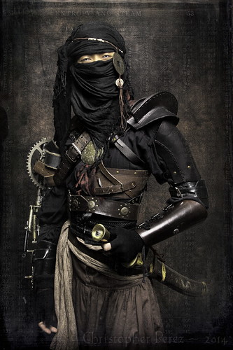
Ninja ~ out of the Age of Steam

Camera Setup - 
  • Set the Exposure by using 
    • Manual Mode (typically "M" on most cameras)
    • 1/125th of a second for the shutter speed
    • f/5.6 or f/8 for the aperture
    • 100 for the ISO (or whichever is the lowest sensor sensitivity your camera offers)
    • Daylight for the White Balance
Manual Mode is selected because we need to bypass the in-camera metering system.  In fact, we want the flash to provide enough power that it itself determines the exposure.  Said another way, we should have enough light from the flash to make the impact of ambient light on our scene irrelevant.

1/125th of a second shutter speed is selected because many imaging devices come with a shutter curtain (physical or electronic) and the flash sync speed is typically 1/160th of a second.  Some systems will do better than this, but many flash/camera setups require additional setup and management to achieve the higher sync speeds.  In my experience, there is nothing to be gained.

I recommend setting the lens aperture to f/5.6 or f/8 as these apertures will accomplish two things.  First, when you subjects eyes are in focus, the depth of field at these apertures will get the nose to the back edge of the head in focus.  With this technique we are not trying to achieve the currently trendy limited depth of field kind of scene.  We want the full Rembrandt/Titian/Rubens/Lebrun painters portraiture details.

Secondly, using f/5.6 or f/8 will ensure that even if you are using the cheap kit lens that comes with many cameras, you will have eliminated the worst of the chromatic aberrations and gone beyond the apertures where spherical aberrations might be influential.  In short, these apertures will be the sharpest apertures your lens can operate at.  If things are too sharp for your artistic sensibilities, you can always soften the scene during image processing later.

I recommend you set the lowest ISO your camera is capable of because that is typically where your image will experience the least sensor noise and the greatest highlight and shadow details.  Keep in mind that as the ISO increases the dynamic range of your imaging system narrows and you will lose highlight and shadow details.

And lastly, I strongly suggest you set your white balance to Daylight.  Many imaging systems come with a Flash white balance option, but there's a problem when using an off-camera flash.  In my many experiences in using a broad variety of systems, skin tones are rendered too red when setting the White Balance to Flash.  Yet when White Balance is set to Daylight, skin tones are correctly rendered with every system I've ever tried.  Strange, perhaps, but true.


Set the Exposure -

By using the in-camera histogram to help set the flash intensity, you can ensure there is enough detail in the highlights and shadows.  We don't want either end "clipped" because that means we would have no information to work with during image processing later.

In the end and when you're all done processing an image you might want one end or the other of the exposure range "clipped", but it's best to begin with a file filled with detail because you might just as easily change your mind and want to use the information in those areas after the shoot.  The goal in setting the exposure correctly is flexibility.  Flexibility allows you a broader range of image processing choices.


Lighting Setup #1 -

This lighting setup is mimics Japanese woodcut "lighting."  It's known as Notan light.  William Mortensen and Robert Balcomb used this kind of light for many of their portraits.  The details of the subject are revealed and nothing is hidden.  It perfectly describes the subject.  I like about this kind of light because viewers don't know where the light is "coming from."

It is very good for portraiture where the subject is not in motion (real nor implied).  I like using this kind of light as it is soft, subtle, and lends the subject an air of substance, reality and truth.  
    Lighting Setup #2 -

    This lighting setup is what we commonly see in magazines and fashion work.  We know this kind of light as "chiaroscuro", or cross-lighting.  It's the classic light of certain periods of Italian painting.

    Cross-lighting for portraiture is expected.  It can reveal the shape and some of the depth of a subject.  Many photographers think of this as "Rembrandt light", or light that appears to spill onto one side of the subject as if through a window.  This setup is the one that will give you that "triangle" of light on the cheek on the off-side of your subject.

    Lighting setup choice -

    I've been giving this, perhaps, far too much thought and here is what I've come to.

    I've found it very interesting to see which kind of light has been used in which situation by looking at the works of the Old Masters.

    As an exercise to help us decide which kind of light to use, let's take a look at a few pieces of art.  Closely observe the following paintings and try to determine where the light is coming from and which light setup you would use to recreate that effect.  Ready?  Here we go -

    • Leonardo da Vinci - Mona Lisa (aka: la Joconde)
    • Titian - any of his portraits
    • Rubens - any of his portraits
    • Vigee Lebrun - any of her portraits
    • Auguste Renoir - any of his portraits
    Do you see a pattern here?  Which light do you think was used for all of this fabulous, timeless, portraiture?

    What about these artists?  Which kind of light did they use?  What was their subject?  How do these make you feel?
    • Gerard van Honthorst - almost anything he did (with a few exceptions)
    • Rembrandt's Nightwatch
    • Caravaggio - Supper at Emmaus,  Calling of Saint Matthew, Incredulity of Saint Thomas, etc.
    • Trophome Bigot - Allegory of Vanity
    • Gerard van Honthorst - Supper With The Minstrel And His Lute
    While the history of art and painting might not be quite as simple as I make it out to be (though it really does look like it could very well be), it comes down to considering just these two approaches.  You needn't rely on me to suggest how things are.  Walk the galleries of any museum in the western world and test this for yourself.  Here is how I see the effect of lighting for use in photography.

    Lighting Setup #1 (Japanese woodcut/Notan) is a calm, pleasant, elegant light.

    Lighting Setup #2 (Chiaroscuro) is a dynamic, active, dramatic light.


    In the next post on the logic behind my portraiture instructions I would like to talk about the art of portraiture.